<!DOCTYPE html>
<html lang="en">
<head>
<meta charset="UTF-8">
<meta http-equiv="X-UA-Compatible" content="IE=edge">
<meta name="viewport" content="width=device-width, initial-scale=1.0">
<title>test</title>
<style>
body{
width: 1000px;
height: 400px;
display: grid;
place-items: center;
}
.list{
list-style: none;
}
.progress-item{
margin-top: 20px;
}
.progress-text{
position: absolute;
margin-left: 156px;
margin-top: 35px;
}
.progress1 {
--progress: 60deg;
width: 100px;
height: 100px;
padding: 4px;
background: linear-gradient(calc(var(--progress) - 90deg), #f2f2f2 50%, #02cb73 50%);
}
.progress2 {
--progress: 60deg;
width: 100px;
height: 100px;
padding: 4px;
background: linear-gradient(90deg, #f2f2f2 50%, transparent 50%),
linear-gradient(calc(var(--progress) - 90deg), #f2f2f2 50%, #02cb73 50%);
}
.progress3 {
--progress: 60deg;
width: 100px;
height: 100px;
padding: 4px;
border-radius: 50%;
background: linear-gradient(90deg, #f2f2f2 50%, transparent 50%),
linear-gradient(calc(var(--progress) - 90deg), #f2f2f2 50%, #02cb73 50%);
}
.progress4 {
--progress: 200deg;
width: 100px;
height: 100px;
padding: 4px;
border-radius: 50%;
background: linear-gradient(90deg, #0000 50%, #02cb73 50%),
linear-gradient(calc(var(--progress) - 90deg), #f2f2f2 50%, #02cb73 50%);
}
.progress5 {
--progress: 200deg;
width: 100px;
height: 100px;
padding: 4px;
border-radius: 50%;
background: linear-gradient(calc(var(--progress) - 270deg), #02cb73 50%, #0000 50%),
linear-gradient(90deg, #f2f2f2 50%, #02cb73 50%);
}
.progress6 {
--progress: 200deg;
width: 100px;
height: 100px;
padding: 4px;
border-radius: 50%;
background: radial-gradient(#f2f2f2 63%, #0000 0),
linear-gradient(90deg, #0000 50%, #02cb73 50%),
linear-gradient(calc(var(--progress) - 90deg), #f2f2f2 50%, #02cb73 50%);
}
.progress7 {
--progress: 200deg;
width: 100px;
height: 100px;
padding: 4px;
border-radius: 50%;
background:
radial-gradient(#f2f2f2 63%, #0000 0),
conic-gradient(#02cb73 var(--progress), #f2f2f2 var(--progress));
}
.progress-radial {
--progress: 25;
display: inline-block;
margin: 15px;
position: relative;
width: 180px;
height: 180px;
border-radius: 50%;
border: 10px solid #5d6771;
background-color: #fffde8;
box-shadow: 0 2px 15px rgba(0, 0, 0, 0.3);
background-image:
linear-gradient(90deg, #5d6771 50%, transparent 50%),
linear-gradient(calc(90deg + var(--progress)*3.6deg), #fffde8 50%, #5d6771 50%);
}
.progress-radial-51{
background-image:
linear-gradient(calc((var(--progress) - 50)*3.6deg - 90deg), #fffde8 50%, transparent 50%),
linear-gradient(270deg, #fffde8 50%, #5d6771 50%);
}
.progress-radial:before {
transform: rotate(calc(var(--progress)*3.6deg)) translate(0, -72.5px);
}
.progress-radial b:after {
counter-reset: showProgress var(--progress);
content: counter(showProgress)"%";
}
.progress-radial:after, .progress-radial:before {
content: '';
width: 35px;
height: 35px;
top: 50%;
left: 50%;
border-radius: 50%;
margin-left: -17.5px;
margin-top: -17.5px;
background: #fffde8;
position: absolute;
z-index: 999;
box-shadow: 10px 0 10px rgba(0, 0, 0, 0.2);
}
.progress-radial:after {
z-index: 998;
box-shadow: none;
transform: translate(0, -72.5px);
}
.progress-radial b:after {
color: #fffde8;
text-shadow: 0 1px 2px rgba(0, 0, 0, 0.6);
position: absolute;
font-weight: 900;
left: 50%;
top: 50%;
width: 50%;
height: 50%;
background-color: #2f3439;
border-radius: 50%;
margin-left: -25%;
margin-top: -25%;
text-align: center;
line-height: 90px;
font-size: 30px;
box-shadow: 0 2px 3px rgba(0, 0, 0, 0.3) inset, 0 0 0 10px #5d6771;
}
</style>
</head>
<body>
<ul class="list">
<li class="progress-item progress1">
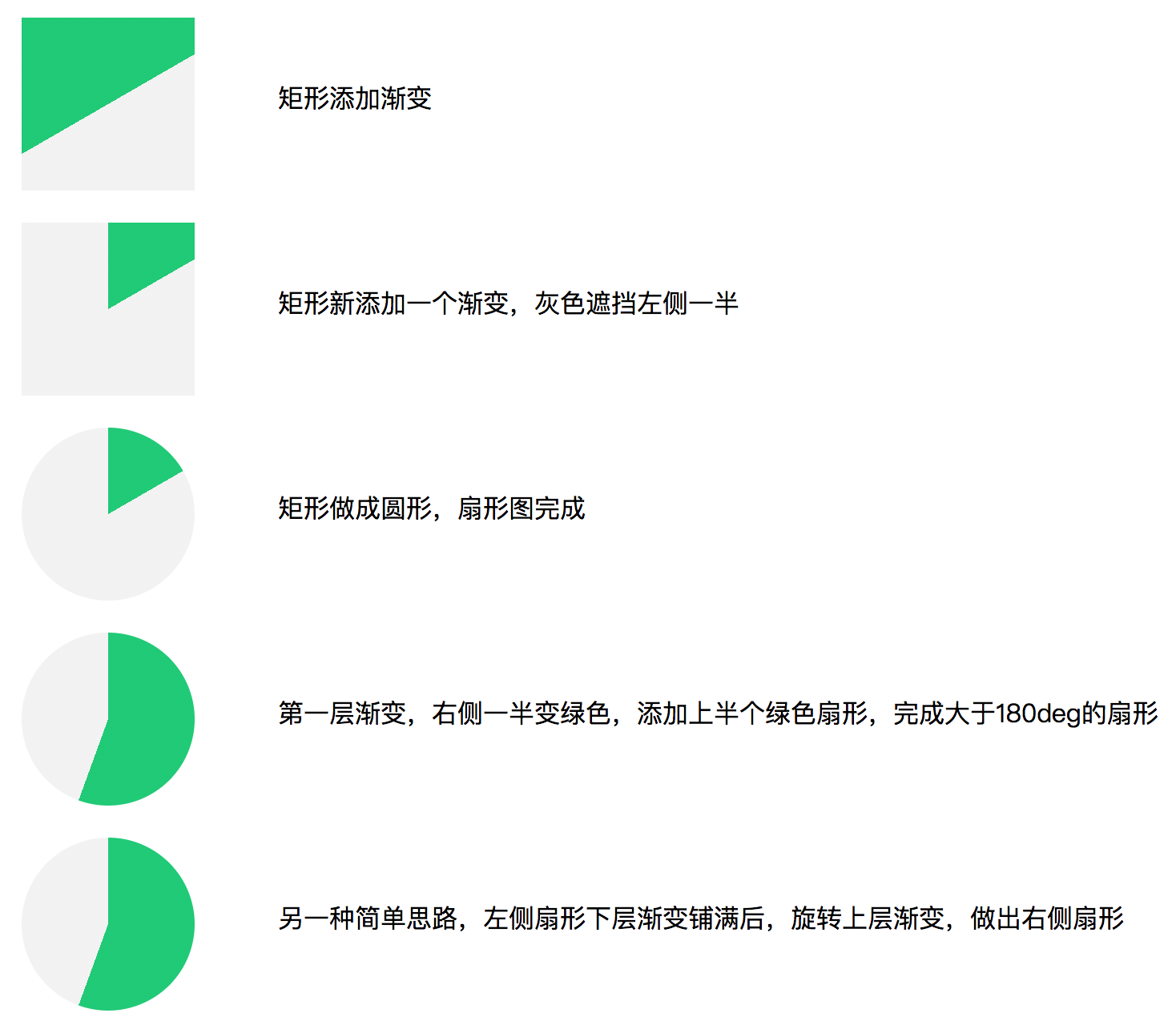
<span class="progress-text">矩形添加渐变</span>
</li>
<li class="progress-item progress2">
<span class="progress-text">矩形新添加一个渐变,灰色遮挡左侧一半</span>
</li>
<li class="progress-item progress3">
<span class="progress-text">矩形做成圆形,扇形图完成</span>
</li>
<li class="progress-item progress4">
<span class="progress-text">第一层渐变,右侧一半变绿色,添加上半个绿色扇形,完成大于180deg的扇形</span>
</li>
<li class="progress-item progress5">
<span class="progress-text">另一种简单思路,左侧扇形下层渐变铺满后,旋转上层渐变,做出右侧扇形</span>
</li>
<li class="progress-item progress6">
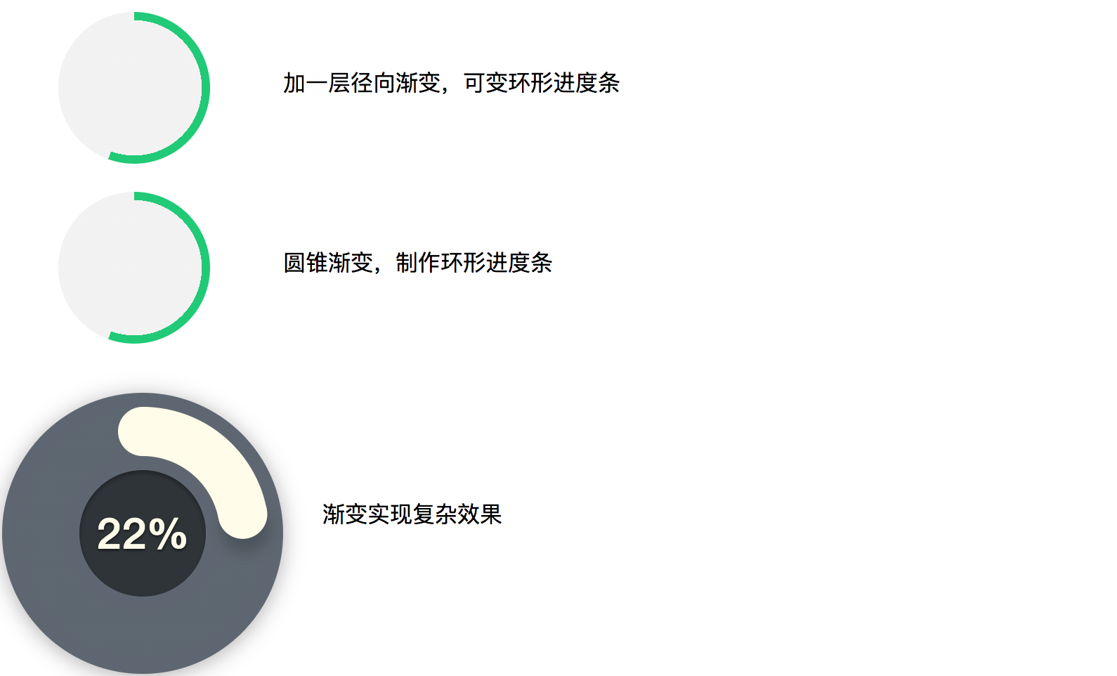
<span class="progress-text">加一层径向渐变,可变环形进度条</span>
</li>
<li class="progress-item progress7">
<span class="progress-text">圆锥渐变,制作环形进度条</span>
</li>
<li class="progress-item">
<span class="progress-text" style="margin-left: 188px;margin-top: 90px;">渐变实现复杂效果</span>
<div class="progress-radial" style="margin-left: -40px;"><b></b></div>
</li>
</ul>
<script>
tickProgress();
function tickProgress(){
let progressCon = document.querySelector('.progress-radial');
let tick = 0;
setInterval(() => {
tick++;
if(tick > 100){
tick = 1;
}
if(tick == 51){
progressCon.classList.add('progress-radial-51');
}
else if(tick == 1){
progressCon.classList.remove('progress-radial-51');
}
progressCon.style.setProperty('--progress', tick);
},50);
}
</script>
</body>
</html>


 浙公网安备 33010602011771号