css动画的实现方式
css实现动画主要有3种方式,第一种是:transition实现渐变动画,第二种是:transform转变动画,第三种是:animation实现自定义动画,下面具体讲一下3种动画的实现方式。
一、transition渐变动画
过渡属性
下表列出了所有的过渡属性:
| 属性 | 描述 | CSS |
|---|---|---|
| transition | 简写属性,用于在一个属性中设置四个过渡属性。 | 3 |
| transition-property | 规定应用过渡的 CSS 属性的名称。 | 3 |
| transition-duration | 定义过渡效果花费的时间。默认是 0。 | 3 |
| transition-timing-function | 规定过渡效果的时间曲线。默认是 "ease"。 | 3 |
| transition-delay | 规定过渡效果何时开始。默认是 0。 | 3 |
<div class="base"></div>
 1     .base {
 2       width: 100px;
 3       height: 100px;
 4       display: inline-block;
 5       background-color: #0EA9FF;
 6       border-width: 5px;
 7       border-style: solid;
 8       border-color: #5daf34;
 9       /* transition-property: width, height, background-color, border-width;
10       transition-duration: 2s;
11       transition-timing-function: ease-in;
12       transition-delay: 500ms; */
13
14       /*简写*/
15       transition: all 2s ease-in 0ms;
16     }
17
18     .base:hover {
19       width: 200px;
20       height: 200px;
21       background-color: #5daf34;
22       border-width: 10px;
23       border-color: #3a8ee6;
24     }

二、transform转变动画
transform属性应用于2D 或 3D转换。该属性允许我们能够对元素进行旋转、缩放、倾斜、移动这四类操作.一般是配合transition的属性一起使用。
- translate():主要用于将元素移动。translate(x, y),定义向x和y轴移动的像素点;translate(x, y, z),定义像x、y、z轴移动的像素点;translateX(x);translateY(y);translateZ(z)。
- rotate():主要分为2D旋转和3D旋转。rotate(angle),2D 旋转,参数为角度,如45deg;rotate(x,y,z,angle),3D旋转,围绕原地到(x,y,z)的直线进行3D旋转;rotateX(angle),沿着X轴进行3D旋转;rotateY(angle);rotateZ(angle);
- scale():一般用于元素的大小收缩设定。主要类型同上,有scale(x, y)、scale3d(x, y, z)、scaleX(x)、scaleY(y)、scaleZ(z),其中x、y、z为收缩比例。
- skew():主要用于对元素的样式倾斜。skew(x-angle, y-angle),沿着x和y轴的2D倾斜转换;skewX(angle),沿着x轴的2D倾斜转换;skew(angle),沿着y轴的2D倾斜转换。
- matrix():matrix()方法和2D变换方法合并成一个。matrix 方法有六个参数,包含旋转,缩放,移动(平移)和倾斜功能。
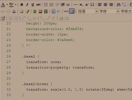
  <h5>transition配合transform一起使用</h5>
  <div class="base base2"></div>
 1     .base {
 2       width: 100px;
 3       height: 100px;
 4       display: inline-block;
 5       background-color: #0EA9FF;
 6       border-width: 5px;
 7       border-style: solid;
 8       border-color: #5daf34;
 9       /* transition-property: width, height, background-color, border-width;
10       transition-duration: 2s;
11       transition-timing-function: ease-in;
12       transition-delay: 500ms; */
13
14       /*简写*/
15       transition: all 2s ease-in 0ms;
16     }
17
18     /* .base:hover {
19       width: 200px;
20       height: 200px;
21       background-color: #5daf34;
22       border-width: 10px;
23       border-color: #3a8ee6;
24     } */
25
26     .base2 {
27       transform: none;
28       transition-property: transform;
29     }
30
31     .base2:hover {
32       transform: scale(0.8, 1.5) rotate(35deg) skew(5deg) translate(30px, 25px);
33     }
三、animation自定义动画
动画是使元素从一种样式逐渐变化为另一种样式的效果。
您可以改变任意多的样式任意多的次数。
请用百分比来规定变化发生的时间,或用关键词 "from" 和 "to",等同于 0% 和 100%。
0% 是动画的开始,100% 是动画的完成。
为了得到最佳的浏览器支持,您应该始终定义 0% 和 100% 选择器。
当在 @keyframes 创建动画,把它绑定到一个选择器,否则动画不会有任何效果。
指定至少这两个CSS3的动画属性绑定向一个选择器:
- 规定动画的名称
- 规定动画的时长
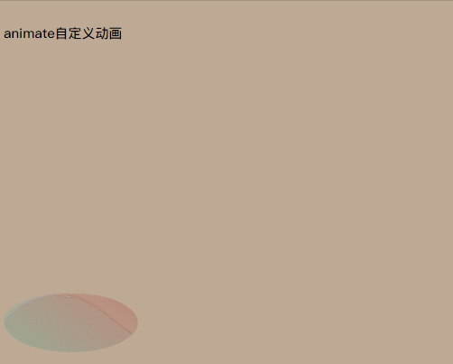
  <h5 class="title">animate自定义动画</h5>
  <div class="base base3"></div>
    .base3 {
      border-radius: 50%;
      transform: none;
      position: relative;
      width: 100px;
      height: 100px;
      background: linear-gradient(35deg,
          #ccffff,
          #ffcccc);
    }

    .base3 {
      animation-name: bounce;
      animation-duration: 3s;
      animation-iteration-count: infinite;
    }

    @keyframes bounce {
      0% {
        top: 0px;
      }

      50% {
        top: 250px;
        width: 150px;
        height: 70px;
      }

      100% {
        top: 0px;
      }
    }
引用了伊泽瑞尔灬的文章

 浙公网安备 33010602011771号