深入margin
1、外边距叠加
外边距叠加是指两个垂直外边距相遇时,这两个外边距会合并成一个外边距,就是二变一,关键是叠加后的外边距会取值两个外边距最大的那个;
例子如下:创建A、B两个盒子,A定义一个margin-bottom:30px;B定义一个margin-top:20px
<!DOCTYPE html>
<html lang="en">
<head>
    <meta charset="UTF-8">
    <title>探讨margin叠加</title>
    <style type="text/css">
        .s1{
            width: 100px;
            height: 100px;
            background-color: red;
            margin-bottom: 30px;
        }
        .s2{
            width: 100px;
            height: 100px;
            background-color: blue;
            margin-top: 20px;
        }
    </style>
</head>
<body>
    <div class="s1"></div>
    <div class="s2"></div>
</body>
</html>
结果
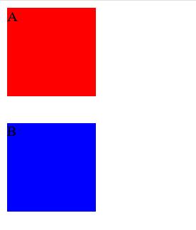
发现他们之间的外边距明显小于 两个之间的和,这个就是外边距叠加造成的效果
对于外边距叠加我们分三种情况讨论:
1、同级元素
2、父子元素
3、空元素
着重说下空元素:
当一个空元素有上下边距是,如果没有border或padding,则元素上边距与下边会发生合并
注意一下几点:
1、水平外边距永远不会发生叠加,水平外边距指的是:margin-left、margin-right
2、垂直外边距只有以上三种情况会发生叠加,垂直外边距指的是:margin-top、margin-bottom
3、外边距叠加后的值是两个垂直外边距最大的那个
4、外边距叠加针对的是block以及inline-block,不包括内联元素,因为margin对内联元素无效
负margin技术
当margin为负数的时候,对普通文档流和浮动元素的而影响是不一样的。
负margin对普通文档流的影响分两种
1、当元素的margin-left和margin-top为负数的时候,“当前元素”会被拉向指定位置
(就是你设置的这个盒子按你指定方向被拉出)
2、当元素的margin-right和margin-bottom为负数的时候,“后续元素”会被拉进来
(就是你的盒子会把旁边的邻居拉进来,覆盖在当前元素)
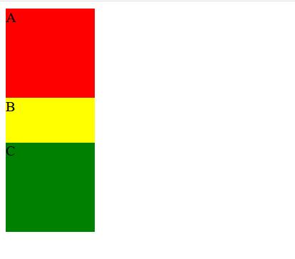
举例margin-top和margin-bottom
这是没有设置margin的代码
<!DOCTYPE html>
<html lang="en">
<head>
    <meta charset="UTF-8">
    <title>探讨margin叠加</title>
    <style type="text/css">
        .s1{
            width:100px;
            height: 300px;
        }
        .m1{
            width: 100px;
            height: 100px;
            background-color: red;

        }
        .m2{
            height: 100px;
            background-color: yellow;

        }
        .m3{
            height: 100px;
            background-color: green;
        }

    </style>

</head>
<body>
    <div class="s1">
        <div class="m1">A</div>
        <div class="m2">B</div>
        <div class="m3">C</div>

    </div>
</body>
</html>
结果: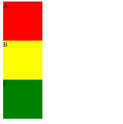
设置margin-top为负数后
<!DOCTYPE html>
<html lang="en">
<head>
    <meta charset="UTF-8">
    <title>探讨margin叠加</title>
    <style type="text/css">
        .s1{
            width:100px;
            height: 300px;
        }
        .m1{
            width: 100px;
            height: 100px;
            background-color: red;

        }
        .m2{
            height: 100px;
            background-color: yellow;
               margin-top: -50px;
        }
        .m3{
            height: 100px;
            background-color: green;
        }

    </style>

</head>
<body>
    <div class="s1">
        <div class="m1">A</div>
        <div class="m2">B</div>
        <div class="m3">C</div>

    </div>
</body>
</html>
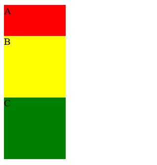
看见B把自己拉出去了,覆盖住元素A
我们再设置B的margin-bottom为负数
<!DOCTYPE html>
<html lang="en">
<head>
    <meta charset="UTF-8">
    <title>探讨margin叠加</title>
    <style type="text/css">
        .s1{
            width:100px;
            height: 300px;
        }
        .m1{
            width: 100px;
            height: 100px;
            background-color: red;

        }
        .m2{
            height: 100px;
            background-color: yellow;
               margin-bottom: -50px;
        }
        .m3{
            height: 100px;
            background-color: green;
        }

    </style>

</head>
<body>
    <div class="s1">
        <div class="m1">A</div>
        <div class="m2">B</div>
        <div class="m3">C</div>

    </div>
</body>
</html>
这时候B把它的后续元素C拉进来,覆盖住它自己
可以同样去实验margin-left和margin-right
负margin的使用技巧
1、图片与文字对齐
2、自适应两列布局
3、元素垂直居中
4、tab选项卡
图片与文字对齐
当文字与图片并排的时候,在底部水平往上往往是不对齐的,这是因为图片与文字默认是基线对齐(vertical-align:baseline).如果想实现图片与文字底部水平方向对齐除了使用vertical-align:text-bottom这个方法外还可以使用
兼容性更好的负margin来实现
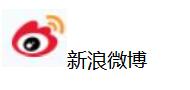
例如 没有设置margin时
设置margin
<!DOCTYPE html>
<html lang="en">
<head>
    <meta charset="UTF-8">
    <title>负margin</title>
    <style type="text/css">
        img{
            margin: 0 3px -3px 0;
        }
    </style>
</head>
<body>
    <img src="images/xinlang.jpg" alt="xinlang"/>新浪微博
</body>
</html>
结果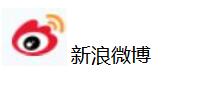
由此可以看出,默认情况下图片与文字在底部水平方向上是不对齐的 。我们再css中添加img{margin: 0 3px -3px 0;}就如上图所示。实际上,{margin: 0 3px -3px 0;}可以将它看成一条公式
2、自适应两列布局
自适应两列布局,指的是在左右两列中,其中有一列的宽度为自适应,一列宽度为固定的。如果使用float,一般只能实现固定的左右两列布局,并不能实现其中一列为自适应的布局
举例
<!DOCTYPE html>
<html lang="en">
<head>
    <meta charset="UTF-8">
    <title>宽度自适应</title>
    <style type="text/css">
        .content,.sidebar{
            float: left;
            color: white;
        }
        .sidebar{
            width: 500px;
            background-color: purple;
        }
        .content{
            width: 100%;
            margin-right: -500px;
            background-color: red;
        }
        /*防止浏览器可视区域不足发生文本重叠*/
        .content p{
            margin-right: 210px;
        }
        /*它是200px+10px,10px为它们间的间距*/
    </style>
</head>
<body>
    <div class="content"><p>宽度自适应</p></div>
    <div class="sidebar"><p>固定宽度</p></div>
</body>
</html>
结果
我们改变浏览器的宽度就可以很快的看出自适应两列布局的实际效果,WordPress经典的两栏自适应布局就是使用这种方法实现
3、元素垂直居中
想要实现块元素垂直居中比较麻烦,不过有一个经典的方法就是使用position定位结合负margin
语法:
父元素{
position:relative;
}
子元素{
position:absolute;
top:50%
left:50%;
margin-top:"height值得一半";
margin-left:"width值得一半";
}
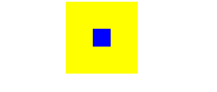
因为你会发现当left:50% top:50% 后,发现子元素盒子的左上角才是在中心点上,所以我们再有负margin技术,把它拉进。
<!DOCTYPE html>
<html lang="en">
<head>
    <meta charset="UTF-8">
    <title>元素居中</title>
    <style type="text/css">

        .main{
            width: 200px;
            height: 200px;
            position: relative;
            margin: 0 auto;
            background-color: yellow;
        }
        .sub{
            position: absolute;
            width: 50px;
            height: 50px;
            left: 50%;
            top: 50%;
            background-color: blue;
        }
    </style>
</head>
<body>
    <div class="main">
        <div class="sub"></div>
    </div>

</body>
</html>
结果

<html lang="en">
<head>
    <meta charset="UTF-8">
    <title>元素居中</title>
    <style type="text/css">

        .main{
            width: 200px;
            height: 200px;
            position: relative;
            margin: 0 auto;
            background-color: yellow;
        }
        .sub{
            position: absolute;
            width: 50px;
            height: 50px;
            left: 50%;
            top: 50%;
            background-color: blue;
            margin-top: -25px;
            margin-left: -25px;
        }
    </style>
</head>
<body>
    <div class="main">
        <div class="sub"></div>
    </div>

</body>
</html>
结果: