CSS
1.HSL值
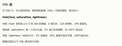
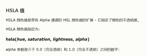
2.HSLA值
background-color 指定元素的背景色
opacity不透明度/透明度 1完全不透明 0完全透明
RGBA
background-image 指定元素背景图像
background-image:url(“paper.gif”)
background-repeat 在水平和垂直方向上都重复图像
background-repeat:repeat-x; 仅在水平方向重复
background-repear:no-repeat; 仅显示一次
background-attachment 指定背景图像是滚动的还是固定的
background-attachment:fixed 背景图片固定,不会随页面其他内容滚动
background-attachment:scroll
background-position指定背景图像的位置 background-position:right top;右上
使用简写属性在一条声明中设置背景属性:
body {
background: #ffffff url("tree.png") no-repeat right top;
}
在使用简写属性时,属性值的顺序为:
background-color
background-image
background-repeat
background-attachment
background-position
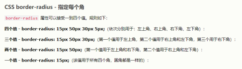
边框border
两个值 上下+左右 三个值 上+左右+下 四个值 上+右+下+左
边框样式
border-style 必须要设置style,border的其他边框属性才能生效
p.dotted {border-style: dotted;} 点线边框
p.dashed {border-style: dashed;} 虚线边框
p.solid {border-style: solid;} 实线边框
p.double {border-style: double;} 双边框
p.groove {border-style: groove;} 3D坡口边框
p.ridge {border-style: ridge;} 3D脊线边框
p.inset {border-style: inset;} 3D inset边框
p.outset {border-style: outset;} 3D outset边框
p.none {border-style: none;} 无边框
p.hidden {border-style: hidden;} 隐藏边框
p.mix {border-style: dotted dashed solid double;} 混合(上,右,下,左)
边框宽度
border-width px pt cm em 预定义 thin medium thick
边框颜色
background-color
边框各边
border-top-style border-right-style border-bottom-style border-left-style
边框简写
border-width border-style(必需) border-color
p {
border: 5px solid red;
}
可以只为一个边指定
边框圆角
border-radius
边框外边距
margin-top
margin-right
margin-bottom
margin-left
auto:使元素在容器中水平居中
inherit:继承自父元素
外边距合并
内边距 padding 不允许负值
高度height 宽度width
属性不包括内边距、边框或外边距,它们设置的是元素的内边距、边框和外边距内的区域的高度/宽度
auto - 默认。浏览器计算高度和宽度。
length - 以 px、cm 等定义高度/宽度。
% - 以包含块的百分比定义高度/宽度。
initial - 将高度/宽度设置为默认值。
inherit - 从其父值继承高度/宽度
框模型
元素总宽度 = 宽度 + 左内边距 + 右内边距 + 左边框 + 右边框 + 左外边距 + 右外边距
元素总高度 = 高度 + 上内边距 + 下内边距 + 上边框 + 下边框 + 上外边距 + 下外边距
轮廓outline(属性什么的与边框相似,但轮廓是在元素边框之外绘制的,并且可能与其他内容重叠。同样,轮廓也不是元素尺寸的一部分;元素的总宽度和高度不受轮廓线宽度的影响)
轮廓偏移 outline-offset
文本颜色 color
文本对齐 text-align center/left/right/justify
文本方向 direction & Unicode-bidi p { direction: rtl; unicode-bidi: bidi-override; }
垂直对齐 vertical-align top/middle/bottom
文字装饰 text-decoration none/overline/line-through/underline
文本转换 text-transform uppercase/lowercase/capitalize
文字间距 text-indent
字母间距letter-spacing 行高 line-height 字间距 word-spacing
空白 white-space
文本阴影 text-shadow 水平阴影/垂直阴影 模糊效果 颜色
h1 { text-shadow: 2px 2px 5px red; }
字体
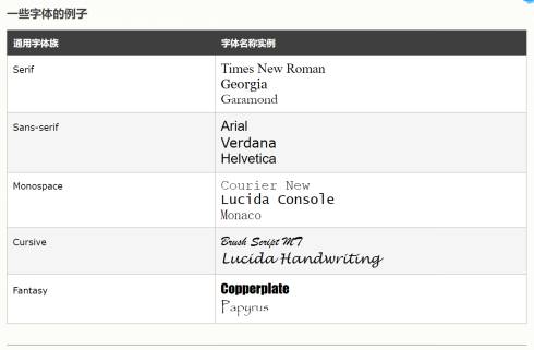
font-family
font-style normal/italic(斜体)/oblique(倾斜)
font-weight 字体粗细
font-variant 字体变体 small-caps 所有小写转换为大写
font-size 字体大小
谷歌字体
简写属性 font-style font-variant font-weight font-size/line-height font-family
图标
(1)Font Awesome
<script src="https://kit.fontawesome.com/yourcode.js"></script>
EXP:<i class="fas fa-cloud"></i>
(2)Bootstrap
<link rel="stylesheet" href="https://maxcdn.bootstrapcdn.com/bootstrap/3.3.7/css/bootstrap.min.css">
EXP:<i class="glyphicon glyphicon-cloud"></i>
(3)Google
<link rel="stylesheet" href="https://fonts.googleapis.com/icon?family=Material+Icons">
EXP:<i class="material-icons">cloud</i>
链接
a:link - 正常的,未访问的链接
a:visited - 用户访问过的链接
a:hover - 用户将鼠标悬停在链接上时
a:active - 链接被点击时
列表
无序列表<ul> 有序列表<ol>
列表项目标记 list-style-type list-style-image list-style-position
List的简写 list-style-type list-style-position list-style-image
表格
<table> <th> <td>
tr:hover {background-color: #f5f5f5;} 在 <tr> 元素上使用 :hover 选择器,以突出显示鼠标悬停时的表格行
定位
position:sticky
div.sticky {
position: -webkit-sticky; /* Safari */
position: sticky;
top: 0; 至少指定top/right/bottom/left之一,以便粘性定位
background-color: green;
border: 2px solid #4CAF50;
}
z-index元素顺序
浮动 float
溢出 overflow
visible - 默认。溢出没有被剪裁。内容在元素框外渲染
hidden - 溢出被剪裁,其余内容将不可见
scroll - 溢出被剪裁,同时添加滚动条以查看其余内容
auto - 与 scroll 类似,但仅在必要时添加滚动条
清除浮动 clear
none - 允许两侧都有浮动元素。默认值
left - 左侧不允许浮动元素
right- 右侧不允许浮动元素
both - 左侧或右侧均不允许浮动元素
inherit - 元素继承其父级的 clear 值
如果一个元素比包含它的元素高,并且它是浮动的,它将溢出到容器之外,
向包含元素添加overflow:auto;可以解决问题,
clearfix hack技术使用起来更安全
.clearfix::after { content: ""; clear: both; display: table; }
布局
对齐
组合器
后代选择器 div p{ } 选择
元素
子选择器 div > p { } 选择属于
元素
相邻兄弟选择器 div + p { } 选择紧随
元素
通用兄弟选择器 div ~ p { } 选择属于
元素
伪类 定义元素的特殊状态
a:hover必须在CSS定义中的a:link和a:visited之后,才能生效!a:active必须在CSS定义中的a:hover之后才能生效!伪类名称对大小写不敏感
a:link 未访问的链接 a:visited 已访问的链接
a:hover 鼠标悬停链接 a:active 已选择的链接
伪元素
用于设置元素指定部分的样式
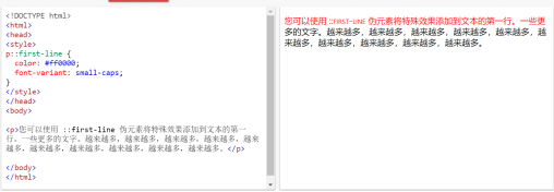
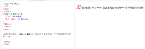
::first-line 用于向文本的首行添加特殊样式
::first-letter 用于向文本的首字母添加特殊格式
::before
::after
::selection
透明盒 opacity&RGBA
用opacity:背景和文本会一起变透明
用RGBA:只改变背景的透明度
属性选择器 可以为带有特定属性的HTML元素设置样式
[attribute] a[target]{ } 选择所有带有target属性的a元素
[attribute=”value”] 选取带有指定属性和值的元素
[attribute~=”value”]选取属性值包含指定词的元素
[attribute|=”value”]选取指定属性以指定值开头的元素 值必须是完整或单独的单词
[attribute^=”value”]选取指定属性以指定值开头的元素 值不必是完整单词
[attribute$=”value”]选取指定属性以指定值结束的元素
[attribute*=”value”]选取属性值包含指定词的元素 值不必是完整单词
css单位
绝对长度 固定的
相对长度
css特异性
如何计算特异性
从 0 开始,为 style 属性添加 1000,为每个 ID 添加 100,为每个属性、类或伪类添加 10,为每个元素名称或伪元素添加 1。
A: h1 1一个元素
B: #content h1 101一个ID引用以及一个元素
C:
<div id="content"><h1 style="color: #ffffff">Heading</h1></div> 1000行内样式
规则1:在特异性相同的情况下,最新的规则很重要。
h1 {background-color: yellow;}
h1 {background-color: red;}
h1是red的
规则2:ID选择器比属性选择器拥有更高的特异性
div#a {background-color: green;}
#a {background-color: yellow;}
div[id=a] {background-color: blue;}
第一条规则比其他两条更具体,因此id为a的div是green的
规则3:上下文选择器比单一元素选择器更具体
来自外部 CSS 文件:
#content h1 {background-color: red;}
在 HTML 文件中:
<style>
#content h1 {
  background-color: yellow;
}
</style>
将适用后一条规则
规则4:类选择器会击败任意数量的元素选择器。(类选择器如.intro会击败h1、p、div等)
对
<h1 class="intro">这是一个标题</h1>
有
<style>
.intro {background-color: yellow;}
h1 {background-color: red;}
</style>
h1是yellow的
此外,通用选择器以及被继承的值拥有0
- 的特异性,body * 及类似拥有 0 的特异性。被继承的值的特异性也为 0。
圆角
椭圆角border-radius: 50px / 15px;
边框图像border-image(Internet Explorer 10 以及更早的版本不支持 border-image 属性。)

border-image属性接受图像,将其分为9部分,将拐角放在拐角处,根据设置重复或拉伸中间部分。
(1)重复图像中间部分以创建边框
#borderimg {
  border: 10px solid transparent;
  padding: 15px;
  border-image: url(border.png) 30 round;
}
(2)拉伸图像中间部分以创建边框
#borderimg {
  border: 10px solid transparent;
  padding: 15px;
  border-image: url(border.png) 30 stretch;
}
border-image:
border-image-source
border-image-slice剪裁值
border-image-width 边框图像的宽度
border-image-outset 边框图像区域超出边框盒的量
border-image-repeat 重复/圆角/拉伸
css多重背景
background-image属性 可以为一个元素添加多幅背景图像
background-image: url(flower.gif), url(paper.gif);
background-position: right bottom, left top;
background-repeat: no-repeat, repeat;
例子中有两幅背景图像,第一幅与底部和右侧对齐,第二幅与左上角对齐
简写:
background: url(flower.gif) right bottom no-repeat, , url(paper.gif) left top repeat;
指定背景图像的大小background-size 指定宽高/contain/cover
contain 将背景图像缩放为尽可能大的尺寸
cover 缩放背景图像,让内容区域完全被图像覆盖(宽/高有一项与容器相同)
全尺寸背景图像
用图像填充整个页面(无空白)
根据需要缩放图像
在页面上居中图像
不引发滚动条
html{
	background:url(image.jpg) no-repeat center fixed;
background-size:cover;
}

Hero Image带有文本的大图像
.hero-image {
  background: url(/i/photo/tiyugongyuan.jpg) no-repeat center;
  background-size: cover;
  height: 500px;
  position: relative;
}

.hero-text {
  text-align: center;
  position: absolute;
  top: 50%;
  left: 50%;
  transform: translate(-50%, -50%);
  color: white;
}
<div class="hero-image">
  <div class="hero-text">
    <h1 style="font-size:50px">我是比尔盖茨</h1>
    <h3>我是一位摄影师</h3>
    <button>聘请我吧</button>
  </div>
</div>
background-origin 指定背景图像的位置
border-box 背景图片从边框的左上角开始
padding-box背景图像从内边距边缘的左上角开始(默认)
content-box 背景图片从内容的左上角开始
background-clip 指定背景的绘制区域
border-box 背景绘制到边框的外部边缘(默认)
padding-box 背景绘制到内边距的外边缘
content-box 在内容框中绘制背景
css渐变
线性渐变(向下/向上/向左/向右/对角线)
径向渐变(由其中心定义)
background-image: linear-gradient(direction, color-stop1, color-stop2, ...);
从上到下(默认)to bottom
从左到右 to right
对角线 从左上角到右下角to bottom right
使用角度
0deg向上
90deg向右
180deg向下
90deg向左
重复性线性渐变 repeating-linear-gradient()
径向渐变 由其中心定义
background-image: radial-gradient(shape size at position, start-color, ..., last-color);
shape参数定义形状,可接受circle或ellipse椭圆(默认)
size参数定义渐变的大小
closest-side
farthest-side
closest-corner
farthest-corner
css阴影
text-shadow
box-shadow
h1 {
  text-shadow: 2px 2px 5px red;	水平阴影,垂直阴影,模糊效果,颜色
}
多个阴影 0 0 3px #FF0000, 0 0 5px #0000FF;
使用text-shadow属性在文本周围创建纯边框
h1 {
  color: yellow;
  text-shadow: -1px 0 black, 0 1px black, 1px 0 black, 0 -1px black;
}

box-shadow
div.card {
  width: 250px;
  box-shadow: 0 4px 8px 0 rgba(0, 0, 0, 0.2), 0 6px 20px 0 rgba(0, 0, 0, 0.19);
  text-align: center;
}
css文本效果
文本溢出text-overflow 剪裁clip 呈现为省略号ellipsis
将鼠标悬停在元素上时显示溢出的内容
div.test:hover {
  overflow: visible;
}
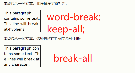
css字换行word-wrap属性使长文字被折断并换到下一行
p {
  word-wrap: break-word;
}
css换行规则
css书写模式
writing-mode:
horizontal-tb水平 vertical-rl垂直
css 2D转换
css transform属性
2D转换方法:
translate() 移动x轴/y轴
rotate() 旋转 正顺负逆
scale() 变大变小
scaleX() 变宽度
scaleY() 变高度
skewX() 沿x轴倾斜
skewY() 沿y轴倾斜
skew() 沿x和y倾斜
matrix() 混合 scaleX(),skewY(),skewX(),scaleY(),translateX(),translateY()
css 3D转换
transform属性
rotateX() 使元素绕X轴旋转给定角度
rotateY() 使元素绕Y轴旋转给定角度
rotateZ() 使元素绕Z轴旋转给定角度
css过渡 在给定的时间内平滑地改变属性值
transition
transition-delay
transition-duration
transition-property
transition-timing-function
要创建过渡效果,必须明确1.添加效果的css属性,2.效果的持续时间
transition:width 2s; 为width属性指定过渡效果,持续时间2s
transition:width 2s,height 4s;
transition-timing-function 规定过渡效果的速度曲线
#div1 {transition-timing-function: linear;}		linear 规定从开始到结束具有相同的速率
#div2 {transition-timing-function: ease;}		ease	 缓慢地开始,加速,缓慢地结束(默认)
#div3 {transition-timing-function: ease-in;}		ease-in 缓慢开始
#div4 {transition-timing-function: ease-out;}		ease-out 缓慢结束
#div5 {transition-timing-function: ease-in-out;}	ease-in-out 开始和结束较慢
									cubic-bezier(n,n,n,n)三次贝塞尔函数中自定义
transition-delay 规定过渡效果的延迟
css动画
动画使元素逐渐从一种样式变为另一样式
@keyframes
animation-name
animation-duration 定义多长时间完成动画
animation-delay 规定动画开始的延迟时间,如果负值则动画开始播放时像放了x秒
animation-iteration-count 指定动画应运行的次数,infinite永远持续
animation-direction 指定动画是向前播放还是向后播放还是交替播放
normal 向前(默认)
reverse 向后
alternate 先向前,然后向后
alternate-reverse 先向后,然后向前
animation-timing-function 规定动画的速度曲线
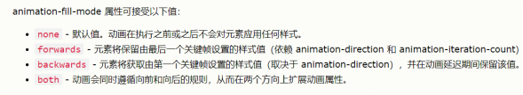
animation-fill-mode 指定动画的填充模式
animation
/* 动画代码 */
@keyframes example {
  from {background-color: red;}
  to {background-color: yellow;}
}
/* 向此元素应用动画效果 */
div {
  width: 100px;
  height: 100px;
  background-color: red;
  animation-name: example;
  animation-duration: 4s;
}
在动画完成 25%,完成 50% 以及动画完成 100% 时更改背景颜色和
/* 动画代码 */
@keyframes example {
  0%   {background-color:red; left:0px; top:0px;}
  25%  {background-color:yellow; left:200px; top:0px;}
  50%  {background-color:blue; left:200px; top:200px;}
  75%  {background-color:green; left:0px; top:200px;}
  100% {background-color:red; left:0px; top:0px;}
}
/* 应用动画的元素 */
div {
  width: 100px;
  height: 100px;
  position: relative;
  background-color: red;
  animation-name: example;
  animation-duration: 4s;
}
css工具提示
<!DOCTYPE html>
<html>
<style>
.tooltip {
  position: relative;
  display: inline-block;
  border-bottom: 1px dotted black;
}
.tooltip .tooltiptext {
  visibility: hidden;
  width: 120px;
  background-color: black;
  color: #fff;
  text-align: center;
  border-radius: 6px;
  padding: 5px 0;

  /* 定位工具提示 */
  position: absolute;
  z-index: 1;
  top: -5px;		工具提示位于容器元素的中间
  left: 105%;		工具提示位于可悬停文本的右侧(left:105%)
}
<font color="#ff3333">
.tooltip:hover .tooltiptext {
  visibility: visible;
}
</font>
</style>
<body style="text-align:center;">
<h1>Right Tooltip</h1>
<p>请把鼠标移到下方文本上:</p>
<div class="tooltip">Hover over me
  <span class="tooltiptext">Tooltip text</span>
</div>
</body>
</html>
右侧工具提示
.tooltip .tooltiptext {
  top: -5px;
  left: 105%;
}
顶部工具提示
.tooltip .tooltiptext {
  width: 120px;
  bottom: 100%;
  left: 50%;
  margin-left: -60px; /* Use half of the width (120/2 = 60), to center the tooltip */
}
底部工具提示
.tooltip .tooltiptext {
  width: 120px;
  top: 100%;
  left: 50%;
  margin-left: -60px; /* Use half of the width (120/2 = 60), to center the tooltip */
}
工具提示箭头
如需创建在工具提示的指定侧面显示的箭头,请在工具提示后添加“空的”内容,并使用伪元素类 ::after 和 content 属性。箭头本身是使用边框创建的。这会使工具提示看起来像气泡。
底部箭头
.tooltip .tooltiptext::after {
  content: " ";			内容为空
  position: absolute;
  top: 100%; /* At the bottom of the tooltip */
  left: 50%;
  margin-left: -5px;
  border-width: 5px;
  border-style: solid;
  border-color: black transparent transparent transparent;
}
淡入的工具提示 transition opacity
.tooltip .tooltiptext {
  opacity: 0;
  transition: opacity 1s;
}

.tooltip:hover .tooltiptext {
  opacity: 1;
}
css图像样式
缩略图
img {
  border: 1px solid #ddd;
  border-radius: 4px;
  padding: 5px;
  width: 150px;
}
<img src="paris.jpg" alt="Paris">
作为链接的缩略图
img {
  border: 1px solid #ddd;
  border-radius: 4px;
  padding: 5px;
  width: 150px;
}
img:hover {
box-shadow: 0 0 2px 1px rgba(0, 140, 186, 0.5);
}
<a href="paris.jpg">
  <img src="paris.jpg" alt="Paris">
</a>
响应式图像 自动调整以适合屏幕尺寸,根据需要缩小图像,杜绝放大到大于原始尺寸
img {
  max-width: 100%;
  height: auto;
}
按钮
background-color
border
border-radius
color 按钮字体颜色
padding
text-align
text-decoration
display
font-size 按钮字体大小
box-shadow 为按钮添加阴影
cursor 禁用按钮 not-allowed
width
可悬停按钮
.button {
  transition-duration: 0.4s;
}
.button:hover {
  background-color: #4CAF50; /* Green */
  color: white;
}
按钮分组 删除外边距并向每个按钮添加float:left来创建按钮组
.button {
  float: left;
}
垂直按钮组 使用display:block取代float:left将按钮上下分组
.button {
  display: block;
}
动画按钮
css分页
css多列
column-count 规定元素应被划分的列数
column-gap 规定列之间的间隙
column-rule-style 规定列之间的规则样式
column-rule-width 规定列之间的规则宽度
column-rule-color 规定列之间规则的颜色
column-rule
column-span 规定元素应跨越多少列
column-width 为列指定建议的最佳宽度
css用户界面
resize 规定元素是否应被用户调整大小
只允许用户调整
div {
  resize: horizontal;
  overflow: auto;
}
只允许用户调整
div {
  resize: vertical;
  overflow: auto;
}
调整高度和宽度
div {
  resize: both;
  overflow: auto;
}
outline-offset 轮廓偏移
css变量
var()函数用于插入css变量的值 var(name,value) 变量名称必须以—开头,且区分大小写
css变量可以访问DOM
使用var()的优势:
1.使代码易于阅读(易于理解);2.使修改颜色值更加容易
:root {
  --blue: #6495ed;
  --white: #faf0e6;
}
body { background-color: var(--blue); }
h2 { border-bottom: 2px solid var(--blue); }
.container {
  color: var(--blue);
  background-color: var(--white);
  padding: 15px;
}
button {
  background-color: var(--white);
  color: var(--blue);
  border: 1px solid var(--blue);
  padding: 5px;
}
css覆盖变量
局部变量&全局变量
button {
  --blue: #0000ff;
  background-color: var(--white);
  color: var(--blue);
  border: 1px solid var(--blue);
  padding: 5px;
}
在button中重新定义—blue
css使用javascript更改变量
<;script>
// 获取根元素
var r = document.querySelector(':root');

// 创建获取变量值的函数
function myFunction_get() {
  // Get the styles (properties and values) for the root
  var rs = getComputedStyle(r);
  // Alert the value of the --blue variable
  alert("The value of --blue is: " + rs.getPropertyValue('--blue'));
}

// 创建设置变量值的函数
function myFunction_set() {
  // Set the value of variable --blue to another value (in this case "lightblue")
  r.style.setProperty('--blue', 'lightblue');
}
<;/script>
css在媒体查询中使用变量
css Flexbox布局模块
flex-direction
flex-wrap 规定是否应该对flex项目换行 wrap/nowrap
flex-flow 用于同时设置flex-direction和flex-wrap
justify-content 用于对齐flex项目 center在容器的中心对齐
align-items
align-content
块(block)
行内(inline)
表
定位

 浙公网安备 33010602011771号