在Vue项目中使用Echarts : Echarts中的常用组件--堆叠面积图
一、安装并全局引入
1、通过npm获取echarts
npm install echarts --save2、在 main.js 中添加下面两行代码
- 在main.js中引入 5.0以下版本
import echarts from 'echarts ' - 5.0以上版本用这个引入 import * as echarts from ‘echarts’
// 原导入方式
import echarts from 'echarts'

// 原导入方式 => 现导入方式
import * as echarts from 'echarts'
Vue.prototype.$echarts = echarts;
二,组件中使用echarts
1,引入echarts
// 第一步引入echarts
// const echarts = require('echarts');
import * as echarts from 'echarts'
2,挂在div视图区
<!-- 2.第二步 为ECharts准备一个具备大小(宽高)的Dom -->
<div id="main" style="width: 850px;height:400px;"></div>
3,基于准备好dom,初始化echarts实例
// 第三步 3. 基于准备好的dom,初始化echarts实例
var myChart = echarts.init(document.getElementById('main'))
4,准备数据和配置项
// 4.准备数据和配置项
myChart.setOption({
})
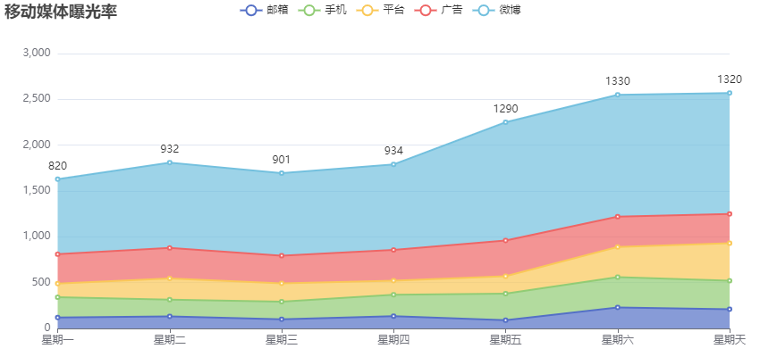
let option = {
title: {
text: '移动媒体曝光率'
},
tooltip: {
trigger: 'axis',
axisPointer: {
type: 'cross',
label: {
backgroundColor: '#6a7985'
}
}
},
legend: {
data: ['邮箱', '手机', '平台', '广告', '微博']
},
toolbox: {
feature: {
saveAsImage: {}
}
},
grid: {
left: '3%',
right: '4%',
bottom: '3%',
containLabel: true
},
xAxis: [
{
type: 'category',
boundaryGap: false,
data: ['星期一', '星期二', '星期三', '星期四', '星期五', '星期六', '星期天']
}
],
yAxis: [
{
type: 'value'
}
],
series: [
{
name: '邮箱',
type: 'line',
stack: 'Total',
areaStyle: {},
emphasis: {
focus: 'series'
},
data: [120, 132, 101, 134, 90, 230, 210]
},
{
name: '手机',
type: 'line',
stack: 'Total',
areaStyle: {},
emphasis: {
focus: 'series'
},
data: [220, 182, 191, 234, 290, 330, 310]
},
{
name: '平台',
type: 'line',
stack: 'Total',
areaStyle: {},
emphasis: {
focus: 'series'
},
data: [150, 232, 201, 154, 190, 330, 410]
},
{
name: '广告',
type: 'line',
stack: 'Total',
areaStyle: {},
emphasis: {
focus: 'series'
},
data: [320, 332, 301, 334, 390, 330, 320]
},
{
name: '微博',
type: 'line',
stack: 'Total',
label: {
show: true,
position: 'top'
},
areaStyle: {},
emphasis: {
focus: 'series'
},
data: [820, 932, 901, 934, 1290, 1330, 1320]
}
]
};5,调用-展示数据
// 5. 展示数据
myChart.setOption(option)
组件源代码
组件源代码
 <template>
<div>
   <!-- 面包屑导航区 -->
   <el-breadcrumb separator-class="el-icon-arrow-right">
      <el-breadcrumb-item :to="{ path: '/Welcome' }">首页</el-breadcrumb-item>
      <el-breadcrumb-item>数据统计</el-breadcrumb-item>
      <el-breadcrumb-item>数据报表</el-breadcrumb-item>
   </el-breadcrumb>
<!--   卡片视图区-->
   <el-card>
      <!-- 2.第二步 为ECharts准备一个具备大小(宽高)的Dom -->
      <div id="main" style="width: 850px;height:400px;"></div>
   </el-card>
</div>
</template>

<script>
// 第一步引入echarts
// const echarts = require('echarts');
import * as echarts from 'echarts'
// Vue.prototype.$echarts = echarts;
export default {
   data(){
      return {
      }
   },
   created() {
   },
   // mounted周期函数里页面上的元素渲染完毕了
   mounted() {
      // 第三步 3. 基于准备好的dom,初始化echarts实例
      var myChart = echarts.init(document.getElementById('main'))
      // 4.准备数据和配置项
      myChart.setOption({
      })
         let  option = {
            title: {
               text: '移动媒体曝光率'
            },
            tooltip: {
               trigger: 'axis',
               axisPointer: {
                  type: 'cross',
                  label: {
                     backgroundColor: '#6a7985'
                  }
               }
            },
            legend: {
               data: ['邮箱', '手机', '平台', '广告', '微博']
            },
            toolbox: {
               feature: {
                  saveAsImage: {}
               }
            },
            grid: {
               left: '3%',
               right: '4%',
               bottom: '3%',
               containLabel: true
            },
            xAxis: [
               {
                  type: 'category',
                  boundaryGap: false,
                  data: ['星期一', '星期二', '星期三', '星期四', '星期五', '星期六', '星期天']
               }
            ],
            yAxis: [
               {
                  type: 'value'
               }
            ],
            series: [
               {
                  name: '邮箱',
                  type: 'line',
                  stack: 'Total',
                  areaStyle: {},
                  emphasis: {
                     focus: 'series'
                  },
                  data: [120, 132, 101, 134, 90, 230, 210]
               },
               {
                  name: '手机',
                  type: 'line',
                  stack: 'Total',
                  areaStyle: {},
                  emphasis: {
                     focus: 'series'
                  },
                  data: [220, 182, 191, 234, 290, 330, 310]
               },
               {
                  name: '平台',
                  type: 'line',
                  stack: 'Total',
                  areaStyle: {},
                  emphasis: {
                     focus: 'series'
                  },
                  data: [150, 232, 201, 154, 190, 330, 410]
               },
               {
                  name: '广告',
                  type: 'line',
                  stack: 'Total',
                  areaStyle: {},
                  emphasis: {
                     focus: 'series'
                  },
                  data: [320, 332, 301, 334, 390, 330, 320]
               },
               {
                  name: '微博',
                  type: 'line',
                  stack: 'Total',
                  label: {
                     show: true,
                     position: 'top'
                  },
                  areaStyle: {},
                  emphasis: {
                     focus: 'series'
                  },
                  data: [820, 932, 901, 934, 1290, 1330, 1320]
               }
            ]
         };
      // 5. 展示数据
      myChart.setOption(option)
      },
   methods: {

   }
}
</script>

<style lang="less" scoped>

</style>
效果图:

 浙公网安备 33010602011771号