CSS
css笔记
如何学习CSS
1.CSS是什么
2.CSS怎么用
3.CSS选择器(重点与难点)
4.美化网页
5.盒子模型
6.浮动
7.定位
8.网页动画(特效效果)
一、什么是CSS
1.1什么是CSS
- CSS 指的是层叠样式表* (Cascading Style Sheets)
- CSS 描述了如何在屏幕、纸张或其他媒体上显示 HTML 元素
- CSS 节省了大量工作。它可以同时控制多张网页的布局
- 外部样式表存储在 CSS 文件中
*:也称级联样式表。
1.2 CSS发展史
CSS1.0
CSS2.0 DIV(块)+ CSS,HTML与CSS结构分离的思想,网页变得简单,利于SEO
CSS2.1 浮动,定位
CSS3.0 圆角,阴影,动画... 浏览器兼容
1.3 快速入门
一、基本入门
<!DOCTYPE html>
<html lang="en">
<head>
    <meta charset="UTF-8">
    <title>Title</title>
    <!--规范,<style>可以编写css的代码,声明用分号结尾
        语法:
            选择器{
                声明1;
                声明2;
                声明3;
            }
    -->
    <style>
        h1{
            color: blue;
        }
    </style>

</head>
<body>
<h1>我是标题</h1>
</body>
</html>
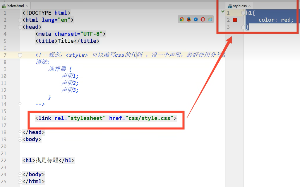
二、分离操作
-
分别创建一个html和css文件
-
在html文件里使用
<link rel="stylesheet" href="css路径">
index.html
<!DOCTYPE html>
<html lang="en">
<head>
    <meta charset="UTF-8">
    <title>Title</title>
    <!--规范,<style>可以编写css的代码,声明用分号结尾
        语法:
            选择器{
                声明1;
                声明2;
                声明3;
            }
    -->
    <link rel="stylesheet" href="1、我的第一个CSS程序/css/style.css">
</head>
<body>
<h1>我是标题</h1>
</body>
</html>
style.css
h1{
    color: blue;
}
建议使用下图规范
三、css的优势
- 内容和表现分离
- 网页结构表现统一,可以实现复用
- 样式丰富
- 建议使用独立于html的css文件
- 利用SEO,容易被搜索引擎收录
1.4 CSS的三种导入方式
-
行内样式
<h1 style="color: red">我是标题</h1> -
内部样式
<style> h1{ color: green; } </style> -
外部样式
<link rel="stylesheet" href="css/style.css"> -
优先级:就近原则(离标题越近优先级越高)
三个样式在html文件中的模板
<html lang="en">
<head>
    <meta charset="UTF-8">
    <title>Title</title>

    <!-- 内部样式 -->
    <style>
        h1{
            color: green;
        }
    </style>

    <!-- 外部样式 -->
    <link rel="stylesheet" href="css/style.css">

</head>
<body>

<!-- 行内式样式: 在标签元素中,编写一个style属性,编写样式即可 -->
<h1 style="color: red">我是标题</h1>

</body>
</html>
拓展:外部样式两种写法
-
链接式:
<!-- 外部样式 --> <link rel="stylesheet" href="css/style.css"> -
导入式
@import是CSS2.1特有的!
<style>
	@import url("css/style.css")
</style>
二、选择器
作用:选择页面上的某一个或者某一类元素
2.1 基本选择器
1. 标签选择器
选择以类标签。格式:
标签名{}
2. 类 选择器 class
选择所有class属性一致的标签,跨标签。格式:
.类名{}
3. ID 选择器
id必须全局唯一!格式:
#id名称{}
4.优先级顺序
ID 选择器>类 选择器>标签选择器
代码演示
-
标签选择器代码
<html lang="en"> <head> <meta charset="UTF-8"> <title>标签选择器</title> <style> /* 标签选择器,会选择到页面上所有这个标签的元素 */ h1{ color: #4852fc; background: #c1fc93; border-radius: 24px; } </style> </head> <body> <h1>学习Java</h1> <h1>学习Java</h1> <p>学习JavaWeb</p> </body> </html> -
类选择器
<html lang="en"> <head> <meta charset="UTF-8"> <title>类选择器</title> <style> /* 类选择器的格式: .class名称{} 好处:可以多个标签归类:是同一个class,可以复用 */ .kun{ color: red; } .ji{ color: yellowgreen; } </style> </head> <body> <h1 class="kun">标题1</h1> <h1 class="ji">标题2</h1> <h1 class="kun">标题3</h1> </body> </html> -
ID选择器
<html lang="en">
    <head>
        <meta charset="UTF-8">
        <title>id选择器</title>
        <style>
            /*id选择器: id必须保证全局唯一!
            格式: #id名称{}
            */
            #101{
                color: red;
            }
            #102{
                color: yellowgreen;
            }
            #103{
                color: #4852fc;
            }
        </style>
    </head>
    <body>

        <h1 id="101" class="kun">标题1</h1>
        <h1 id="102">标题2</h1>
        <h1 id="103">标题3</h1>

    </body>
</html>
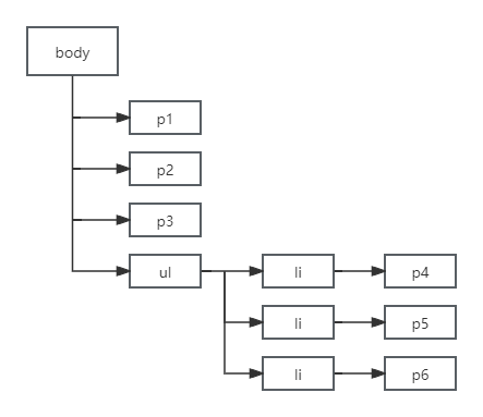
2.2 层次选择器
1. 后代选择器(空格)
-
在某个元素的后面所有后代
/*后代选择器*/
body p{
	background: red;
}
2. 子选择器(>)
-
在某个元素的后面,只有一代,儿子
/*子选择器*/
body>p{
    background: green;
}
3. 相邻兄弟选择器(+)
-
只选择某个标签的向下的一个兄弟标签
/*兄弟选择器*/
.active + p{
    background: brown;
}
4. 通用选择器(~)
-
选择某个标签向下的所有兄弟标签
/*通用兄弟选择器*/
.active~p{
    background: red;
}
层次结构图
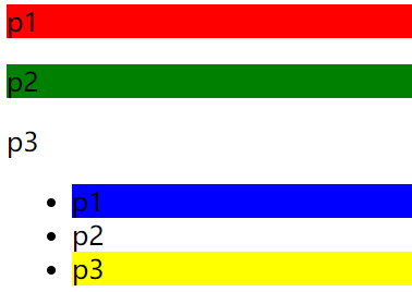
2.3 结构伪类选择器
格式:
伪类:条件{}
示例:
/*ul的第一个子元素*/
ul li:first-child{
    background: blue;
}

/*ul的最后一个子元素*/
ul li:last-child{
    background: yellow;
}

/* 选中 p1:定位到父元素,选择当前的第一元素
选择当前p元素的父级元素,选中父级元素的第一个,顺序选择
*/
p:nth-child(1){
    background: red;
}

/* 根据 p元素 类型选择第二个元素,类型选择 */
p:nth-of-type(2){
    background: green;
}
2.4 属性选择器(重点)
属性选择器 是 ID选择器 + 类选择器 的结合
使用格式:
标签名[属性名/属性名=属性值(正则)]{

}
演示代码
<head>
    <meta charset="UTF-8">
    <title>属性选择器</title>

    <style>
        .demo a{
            float: left;
            display: block;
            height: 50px;
            width: 50px;
            border-radius: 10px;
            background: coral;
            text-align: center;
            color: aliceblue;
            text-decoration: none;
            margin-right: 5px;
            font: bold 20px/50px Arial;
        }
		/* 属性选择器位置 */

    </style>
</head>
<body>

    <p class="demo">
        <a href="https://www.baidu.com" class="links item first" id="first">1</a>
        <a href="https://www.csdn.com" class="links item active" target="_blank" title="text">2</a>
        <a href="image/123.html" class="links item">3</a>
        <a href="image/123.html" class="links item">4</a>
        <a href="image/123.html" class="links item">5</a>
        <a href="abc" class="links item">6</a>
        <a href="/a.pdf" class="links item">7</a>
        <a href="/abc.pdf" class="links item">8</a>
        <a href="abc.doc" class="links item">9</a>
        <a href="abcd.doc" class="links item last">10</a>
    </p>

</body>
</html>
此代码图结果
-
选中存在id属性的元素
a[id]{
    background: red;
}
-
选中 id=first 的元素
a[id=first]{
    background: red;
}
-
选中 class 中有 links的元素
a[class*="links"]{
    background: yellowgreen;
}
-
选中href中以http开头的元素
a[href^=https]{
    background: aqua;
}
-
选中href中以pdf结尾的元素
a[href$=pdf]{
    background: blueviolet;
}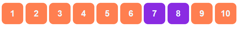
三、美化网页元素
3.1 为什么要美化网页
- 有效的传递页面信息
- 美化网页、页面漂亮,吸引用户
- 凸显页面的主体
- 提高用户的体验
3.2 字体样式
<!--
font-family:字体风格
font-size:字体大小
font-weight:字体粗细
color:字体颜色
-->
<style>
    body{
        font-family: 宋体;
        color: brown;
    }
    h1{
        font-size: 50px;
    }
    .p1{
        font-weight: bolder;
    }
</style>
3.2 文本样式
- 颜色 -- color rgb rgba
- 文本对齐的方式 -- text-align = center
- 首行缩进 -- text-indent:2em
- 行高 -- line-height
- 装饰 -- text-decoration
- 文本图片水平对齐 -- vertical-align:middle
代码演示
<html lang="en">
    <head>
        <meta charset="UTF-8">
        <title>文本样式</title>

        <!--
			颜色:color
			RGB 0~F
			RGBA  A:0~1
			text-align: 排版,居中
			text-indent: 2em; 段落首行缩进
			height: 300px
			line-height: 300px
			行高 和 块的高度一致,就可以上下居中
		-->
        <style>
            h1{
                color: rgba(0,255,255,0.9);
                text-align: center;
            }
            .p1{
                text-indent: 2em;
            }
            .p2{
                background: #2700ff;
                height: 300px;
                line-height: 300px;
            }
            /* 下划线 */
            .l1{
                text-decoration: underline;
            }
            /* 中划线 */
            .l2{
                text-decoration: line-through;
            }
            /* 上划线 */
            .l3{
                text-decoration: overline;
            }
            /* 超链接去下划线 */
            a{
                text-decoration: none;
            }

            /* 水平对齐~ 参照物, a,b */
            img,span{
                vertical-align: middle;
            }

        </style>

    </head>
    <body>

        <p class="l1">123132123</p>
        <p class="l2">123132123</p>
        <p class="l3">123132123</p>

        <h1>故事介绍</h1>
        <p class="p1">这个世界名为元泱境界,脉(本质为振动)是构成万物的基础。每隔333年,会有一个神秘而强大的异常生物重生,它就是魁拔!魁拔的每一次出现,都会给元泱境界带来巨大的灾难!即便是天界的神族,也在劫难逃。在天地两界各种力量的全力打击下,魁拔一次次被消灭,但又总是按333年的周期重新出现。魁拔纪元1664年,天神经过精确测算后,在魁拔苏醒前一刻对其进行毁灭性打击。
        </p>

        <p class="p2">但谁都没有想到,由于一个差错导致新一代魁拔成功地逃脱了致命一击。很快,天界魁拔司和地界神圣联盟均探测到了魁拔依然生还的迹象。因此,找到魁拔,彻底消灭魁拔,再一次成了各地热血勇士的终极目标。</p>

        <a href="">点击跳转</a>

        <p>
            <img src="../image/img.png">
            <span>了解莎士比亚</span>
        </p>

    </body>
</html>
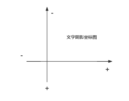
3.3 文本阴影
text-shadow 属性为文本添加阴影。
最简单的用法是只指定水平阴影(2px)和垂直阴影(2px):
h1{
    text-shadow: red 2px 2px;
}
1. 所有 CSS 文本属性
| 属性 | 描述 |
|---|---|
| color | 设置文本颜色。 |
| direction | 指定文本的方向 / 书写方向。 |
| letter-spacing | 设置字符间距。 |
| line-height | 设置行高。 |
| text-align | 指定文本的水平对齐方式。 |
| text-decoration | 指定添加到文本的装饰效果。 |
| text-indent | 指定文本块中首行的缩进。 |
| text-shadow | 指定添加到文本的阴影效果。 |
| text-transform | 控制文本的大小写。 |
| text-overflow | 指定应如何向用户示意未显示的溢出内容。 |
| unicode-bidi | 与 direction 属性一起使用,设置或返回是否应重写文本来支持同一文档中的多种语言。 |
| vertical-align | 指定文本的垂直对齐方式。 |
| white-space | 指定如何处理元素内的空白。 |
| word-spacing | 设置单词间距。 |
3.4 超链接伪类
通过 CSS,可以用不同的方式设置链接的样式。
四种链接状态分别是:
-
a:hover- 用户将鼠标悬停在链接上时 -
a:link- 正常的,未访问的链接 -
a:visited- 用户访问过的链接 -
a:active- 链接被点击时
/* 默认的颜色 */
a{
    text-decoration: none;
    color: black;
}
/* 鼠标悬浮的状态(只需记住:hover)*/
a:hover{
    color: orange;
    font-size: 25px;
}
如果为多个链接状态设置样式,请遵循如下顺序规则:
- a:hover 必须 a:link 和 a:visited 之后
- a:active 必须在 a:hover 之后
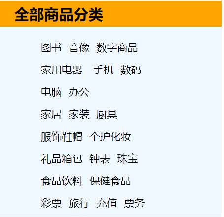
3.5 列表样式练习
- 先创建一个html文件,模仿淘宝的商品分类列表
- 在使用外部样式链接style.css文件
- 修改
全部商品分类的字体大小、粗细、缩进、行高和背景颜色 - 再修改列表
<ul><li>的字高、缩进和字体样式 - 设置字体悬浮
列表样式.html
<html lang="en">
<head>
<meta charset="UTF-8">
<title>列表样式</title>
<link rel="stylesheet" href="css/style.css">
</head>
<body>
<div id="nav">
<h2 class="title">全部商品分类</h2>
<ul>
<li><a href="#">图书</a> <a href="#">音像</a> <a href="#">数字商品</a></li>
<li><a href="#">家用电器</a> <a href="#">手机</a> <a href="#">数码</a></li>
<li><a href="#">电脑</a> <a href="#">办公</a></li>
<li><a href="#">家居</a> <a href="#">家装</a> <a href="#">厨具</a>
<li><a href="#">服饰鞋帽</a> <a href="#">个护化妆</a></li>
<li><a href="#">礼品箱包</a> <a href="#">钟表</a> <a href="#">珠宝</a></li>
<li><a href="#">食品饮料</a> <a href="#">保健食品</a></li>
<li><a href="#">彩票</a> <a href="#">旅行</a> <a href="#">充值</a> <a href="#">票务</a>
</li>
</ul>
</div>
</body>
</html>
style.css
#nav{
    width: 300px;
    background: aliceblue;
}

.title{
    font-size: 20px;
    font-weight: bold;
    text-indent: 1em;
    line-height: 35px;
    background: orange;
}

/* ul li */
/*
list-style:
    none 去掉圆点
    circle 空心圆
    decimal 数字
    square 正方形
*/

ul li{
    height: 30px;
    list-style: none;
    text-indent: 1em;
}
a{
    text-decoration: none;
    font-size: 14px;
    color: black;
}
a:hover{
    color: orange;
    text-decoration: underline;
}
结果图
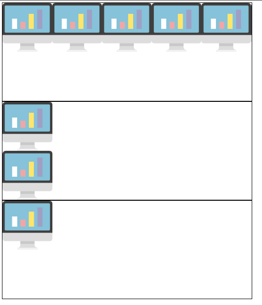
3.6 背景
1. 背景颜色
background-color
2. 背景图片
background-image
body {
  background-image: url("paper.gif");
}
3. 背景重复
默认情况下,background-image 属性在水平和垂直方向上都重复图像。
- background-repeat: repeat-x 水平重复
- background-repeat: repeat-y 垂直重复
- background-repeat: no-repeat 只出现一个
<head>
    <meta charset="UTF-8">
    <title>背景样式</title>
    <style>
        div{
            width: 1000px;
            height: 700px;
            border: 2px solid black;
            background-image: url("images/1.png") ;
        }
        .div1{
            background-repeat: repeat-x;
        }
        .div2{
            background-repeat: repeat-y;
        }
        .div3{
            background-repeat: no-repeat;
        }
    </style>
</head>
<body>

<div class="div1"></div>
<div class="div2"></div>
<div class="div3"></div>
</body>
效果图
4. 背景简写
在使用简写属性时,属性值的顺序为:
- background-color
- background-image
- background-repeat
- background-attachment
- background-position
属性值之一缺失并不要紧,只要按照此顺序设置其他值即可。请注意,在上面的例子中,我们没有使用 background-attachment 属性,因为它没有值。
5. 所有 CSS 背景属性
| 属性 | 描述 |
|---|---|
| background | 在一条声明中设置所有背景属性的简写属性。 |
| background-attachment | 设置背景图像是固定的还是与页面的其余部分一起滚动。 |
| background-clip | 规定背景的绘制区域。 |
| background-color | 设置元素的背景色。 |
| background-image | 设置元素的背景图像。 |
| background-origin | 规定在何处放置背景图像。 |
| background-position | 设置背景图像的开始位置。 |
| background-repeat | 设置背景图像是否及如何重复。 |
| background-size | 规定背景图像的尺寸。 |
3.7 背景渐变
CSS 渐变使您可以显示两种或多种指定颜色之间的平滑过渡。
CSS 定义了两种渐变类型:
- 线性渐变(向下/向上/向左/向右/对角线)
- 径向渐变(由其中心定义)
1. 线性渐变
语法如下:
background-image: linear-gradient(direction, color-stop1, color-stop2, ...);
- direction:设置起点和方向(或角度)
- color-stop1:颜色1
- color-stop2:颜色2
演示:
<style>
    body{
        background-image: linear-gradient(160deg, #0093E9 0%, #80D0C7 100%);
    }
</style>
2. 径向渐变
径向渐变由其中心定义。
语法如下:
background-image: radial-gradient(shape size at position, start-color, ..., last-color);
默认地,shape 为椭圆形,size 为最远角,position 为中心。
- 设置形状
shape 参数定义形状。它可接受 circle 或 ellipse 值。默认值为 ellipse(椭圆)。
-
使用大小不同的关键字
-
size* 参数定义渐变的大小。它可接受四个值:
-
closest-side
-
farthest-side
-
closest-corner
-
farthest-corner
-
-
演示:
body {
  background-image: radial-gradient(circle, red, yellow, green);
}
渐变网站:https://www.grabient.com/
四、盒子模型
4.1 什么是盒子模型
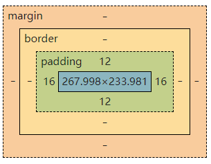
margin:外边距
padding:内边距
border:边框
4.2 边框
1. 简写边框属性
border 属性是以下各个边框属性的简写属性:
-
border-width-- 边框宽度 -
border-style(必需)-- 边框样式 -
border-color-- 边框颜色p { border: 5px solid red; }
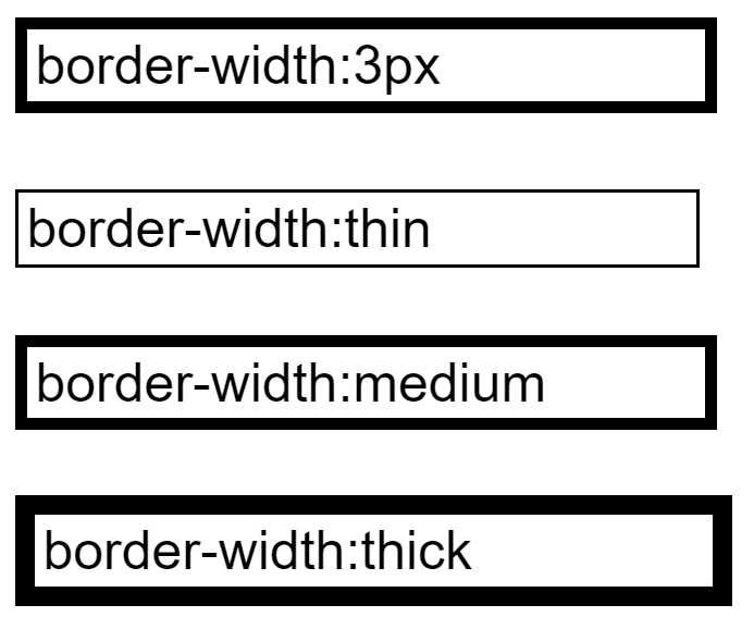
2. 边框宽度 border-width
border-width 属性指定四个边框的宽度。
可以将宽度设置为特定大小(以 px、pt、cm、em 计),也可以使用以下三个预定义值之一:thin、medium 或 thick。
实例:
input.one{
    border-style: solid;
    border-color:black;
    border-width:3px

}
input.two{
    border-style: solid;
    border-color:black;
    border-width:thin
}
input.three{
    border-style: solid;
    border-color:black;
    border-width:medium
}
input.four{
    border-style: solid;
    border-color:black;
    border-width:thick
}
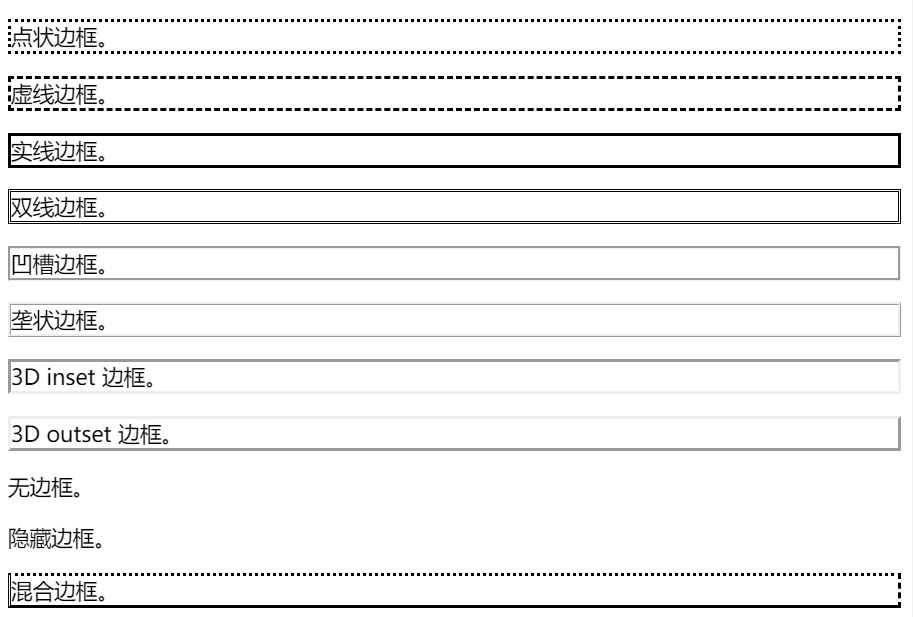
3. 边框样式 border-style
border-style 属性指定要显示的边框类型。
允许以下值:
dotted- 定义点线边框dashed- 定义虚线边框solid- 定义实线边框double- 定义双边框groove- 定义 3D 坡口边框。效果取决于 border-color 值ridge- 定义 3D 脊线边框。效果取决于 border-color 值inset- 定义 3D inset 边框。效果取决于 border-color 值outset- 定义 3D outset 边框。效果取决于 border-color 值none- 定义无边框hidden- 定义隐藏边框
演示
p.dotted {border-style: dotted;}
p.dashed {border-style: dashed;}
p.solid {border-style: solid;}
p.double {border-style: double;}
p.groove {border-style: groove;}
p.ridge {border-style: ridge;}
p.inset {border-style: inset;}
p.outset {border-style: outset;}
p.none {border-style: none;}
p.hidden {border-style: hidden;}
p.mix {border-style: dotted dashed solid double;}
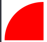
4. 圆角边框 border-radius
正常语法:
p {
  border: 2px solid red;
  border-radius: 5px;
}
我们也可以控制边框的四个角,从而画出扇形
p.round1 {
  width:100px;
  height:100px;
  background:red;
  border-radius: 100px 0 0 0;
}
5. 所有 CSS 边框属性
| 属性 | 描述 |
|---|---|
| border | 简写属性,在一条声明中设置所有边框属性。 |
| border-color | 简写属性,设置四条边框的颜色。 |
| border-radius | 简写属性,可设置圆角的所有四个 border-*-radius 属性。 |
| border-style | 简写属性,设置四条边框的样式。 |
| border-width | 简写属性,设置四条边框的宽度。 |
| border-bottom | 简写属性,在一条声明中设置所有下边框属性。 |
| border-bottom-color | 设置下边框的颜色。 |
| border-bottom-style | 设置下边框的样式。 |
| border-bottom-width | 设置下边框的宽度。 |
| border-left | 简写属性,在一条声明中设置所有左边框属性。 |
| border-left-color | 设置左边框的颜色。 |
| border-left-style | 设置左边框的样式。 |
| border-left-width | 设置左边框的宽度。 |
| border-right | 简写属性,在一条声明中设置所有右边框属性。 |
| border-right-color | 设置右边框的颜色。 |
| border-right-style | 设置右边框的样式。 |
| border-right-width | 设置右边框的宽度。 |
| border-top | 简写属性,在一条声明中设置所有上边框属性。 |
| border-top-color | 设置上边框的颜色。 |
| border-top-style | 设置上边框的样式。 |
| border-top-width | 设置上边框的宽度。 |
4.3 外边距margin
margin 属性用于在任何定义的边框之外,为元素周围创建空间。
所有外边距属性都可以设置以下值:
- auto - 浏览器来计算外边距 -- 以使元素在其容器中水平居中
- length - 以 px、pt、cm 等单位指定外边距
- % - 指定以包含元素宽度的百分比计的外边距
- inherit - 指定应从父元素继承外边距
提示:允许负值。
实例
margin 简写属性设置四个值:
p {
  margin: 25px 50px 75px 100px;
}
- 上外边距是 25px
- 右外边距是 50px
- 下外边距是 75px
- 左外边距是 100px
总结:顺序按顺时针,上右下左设置外边距
4.4 内边距padding
padding 属性用于在任何定义的边界内的元素内容周围生成空间。
所有内边距属性都可以设置以下值:
- length - 以 px、pt、cm 等单位指定内边距
- % - 指定以包含元素宽度的百分比计的内边距
- inherit - 指定应从父元素继承内边距
提示:不允许负值。
实例
div {
  padding: 25px 50px 75px 100px;
}
- 上内边距是 25px
- 右内边距是 50px
- 下内边距是 75px
- 左内边距是 100px
总结:与外边距结论一样
4.5 盒子阴影 box-shadow
box-shadow 属性向框添加一个或多个阴影。
语法:
p{
    box-shadow: h-shadow v-shadow blur spread color inset;
}
属性值
| 值 | 描述 |
|---|---|
| h-shadow | 必需。水平阴影的位置。允许负值。 |
| v-shadow | 必需。垂直阴影的位置。允许负值。 |
| blur | 可选。模糊距离。 |
| spread | 可选。阴影的尺寸。 |
| color | 可选。阴影的颜色。请参阅 CSS 颜色值。 |
| inset | 可选。将外部阴影 (outset) 改为内部阴影。 |
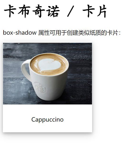
实例:制作一个咖啡的卡片
<html lang="en">
<head>
    <meta charset="UTF-8">
    <title>盒子阴影</title>
    <style>
        h1{
            font-family: 楷体;
            font-size: 40px;
        }
        div.cappuccino{
            width: 250px;
            box-shadow: 0 4px 8px 0 rgba(0, 0, 0, 0.2), 0 6px 20px 0 rgba(0, 0, 0, 0.19);
            text-align: center;
        }
        div.container{
            padding: 10px;
        }
    </style>
</head>
<body>

<h1>卡布奇诺 / 卡片</h1>

<div class="cappuccino">
    <img src="image/coffee.png" style="width:100%" alt="Coffee">
    <div class="container">
        <p>Cappuccino</p>
    </div>
</div>
</body>
</html>
五、浮动
5.1 标准文档流
标准文档流包括:块级元素和行内元素。
5.2 display 属性
display 属性规定是否/如何显示元素。
每个 HTML 元素都有一个默认的 display 值,具体取决于它的元素类型。大多数元素的默认 display 值为 block 或 inline
(1)块级元素
特点: 一个元素单独一行,不与其他元素并行,可以设置其宽度和高度,如果不设置宽度,宽度默认为其父元素的100%。
<div><h><li><p><dt><dd>
(2)行内元素
特点:与其他元素并行,不能设置其宽度和高度,默认宽度为内容的宽度。
<a><b><span><em><u><i>
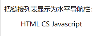
(3) 转换
-
将行内元素更改为块元素,反之亦然
语法:
display: inline;实例:
<html>
<head>
<style>
li {
  display: inline;
}
</style>
</head>
<body>

<p>把链接列表显示为水平导航栏:</p>

<ul>
  <li>HTML</li>
  <li>CS</li>
  <li>JavaScript</li>
</ul>

</body>
</html>
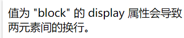
- 设置元素的 display 属性仅会更改元素的显示方式,而不会更改元素的种类。因此,带有
display: block;的行内元素不允许在其中包含其他块元素。
<html>
<head>
<style>
span {
  display: block;
}
</style>
</head>
<body>

<span>值为 "block" 的 display 属性会导致</span><span>两元素间的换行。</span>

</body>
</html>
5.3 float属性
float 属性规定元素如何浮动。
float 属性可以设置以下值之一:
-
left - 元素浮动到其容器的左侧
-
right - 元素浮动在其容器的右侧
-
none - 元素不会浮动(将显示在文本中刚出现的位置)。默认值。
实例:左右浮动
/* 元素浮动到右侧 */
img {
	float: right;
}
/* 元素浮动到左侧 */
img {
	float: left;
}
/* 元素不浮动 */
img {
	float: none;
}
5.4 清除浮动
clear 属性指定哪些元素可以浮动于被清除元素的旁边以及哪一侧。
clear 属性可设置以下值之一:
- none - 允许两侧都有浮动元素。默认值
- left - 左侧不允许浮动元素
- right- 右侧不允许浮动元素
- both - 左侧或右侧均不允许浮动元素
提示:clear 属性的最常见用法是在元素上使用了 float 属性之后。
div {
  clear: none;
}
div {
  clear: left;
}
div {
  clear: right;
}
div {
  clear: both;
}
5.5 父级边框塌陷的问题
1. 增加父元素的高度
#father{
    /* 方法一:加高height */
    height: 400px;
    border: 1px #000 solid;
}
2. 浮动元素后加空白div标签,清除浮动
/* 方法二: 浮动元素后加空白div标签 */
<div class="clear"></div>

.clear{
    clear:both;
    margin:0;
    padding:0;
}
3. 在父级边框添加overflow属性
| 属性值 | 说明 |
|---|---|
| visible | 默认值,内容不会被修剪,会呈现在盒子之外 |
| hidden | 内容会被修剪,并且其余内容是不可见的 |
| scroll | 内容会被修剪,但是浏览器会显示滚动条,以便查看其内容 |
| auto | 如果内容被修剪,则浏览器会显示滚动条以便查看其余的内容 |
#father{
    border: 1px #000 solid;
    /* 方法三: 父级添加overflow属性 */
     overflow: hidden;
}
4. 父类添加一个伪类:after
/* 方式四:父级添加伪类after */
#father:after{
    content: '';        /* 在father后面添加内容为空 */
    display: block;     /* 把添加的内容转化为块元素 */
    clear: both;        /* 清除这个元素两边的浮动 */
}
5. 小结
(1)设置父元素的高度
弊端:高度不好把控,元素固定高度会降低扩展性
(2)浮动元素后面增加空div标签
弊端:多个空白div,容易造成html标签冗余
(3)overflow
弊端:下拉列表框的场景不能使用
(4)父类添加一个伪类:after(推荐使用)
优点:不改动原有内容,在父类后面添加空内容;把添加的内容转化为块元素,清除这个元素两边的浮动
5.6 display与float对比
-
display
方向不可以控制
-
float
浮动会脱离标准文档流,所以要解决父级边框塌陷的问题
六、定位
position 属性规定应用于元素的定位方法的类型。
6.1 position 属性
position 属性规定应用于元素的定位方法的类型。
有五个不同的位置值:
- static
- relative -- 相对定位
- fixed -- 固定定位
- absolute -- 绝对定位
- sticky
元素其实是使用 top、bottom、left 和 right 属性定位的。但是,除非首先设置了 position 属性,否则这些属性将不起作用。
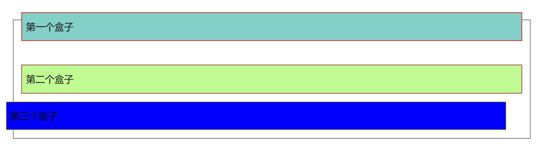
6.2 相对定位
position: relative; 的元素相对于原来的位置进行定位。它仍然在标准文档流中!
实例
<head>
    <meta charset="UTF-8">
    <title>相对定位</title>

    <!-- 相对定位
    相对于自己原来的位置进行偏移
    -->
    <style>
        body{
            padding: 20px;
        }
        div{
            margin: 10px;
            padding: 5px;
            font-size: 12px;
            line-height: 25px;
        }
        #father{
            border: 1px solid #666;
            padding: 0;
        }
        #first{
            background-color: #80D0C7;
            border: 1px solid red;
            position: relative;/*相对定位:上下左右*/
            top:-20px;
        }
        #second{
            background-color: #c1fc93;
            border: 1px solid brown;
        }
        #third{
            background-color: #0000FF;
            border: 1px solid yellow;
            position: relative;
            right: 20px;
        }
    </style>
</head>
<body>
<div id="father">
    <div id="first">第一个盒子</div>
    <div id="second">第二个盒子</div>
    <div id="third">第三个盒子</div>
</div>
</body>
</html>
效果图
6.3 绝对定位
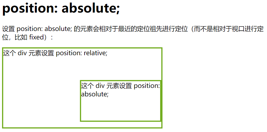
position: absolute; 的元素相对于最近的定位祖先元素进行定位
- 没有父级元素定位的前提下,它将使用文档主体(body),并随页面滚动一起移动;
- 若父级元素存在定位,则该元素相对于父级元素进行定位;该元素可以脱机父级元素。
绝对定位它不在标准文档流中,原来的位置也不会保留。
<html>
<head>
<style>
div.relative {
  position: relative;
  width: 400px;
  height: 200px;
  border: 3px solid #73AD21;
}

div.absolute {
  position: absolute;
  top: 80px;
  right: 0;
  width: 200px;
  height: 100px;
  border: 3px solid #73AD21;
}
</style>
</head>
<body>

<h1>position: absolute;</h1>

<p>设置 position: absolute; 的元素会相对于最近的定位祖先进行定位:</p>

<div class="relative">这个 div 元素设置 position: relative;
  <div class="absolute">这个 div 元素设置 position: absolute;</div>
</div>

</body>
</html>
6.4 固定定位
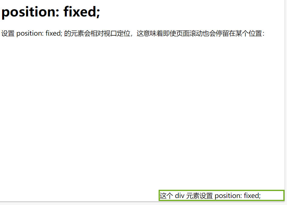
position: fixed; 的元素是相对于视口定位的,这意味着即使滚动页面,它也始终位于同一位置。
<html>
<head>
<style>
div.fixed {
  position: fixed;
  bottom: 0;
  right: 0;
  width: 300px;
  border: 3px solid #73AD21;
}
</style>
</head>
<body>

<h1>position: fixed;</h1>

<p>设置 position: fixed; 的元素会相对视口定位,这意味着即使页面滚动也会停留在某个位置:</p>

<div class="fixed">
这个 div 元素设置 position: fixed;
</div>

</body>
</html>
6.5 重叠元素 z-index
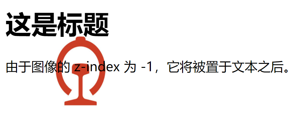
在对元素进行定位时,它们可以与其他元素重叠。
z-index 属性指定元素的堆栈顺序(哪个元素应放置在其他元素的前面或后面)。
元素可以设置正或负的堆叠顺序:
<html lang="en">
<head>
    <meta charset="UTF-8">
    <title>z-index</title>
    <style>
        img{
            position: absolute;
            left: 10px;
            top: 10px;
            z-index: -1;
        }
    </style>
</head>
<body>
<h1>这是标题</h1>
<img src="images/1.jpeg" width="188" height="188">
<p>由于图像的 z-index 为 -1,它将被置于文本之后。</p>
</body>
</html>
效果图
6.6 透明度 opacity
opacity 属性指定元素的不透明度/透明度。
1. 透明图像
opacity 属性的取值范围为 0.0-1.0。值越低,越透明:
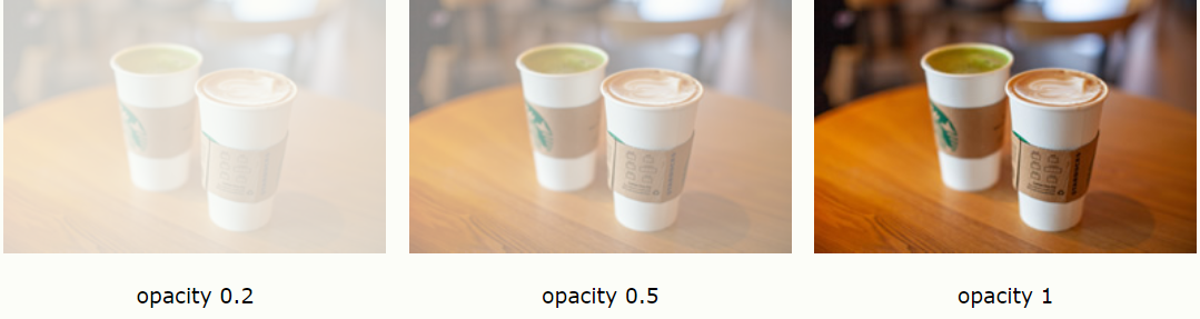
img {
  opacity: 0.5;
}
2. 透明悬停效果
opacity 属性通常与 :hover 选择器一同使用,这样就可以在鼠标悬停时更改不透明度
<html>
<head>
<style>
img {
  opacity: 0.5;
}

img:hover {
  opacity: 1.0;
}
</style>
</head>
<body>

<h1>图像透明度</h1>

<p>opacity 属性常与 :hover 选择器一起使用,改变鼠标悬停时的不透明度:</p>

<img src="/i/photo/tulip.jpg" alt="Tulip" width="170" height="170">

</body>
</html>
练习
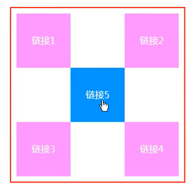
思路:
- 已知方块高度为100px,那么主体外框就是300 x 300px,主体外框样式设置为实线,颜色为红色,宽度为3px,内距为10px;
<a>标签样式设置高度为100 x 100px,去下划线,背景为粉色,线行高设置为100px,文字样式居中,文字颜色为白色,将行内元素转为块元素;- 设置
<a>标签超链接伪类使得鼠标移上去变色 - 然后设置各标签的相对位置
练习.html
<html lang="en">
<head>
    <meta charset="UTF-8">
    <title>练习</title>
    <link rel="stylesheet" href="css/style.css" type="text/css">
</head>
<body>
    <div class="father">
        <a href="#" class="a1">链接1</a>
        <a href="#" class="a2">链接2</a>
        <a href="#" class="a3">链接3</a>
        <a href="#" class="a4">链接4</a>
        <a href="#" class="a5">链接5</a>
    </div>
</body>
</html>
style.css
.father{
    width: 300px;
    height: 300px;
    padding: 10px;
    border: 3px solid red;
}
a{
    width: 100px;
    height: 100px;
    text-decoration: none;
    background-color: pink;
    line-height: 100px;
    text-align: center;
    color: white;
    display: block;
}
a:hover{
    background-color: blue;
}
.a2,.a4{
    position: relative;
    left: 200px;
    bottom: 100px;
}
.a5{
    position: relative;
    left: 100px;
    bottom: 300px;
}

 浙公网安备 33010602011771号