
echarts饼图详细+仪表盘
标签属性
标签属性:label模板字符串显示name和value
未使用之前,系列的name默认就显示在外面了,显示的是name
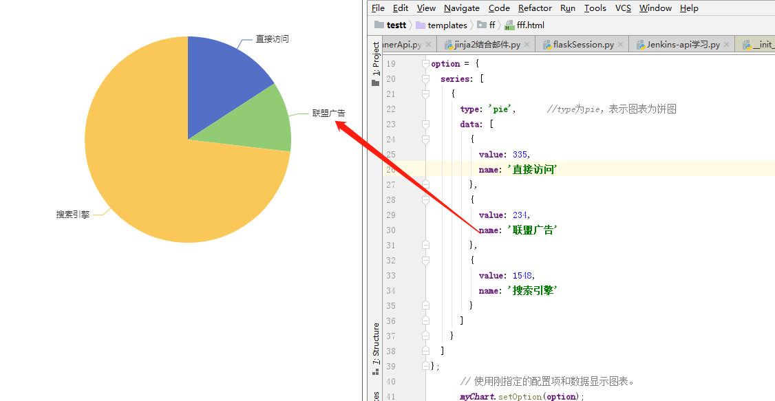
系列里面有系列的类型,数据,label标签。数据就是一个列表,列表元素是字典,一个字典代表饼图的一个扇区的数据,一个数据就有name,和value。
系列的标签设置:如下,a代表啥不清楚,b代表数据里的name,c代表数据里的value,d代表数据里的value的占比。formatter可以控制显示哪些内容。position代表显示在图内还是图外,inside和outside。
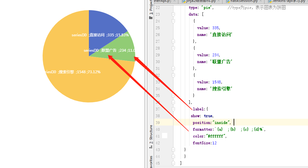
如下,a代表系列的名称。系列在pandas里面就是一列数据,这里貌似类似,我们这里相当于data里面一个字典就代表一个单元格数据,name相当于行标题,一列就不需要标题了,只要对应数值就行,貌似这样理解也行。标签就是对每个数据单元的标签描述、信息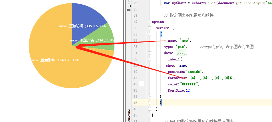
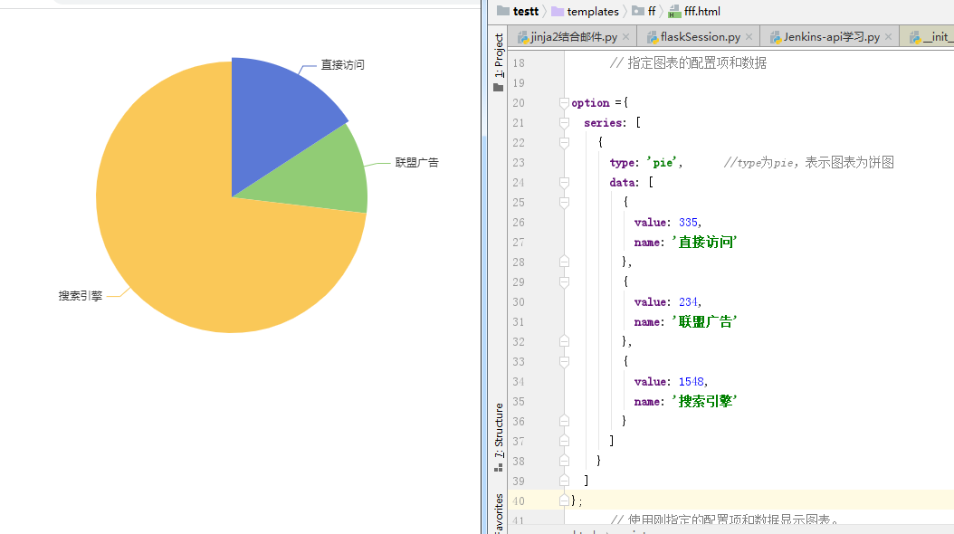
饼图实现系列data的name value在图外,百分比在图内
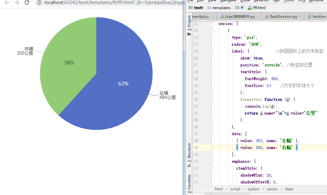

option = {
  series: [
      {
        type: 'pie',
        radius: '90%',
        label: {            //饼图图形上的文本标签
            show: true,
            position: 'outside', //标签的位置
            textStyle: {
              fontWeight: 300,
              fontSize: 14    //文字的字体大小
            },
            formatter: function (d) {
              console.log(d);
              return d.name+"\n"+d.value+"公里"
            }
        },
        data: [
          { value: 484, name: '左幅' },
          { value: 300, name: '右幅' }
        ],
        emphasis: {
          itemStyle: {
            shadowBlur: 10,
            shadowOffsetX: 0,
            shadowColor: 'rgba(0, 0, 0, 0.5)'
          }
        }
      },


      {
        type: 'pie',
        radius: '90%',
        label: {            //饼图图形上的文本标签
            show: true,
            position: 'inside', //标签的位置
            textStyle: {
              fontWeight: 300,
              fontSize: 16    //文字的字体大小
            },
            formatter: function (d) {
              return Math.round(d.percent) + '%'
            }
        },
        data: [
          { value: 484, name: '左幅' },
          { value: 300, name: '右幅' }
        ],
        emphasis: {
          itemStyle: {
            shadowBlur: 10,
            shadowOffsetX: 0,
            shadowColor: 'rgba(0, 0, 0, 0.5)'
          }
        }
      }

    ]
};
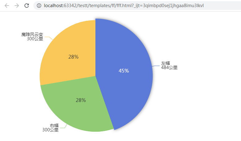
当我们想要添加一个数据时,如下在两个data上共添加两行
效果:
、
程序:
option = {
  series: [
      {
        type: 'pie',
        radius: '90%',
        label: {            //饼图图形上的文本标签
            show: true,
            position: 'outside', //标签的位置
            textStyle: {
              fontWeight: 300,
              fontSize: 14    //文字的字体大小
            },
            formatter: function (d) {
              console.log(d);
              return d.name+"\n"+d.value+"公里"
            }
        },
        data: [
          { value: 484, name: '左幅' },
          { value: 300, name: '右幅' },
          { value: 300, name: '魔降风云变' },
        ],
        emphasis: {
          itemStyle: {
            shadowBlur: 10,
            shadowOffsetX: 0,
            shadowColor: 'rgba(0, 0, 0, 0.5)'
          }
        }
      },


      {
        type: 'pie',
        radius: '90%',
        label: {            //饼图图形上的文本标签
            show: true,
            position: 'inside', //标签的位置
            textStyle: {
              fontWeight: 300,
              fontSize: 16    //文字的字体大小
            },
            formatter: function (d) {
              return Math.round(d.percent) + '%'
            }
        },
        data: [
          { value: 484, name: '左幅' },
          { value: 300, name: '右幅' },
      { value: 300, name: '魔降风云变' },
        ],
        emphasis: {
          itemStyle: {
            shadowBlur: 10,
            shadowOffsetX: 0,
            shadowColor: 'rgba(0, 0, 0, 0.5)'
          }
        }
      }

    ]
};
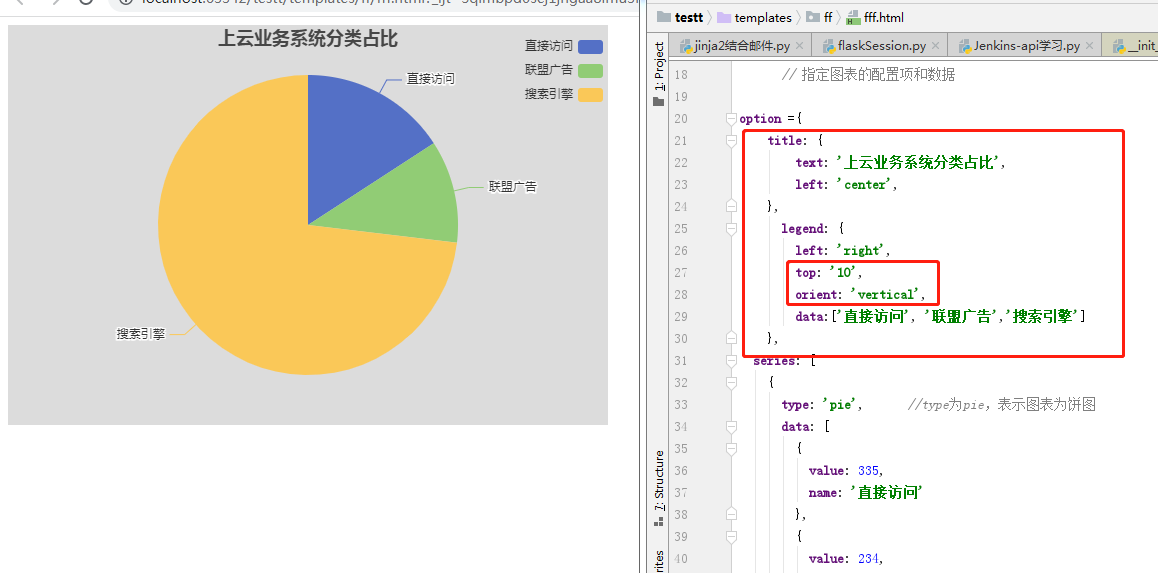
图形标题居中和图例靠右的设置
<!DOCTYPE html>
<html>
  <head>
    <meta charset="utf-8" />
    <!-- 引入刚刚下载的 ECharts 文件 -->
    <script src="echarts.min.js"></script>
    <script src="echarts-liquidfill.js"></script>
  </head>
<body>
  <!-- 为 ECharts 准备一个定义了宽高的 DOM -->
  <div id="main" style="width: 600px;height:400px;background-color: gainsboro;"></div>

</body>
    <script type="text/javascript">
      // 基于准备好的dom,初始化echarts实例
      var myChart = echarts.init(document.getElementById('main'));

      // 指定图表的配置项和数据

option ={
    title: {
        text: '上云业务系统分类占比',
        left: 'center',
    },
      legend: {
        left: 'right',
        top: '10',
        orient: 'vertical',
        data:['直接访问', '联盟广告','搜索引擎']
    },
  series: [
    {
      type: 'pie',      //type为pie,表示图表为饼图
      data: [
        {
          value: 335,
          name: '直接访问'
        },
        {
          value: 234,
          name: '联盟广告'
        },
        {
          value: 1548,
          name: '搜索引擎'
        }
      ]
    }
  ]
};
      // 使用刚指定的配置项和数据显示图表。
      myChart.setOption(option);
    </script>
</html>
设置之前没有的
如下,标题和图例。图例距离上面10px,有vertical,那么就竖直排图例,不然就是横着排在一行
echarts grid画布属性
myChart.setOption({
       option: {
           title: {
                    text: 'ECharts 入门示例'
           },

       //设置canvas内部表格的内距
           grid:{
                  x:50,
                  y:50,
                  x2:50,
                  y2:60,
                  borderWidth:10
           }
                ....
grid配置项:图标离容器的距离
show:是否显示直角坐标系网格-----------值:true?false
left:图表离容器左侧的距离-----------------值:number?百分比
top:图表离容器顶部的距离-----------------值:number?百分比
right:图表离容器右侧的距离---------------值:number?百分比
bottom:图表离容器底部的距离------------值:number?百分比
backgroundColor:网格背景色-------------值:rgba或#000000
borderColor:网格的边框颜色--------------值:rgba或#000000
borderWidth:网格的边框线宽-------------值:number
备注:背景色-边框-线宽生效前提:设置了show:true,边距不受show影响
grid: {
    show:true,
    left: "5%",
    top: "5%",
    right: "5%",
    bottom: "5%"
    backgroundColor: "rgba(224, 17, 17, 1)"
    borderColor: "rgba(96, 67, 67, 1)"
},
echarts title属性
    option = {
        title: {  //标题组件
            show: true, //是否显示标题组件  默认true
            text: "主标题",
            link: "", //主标题超链接
            textStyle: { //主标题样式
                color: "rgba(0,0,0,1)",
                fontStyle: "normal", //字体样式-倾斜 normal italic oblique
                fontWeight: "normal", //字体粗细 bold lighter 400 500
                fontFamily: "", //字体风格 黑体 楷体 宋体
                fontSize: 12, //字体大小
                lineHeight: "20", //行高
                width: "20", //宽度
                height: "20", //高度
                textBorderColor: "rgba(0,0,0,1)", //文字描边颜色
                textBorderWidth: "2", //文字描边宽度
                textBorderType: "solid", //文字描边类型 直线solid 虚线dotted 后面还有很多
                rich: {}, //自定义富文本样式
            },
            subtext: "副标题",
            sublink: "", //副标题超链接
            subtextStyle: {}, //副标题样式
            textAlign: "", //标题的水平对齐 auto left right center
            textVerticalAlign: "", //标题垂直对齐 auto top bottom middle
            padding: [1, 1, 1, 1], //标题内边距
            itemGap: 10, //主副标题之间的间距
            z: 999, //标题的层级
            top: '', bottom: '', left: '', right: '', //title组件距离容器的距离
            backgroundColor: 'red', //标题背景颜色
            borderColor: 'yellow', //标题边框颜色
            borderWidth: 2, //标题边框现款
            borderRadius: 5, //标题边框圆角
            //shadow 阴影属性
        }
    }
echarts liquidFill 配置说明
{
    data: [],

    color: ['#294D99', '#156ACF', '#1598ED', '#45BDFF'],
    center: ['50%', '50%'],
    radius: '50%',
    amplitude: '8%', // 波浪的振幅,可设置为像素值或百分比,其中百分比是相对图的直径
    waveLength: '80%',
    phase: 'auto', // 波浪的相位
    period: 'auto', // 向前移动一个波长所需的毫秒数
    direction: 'right', //波浪滚动的方向
    shape: 'circle', // 波浪形状,可被设置为'circle', 'rect', 'roundRect', 'triangle', 'diamond', 'pin', 'arrow' 或者 svg路径

    waveAnimation: true,   // 是否开启波浪动画
    animationEasing: 'linear', //当波浪从底部开始上升时,初始动画的简化方法。
    animationEasingUpdate: 'linear', // 其他动画的简化方法,例如,当数据值改变及波位改变时。
    animationDuration: 2000, // 动画持续时间,单位为毫秒
    animationDurationUpdate: 1000, // 数据更新动画持续时间

    outline: {
        show: true,
        borderDistance: 8,
        itemStyle: {
            color: 'none',
            borderColor: '#294D99',
            borderWidth: 8,
            shadowBlur: 20,
            shadowColor: 'rgba(0, 0, 0, 0.25)'
        }
    },

    backgroundStyle: {
        color: '#E3F7FF'
    },

    itemStyle: {
        opacity: 0.95,
        shadowBlur: 50,
        shadowColor: 'rgba(0, 0, 0, 0.4)'
    },

    label: {
        show: true,
        color: '#294D99',
        insideColor: '#fff',
        fontSize: 50,
        fontWeight: 'bold',

        align: 'center',
        baseline: 'middle'
        position: 'inside'
    },

    emphasis: {
        itemStyle: {
            opacity: 0.8
        }
    }
}
仪表盘
仪表盘案例1和介绍
https://echarts.apache.org/examples/zh/editor.html?c=gauge-temperature


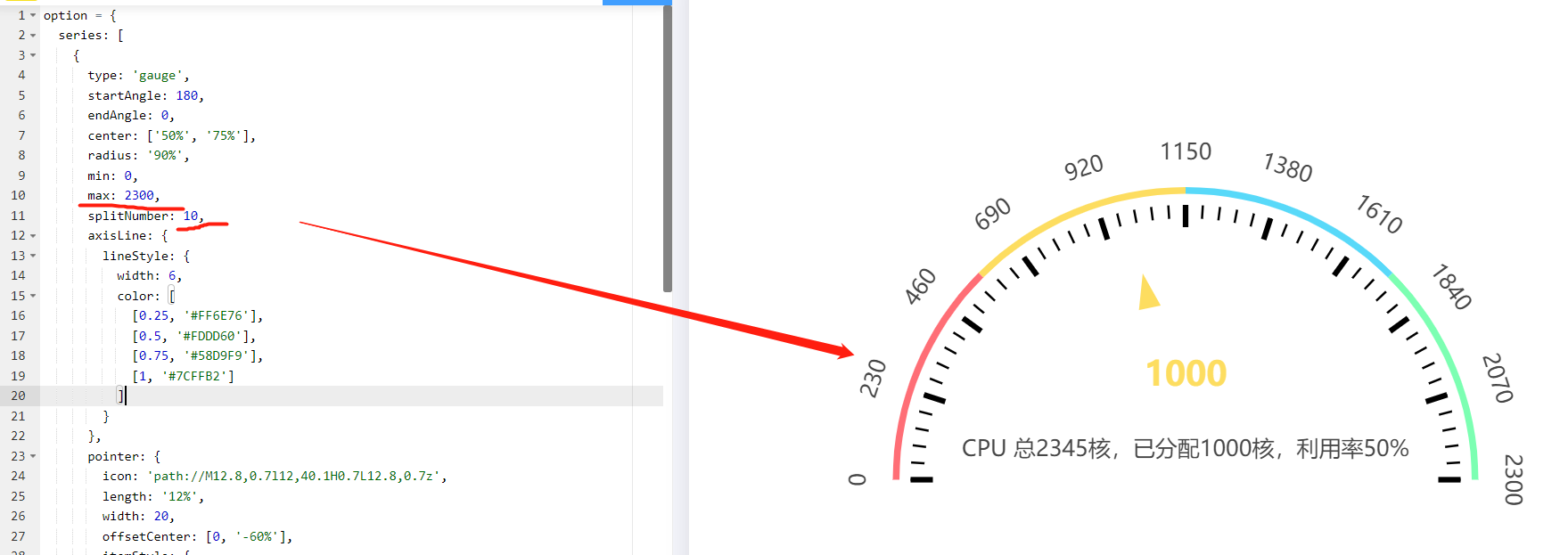
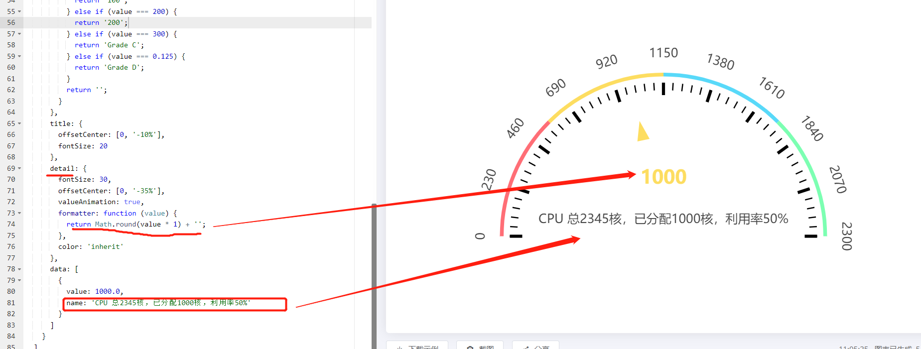
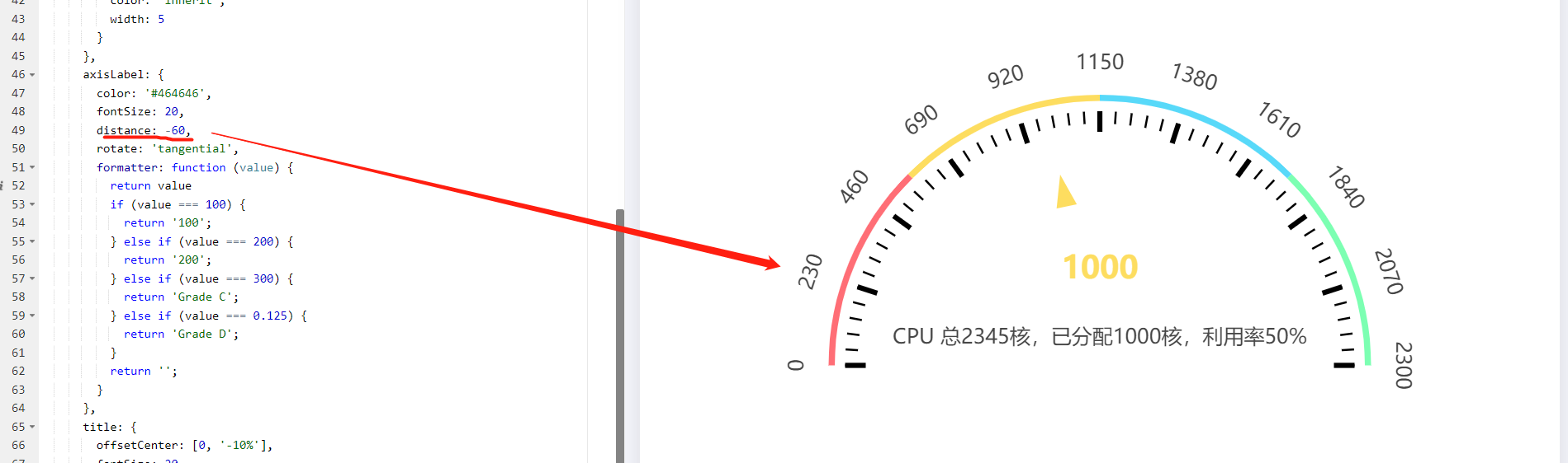
option = {
  series: [
    {
      type: 'gauge',
      startAngle: 180,
      endAngle: 0,
      center: ['50%', '75%'],
      radius: '90%',
      min: 0,
      max: 2300,
      splitNumber: 10,
      axisLine: {
        lineStyle: {
          width: 6,
          color: [
            [0.25, '#FF6E76'],
            [0.5, '#FDDD60'],
            [0.75, '#58D9F9'],
            [1, '#7CFFB2']
          ]
        }
      },
      pointer: {
        icon: 'path://M12.8,0.7l12,40.1H0.7L12.8,0.7z',
        length: '12%',
        width: 20,
        offsetCenter: [0, '-60%'],
        itemStyle: {
          color: 'inherit'
        }
      },
      axisTick: {
        length: 12,
        lineStyle: {
          color: 'inherit',
          width: 2
        }
      },
      splitLine: {
        length: 20,
        lineStyle: {
          color: 'inherit',
          width: 5
        }
      },
      axisLabel: {
        color: '#464646',
        fontSize: 20,
        distance: -60,
        rotate: 'tangential',
        formatter: function (value) {
          return value
          if (value === 100) {
            return '100';
          } else if (value === 200) {
            return '200';
          } else if (value === 300) {
            return 'Grade C';
          } else if (value === 0.125) {
            return 'Grade D';
          }
          return '';
        }
      },
      title: {
        offsetCenter: [0, '-10%'],
        fontSize: 20
      },
      detail: {
        fontSize: 30,
        offsetCenter: [0, '-35%'],
        valueAnimation: true,
        formatter: function (value) {
          return Math.round(value * 1) + '';
        },
        color: 'inherit'
      },
      data: [
        {
          value: 1000.0,
          name: 'CPU 总2345核,已分配1000核,利用率50%'
        }
      ]
    }
  ]
};
基础仪表盘,设置最大值,切割数字10,这样看起来整体很合理。
得要return值,才能显示刻度值
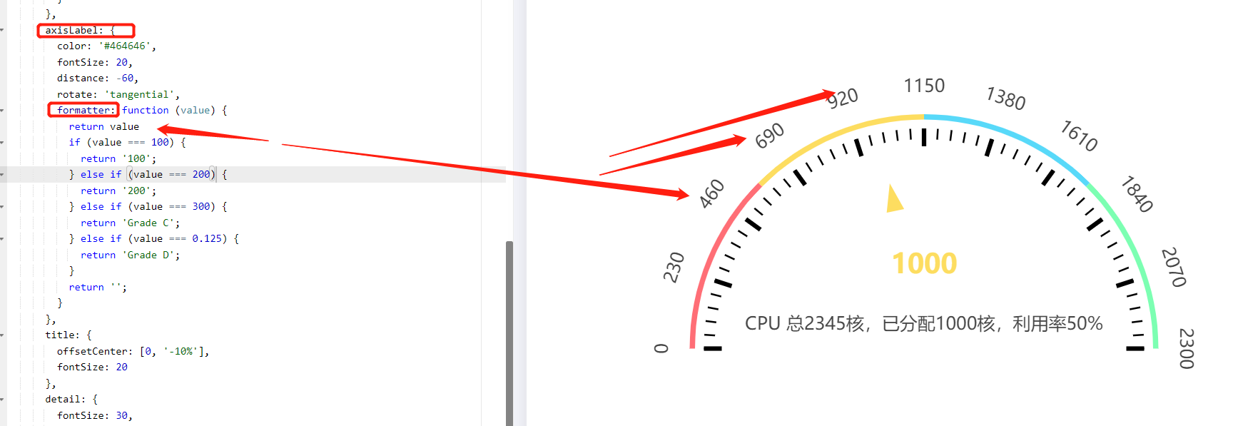
data里面定义value,其它地方使用value,详情属性格式里面返回仪表盘中间的数据,是value做过处理的数据,data里面的name,就是定义仪表盘下面的文字信息
下面这个调整刻度标签,在仪表盘内是正数,在仪表盘外就是负数,绝对值越大,离仪表盘边越远
这个是这个线的宽度,其它的宽度,比如有指针的宽度,有切割线的宽度
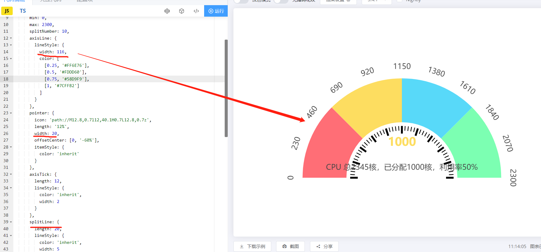
通过radius,调整仪表盘半径,让仪表盘变大,占满div。此时半径大于div的高度,仪表盘上面被隐藏。这是我们不需要1/2圆,可以通过startAngle和endAngle来调整扇区对应的弧线。如果是半圆弧形,那么是从180度开始,从0度结束的,根据实际需要,填写开始和结束,截取需要的弧度。这样就出来想要的了。虽然不是半椭圆,但是这个弧形的就可以了。因为选定弧形之后,这部分弧形不是在div的中间展示,我们通过调整center,来把弧形调整到如下图div的中间展示。50%是x方向,x方向一般这个50%就能水平方向居中了,120%是y方向

案例2有定时加载变化的数,设置样式变量

<div id="main" style="width: 400px;height: 300px;"></div>
        <script>
            var myChart = echarts.init(document.getElementById("main"));
            option = {
                //提示框组件。开发实际中去掉了指针,提示框可以不用设置。
                tooltip: {
                    formatter: "{a} <br/>{b} : {c}%"
                },
                //工具栏。本次好像也没用到,刷新,下载,我觉得还是挺实用的,具体开需求!
                toolbox: {
                    feature: {
                        restore: {},
                        saveAsImage: {}
                    }
                },
                //下面属性才是仪表盘的核心!!反正我是这么认为的!!!
                series: [{
                    //类型
                    type: 'gauge',
                    //半径
                    radius: 150,
                    //起始角度。圆心 正右手侧为0度,正上方为90度,正左手侧为180度。
                    startAngle: 180,
                    //结束角度。
                    endAngle: 0,
                    center: ['50%', '90%'],
                    //仪表盘轴线相关配置。
                    axisLine: {
                        show:true,
                        // 属性lineStyle控制线条样式
                        lineStyle: {
                            width: 60,
                            color:[[1, '#63869e']]
                        }
                    },
                    //分隔线样式。
                    splitLine: {
                        show: false,
                    },
                    //刻度样式。
                    axisTick: {
                        show: false,
                    },
                    //刻度标签。
                    axisLabel: {
                        show:false,
                    },
                    //仪表盘指针。
                    pointer: {
                        //这个show属性好像有问题,因为在这次开发中,需要去掉指正,我设置false的时候,还是显示指针,估计是BUG吧,我用的echarts-3.2.3;希望改进。最终,我把width属性设置为0,成功搞定!
                        show: false,
                        //指针长度
                        length:'90%',
                        width:0,
                    },
                    //仪表盘标题。
                    title: {
                        show: true,
                        offsetCenter: [0, '-40%'], // x, y,单位px
                        textStyle: {
                            color: '#hhh',
                            fontSize: 30
                        }
                    },
                    //仪表盘详情,用于显示数据。
                    detail: {
                        show: true,
                        offsetCenter: [0, '-10%'],
                        formatter: '{value}%',
                        textStyle: {
                            fontSize: 30
                        }
                    },
                    data: [{
                        value: 0,
                        name: '存储量'
                    }]
                }]
            };
            myChart.setOption(option);
            //设置定时,加载随机数据,可以直观显示
            timeTicket = setInterval(function() {
                var random=(Math.random() * 100).toFixed(2);
                var color=[[random/100, '#63869e'], [1, '#c23531']];
                option.series[0].axisLine.lineStyle.color=color;
                option.series[0].data[0].value =random ;
                myChart.setOption(option, true);
            }, 200)
        </script>
仪表盘属性详解
var option = {

backgroundColor: "#000",

tooltip: { // 本系列特定的 tooltip 设定。

show: true,

formatter: "{b}:{c}%",

backgroundColor: "rgba(50,50,50,0.7)", // 提示框浮层的背景颜色。注意:series.tooltip 仅在 tooltip.trigger 为 'item' 时有效。

borderColor: "#333", // 提示框浮层的边框颜色。...

borderWidth: 0, // 提示框浮层的边框宽。...

padding: 5, // 提示框浮层内边距,单位px,默认各方向内边距为5,接受数组分别设定上右下左边距。...

textStyle: { // 提示框浮层的文本样式。...

// color ,fontStyle ,fontWeight ,fontFamily ,fontSize ,lineHeight ,.......

},

},

series: [

{

name: "单仪表盘示例", // 系列名称,用于tooltip的显示,legend 的图例筛选,在 setOption 更新数据和配置项时用于指定对应的系列。

type: "gauge", // 系列类型

radius: "80%", // 参数:number, string。 仪表盘半径,默认 75% ,可以是相对于容器高宽中较小的一项的一半的百分比,也可以是绝对的数值。

center: ["50%", "55%"], // 仪表盘位置(圆心坐标)

startAngle: 225, // 仪表盘起始角度,默认 225。圆心 正右手侧为0度,正上方为90度,正左手侧为180度。

endAngle: -45, // 仪表盘结束角度,默认 -45

clockwise: true, // 仪表盘刻度是否是顺时针增长,默认 true。

min: 0, // 最小的数据值,默认 0 。映射到 minAngle。

max: 100, // 最大的数据值,默认 100 。映射到 maxAngle。

splitNumber: 10, // 仪表盘刻度的分割段数,默认 10。

axisLine: { // 仪表盘轴线(轮廓线)相关配置。

show: true, // 是否显示仪表盘轴线(轮廓线),默认 true。

lineStyle: { // 仪表盘轴线样式。

color: colorTemplate1, //仪表盘的轴线可以被分成不同颜色的多段。每段的 结束位置(范围是[0,1]) 和 颜色 可以通过一个数组来表示。默认取值:[[0.2, '#91c7ae'], [0.8, '#63869e'], [1, '#c23531']]

opacity: 1, //图形透明度。支持从 0 到 1 的数字,为 0 时不绘制该图形。

width: 30, //轴线宽度,默认 30。

shadowBlur: 20, //(发光效果)图形阴影的模糊大小。该属性配合 shadowColor,shadowOffsetX, shadowOffsetY 一起设置图形的阴影效果。

shadowColor: "#fff", //阴影颜色。支持的格式同color。

}

},

splitLine: { // 分隔线样式。

show: true, // 是否显示分隔线,默认 true。

length: 30, // 分隔线线长。支持相对半径的百分比,默认 30。

lineStyle: { // 分隔线样式。

color: "#eee", //线的颜色,默认 #eee。

opacity: 1, //图形透明度。支持从 0 到 1 的数字,为 0 时不绘制该图形。

width: 2, //线度,默认 2。

type: "solid", //线的类型,默认 solid。 此外还有 dashed,dotted

shadowBlur: 10, //(发光效果)图形阴影的模糊大小。该属性配合 shadowColor,shadowOffsetX, shadowOffsetY 一起设置图形的阴影效果。

shadowColor: "#fff", //阴影颜色。支持的格式同color。

}

},

axisTick: { // 刻度(线)样式。

show: true, // 是否显示刻度(线),默认 true。

splitNumber: 5, // 分隔线之间分割的刻度数,默认 5。

length: 8, // 刻度线长。支持相对半径的百分比,默认 8。

lineStyle: { // 刻度线样式。

color: "#eee", //线的颜色,默认 #eee。

opacity: 1, //图形透明度。支持从 0 到 1 的数字,为 0 时不绘制该图形。

width: 1, //线度,默认 1。

type: "solid", //线的类型,默认 solid。 此外还有 dashed,dotted

shadowBlur: 10, //(发光效果)图形阴影的模糊大小。该属性配合 shadowColor,shadowOffsetX, shadowOffsetY 一起设置图形的阴影效果。

shadowColor: "#fff", //阴影颜色。支持的格式同color。

},

},

axisLabel: { // 刻度标签。

show: true, // 是否显示标签,默认 true。

distance: 5, // 标签与刻度线的距离,默认 5。

color: "#fff", // 文字的颜色,默认 #fff。

fontSize: 12, // 文字的字体大小,默认 5。

formatter: "{value}", // 刻度标签的内容格式器,支持字符串模板和回调函数两种形式。 示例:// 使用字符串模板,模板变量为刻度默认标签 {value},如:formatter: '{value} kg'; // 使用函数模板,函数参数分别为刻度数值,如formatter: function (value) {return value + 'km/h';}

},

pointer: { // 仪表盘指针。

show: true, // 是否显示指针,默认 true。

length: "70%", // 指针长度,可以是绝对数值,也可以是相对于半径的百分比,默认 80%。

width: 5, // 指针宽度,默认 8。

},

itemStyle: { // 仪表盘指针样式。

color: "auto", // 指针颜色,默认(auto)取数值所在的区间的颜色

opacity: 1, // 图形透明度。支持从 0 到 1 的数字,为 0 时不绘制该图形。

borderWidth: 0, // 描边线宽,默认 0。为 0 时无描边。

borderType: "solid", // 柱条的描边类型,默认为实线,支持 'solid', 'dashed', 'dotted'。

borderColor: "#000", // 图形的描边颜色,默认 "#000"。支持的颜色格式同 color,不支持回调函数。

shadowBlur: 10, // (发光效果)图形阴影的模糊大小。该属性配合 shadowColor,shadowOffsetX, shadowOffsetY 一起设置图形的阴影效果。

shadowColor: "#fff", // 阴影颜色。支持的格式同color。

},

emphasis: { // 高亮的 仪表盘指针样式

itemStyle: {

//高亮 和正常 两者具有同样的配置项,只是在不同状态下配置项的值不同。

}

},

title: { // 仪表盘标题。

show: true, // 是否显示标题,默认 true。

offsetCenter: [0,"20%"],//相对于仪表盘中心的偏移位置,数组第一项是水平方向的偏移,第二项是垂直方向的偏移。可以是绝对的数值,也可以是相对于仪表盘半径的百分比。

color: "#fff", // 文字的颜色,默认 #333。

fontSize: 20, // 文字的字体大小,默认 15。

},

detail: { // 仪表盘详情,用于显示数据。

show: true, // 是否显示详情,默认 true。

offsetCenter: [0,"50%"],// 相对于仪表盘中心的偏移位置,数组第一项是水平方向的偏移,第二项是垂直方向的偏移。可以是绝对的数值,也可以是相对于仪表盘半径的百分比。

color: "auto", // 文字的颜色,默认 auto。

fontSize: 30, // 文字的字体大小,默认 15。

formatter: "{value}%", // 格式化函数或者字符串

},

data: data1

}

]

};
如果仪表盘中间的数字字体显示不同的样式,把detail里面的设置改一下
detail: {
              valueAnimation: true, //
              animationThreshold:1100,//当大于这个阀值关闭动画
              width: '60%',              //宽
              lineHeight: 0,             //行高
              offsetCenter: ['2%', '10%'],  //中间显示文字的位置
              color: '#3866FF',                //颜色
              formatter: function(value) {
                return '{value|' + value.toFixed(0) + '}{unit|M}'
              },                             //动态设置不同文字的样式
              rich: { //特定样式
                value: {
                  fontSize: 25, //字体大小
                  fontWeight: 'bolder', //是否加粗
                },
                unit: {
                  fontSize: 16,
                  fontWeight: 'bolder',
                    padding: [0, 0, -2, 0],//调整位置
                }
              },
            },


【推荐】国内首个AI IDE,深度理解中文开发场景,立即下载体验Trae
【推荐】编程新体验,更懂你的AI,立即体验豆包MarsCode编程助手
【推荐】抖音旗下AI助手豆包,你的智能百科全书,全免费不限次数
【推荐】轻量又高性能的 SSH 工具 IShell:AI 加持,快人一步
· 无需6万激活码!GitHub神秘组织3小时极速复刻Manus,手把手教你使用OpenManus搭建本
· C#/.NET/.NET Core优秀项目和框架2025年2月简报
· 什么是nginx的强缓存和协商缓存
· 一文读懂知识蒸馏
· Manus爆火,是硬核还是营销?
2021-10-26 dbeaver使用详解