封装element Table组件二次封装
子组件:
<template>
<div>
<!-- S 表格 A -->
<el-table stripe :data="tableData" :header-cell-style="{background:'#eef1f6',color:'#606266'}" @selection-change="selectionChange">
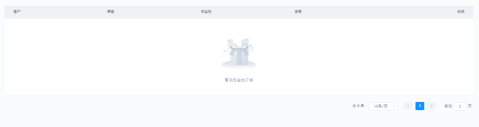
<template slot="empty">
<div class="empty-cont"><img :src="mTable.img" alt=""><span>{{mTable.description}}</span></div>
</template>
<!-- /缺省页 -->
<slot v-if="showSelection" name="showSelection" />
<!-- /多选插槽 -->
<slot v-if="headerSlot" name="headerSlot" />
<!-- /头部插槽 -->
<template v-for="(item, index) in columns">
<el-table-column :key="index" :prop="item.prop" :label="item.label" :align="item.align" :width="item.width" :class="item.style" :formatter="item.formatter?item.formatter : formatterValue">
</el-table-column>
</template>
<!-- /表格内容 -->
<slot v-if="footerSlot" name="footerSlot" />
<!-- /尾部插槽 -->
</el-table>
<!-- E 表格 A -->
<!-- S 分页 B -->
<el-pagination background style="text-align: right;" v-if="showPagination" @size-change="handleSizeChange" @current-change="handleCurrentChange" :current-page="pager.pageNo"
:page-size="pager.pageSize" :total="pager.totalCount" layout="total, sizes, prev, pager, next, jumper">
</el-pagination>
<!-- E 分页 B -->
</div>
</template>
<script>
export default {
name: "elementTable",
props: {
empty: Object, //缺省
columns: Array, //表格的列
tableData: Array, //表格的数据
showSelection: { type: Boolean, default: false }, //是否显示多选
/**表格*/
pager: Object, //分页传值
showPagination: { type: Boolean, default: false }, //是否显示分页
headerSlot: { type: Boolean, default: false }, //是否显示头部插槽
footerSlot: { type: Boolean, default: false }, //是否显示底部插槽
/**分页*/
},
computed: {
// 缺省页默认值
mTable () {
return Object.assign({
img: 'https://xx.png',
description: "暂无数据"
}, this.empty);
},
},
methods: {
/**当选择项发生变化时会触发该事件*/
selectionChange (val) { this.$emit('selectionChange', val) },
//$emit 绑定一个自定义事件event,被执行时将参数传递给父组件,父组件通过@event监听并接收参数
/**分页*/
handleSizeChange (val) { this.$emit('handleSizeChange', val) },
handleCurrentChange (val) { this.$emit('handleCurrentChange', val) },
/**表格内容插槽*/
formatterValue (row, column, cellValue) { return cellValue },
}
}
</script>
<style lang='scss' scoped>
/* 缺省页
---------------------------------------------------------------- */
.empty-cont {
display: flex;
flex-direction: column;
align-items: center;
margin: 40px 0;
> img {
width: 20%;
height: 20%;
}
span {
font-size: 14px;
line-height: 1.8;
}
}
</style>
父组件:
<template>
<div>
<!-- S 表格 A -->
<elTable :columns="columns" :tableData="tableData" :footerSlot="footerSlot" :showPagination="showPagination" :pager="listPagination" :empty="empty" :showSelection="showSelection"
@handleSizeChange="handleSizeChange" @handleCurrentChange="handleCurrentChange">
<el-table-column slot="showSelection" width="88" label="全选" align="center" type="selection">
</el-table-column>
<!-- /全选 -->
<el-table-column slot="footerSlot" label="操作" align="right" width="200">
<template slot-scope="scope">
<el-button type="text">按钮</el-button>
</template>
</el-table-column>
<!-- /尾部 -->
</elTable>
<!-- E 表格 A -->
</div>
</template>
<script>
import elTable from "../../components/CommonTable/index";
export default {
  name: "sell",
  components: { elTable },
  data () {
    return {
      empty: {
        img: "https://qimg-1257286775.cos.ap-chengdu.myqcloud.com/qy%2F%E7%BC%BA%E7%9C%81%E9%A1%B5%2F%E6%9A%82%E6%97%A0%E6%9D%83%E7%9B%8A%E5%8C%85.png",
        description: "暂无"
      },//缺省页
      showSelection: true, // 多选插槽
      footerSlot: true, // 尾部插槽
      columns: [
        { label: "单号", prop: "number", align: "left" },
        { label: "时间", prop: "date", align: "right" },
      ],//列属性
      tableData: [], //表格数据
      showPagination: true, //是否分页
      listPagination: {
        current: 1,
        size: 10,
        totalCount: 0,
      },//分页
    };
  },
  mounted () {
    // this._list();
  },
  methods: {
    /**
     * 列表
    */
    _list () {
      this.$api.xx(this.listPagination).then((res) => {
        this.tableData = res.data.list;
        this.listPagination.totalCount = res.data.totalCount;
      });
    },

    /**
     * 分页
    */
    handleSizeChange (val) {
      this.listPagination.size = val;
    },
    handleCurrentChange (val) {
      this.listPagination.current = val;
    },
  },
};
</script>
