

Echarts坐标系x轴y轴属性设置大全
最简单的直角坐标系,以柱状图为例。
常见的直角坐标系,x轴设置type: 'category',为类目轴,适用于离散的类目数据;y轴设置type: 'value',为数值轴,适用于连续数据。
<template>
<div ref="barChart" class="chart-content">暂无数据</div>
</template>
<script>
import * as echarts from 'echarts';
export default {
name: 'bar',
data() {
return {};
},
mounted() {
this.draw();
},
methods: {
draw() {
this.chart = echarts.init(this.$refs.barChart);
var option = {
xAxis: {
type: 'category',
data: ['周一', '周二', '周三', '周四', '周五', '周六', '周日'],
},
yAxis: {
type: 'value'
},
series: [
{
data: [120, 200, 150, 80, 70, 110, 130],
type: 'bar'
}
]
};
this.chart.setOption(option);
},
},
};
</script>
<style scoped>
.chart-content {
width: 600px;
height: 400px;
box-sizing: border-box;
border: 1px solid #ccc;
}
</style>
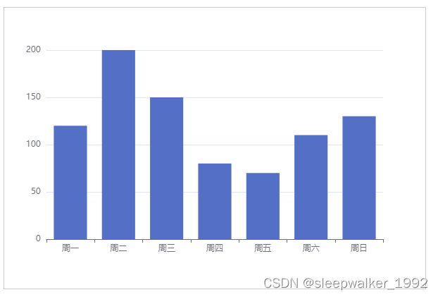
渲染结果:
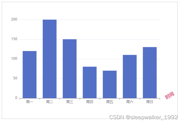
3、坐标轴名称相关设置
name: '时间', // 坐标轴名称
nameLocation: 'end', // 坐标轴名称显示位置,可取值'start'、'middle' 或 'center'、'end'
// 坐标轴名称文字样式设置
nameTextStyle: {
color: '#d46c89',
fontWeight: 'bold',
fontSize: '16px',
},
nameGap: 20, // 坐标轴名称与轴线之间的距离,默认值15
nameRotate: 30, // 坐标轴名称旋转,角度值
只设置x轴,渲染效果:
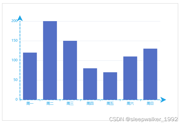
4、坐标轴轴线相关设置
// 坐标轴轴线相关设置
axisLine: {
show: true, // 是否显示坐标轴轴线
symbol: ['none', 'arrow'], // 轴线两边的箭头,none表示没有箭头,arrow表示有箭头,可取值为字符串或长度为2的数组:默认不显示箭头 'none'。两端都显示箭头 'arrow',只在末端显示箭头 ['none', 'arrow']
symbolSize: [15, 20], // 轴线两边的箭头的大小,第一个数字表示宽度(垂直坐标轴方向),第二个数字表示高度(平行坐标轴方向),默认值[10, 15]。
symbolOffset: 20, // 轴线两边的箭头的偏移,如果是数组,第一个数字表示起始箭头的偏移,第二个数字表示末端箭头的偏移;如果是数字,表示这两个箭头使用同样的偏移。
// 坐标轴轴线样式设置
lineStyle: {
color: '#21a6e6',
width: 2,
type: 'dashed',
}
},
x轴y轴都设置,渲染效果:
5、坐标轴刻度相关设置
// 坐标轴刻度相关设置
axisTick: {
show: true, // 是否显示坐标轴刻度。
interval: 0, // 坐标轴刻度的显示间隔,在类目轴中有效。不设置时默认同 axisLabel.interval 一样。设置成 0 强制显示所有标签。如果设置为 1,表示『隔一个标签显示一个标签』,如果值为 2,表示隔两个标签显示一个标签,以此类推。
inside: true, // 默认值false。true 表示坐标轴刻度朝内,false 表示坐标轴刻度朝外
// 坐标轴刻度样式设置
lineStyle: {
color: '#d96c67',
width: 6,
}
},
只设置X轴,渲染效果:

6、坐标轴刻度标签相关设置
axisLabel: {
show: true, // 是否显示坐标轴刻度标签。
interval: 0, // 坐标轴刻度标签的显示间隔,在类目轴中有效。设置成 0 强制显示所有标签,如果设置为 1,表示『隔一个标签显示一个标签』,如果值为 2,表示隔两个标签显示一个标签,以此类推
inside: false, // 默认值false。true 表示坐标轴刻度标签朝内,false 表示坐标轴刻度标签朝外
rotate: 30, // 刻度标签旋转的角度,旋转的角度从 -90 度到 90 度
margin: 20, // 刻度标签与轴线之间的距离
color: '#d46c89', // 刻度标签文字的颜色。不设置就默认取 axisLine.lineStyle.color,即与轴线颜色一样
},
只设置x轴,渲染效果:

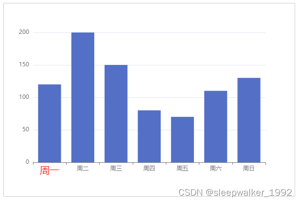
7、设置某个类目标签的文字样式
type: 'category',
data: [{ // 类目数据,在类目轴(type: 'category')中有效
value: '周一',
// 突出周一
textStyle: {
fontSize: 20,
color: 'red'
}
}, '周二', '周三', '周四', '周五', '周六', '周日'],
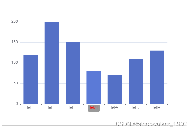
8、坐标轴指示器相关设置
直线指示器
axisPointer: {
show: true, // 默认不显示。但是如果 tooltip.trigger 设置为 'axis' 或者 tooltip.axisPointer.type 设置为 'cross',则自动显示 axisPointer。坐标系会自动选择显示哪个轴的 axisPointer,也可以使用 tooltip.axisPointer.axis 改变这种选择
type: 'line', // 'line' 直线指示器,'shadow' 阴影指示器,'none' 无指示器
// 坐标轴指示器的文本标签设置
label: {
show: true, // 是否显示文本标签。如果 tooltip.axisPointer.type 设置为 'cross' 则默认显示标签,否则默认不显示
color: 'red',
backgroundColor: '#999',
},
// type: 'line'时坐标轴指示器线的设置
lineStyle: {
color: 'orange', // 线的颜色
width: 3, // 线的宽度
},
}
只设置X轴,鼠标悬浮上去渲染效果:
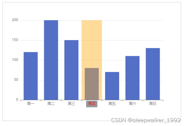
阴影指示器
axisPointer: {
show: true, // 默认不显示。但是如果 tooltip.trigger 设置为 'axis' 或者 tooltip.axisPointer.type 设置为 'cross',则自动显示 axisPointer。坐标系会自动选择显示哪个轴的 axisPointer,也可以使用 tooltip.axisPointer.axis 改变这种选择
type: 'shadow', // 'line' 直线指示器,'shadow' 阴影指示器,'none' 无指示器
// 坐标轴指示器的文本标签设置
label: {
show: true, // 是否显示文本标签。如果 tooltip.axisPointer.type 设置为 'cross' 则默认显示标签,否则默认不显示
color: 'red',
backgroundColor: '#999',
},
// type: 'shadow'时坐标轴指示器填充区域的设置
shadowStyle: {
color: 'orange', // 填充的颜色
opacity: 0.4,
},
}
只设置X轴,鼠标悬浮上去渲染效果:
9、实现坐标轴刻度线和标签对齐
boundaryGap: true, // 类目轴中boundaryGap可取值,true或false,默认true。
axisTick: {
alignWithLabel: true, // 类目轴中在 boundaryGap 为 true 的时候有效,可以保证刻度线和标签对齐。
},
只设置X轴,渲染效果:

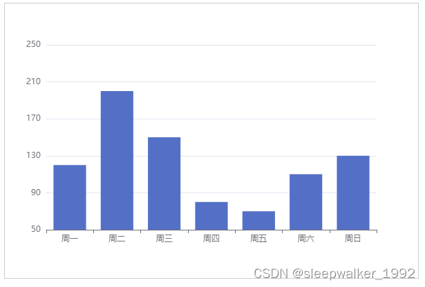
10、设置坐标轴最小刻度值、最大刻度值、分割间隔
min: 50, // 坐标轴刻度最小值
max: 250, // 坐标轴刻度最大值
interval: 40, // 强制设置坐标轴分割间隔
只设置y轴,渲染效果:
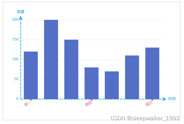
11、完整示例
var option = {
xAxis: {
type: 'category',
data: ['周一', '周二', '周三', '周四', '周五', '周六', '周日'],
name: '时间',
nameGap: 20,
axisLine: {
symbol: ['none', 'arrow'],
symbolOffset: 14,
lineStyle: {
color: '#21a6e6',
width: 2,
type: 'dashed',
}
},
axisTick: {
alignWithLabel: true,
lineStyle: {
color: '#d96c67',
width: 6,
}
},
axisLabel: {
interval: 2,
rotate: 30,
margin: 10,
color: '#d46c89',
},
},
yAxis: {
type: 'value',
name: '数值',
nameGap: 20,
axisLine: {
show: true,
symbol: ['none', 'arrow'],
symbolOffset: 14,
lineStyle: {
color: '#21a6e6',
width: 2,
type: 'dashed',
}
},
},
series: [
{
data: [120, 200, 150, 80, 70, 110, 130],
type: 'bar'
},
]
};
渲染效果:
原文转自:https://blog.csdn.net/sleepwalker_1992/article/details/126420600


【推荐】国内首个AI IDE,深度理解中文开发场景,立即下载体验Trae
【推荐】编程新体验,更懂你的AI,立即体验豆包MarsCode编程助手
【推荐】抖音旗下AI助手豆包,你的智能百科全书,全免费不限次数
【推荐】轻量又高性能的 SSH 工具 IShell:AI 加持,快人一步
· Manus爆火,是硬核还是营销?
· 终于写完轮子一部分:tcp代理 了,记录一下
· 震惊!C++程序真的从main开始吗?99%的程序员都答错了
· 别再用vector<bool>了!Google高级工程师:这可能是STL最大的设计失误
· 单元测试从入门到精通