
【Demo】CSS3元素旋转、缩放、移动或倾斜
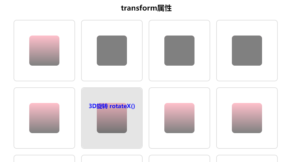
CSS3元素旋转、缩放、移动或倾斜
代码:
<!DOCTYPE html>
<html lang="en">
<head>
    <meta charset="UTF-8">
    <title>Document</title>
    <style type="text/css">

        *{
            margin: 0;
            padding: 0;
        }
        .container{
            width: 900px;
            margin:0 auto;
        }
        header{
            text-align: center;
            line-height: 60px;
        }
        section{
            width: 200px;
            height: 200px;
            border:2px solid #ddd;
            float: left;
            margin:10px;
            border-radius: 10px;
            background: #fff;
            position: relative;
        }
        section h3{
            width: 200px;
            height: 200px;
            text-align: center;
            line-height: 120px;
            color: blue;
            background: rgba(0,0,0,0.1);
            border-radius: 10px;
            display: none;
            position: absolute;
            top:0;
            left:0;
            z-index: 9;
        }
        section:hover h3{
            display: block;
        }

        .content{
            width: 100px;
            height: 100px;
            margin:50px;
            border-radius: 10px;
            background-image: linear-gradient(pink,gray);
            transition: all 1s linear;
        }
        .box{
            width: 100px;
            height: 100px;
            background: gray;
            border-radius: 10px;
            transition: all 1s linear;
        }
        .item:nth-of-type(1):hover .content{
            transform:translate(50px,50px);
        }
        .item:nth-of-type(2):hover .content .box{
            transform:translateX(50px);
        }
        .item:nth-of-type(3):hover .content .box{
            transform:translateY(50px);
        }
        .item:nth-of-type(4):hover .content .box{
            transform:perspective(300px) translateZ(-100px);
        }
        .item:nth-of-type(5):hover .content{
            /*默认顺时针旋转,旋转中心为当前元素中心点*/
            transform:rotate(360deg);
            /*设置当前元素旋转中心点*/
            /*transform-origin: 0 0;*/
        }
        .item:nth-of-type(6):hover .content{
            transform:rotateX(360deg);
        }
        .item:nth-of-type(7):hover .content{
            transform:rotateY(360deg);
        }
        .item:nth-of-type(8):hover .content{
            transform:rotateZ(360deg);
        }
        .item:nth-of-type(9):hover .content{
            transform:skew(60deg,60deg);
        }
        .item:nth-of-type(10):hover .content{
            transform:scale(1.5,1.5);
        }
        .item:nth-of-type(11):hover .content{
            transform:scaleX(2);
        }
        .item:nth-of-type(12):hover .content{
            transform:scaleY(2);
        }
        .item:nth-of-type(13):hover .content{
            /*在z轴上的位置已经按照z轴进行了缩放 - 它看起来更接近你,因此更大,但是实际的尺寸(宽度和高度)不变。*/
            transform:perspective(300px) translateZ(-100px);
        }
        .item:nth-of-type(14):hover .content{
            /*在z轴上的位置已经按照z轴进行了缩放 - 它看起来更接近你,因此更大,但是实际的尺寸(宽度和高度)不变。*/
            transform:perspective(300px) scaleZ(10) translateZ(-100px);
        }
        .item:nth-of-type(15):hover .content{
            transform:perspective(100px) rotateX(360deg);
        }
        .item:nth-of-type(16):hover .content{
            transform:perspective(100px) rotateY(360deg);
        }
    </style>
</head>
<body>

<div class="container">

    <header>
        <h2>transform属性</h2>
    </header>
    <section class="item">
        <h3>translate平移2D</h3>
        <div class="content"></div>
    </section>
    <section class="item">
        <h3>translateX</h3>
        <div class="content">
            <div class="box"></div>
        </div>
    </section>
    <section class="item">
        <h3>translateY</h3>
        <div class="content">
            <div class="box"></div>
        </div>
    </section>
    <section class="item">
        <h3>translateZ</h3>
        <div class="content">
            <div class="box"></div>
        </div>
    </section>
    <section class="item">
        <h3>rotate旋转</h3>
        <div class="content"></div>
    </section>
    <section class="item">
        <h3>3D旋转 rotateX()</h3>
        <div class="content"></div>
    </section>
    <section class="item">
        <h3>3D旋转 rotateY()</h3>
        <div class="content"></div>
    </section>
    <section class="item">
        <h3>3D旋转 rotateZ()</h3>
        <div class="content"></div>
    </section>
    <section class="item">
        <h3>3D翻转 skew()</h3>
        <div class="content"></div>
    </section>
    <section class="item">
        <h3>放大 scloe()</h3>
        <div class="content"></div>
    </section>
    <section class="item">
        <h3>X轴放大 scaleX()</h3>
        <div class="content"></div>
    </section>
    <section class="item">
        <h3>Y轴放大 scaleY()</h3>
        <div class="content"></div>
    </section>
    <section class="item">
        <h3>Z轴放大缩小(右边对比图)</h3>
        <div class="content"></div>
    </section>
    <section class="item">
        <h3>Z轴放大缩小(越近越大,越远越小) scaleZ()</h3>
        <div class="content"></div>
    </section>
    <section class="item">
        <h3> 3D透视图perspective(n) X轴旋转</h3>
        <div class="content"></div>
    </section>
    <section class="item">
        <h3> 3D透视图perspective(n) Y轴旋转</h3>
        <div class="content"></div>
    </section>
</div>
</body>
</html>
实现效果:

 浙公网安备 33010602011771号