
【Demo】CSS3 动画
CSS3 动画(@keyframes,animation)
CSS3 @keyframes 规则
要创建CSS3动画,你将不得不了解@keyframes规则。
@keyframes规则是创建动画。 @keyframes规则内指定一个CSS样式和动画将逐步从目前的样式更改为新的样式。
@keyframes myfirst
{
    from {background: red;}
    to {background: yellow;}
}

@-webkit-keyframes myfirst /* Safari 与 Chrome */
{
    from {background: red;}
    to {background: yellow;}
}
CSS3 动画
当在 @keyframes 创建动画,把它绑定到一个选择器,否则动画不会有任何效果。
指定至少这两个CSS3的动画属性绑定向一个选择器:
- 规定动画的名称
- 规定动画的时长
把 "myfirst" 动画捆绑到 div 元素,时长:5 秒:
<style>
div
{
    width:100px;
    height:100px;
    background:red;
    animation:myfirst 5s;
    -webkit-animation:myfirst 5s; /* Safari and Chrome */
}

@keyframes myfirst
{
    from {background:red;}
    to {background:yellow;}
}

@-webkit-keyframes myfirst /* Safari and Chrome */
{
    from {background:red;}
    to {background:yellow;}
}
</style>
</head>
<body>

<p><b>注意:</b> 该实例在 Internet Explorer 9 及更早 IE 版本是无效的。</p>

<div></div>

</body>
注意: 您必须定义动画的名称和动画的持续时间。如果省略的持续时间,动画将无法运行,因为默认值是0。
请用百分比来规定变化发生的时间,或用关键词 "from" 和 "to",等同于 0% 和 100%。
0% 是动画的开始,100% 是动画的完成。
为了得到最佳的浏览器支持,您应该始终定义 0% 和 100% 选择器。
实例:
当动画为 25% 及 50% 时改变背景色,然后当动画 100% 完成时再次改变:
<style>
div
{
    width:100px;
    height:100px;
    background:red;
    animation:myfirst 5s;
    -moz-animation:myfirst 5s; /* Firefox */
    -webkit-animation:myfirst 5s; /* Safari and Chrome */
    -o-animation:myfirst 5s; /* Opera */
}

@keyframes myfirst
{
    0%   {background:red;}
    25%  {background:yellow;}
    50%  {background:blue;}
    100% {background:green;}
}

@-moz-keyframes myfirst /* Firefox */
{
    0%   {background:red;}
    25%  {background:yellow;}
    50%  {background:blue;}
    100% {background:green;}
}

@-webkit-keyframes myfirst /* Safari and Chrome */
{
    0%   {background:red;}
    25%  {background:yellow;}
    50%  {background:blue;}
    100% {background:green;}
}

@-o-keyframes myfirst /* Opera */
{
    0%   {background:red;}
    25%  {background:yellow;}
    50%  {background:blue;}
    100% {background:green;}
}
</style>
</head>
<body>

<div></div>

<p><b>注释:</b>当动画完成时,会变回初始的样式。</p>


<p><b>注意:</b> 该实例在 Internet Explorer 9 及更早 IE 版本是无效的。</p>

</body>
实例:改变背景色和位置:
<style>
div
{
    width:100px;
    height:100px;
    background:red;
    position:relative;
    animation:myfirst 5s;
    -webkit-animation:myfirst 5s; /* Safari and Chrome */
}

@keyframes myfirst
{
    0%   {background:red; left:0px; top:0px;}
    25%  {background:yellow; left:200px; top:0px;}
    50%  {background:blue; left:200px; top:200px;}
    75%  {background:green; left:0px; top:200px;}
    100% {background:red; left:0px; top:0px;}
}

@-webkit-keyframes myfirst /* Safari and Chrome */
{
    0%   {background:red; left:0px; top:0px;}
    25%  {background:yellow; left:200px; top:0px;}
    50%  {background:blue; left:200px; top:200px;}
    75%  {background:green; left:0px; top:200px;}
    100% {background:red; left:0px; top:0px;}
}
</style>
</head>
<body>

<p><b>注意:</b> 该实例在 Internet Explorer 9 及更早 IE 版本是无效的。</p>

<div></div>

</body>
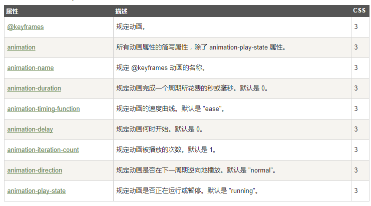
CSS3的动画属性
下面的表格列出了 @keyframes 规则和所有动画属性:
下面两个例子设置所有动画属性:
实例
运行myfirst动画,设置所有的属性:
div
{
    animation-name: myfirst;
    animation-duration: 5s;
    animation-timing-function: linear;
    animation-delay: 2s;
    animation-iteration-count: infinite;
    animation-direction: alternate;
    animation-play-state: running;
    /* Safari 与 Chrome: */
    -webkit-animation-name: myfirst;
    -webkit-animation-duration: 5s;
    -webkit-animation-timing-function: linear;
    -webkit-animation-delay: 2s;
    -webkit-animation-iteration-count: infinite;
    -webkit-animation-direction: alternate;
    -webkit-animation-play-state: running;
}
实例
与上面的动画相同,但是使用了简写的动画 animation 属性:
div
{
    animation: myfirst 5s linear 2s infinite alternate;
    /* Safari 与 Chrome: */
    -webkit-animation: myfirst 5s linear 2s infinite alternate;
}

 浙公网安备 33010602011771号