filter: hue-rotate() 制作炫酷的文字效果
主要用到属性有:
filter 滤镜的 hue-rotate 色调旋转,
text-shadow 文字阴影,
transform 的 scale缩放,
transition 过渡属性,
animation 动画
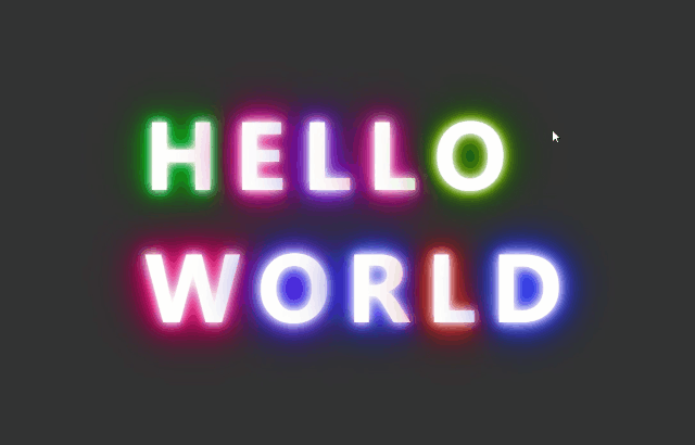
效果图:
代码:
 1 <!DOCTYPE html>
 2 <html lang="en">
 3 <head>
 4     <meta charset="UTF-8">
 5     <meta name="viewport" content="width=device-width, initial-scale=1.0">
 6     <meta http-equiv="X-UA-Compatible" content="ie=edge">
 7     <title>text-animation</title>
 8     <style>
 9         html,body {
10             height: 100%;
11             margin: 0;
12             padding: 0;
13         }
14         body {display: flex;justify-content: center;align-items: center;background-color: #333;} /*用flex布局让div上下左右居中对齐*/
15         h1 {
16             color: white; /*字体颜色*/
17             display: inline-block; /*转换为行内块*/
18             font-size: 7rem; /*字体大小*/
19             letter-spacing: 1rem; /*字体间距*/
20             cursor: pointer; /*光标手指状态*/
21             text-transform: uppercase; /*文字内容大写*/
22             line-height: 1rem; /*行高*/
23             text-shadow: #fff 0 0 10px,#fff 0 0 20px,
24             rgb(245, 10, 245) 0 0 30px,rgb(245, 10, 245) 0 0 40px,
25             purple 0 0 50px,purple 0 0 60px,purple 0 0 70px; /*文字阴影*/
26             transition: transform .8s; /*过渡*/
27         }
28         h1:hover {
29             transform:scale(.3); /*缩放*/
30         }
31
32         /*给每个文字设置不同时长的动画*/
33         h1:first-of-type {animation: light 4s linear infinite;}
34         h1:nth-of-type(2) {animation: light 3s linear infinite;}
35         h1:nth-of-type(3) {animation: light 2.8s linear infinite;}
36         h1:nth-of-type(4) {animation: light 3.6s linear infinite;}
37         h1:nth-of-type(5) {animation: light 4.4s linear infinite;}
38         h1:nth-of-type(6) {animation: light 2s linear infinite;}
39         h1:nth-of-type(7) {animation: light 3.3s linear infinite;}
40         h1:nth-of-type(8) {animation: light 1.4s linear infinite;}
41         h1:nth-of-type(9) {animation: light 1s linear infinite;}
42         h1:last-of-type {animation: light 5s linear infinite;}
43         @keyframes light {
44             100% {filter: hue-rotate(360deg);/*色调旋转*/}
45         }
46     </style>
47 </head>
48 <body>
49     <div>
50         <h1>h</h1>
51         <h1>e</h1>
52         <h1>l</h1>
53         <h1>l</h1>
54         <h1>o</h1>
55         <br/>
56         <h1>w</h1>
57         <h1>o</h1>
58         <h1>r</h1>
59         <h1>l</h1>
60         <h1>d</h1>
61     </div>
62 </body>
63 </html>

 浙公网安备 33010602011771号