python matplotlib模块使用
1.matplotlib 简介
Matplotlib 是 Python 的绘图库,提供了一种有效的 MatLab 开源替代方案。
2.matplotlib 生成折线图
import pandas as pd
import numpy as np
import matplotlib
from matplotlib import pyplot as plt
import random
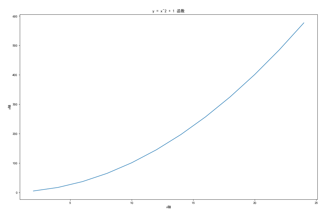
x = [x for x in range(2, 26, 2)]
y = [i * i + 1 for i in x]
/* 设置中文字体和负号正常显示*/
matplotlib.rcParams['font.sans-serif'] = ['SimHei']
matplotlib.rcParams['axes.unicode_minus'] = False
plt.figure(figsize=(16,10),dpi=80)
plt.plot(x,y)
plt.ylabel("y轴")
plt.xlabel("x轴")
plt.title("y = x^2 + 1 函数")
plt.show()
结果展示如下
3.matplotlib 生成条形图
3.1 网易云华语男歌手热门歌曲评论情况
import pandas as pd
import numpy as np
import matplotlib
from matplotlib import pyplot as plt
import random
# x = [x for x in range(2, 26, 2)]
# #y = random.sample(range(12,30),12)
# y = [i * i + 1 for i in x]
# #plt.figure(figsize=(20,12),dpi=60)
# plt.plot(x,y)
# plt.show()

pre_path = 'D:\\WorkSpace\\python\\file\\comment华语男歌手'
df = pd.DataFrame()
#循环读取文件
for i in range(18):
    file_path = pre_path+str(i)+'.csv'
    # 没有列头 自定义列头
    data = pd.read_csv(file_path,header=None,names=['歌手名','歌曲名','评论数'])
    df = df.append(data,ignore_index=True)

#数据处理
df = df.drop_duplicates(keep='first') #去除重复行
df['评论数'].replace({'评论':'-1'},inplace=True)
df['评论数']=pd.to_numeric(df['评论数'],errors='coerce')
df = df[df['评论数']!=-1] #剔除问题数据

#纬度值获取
df0 = df[df['评论数']==0]['歌曲名'].count()
df1k = df[(df['评论数']>0) & (df['评论数']<1000)]['歌曲名'].count()
df5K = df[(df['评论数']>=1000) & (df['评论数']<5000)]['歌曲名'].count()
df1W = df[(df['评论数']>=5000) & (df['评论数']<10000)]['歌曲名'].count()
df3W = df[(df['评论数']>=10000) & (df['评论数']<30000)]['歌曲名'].count()
df5W = df[(df['评论数']>=30000) & (df['评论数']<50000)]['歌曲名'].count()
df7W = df[(df['评论数']>=50000) & (df['评论数']<70000)]['歌曲名'].count()
df10W = df[(df['评论数']>=70000) & (df['评论数']<100000)]['歌曲名'].count()
df30W = df[(df['评论数']>=100000) & (df['评论数']<300000)]['歌曲名'].count()
df50W = df[(df['评论数']>=300000) & (df['评论数']<500000)]['歌曲名'].count()
df100W = df[(df['评论数']>=500000) & (df['评论数']<1000000)]['歌曲名'].count()
dfgt100W = df[df['评论数']>=1000000]['歌曲名'].count()

#坐标值定义
datax = ['0','(0,1000)','[1000,5000)','[5000,10000)','[10000,30000)','[30000,50000)','[50000,70000)','[70000,100000)','[100000,300000)','[300000,500000)','[500000,1000000)','[1000000,)']
datay = [df0,df1k,df5K,df1W,df3W,df5W,df7W,df10W,df30W,df50W,df100W,dfgt100W]

# 设置中文字体和负号正常显示
matplotlib.rcParams['font.sans-serif'] = ['SimHei']
matplotlib.rcParams['axes.unicode_minus'] = False

# 设置图形打下
plt.figure(figsize=(20,10),dpi=90)

label_list = datax    # 横坐标刻度显示值
num_list = datay      # 纵坐标值
x = range(len(num_list))
"""
绘制条形图
x:横坐标
height:长条形高度
width:长条形宽度,默认值0.8
label:为后面设置legend准备
"""
rects1 = plt.bar(x=x, height=num_list, width=0.4, alpha=0.8, color='blue', label="歌曲数")
#plt.ylim(0, 60000)     # y轴取值范围
plt.yticks(range(0,70000,5000)) #设置y轴坐标
plt.ylabel("数量")

"""
设置x轴刻度显示值
参数一:中点坐标
参数二:显示值
"""
plt.xticks([index for index in x], label_list) #设置x轴坐标
plt.xlabel("评论区间")
plt.title("华语男歌手热门歌曲50首评论分布情况")
plt.legend()     # 设置题注
# 编辑文本
for rect in rects1:
    height = rect.get_height()
    plt.text(rect.get_x() + rect.get_width() / 2, height+1, str(height), ha="center", va="bottom")
plt.show()
以下是截至2021年3月31号,网易云华语男歌手热门歌曲评论情况:
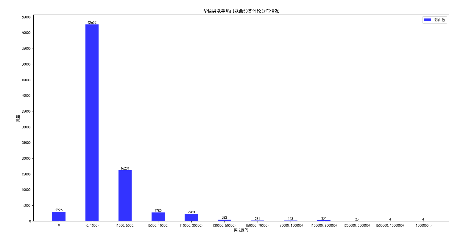
从图形上可以明显看出,歌曲的评论都集中在0到1000这个区间,评论1w以上的歌曲在3000首左右;
3.2 第六次人口普查年龄、性别数据分布情况
import pandas as pd
import numpy as np
import matplotlib
from matplotlib import pyplot as plt
import random
def showPicturexyy(label_list,num_list1,num_list2,label1='类型1',label2='类型2',xlabel='x轴坐标',title='标题'):
    '''生成柱状图 y轴为2
    label_list 为 x 轴坐标  xlabel 为 x轴 说明
    num_list1 为 y 轴 值1   label1 为 y轴 值1说明
    num_list2 为 y 轴 值2   label2 为 y轴 值2说明
    title 为标题
    '''
    # # 设置中文字体和负号正常显示
    matplotlib.rcParams['font.sans-serif'] = ['SimHei']
    matplotlib.rcParams['axes.unicode_minus'] = False

    # # 设置图形打下
    plt.figure(figsize=(20,10),dpi=90)
    # label_list = ['2014', '2015', '2016', '2017']    # 横坐标刻度显示值
    # num_list1 = [20, 30, 15, 35]      # 纵坐标值1
    # num_list2 = [15, 30, 40, 20]      # 纵坐标值2
    x = range(len(num_list1))
    """
    绘制条形图
    left:长条形中点横坐标
    height:长条形高度
    width:长条形宽度,默认值0.8
    label:为后面设置legend准备
    """
    rects1 = plt.bar(x=x, height=num_list1, width=0.4, alpha=0.8, color='orange', label=label1)
    rects2 = plt.bar(x=[i + 0.4 for i in x], height=num_list2, width=0.4, color='green', label=label2)
    plt.ylim(min(min(num_list1),min(num_list2))*0.9, max(max(num_list1),max(num_list2))*1.1)     # y轴取值范围
    plt.ylabel("数量")
    """
    设置x轴刻度显示值
    参数一:中点坐标
    参数二:显示值
    """
    plt.xticks([index + 0.2 for index in x], label_list)
    plt.xlabel(xlabel)
    plt.title(title)
    plt.legend()     # 设置题注
    # 编辑文本
    for rect in rects1:
        height = rect.get_height()
        plt.text(rect.get_x() + rect.get_width() / 2, height+1, str(height), ha="center", va="bottom")
    for rect in rects2:
        height = rect.get_height()
        plt.text(rect.get_x() + rect.get_width() / 2, height+1, str(height), ha="center", va="bottom")
    plt.show()

pre_path2010 = 'D:\\WorkSpace\\python\\file\\2020全国分年龄、性别的人口.csv'
df2010 = pd.read_csv(pre_path2010)
#print(df2010)
df2010 = df2010.loc[df2010.index[[1, 7, 13, 19, 25, 31, 37, 43, 49, 55, 61, 67, 73, 79, 85, 91, 97, 103, 109, 115, 121]], ['年龄','合计','男','女']]
print(df2010)
datarate = (df2010['男']*100/df2010['女']).astype('int').to_list()
print(datarate)

df2010['合计'] = df2010['合计']/10000
df2010['男'] = df2010['男']/10000
df2010['女'] = df2010['女']/10000

df2010['合计']=df2010['合计'].astype('int')
df2010['男']=df2010['男'].astype('int')
df2010['女']=df2010['女'].astype('int')

# #纬度值获取
datax = df2010['年龄'].to_list()
dataym = df2010['男'].to_list()
datayf = df2010['女'].to_list()

#print(max(max(dataym),max(datayf)))

showPicturexyy(datax,dataym,datayf,'男','女','年龄段','第六次人口普查年龄、性别数据(单位:万人,时间:2010)')

#男女比例折线图
# matplotlib.rcParams['font.sans-serif'] = ['SimHei']
# matplotlib.rcParams['axes.unicode_minus'] = False
# plt.figure(figsize=(20,10),dpi=90)
# plt.plot(datax,datarate)
# plt.show()
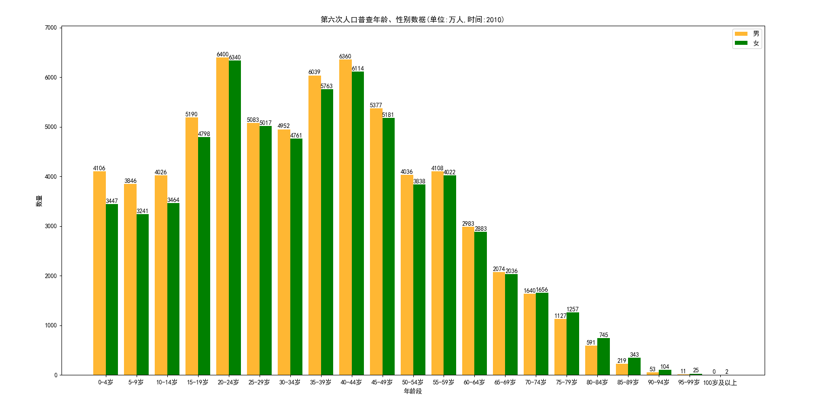
从图形上可以看到,在2010年10到19岁的这批人,到了2021年已经是21到30岁了,这个区间的男女比例失调严重,男多女少明显;