


移动端表单校验错误显示组件
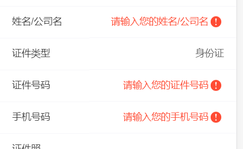
因业务需要,项目涉及大量表单提交,并且校验时会展示相应的错误样式(如下图),目前移动端的ui框架中并未找到相应的通用组件,如果按照原生的方法则需要给每一条数据项分别添加,代码会出现冗余,影响开发效率,所以需要实现组件化
具体代码如下:
 1 <template>
 2     <div class="valid-input" :class="{'error':error}" @change='validation()'>
 3         <slot></slot>  //使用时具体数据项
 4         <img src="../assets/error.png" v-show="error">
 5     </div>
 6 </template>
 7
 8 <script>
 9     export default {
10         name: "Valid",
11         props:{
12             max:{
13                 type:Number,
14                 required:false //控制可输入数据最大长度
15             },
16             min:{
17                 type:Number,
18                 required:false //控制可输入数据的最小长度
19             },
20             validator:{
21                 type:Function,
22                 required:false  //根据业务需要具体定义校验方法
23             },
24             content:{
25                 required:true
26             },
27 30         },
31 51         data(){
52             return {
53                 error:false
54             }
55         },
methods:{
validation(){
if (this.min && this.content.length < this.min){
this.error = true;
}else if (this.max && this.content.length > this.max){
this.error = true;
}else this.error = !!(this.validator && !this.validator(this.content));
return this.error;
},
}
56     }
57 </script>
58
59 <style scoped lang="scss">
60     .valid-input{
61         position: relative;
62         line-height: 13.33vw;
63         img{
64             width: 4.53vw;
65             margin: 0 1vw;
66             vertical-align: middle;
67         }
68     }
69     .error>*{
70         color: #ff4b33;
71         &::placeholder{
72             color: #ff4b33;
73         }
74         &:-moz-placeholder{
75             color: #ff4b33;
76         }
77         &::-webkit-input-placeholder{
78             color: #ff4b33;
79         }
80         &:-ms-input-placeholder{
81             color: #ff4b33;
82         }
83     }
     // 可根据业务自定义错误的样式
84 </style>
使用时:
 <tr>
        <td>手机号码</td>
        <td>
          <valid
                  :validator="validator.phoneValid"
                  :content="validate.tel"
                   ref='valid0'   //绑定校验项
          >
            <input type="tel" v-model="applicantInfo.tel" placeholder="请输入您的手机号码"  @change="telChange"/>
          </valid>

        </td>
      </tr>
提交表单时候,校验每项数据
for (let i=0; i<2; i++){
if (this.$refs['valid'+i].validation()){
//调用组件vallidation方法
flag = true;
}
}
validator 绑定的是所在项的单独的校验规则
     validator:{
        idValid:this.idValid,
        phoneValid:isPhoneNum, //公共方法中定义

      },
