CSS布局--两栏固定中间自适应的几种方法
CSS布局--两栏固定中间自适应的几种方法
目录
HTML结构
   <div class="container">
        <div class="left"></div>
        <div class="middle">djflajflajdflaksdjflksdjflkdjaslkfjlsadk</div>
        <div class="right"></div>
    </div>
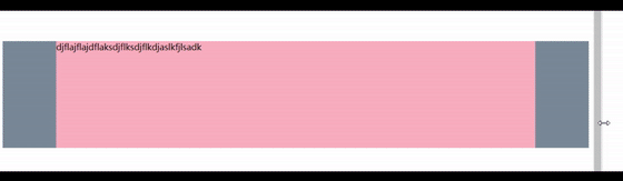
最终效果图
一: 浮动 + 相对定位 + margin负值
这种结构要改一下, middle要放在第一位. 使用margin负值来让元素处于同一行
重点: 浮动和margin负值的使用 👈
缺点: 在中间元素宽度被压到很小的时候结构会混乱,需要给容器设置最小宽度
    <style>
        body{
            height: 100vh;
        }
        .container {
            position: relative;
            /* 设置padding,留出两侧元素的位置 */
            padding: 0 100px;
            height: 200px;
            background-color: lightskyblue;
            word-break: break-all;
        }
        .container div {
            /* 使用相对定位和浮动 */
            position: relative;
            float: left;
        }
        .left, .right {
            height: 200px;
            width: 100px;
            background-color: lightslategray;
        }
        .left {
            /* 这里100%为父元素content的宽度,这样可以让元素浮上去 */
            /* 左边元素会浮动到父元素content区域的最左侧 */
            margin-left: -100%;
            /* 让元素向后移动100px(这里要用负值), 移动到padding位置里里去 */
            left: -100px;
        }
        .right {
            /* 右边元素只需要将 margin-right设为-100% 就可浮动到指定位置 */
            /* 因为left还占着100px位置(相对定位) */
           margin-right: -100%;
        }
        .middle {
            /* 设置中间元素宽高(100% == 父元素content宽度) */
            height: 100%;
            width: 100%;
            background-color: lightpink;
        }
    </style>
二: 👍绝对定位+CSS3新盒子
利用新盒子 width = content + padding + border 特性 🎈
    <style>
        body{
            height: 100vh;
        }
        .container {
            position: relative;
            height: 200px;
            background-color: lightskyblue;
            word-break: break-all;
        }
        .container div {
            /* 使用绝对定位来控制元素 */
            position: absolute;
        }
        .left, .right {
            height: 200px;
            width: 100px;
            background-color: lightslategray;
        }
        .right {
            right: 0;
        }
        .middle {
            /* 控制padding来放置两侧元素, content宽度会自动计算 */
            box-sizing: border-box;
            height: 100%;
            width: 100%;
            /* 两端填充100px, 用来放两侧固定元素 */
            padding: 0 100px;
            background-color: lightpink;
        }
    </style>
三: 绝对定位 + 过度约束
过度约束: margin + border + padding + content = 父元素content宽度
- 文档流中块级元素满足横向过度约束 ✨
margin,padding,width可以设置为auto, 且width优先于margin和padding- 在没有手动设置情况下,
width默认auto, 所以默认情况下块级元素宽度=父元素content宽度
margin-left/right + border-left/right + padding-left/right + width = 父元素content宽度
- 绝对定位中(脱离文档流) 🪁
- 横向和纵向都满足过渡约束, 并且横向要加上
left,right; 纵向要加上top,bottom
- 横向和纵向都满足过渡约束, 并且横向要加上
    // 横向
    margin-left/right + border-left/right + padding-left/right + width + left + right = 父元素content宽度
    // 纵向
    margin-top/bottom + border-top/bottom + padding-top/bottom + height + top + bottom = 父元素content高度
- 利用这种特性可以实现元素的垂直居中,水平居中,水平垂直居中
     <style>
        body{
            height: 100vh;
        }
        .container {
            position: relative;
            /* 让容器垂直居中, 类似 top + transform */
            /* 父元素高度一半 - 容器高度一半 */
            top: calc(50% - 100px);
            height: 200px;
            background-color: lightskyblue;
            word-break: break-all;
        }
        .container div {
            position: absolute;
        }
        .left, .right {
            height: 200px;
            width: 100px;
            background-color: lightslategray;
        }
        .right {
            right: 0;
        }
        .middle {
            /* 使用绝对定位的过渡约束,自动扩充 width和height */
            /* 脱离文档流, 所有元素宽高都由内容撑开, 类似行内块.所以宽高都需要设置 */
            top: 0;
            left: 0;
            right: 0;
            bottom: 0;
            padding: 0;
            /* 元素两侧向内挤100px, 留出两侧元素位置 */
            margin: 0 100px;
            background-color: lightpink;
        }
    </style>
四: 👍使用flex
通过改变
flex-grow和flex-shrink实现
    <style>
        body{
            height: 100vh;
        }
        .container {
            display: flex;
            flex-direction: row;
            height: 200px;
            background-color: lightskyblue;
            word-break: break-all;
        }
        .left, .right {
            /* 左右固定长度 */
            flex-basis: 100px;
            /* 将增长比和缩小比都设置为 0 ,避免宽度变化 */
            flex-grow: 0;
            flex-shrink: 0;
            background-color: lightslategray;
        }
        .middle {
            /* 中间自动适应 */
            flex-grow: 1;
            flex-shrink: 1;
            background-color: lightpink;
        }
    </style>
五: 使用grid
grid表格系统可以轻松实现各种布局,就像棋盘,你可以将棋子落到任何一个格子上 🎉
grid是对flex的提升, 设置flex的元素可以在主轴方向上伸缩,而grid可以在两个方向伸缩- 缺点就是兼容性不好😥
    <style>
        body{
            height: 100vh;
        }
        .container {
            display: grid;
            /* 设置列: 1,3列宽100px, 中间列宽度auto */
            grid-template-columns: 100px auto 100px;
            /* 设置行: 1行, 高200px */
            grid-template-rows: 200px;
            background-color: lightskyblue;
            word-break: break-all;
        }
        .left, .right {
            background-color: lightslategray;
        }
        .right {
            /* 将right元素设置到第三列 */
            grid-column: 3;
            /* 位于第一行 */
            grid-row: 1;
        }
        .left {
            /* 设置到第一列 */
            grid-column:1/2;
            grid-row: 1;
        }
        .middle {
            /* 设置到第二列 */
            grid-column: 2/3;
            background-color: lightpink;
        }
    </style>
暂时只想到这么多. 欢迎指出错误或者可以改进的地方!!! 🚴♀️🚴♂️(。・ω・。)