python 为直方图绘制拟合曲线
    def normfun(self, x, mu, sigma):
        """
        正态分布的概率密度函数
        :param x: 数据集中的某一具体测量值
        :param mu: 数据集的平均值,反映测量值分布的集中趋势
        :param sigma: 数据集的标准差,反映测量值分布的分散程度
        :return:
        """
        pdf = np.exp(-((x - mu) ** 2) / (2 * sigma ** 2)) / (sigma * np.sqrt(2 * np.pi))
        return pdf
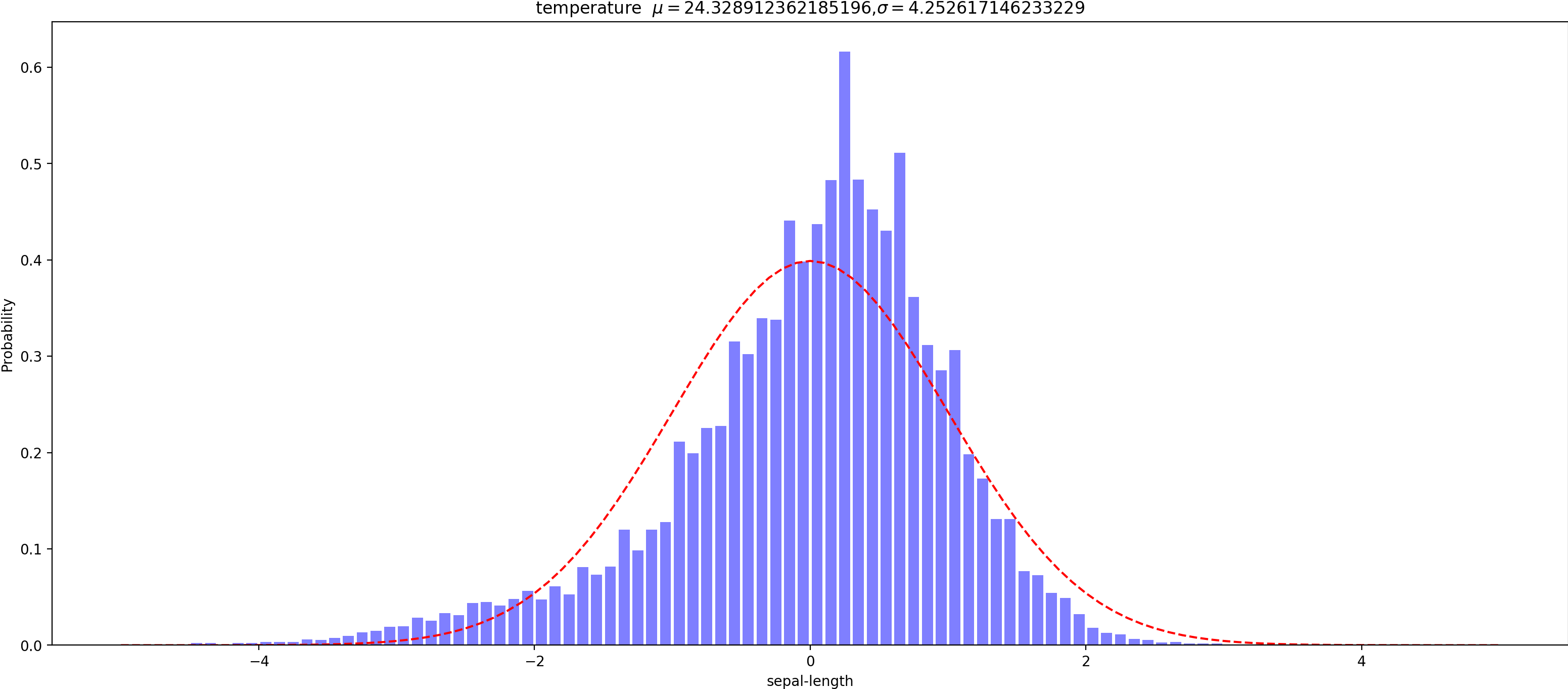
    def draw(self, name, data):
        mean = np.mean(data)  # 计算均值
        std = np.std(data)  # 计算方差
        data1 = [(x-mean)/std for x in data]  # z-score标准化方法(数据标准化)
        num_bins = 100  # 直方图柱子的数量
        plt.figure(figsize=(20, 8))
                            # data数据  num_bins柱子个数 range取值范围[-3.3] rwidth柱子宽度
        n, bins, patches = plt.hist(data1, num_bins, range=[-5, 5], rwidth=0.8, density=0.9, facecolor='blue', alpha=0.5)
        # 直方图函数,x为x轴的值,density=1表示为概率密度,即和为一,绿色方块,色深参数0.5.返回n个概率,直方块左边线的x值,及各个方块对象
        # print(bins)
        y = self.normfun(bins, np.mean(data1), np.std(data1))  # 拟合一条最佳正态分布曲线(方程)y  代替品 ——>>> from scipy.stats import norm  y = norm.pdf(bins, mu, sigma)
        plt.plot(bins, y, 'r--')  # 绘制y的曲线
        plt.xlabel('sepal-length')  # 绘制x轴
        plt.ylabel('Probability')  # 绘制y轴
        plt.title(r'{}  $\mu={}$,$\sigma={}$'.format(name, mean, std))  # 标题
        plt.subplots_adjust(left=0.15)  # 左边距

        out_file = 'out_pic/%s.png' % name
        plt.savefig(out_file, transparent=True, bbox_inches='tight', dpi=200, pad_inches=0.0, set_visiable=False,
                    format='png')
        print('画图完成 %s' % out_file)
        # plt.show()
| 属性 | 说明 | 类型 |
|---|---|---|
| x | 数据 | 数值类型 |
| bins | 条形数 | int |
| color | 颜色 | "r","g","y","c" |
| density | 是否以密度的形式显示 | bool |
| range | x轴的范围 | 数值元组(起,终) |
| bottom | y轴的起始位置 | 数值类型 |
| histtype | 线条的类型 | "bar":方形,"barstacked":柱形, "step":"未填充线条" "stepfilled":"填充线条" |
| align | 对齐方式 | "left":左,"mid":中间,"right":右 |
| orientation | orientation | "horizontal":水平,"vertical":垂直 |
| log | 单位是否以科学计术法 | bool |
参考:计算标准化 https://www.cnblogs.com/yahengwang/p/10634010.html


 浙公网安备 33010602011771号