


CSS 水波纹效果 动画
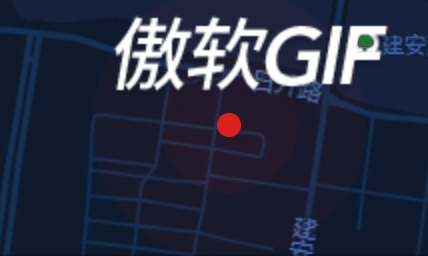
html
<div class="point"></div>
css

.point,.point::before,.point::after {
    position: absolute;/*必须设置*/

   margin-top: -22px;

  margin-left: 5px;
   width: 30px;height: 15px;
  border-radius: 50%;
  content: '';/*必须设置*/
}
.point::before {animation: scale 2s infinite;}
.point::after { animation: scale2 2s infinite;}


--设置背景颜色
.point::before,.point::after {    background: linear-gradient( rgba(60, 188, 179, 0) 2%,
        rgba(60, 188, 179, 0.4) 20%,rgba(60, 188, 179, 0.5) 40%,
        rgba(60, 188, 179, 0.6) 90%, rgba(60, 188, 179, 0.8) 95%, rgb(60, 188, 179) 100%);
}
.point {background-color: none !important;}
@keyframes scale {
    0% {transform: scale(1);opacity: .3}
    100% {transform: scale(1);opacity: 0;}
}
@keyframes scale2 {
    0% {transform: scale(1);opacity: .5;}
    100% {transform: scale(2);opacity: 0;}
}


【推荐】国内首个AI IDE,深度理解中文开发场景,立即下载体验Trae
【推荐】编程新体验,更懂你的AI,立即体验豆包MarsCode编程助手
【推荐】抖音旗下AI助手豆包,你的智能百科全书,全免费不限次数
【推荐】轻量又高性能的 SSH 工具 IShell:AI 加持,快人一步
· AI与.NET技术实操系列:基于图像分类模型对图像进行分类
· go语言实现终端里的倒计时
· 如何编写易于单元测试的代码
· 10年+ .NET Coder 心语,封装的思维:从隐藏、稳定开始理解其本质意义
· .NET Core 中如何实现缓存的预热?
· 分享一个免费、快速、无限量使用的满血 DeepSeek R1 模型,支持深度思考和联网搜索!
· 基于 Docker 搭建 FRP 内网穿透开源项目(很简单哒)
· ollama系列01:轻松3步本地部署deepseek,普通电脑可用
· 25岁的心里话
· 按钮权限的设计及实现
2019-08-10 js jquey 笔记