
ggplot在python中的使用(plotnine)
plt中的中文乱码解决:
plt.rcParams['font.sans-serif']=['SimHei'] #用来正常显示中文标签
plt.rcParams['axes.unicode_minus']=False #用来正常显示负号
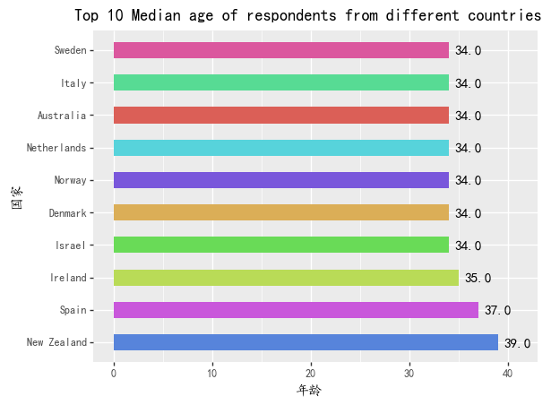
条形图:
注意中文乱码
from plotnine import *
import pandas as pd

median_age_dict={
    '国家': ['New Zealand','Spain','Ireland','Israel','Denmark','Norway','Netherlands','Australia','Italy','Sweden'],
    '年龄': [39.0, 37.0, 35.0, 34.0, 34.0, 34.0, 34.0, 34.0, 34.0, 34.0]
}
median_age=pd.DataFrame(median_age_dict)

(
#     fill以颜色区分
ggplot(median_age,aes(x='国家',y='年龄',fill='国家'))
#     条形图,需要stat指明统计量
    +geom_bar(stat='identity',width=0.5)
#     文本标签,nudge_y表示偏离量
    +geom_text(aes(x='国家',y='年龄',label='年龄'),nudge_y=2)
    +coord_flip()# 翻转x,y
#     排序条形图
    +xlim(median_age['国家'])
#     +xlim(median_age['Country'][::-1])逆序
#     隐藏图例,设置中文字体
    +theme(legend_position = 'none',text=element_text(family='KaiTi'))
#     加上标题
    +ggtitle('Top 10 Median age of respondents from different countries')
)
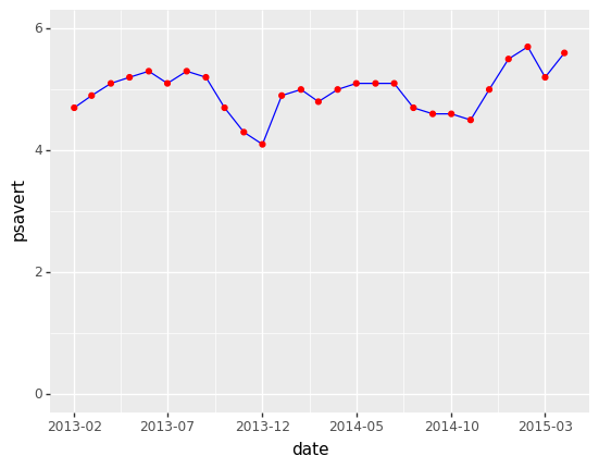
折线图:
这里我比较喜欢日期的间距设置
from plotnine.data import economics
save_rate = economics[economics['date']>'2013-01-01']
save_rate=save_rate.reset_index(drop=True)
(
ggplot(save_rate,aes(x='date',y='psavert'))
+ geom_line(color='blue')
+geom_point(color='red')
+ ylim(0,6)#y轴的范围
#     改变x坐标刻度间距
+ scale_x_date(breaks='5 months',date_labels='%Y-%m')
)