

flex布局的两个概念
flex container 和 flex items
flex container 设置 display:flex
flex items 设置 flex:1
flex 布局排列方向:
默认:
/* flex-direction的值的改变,会改变元素排列方式和对齐方式 */
flex-direction:row; // 默认排序方式,文字左对齐
flex-direction:row-reverse //水平从右向左排列,文字右对齐
flex-direction:column; // 垂直顺序排序,文字上对齐
flex-direction:column-reverse; // 垂直反向排列,文字下对齐
justify-content可以设置items的分布方式:
可取的值有:
jusitify-content:center //中间分布,之间没有空位
justify-content:space-around; 中间分布,直接有相同大小的空隙
justify-content:space-between; //向两边平均分布
justify-content:flex-end; // 如果flex-direction是row,那么就靠右,如果flex-direction:row-reverse,那么就靠左
justify-content:flex-start; // 如果flex-direction是row,靠左,如果flex-direction是row-reverse,靠右
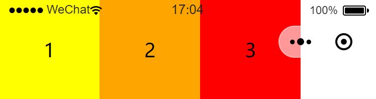
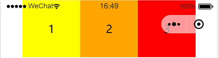
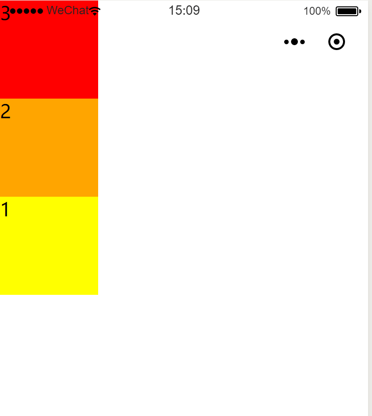
flex布局可以使用在微信小程序中:
例如:
<view></view>在小程序里相当于div
wxml文件
<view class='box yellow'>1</view>
  <view class='box orange'>2</view>
  <view class='box red'>3</view>
wcss

 .container{
   display: flex;
   flex-direction:column-reverse;
 }

 .box{
   width: 100px;
   height: 100px;

 }

 .red{
   background-color: red;
    flex: 1;
 }

  .yellow{
   background-color: yellow;
   flex: 1;
 }

   .orange{
   background-color: orange;
   flex: 1;
 }
效果如下
标签:
flex布局 微信小程序


【推荐】国内首个AI IDE,深度理解中文开发场景,立即下载体验Trae
【推荐】编程新体验,更懂你的AI,立即体验豆包MarsCode编程助手
【推荐】抖音旗下AI助手豆包,你的智能百科全书,全免费不限次数
【推荐】轻量又高性能的 SSH 工具 IShell:AI 加持,快人一步
· 基于Microsoft.Extensions.AI核心库实现RAG应用
· Linux系列:如何用heaptrack跟踪.NET程序的非托管内存泄露
· 开发者必知的日志记录最佳实践
· SQL Server 2025 AI相关能力初探
· Linux系列:如何用 C#调用 C方法造成内存泄露
· 无需6万激活码!GitHub神秘组织3小时极速复刻Manus,手把手教你使用OpenManus搭建本
· Manus爆火,是硬核还是营销?
· 终于写完轮子一部分:tcp代理 了,记录一下
· 别再用vector<bool>了!Google高级工程师:这可能是STL最大的设计失误
· 单元测试从入门到精通