
Unity_UGUI翻译(3)Visual Components
Visual Components(可视化组件)
There are new components and gameObjects that have been added with UI that allow for ease of creation and GUI specific functionality. This section will cover the basics of the new gameObjects that can be created.
在UI系统中添加了一些新的组件和游戏物体,它们的创建非常简单,而且也可以使用特定的GUI功能.在这一节中将介绍一些新添加的游戏物体的基本功能.
Text
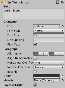
The Text component, which is also known as a Label, has a Text area for entering the text that will be displayed. It is possible to set the font, font style, font size and whether or not the text has rich text capability.
Text组件有一个文本输入区域,这里输入的文字可以被显示出来,它经常被作为标签使用.Text组件也可以设置字体,字体大小,或者是否选上Rich Text选项
There are options to set the alignment of the text, settings for horizontal and vertical overflow which control what happens if the text is larger than the width or height of the rectangle, and a Best Fit option that makes the text resize to fit the available space.
也可以设置文本的对齐方式,通过设置水平方向和垂直方向的对齐方式,可以控制当文本长度超过矩形框宽度和长度的时候,如何显示.Best Fit选项可以使得文本自动根据长度改变文字大小来适应Text组件空间.
Image
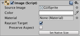
A Toggle has a Rect Transform component and an Image component. A sprite can be applied to the Image component under the Target Graphic field, and its colour can be set in the Color field. A material can also be applied to the Image component. The Image Type field defines how the applied sprite will appear, the options are:
Toggle(Image?)有Rect Transform组件和一个Image组件,精灵图片可以放置到Image组建的目标图像输入框(Source Image)中,同时也可以在色彩栏中选择要设置的颜色,一个材质球同样也可以放置到Image组件中,Image种类选择栏提供了几种不同的精灵图片显示方式,这些选项如下:
-
Simple - Scales the whole sprite equally.
- 按原图大小显示
-
Sliced - Utilises the 3x3 sprite division so that resizing does not distort corners and only the center part is stretched.
- Sliced-把精灵图片分割成3×3的方块,这样便于改变大小的时候,边角处不会受到改变,只有中间的部分会根据情况改变大小.
-
Tiled - Similar to Sliced, but tiles (repeats) the center part rather than stretching it. For sprites with no borders at all, the entire sprite is tiled.
- Tiled-和Sliced方式很像,只不过中间的部分采取的方式不是改变大小,而是不断重复.对于没有边框的精灵突变,整个图片就是Tiled的
-
Filled - Shows the sprite in the same way as Simple does except that it fills in the sprite from an origin in a defined direction, method and amount.
- Filed-和Simple采取同样的方式显示精灵图片,除了它可以定义图片开始显示时候的方向,方法,数量.
The option to Set Native Size, which is shown when Simple or Filled is selected, resets the image to the original sprite size.
当使用Simple和Filled方式时,Set Native Size(设为原始大小)选项,可以重置图片到原始的大小
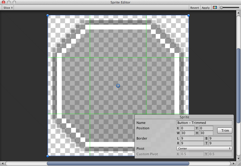
Images can be imported as UI sprites by selecting Sprite( 2D / UI) from the ‘Texture Type’ settings. Sprites have extra import settings compared to the old GUI sprites, the biggest difference is the addition of the sprite editor. The sprite editor provides the option of 9-slicing the image, this splits the image into 9 areas so that if the sprite is resized the corners are not stretched or distorted.
可以在图片的Texture Type将它设为Sprite(2D/UI),这样这个图片就可以被导入为UI精灵.这比之前老的GUI精灵有更多的导入设置,最大的不同是,新添加了一个精灵编辑器,他有一个九宫格选项,可以设置如果划分图片的9个区域,哪些是角落位置,哪些是中心位置,以便于在改变图片大小的时候,角落不会发生拉伸.
Raw Image(原始图片)
The Image component takes a sprite but Raw Image takes a texture (no borders etc). Raw Image should only be used if necessary otherwise Image will be suitable in the majority of cases.
Image组件需要一个精灵图片,但是原始图片需要的是一个纹理材质(texture),不过这样的纹理应该是无边框的.使用Raw Image是有必要,除非为图像会在大多数情况下适用
Mask
A Mask is not a visible UI control but rather a way to modify the appearance of a control’s child elements. The mask restricts (ie, “masks”) the child elements to the shape of the parent. So, if the child is larger than the parent then only the part of the child that fits within the parent will be visible.
Mask不是一个可见的UI控制器,而是用来控制UI子对象的大小显示.mask限制了子物体的大小只能限制在父物体里面,如果子物体比父物体大,那么只有在父物体中的那部分可以看到.
Effects
Visual components can also have various simple effects applied, such as a simple drop shadow or outline. See the Effects reference page for more information.
Effects reference pages中会详细介绍

 浙公网安备 33010602011771号