【Vue】vue中echarts的使用
在中间添加文字
option:{
  title: {
  // 图形标题(如果想要换行则使用ES6 `` 模板字符串)
  // 例如: `示例
  //   这里的文字会变为第二行(因为会保留格式)
  //  `
  text: '文字',
  left: "center",//对齐方式居中
  top: "45%",//距离顶部
  textStyle: {//文字配置
    color: "rgb(50,197,233)",//文字颜色
    fontSize: 15,//字号
    align: "center"//对齐方式
    }
  }
}
柱状图柱子值太小点不上可点击所在列
option={
  tooltip: {
            trigger: 'axis',
            formatter: function (params) {
              _params = params
            }
          }
}
// 点击柱状图显示对应的信息
// 在添加点击事件之前一定要解绑上一次的事件
        this.zzt.myChart.getZr().off('click')
        this.zzt.myChart.getZr().on('click', params => {
          const pointInPixel = [params.offsetX, params.offsetY]
          if (this.zzt.myChart.containPixel('grid', pointInPixel)) {
            // 执行代码
            console.log(_params)
          }
        })
实现动态数据渲染
// data中添加饼状图的信息对象
bingtu1: {
        myChart: null,
        option: null,
        data: []
      },
// 在watch中监视data数据
    'bingtu1.data': {
      deep: true,
      handler(newval, oldval) {
        // eslint-disable-next-line no-var
        setTimeout(() => {
          this.bingtu1.myChart = echarts.init(
            document.querySelector('.jiegoubottom1 .tubiao1')
          )

          // eslint-disable-next-line no-var
          this.bingtu1.option = {
            color: ['#008cfe', '#FF8A5B', '#00CEFE'],
            series: [
              {
                center: ['30%', '50%'],
                type: 'pie',
                color: ['#eef5ff'],
                radius: ['40%', '0%'],
                avoidLabelOverlap: false,
                label: {
                  normal: {
                    show: true,
                    position: 'center',
                    formatter: '{active|总计}' + '\n\r' + '{total|' + this.list.length + '}',
                    rich: {
                      total: {
                        fontSize: 25,
                        // 字体加黑
                        fontWeight: 'bold',
                        fontFamily: '微软雅黑',
                        color: '#454c5c'
                      },
                      active: {
                        fontFamily: '微软雅黑',
                        fontSize: 15,
                        color: '#6c7a89',
                        lineHeight: 30
                      }
                    }
                  },
                  emphasis: {
                    // 中间文字显示
                    show: true
                  }
                },
                lableLine: {
                  normal: {
                    show: false
                  },
                  emphasis: {
                    show: true
                  },
                  tooltip: {
                    show: false
                  }
                },
                data: [{ value: 484, name: 'Union Ads' }]
              },
              {
                name: 'Access From',
                center: ['30%', '50%'],
                type: 'pie',

                radius: ['50%', '70%'],
                avoidLabelOverlap: true,
                itemStyle: {
                  borderRadius: 0,
                  borderColor: '#fff',
                  borderWidth: 2
                },

                label: {
                  show: false,
                  position: 'center'
                },
                labelLine: {
                  show: true
                },
                data: newval
              }
            ]
          }
          this.bingtu1.myChart.setOption(this.bingtu1.option)
        }, 200)
      }
    },
图表标签lable的大小位置
// 也可以在data中单独定义
label: {
        show: true,
        fontSize: 13,
        formatter: '{b} : {c} ({d}%)' //标签显示百分比 类型+百分比
        },
labelLine: {
     show: true
            },
// data中定义时可以自定义当前标签的位置
data:[{
              value: 54,
              name: '24.75%',
              labelLine: {
                show: true,
                length: 80,
                length2: -70
              },{
              value: 54,
              name: '24.75%',
              labelLine: {
                show: true,
                length: 80,
                length2: -70
              },{
              value: 54,
              name: '24.75%',
              labelLine: {
                show: true,
                length: 80,
                length2: -70
              }]
echarts自定义图标图例文字
如果为单图例
使用字符串模板,模板变量为图例名称 {name}
formatter: 'Legend {name}'
或者使用回调函数
formatter: function (name) {
return 'Legend ' + name;
}
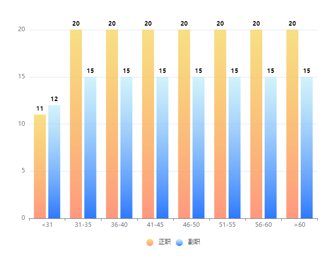
如果是柱状图,并且为双图例
则使用
formatter: function(name){
if(name==='zhengzhi'){
return '正职'
}
if(name==='fuzhi'){
return '副职'
}
},
name为 dataset中给定的name值