
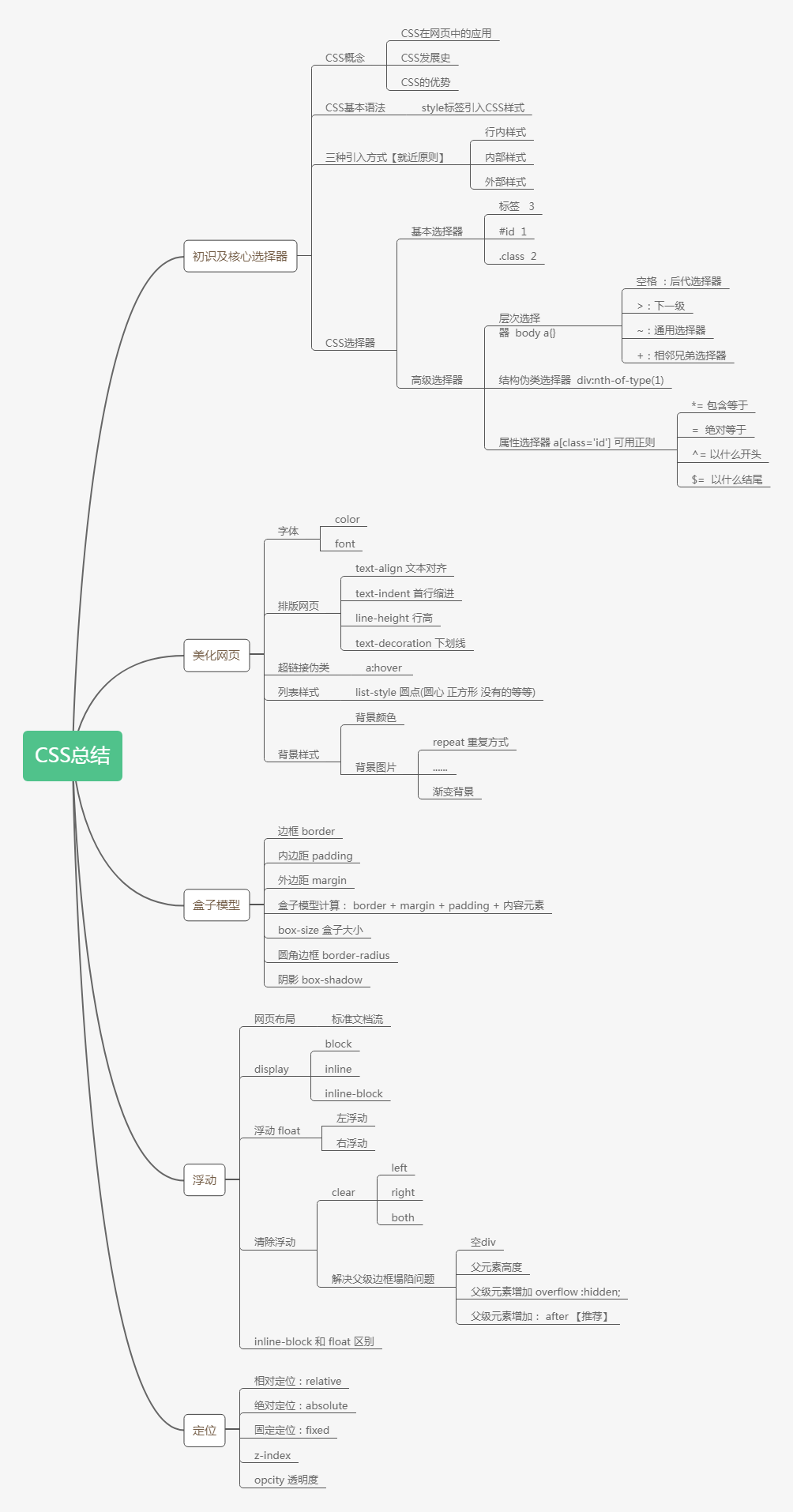
CSS入门
CSS入门
HTML + CSS + JavaScript
结构 + 表现 + 交互
1.如何学习
1、CSS是什么
2、CSS怎么用(快速入门)
3、CSS选择器【重点+难点】
4、美化网页(文字,阴影,超链接,列表,渐变...)
5、盒子模型
6、浮动
7、定位
8、网页动画(特效,推荐网站:W3Cshcool 菜鸟教程 )
1.1什么是CSS
Cascading Style Sheet 层叠级联样式表
CSS:表现层---》美化网页
字体、颜色、边距、高度、宽度、背景图片、网页定位、网页浮动
1.2发展史
CSS1.0
CSS2.0:div【块】+css HTML与CSS结构分离的思想,网页变得简单SEO【搜索引擎】
CSS2.1:浮动、定位
CSS3.0:圆角,阴影,动画...【浏览器兼容性问题~】
1.3快速入门
示例1:
<!DOCTYPE html>
<html lang="en">
<head>
<meta charset="UTF-8">
<title>Title</title>
<!-- 规范 可以编写css代码,每一个声明最好使用分号结尾
语法:
选择器{
声明1;
声明2;
声明3;
}
-->
<style>
h1{
color:red;
}
</style>
</head>
<body>
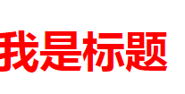
<h1>我是标题</h1>
</body>
</html>
示例2:建议用此规范
index.html
<!DOCTYPE html>
<html lang="en">
<head>
    <meta charset="UTF-8">
    <title>Title</title>

<!--    规范 可以编写css代码,每一个声明最好使用分号结尾
    语法:
        选择器{
            声明1;
            声明2;
            声明3;
        }
-->
    <link rel="stylesheet" href="css/style.css">
</head>
<body>
<h1>我是标题</h1>
</body>
</html>
style.css
h1{
     color:red;
   }
CSS的优势
- 内容和表现分离
- 网页结构表现统一,可以实现复用
- 样式十分的丰富
- 建议使用独立于html的css文件
- 利于SEO,容易被搜索引擎收录
1.4CSS的三种导入方式
- 行内样式 内部样式 外部样式
<!DOCTYPE html>
<html lang="en">
<head>
    <meta charset="UTF-8">
    <title>Title</title>

<!--    内部样式-->
    <style>
        h1{
        color: green;
        }
    </style>
    <link rel="stylesheet" href="css/style.css">
</head>
<body>

<!--优先级:【就近原则】-->
<!--行内样式 在标签元素中 编写一个style属性 编写样式即可 多个用分号分隔-->
<h1 style="color:red;">我是标题</h1>
</body>
</html>
拓展:外部样式两种写法
-
link 链接式
html
<link rel="stylesheet" href="css/style.css">
-
导入式 @import
@import 是CSS2.1特有的
<!DOCTYPE html>
<html lang="en">
<head>
    <meta charset="UTF-8">
    <title>Title</title>
<!--导入式 CSS2.1 弊端:网页比较大的时候先展示结构 再去渲染-->
    <style>
        @import url("css/style.css");
    </style>

</head>
<body>
<h1>summer</h1>
</body>
</html>
2.选择器
作用:选择页面上的某一个或者某一类元素
2.1基本选择器
- 标签选择器 : 选择一类标签 格式:标签{}
<!DOCTYPE html>
<html lang="en">
<head>
<meta charset="UTF-8">
<title>Title</title>
<style>
/*标签选择器,会选择到页面上所有的这个标签的元素*/
h1{
color: red;
background: wheat;
border-radius: 24px;
}
p{
font-size:80px;
}
</style>
</head>
<body>
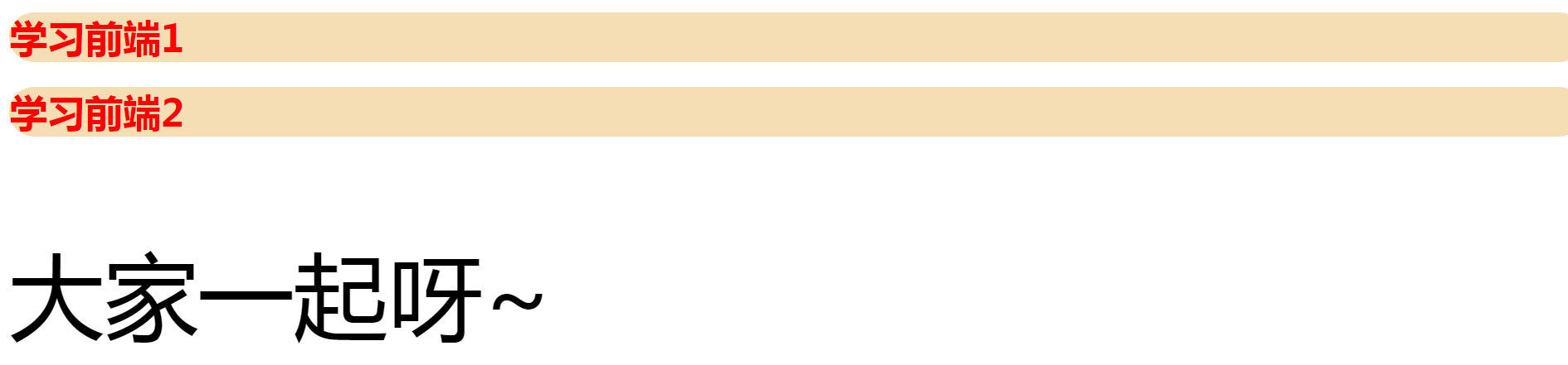
<h1>学习前端1</h1>
<h1>学习前端2</h1>
<p>大家一起呀~</p>
</body>
</html>
- 类选择器 class : 选择所有class属性一致的标签,跨标签 格式:.类名{}
<!DOCTYPE html>
<html lang="en">
<head>
<meta charset="UTF-8">
<title>Title</title>
<style>
/*类选择器的格式 .class的名称{}
好处:可以多个标签归类 是同一个class 可以复用
*/
.summer{
color: #3748ff;
}
.winter{
color: #a24fff;
}
</style>
</head>
<body>
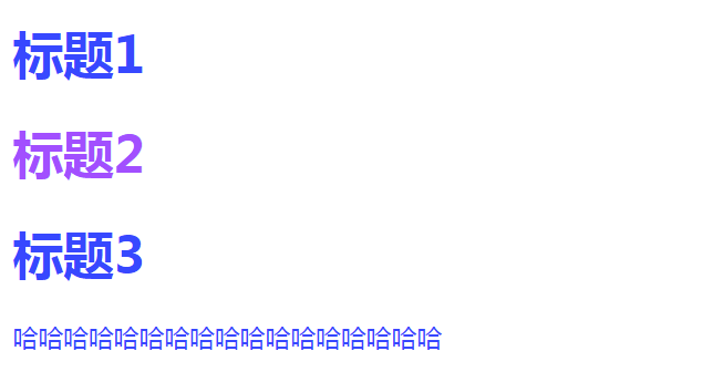
<h1 class="summer">标题1</h1>
<h1 class="winter">标题2</h1>
<h1 class="summer">标题3</h1>
<p class="summer">哈哈哈哈哈哈哈哈哈哈哈哈哈哈哈哈哈</p>
</body>
</html>
- id选择器:全局唯一 格式:.id名{}
<!DOCTYPE html>
<html lang="en">
<head>
    <meta charset="UTF-8">
    <title>Title</title>

    <style>
    /* id选择器
        #id名称{}  id 必须全局唯一

        不遵循就近原则,固定的
        优先级: id选择器  > 类选择器 > 标签选择器
    */
        #summer{
        color: #145fff;
        }
        .summer{
        color: #f0090a;
        }
        h1{
        color: red;
       }
    </style>
</head>
<body>
<h1 id="summer">标题1</h1>
<h1 class="summer">标题2</h1>
<h1 class="summer">标题3</h1>
<h1>标题4</h1>
<h1>标题5</h1>
<h1>标题6</h1>

</body>
</html>
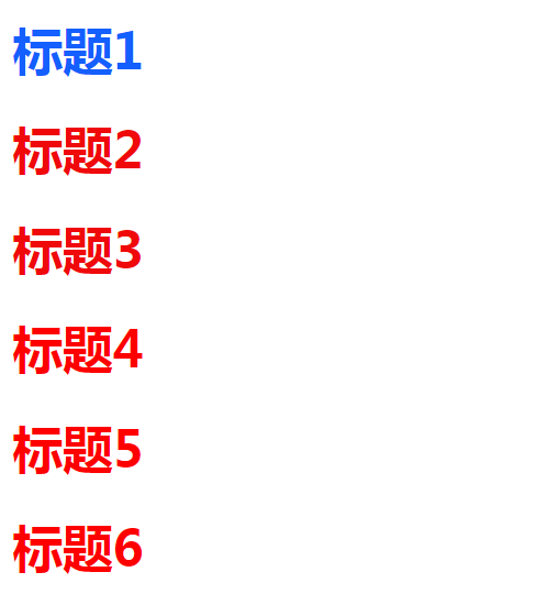
优先级:id>class>标签
2.2层次选择器
<body>
<p>p0</p>
<p class="active">p1</p>
<p>p2</p>
<p>p3</p>
<ul>
    <li>
        <p>p4</p>
    </li>
    <li>
        <p>p5</p>
    </li>
    <li>
        <p>p6</p>
    </li>
</ul>
<p>p3</p>
</body>
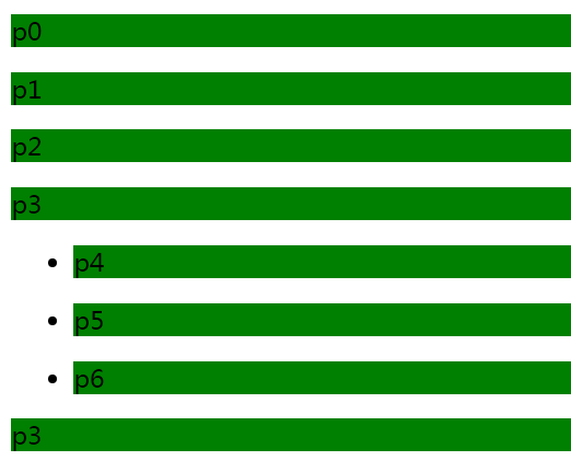
- 后代选择器:在某个元素的后面 e.g. 祖爷爷--爷爷--爸爸--你 【后代全变】
		/*后代选择器*/
        body p{
         background: green;
        }
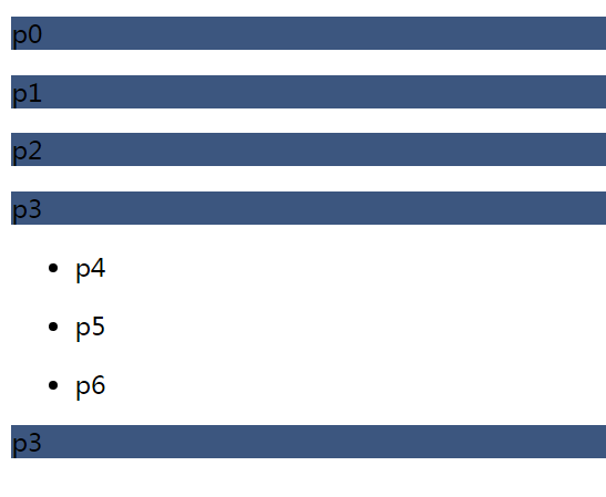
- 子选择器 一代 儿子【只选择当前下面的一代】
        /*子选择器*/
        body>p{
         background: #3c567f;
        }
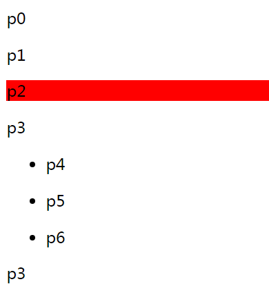
- 相邻兄弟选择器【同辈向下选一个】
        /*兄弟选择器 只有一个向下延伸*/
        .active + p{
            background: red;
        }
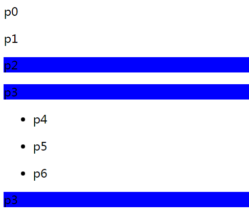
- 通用选择器【同辈向下选择所有】
        /*通用选择器 当前选中的元素向下的所有元素*/
        .active~p{
            background: blue;
        }
2.3结构伪类选择器
伪类:【 所有带:冒号的】
        /*ul的第一个子元素*/
        ul li:first-child{
        background:red;
        }
        /*ul的最后一个子元素*/
        ul li:last-child{
        background:red;
        }

        /*选中p1:定位到父元素,选择当前的第一个元素
        选择当前p元素的父级元素,选中父级元素的第一个,并且是当前元素才生效 顺序*/
        p:nth-child(1){
        background:yellow;
        }

         /*
        选择当前p元素的父级元素,选中父级P元素的第一个 类型*/
        p:nth-of-type(1){
        background:yellow;
        }
2.4属性选择器【常用】
<!DOCTYPE html>
<html lang="en">
<head>
    <meta charset="UTF-8">
    <title>Title</title>

    <style>
        .demo a{
         float: left;
         display: block; /*display 为block变为块局元素*/
         height: 50px;  /*高度*/
         width: 50px;  /*宽度*/
         border-radius: 10px; /*圆角边框*/
         background: blue; /*背景颜色*/
         text-align: center; /*文本左右对齐*/
         color: gainsboro;  /*文字变为灰色*/
         text-decoration: none;  /*去掉链接的下划线*/
         margin-right: 5px;  /*每个元素向右偏移5个像素*/
         font: bold 20px/50px Arial;  /* font 属性可以放在一行 粗体 字体大小/行高 字体*/
        }

        /*存在id属性的元素   a[]{} []---填写的内容--》属性名、属性名=属性值(属性值可以正则)  */
        a[id]{
        background: yellow;
        }
        a[id=first]{
        background: green;
        }

        /*class 中有links的元素
          = 是绝对等于
          *= 是包含这个元素
          */
        a[class*=links]{
        background: yellow;
        }

         /*选中href 中以http开头的元素
          */
          a[href^=http]{
          background: red;
          }

          /*选中href 中以doc开头的元素
          */
          a[href$=doc]{
          background: blue;
          }
    </style>

</head>
<body>
<p class="demo">
    <a href="http://www.baidu.com" class="links item first" id="first">1</a>
    <a href="" class="links item active" target="_blank" title="test">2</a>
    <a href="images/123.html" class="links item">3</a>
    <a href="images/123.png" class="links item">4</a>
    <a href="images/123.jpg" class="links item">5</a>
    <a href="abc" class="links item">6</a>
    <a href="/a.pdf" class="links item">7</a>
    <a href="/abc.pdf" class="links item">8</a>
    <a href="abc.doc" class="links item">9</a>
    <a href="abcd.doc" class="links item last">10</a>

</p>
</body>
</html>
总结正则
=   绝对等于
*=  包含等于
^=  以什么开头
$=  以什么结尾
CSS、JS、JQuery、vue会用选择器!
3.美化网页元素
3.1为什么美化页面
- 有效的传递网页信息
- 美化网页,页面漂亮,才能吸引用户
- 凸显页面的主题
- 提高用户体验
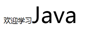
span标签
def:重点要突出的字,使用span套起来
<!DOCTYPE html>
<html lang="en">
<head>
    <meta charset="UTF-8">
    <title>Title</title>

    <style>
        #title{
        font-size: 50px;
        }
    </style>
</head>
<body>
欢迎学习<span id="title">Java</span>
</body>
</html>
3.2字体样式
<!DOCTYPE html>
<html lang="en">
<head>
<meta charset="UTF-8">
<title>Title</title>
<!--
font-family: 字体
font-size :字体大小
font-weight: bold;字体变粗
color: red; 字体颜色
-->
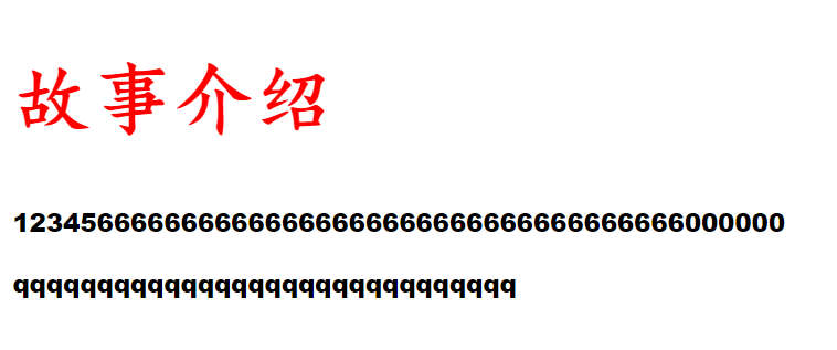
<style>
body{
font-family: "Arial Black", 楷体;
}
h1{
font-size: 50px;
color: red;
}
.p1{
font-weight: bold;
}
</style>
</head>
<body>
<h1>故事介绍</h1>
<p class="p1"> 1234566666666666666666666666666666666666000000</p>
<p> qqqqqqqqqqqqqqqqqqqqqqqqqqqqqq</p>
</body>
</html>
<!--    颜色:单词RGB 0~F
                RGBA  A:透明度 0~1
                rgb(0,255,255)
                rgba(0.255,255,0.5)

                 text-align: center;排版 左右居中
                 text-indent: 2em;  搜行缩进两个单词

            height: 300px;  行高和块高度一致 就可以上下居中
            line-height: 300px;

            text-decoration: underline;         下划线
            text-decoration: line-through;      中划线
            text-decoration: overLine;          上划线
                -->
3.3文本样式
-
颜色
-
文本对齐方式
-
首行缩进
-
行高
-
装饰【下划线...】
text-decoration: underline; 下划线
text-decoration: line-through; 中划线
text-decoration: overLine; 上划线 text-decoration: none; 去下划线
-
文本图片水平居中
vertical-align: middle;
<!DOCTYPE html>
<html lang="en">
<head>
<meta charset="UTF-8">
<title>Title</title>
<!--
font-family: 字体
font-size :字体大小
font-weight: bold;字体变粗
color: red; 字体颜色
-->
<!-- 颜色:单词RGB 0~F
RGBA A:透明度 0~1
rgb(0,255,255)
rgba(0.255,255,0.5)
text-align: center;排版 左右居中
text-indent: 2em; 搜行缩进两个单词
height: 300px; 行高和块高度一致 就可以上下居中
line-height: 300px;
text-decoration: underline; 下划线
text-decoration: line-through; 中划线
text-decoration: overLine; 上划线
-->
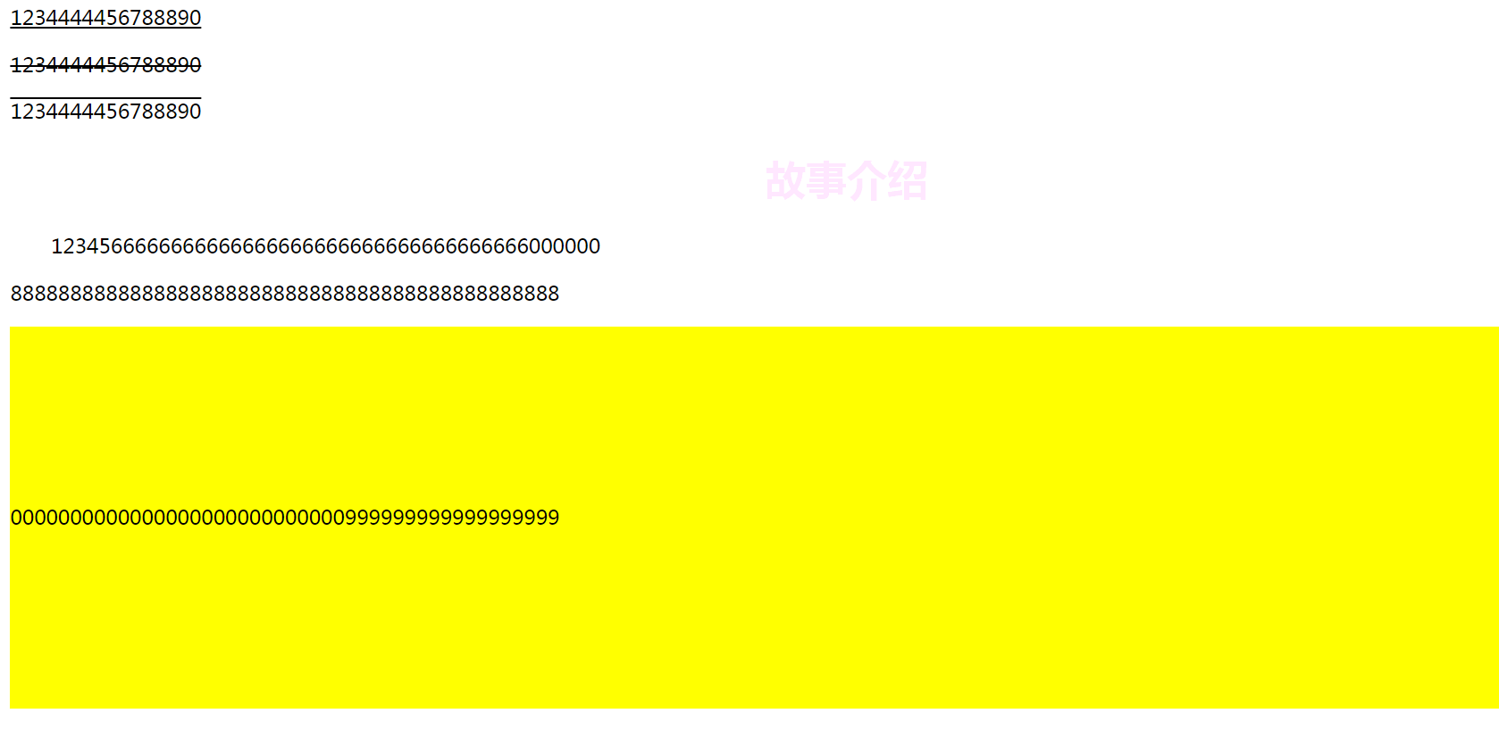
<style>
h1{
color: rgba(255,0,255,0.1);
text-align: center;
}
.p1{
text-indent: 2em;
}
.p3{
background: yellow;
height: 300px;
line-height: 300px;
}
/*下划线*/
.l1{
text-decoration: underline;
}
/*中划线*/
.l2{
text-decoration: line-through;
}
/*上划线*/
.l3{
text-decoration: overLine;
}
img,span{
vertical-align: middle;
}
</style>
</head>
<body>
<p class="l1">1234444456788890</p>
<p class="l2">1234444456788890</p>
<p class="l3">1234444456788890</p>
<h1>故事介绍</h1>
<p class="p1"> 1234566666666666666666666666666666666666000000</p>
<p>8888888888888888888888888888888888888888888888</p>
<p class="p3">0000000000000000000000000000999999999999999999</p>
<p>
<img src="image/1.png" alt="">
<span>百度一下</span>
</p>
</body>
</html>
3.4阴影
 /* text-shadow: yellow 10px 10px 10px;
                阴影  阴影颜色  水平偏移 阴影半径*/
    #price{
        text-shadow: yellow 10px 10px 10px;
    }
3.5超链接伪类
正常情况下用 a a:hover
  /*鼠标按住未释放的状态*/
    a:active{
     color: green;
    }
示例
<!DOCTYPE html>
<html lang="en">
<head>
<meta charset="UTF-8">
<title>Title</title>
</head>
<style>
/*默认的颜色 并且去掉超链接下划线*/
a{
text-decoration: none;
color: black;
}
/*鼠标悬浮状态【记住常用】*/
a:hover{
color: orange; /*变橙色*/
font-size: 50px; /*字体方大*/
}
/*鼠标按住未释放的状态*/
a:active{
color: green;
}
/*a:link a:visited 自己去看看*/
/* text-shadow: yellow 10px 10px 10px;
阴影 阴影颜色 水平偏移 阴影半径*/
#price{
text-shadow: yellow 10px 10px 10px;
}
</style>
<body>
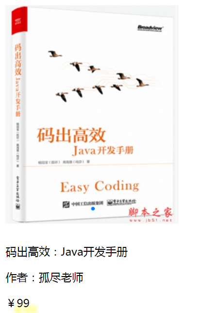
<a href="#">
<img src="images/a.png" alt="">
</a>
<p>
<a href="#">码出高效:Java开发手册</a>
</p>
<p>
<a href="">作者:孤尽老师</a>
</p>
<p id="price">
¥99
</p>
</body>
</html>
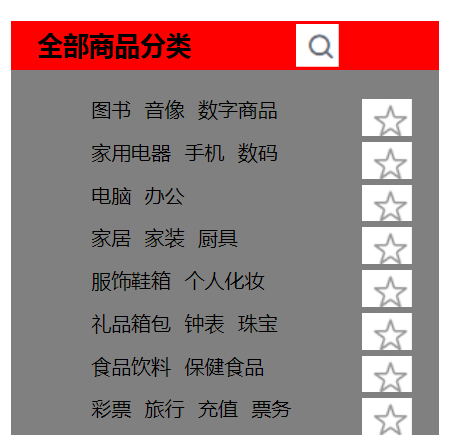
3.6 列表
html
<!DOCTYPE html>
<html lang="en">
<head>
<meta charset="UTF-8">
<title>Title</title>
<link rel="stylesheet" href="css/style.css">
</head>
<body>
<div id="nav">
<h2 class="title">全部商品分类</h2>
<ul>
<li><a href="#">图书</a> <a href="#">音像</a> <a href="#">数字商品</a></li>
<li><a href="#">家用电器</a> <a href="#">手机</a> <a href="#">数码</a></li>
<li><a href="#">电脑</a> <a href="#">办公</a></li>
<li><a href="#">家居</a> <a href="#">家装</a> <a href="#">厨具</a></li>
<li><a href="#">服饰鞋箱</a> <a href="#">个人化妆</a></li>
<li><a href="#">礼品箱包</a> <a href="#">钟表</a> <a href="#">珠宝</a></li>
<li><a href="#">食品饮料</a> <a href="#">保健食品</a></li>
<li><a href="#">彩票</a> <a href="#">旅行</a> <a href="#">充值</a> <a href="#">票务</a></li>
</ul>
</div>
</body>
</html>
css
#nav{
   width: 300px;
   background: gray;
}

.title{
    font-size: 18px;
    font-weight: bold;
    text-indent: 1em;
    line-height: 35px;
    background: red;
}
/*ul li
    list-style:
                none;去掉原点
                circle;空心圆
                decimal 数字
                square 正方形
*/
ul{
    background: gray;
}

ul li{
    height: 30px; /*行高*/
    list-style: none;
    text-indent: 1em;
}

a{
    text-decoration:none;
    font-size: 14px;
    color: black;
}

a:hover{
    color: orange;
    text-decoration:underline;
}
)
3.7 背景
背景颜色
背景图片
<!DOCTYPE html>
<html lang="en">
<head>
    <meta charset="UTF-8">
    <title>Title</title>

    <style>
        div{
        width: 1000px;
        height: 200px;
        border: 1px solid red;/* 边框粗细 边框样式solid代表实线 边框的颜色*/
        background-image: url("images/a.png"); /* 默认是全部平铺的*/
        }
        .div1{
        background-repeat: repeat-x;/* 水平平铺*/
        }
        .div2{
        background-repeat: repeat-y;/* 竖直平铺*/
        }
        .div3{
        background-repeat: no-repeat;/* 不平铺*/
        }
    </style>

</head>
<body>
<div class="div1"></div>
<div class="div2"></div>
<div class="div3"></div>

</body>
</html>
#nav{
   width: 300px;
   background: gray;
}

.title{
    font-size: 18px;
    font-weight: bold;
    text-indent: 1em;
    line-height: 35px;
    /* 颜色 图片 图片位置 平铺方式 */
    background: red url("../images/b.png") 200px 2px no-repeat;
}
/*ul li
    list-style:
                none;去掉原点
                circle;空心圆
                decimal 数字
                square 正方形
*/
ul{
    background: gray;

}

ul li{
    height: 30px; /*行高*/
    list-style: none;
    text-indent: 1em;
    background-image: url("../images/c.png");
    background-repeat: no-repeat;
    background-position: 206px 4px;
}

a{
    text-decoration:none;
    font-size: 14px;
    color: black;
}

a:hover{
    color: orange;
    text-decoration:underline;
}
渐变:网站css
<!DOCTYPE html>
<html lang="en">
<head>
    <meta charset="UTF-8">
    <title>Title</title>
</head>

<!--径向渐变 还有就是圆形渐变-->
<style>
    body{
        background-color: #4158D0;
        background-image: linear-gradient(160deg, #4158D0 0%, #C850C0 46%, #FFCC70 100%);

    }
</style>
<body>

</body>
</html>
4.盒子模型
4.1 什么是盒子模型
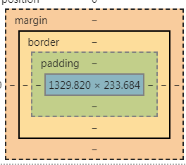
- margin:外边距
- padding:内边距
- border:边框
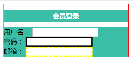
4.2 边框border/border-
- 边框的粗细 xxx px
- 边框的样式 solid实线 dashed虚线
- 边框的颜色
<!DOCTYPE html>
<html lang="en">
<head>
<meta charset="UTF-8">
<title>Title</title>
<style>
/*body 总有一个默认的外边距8 margin: 0*/
/* 规范:
h1,ul,li,a,body {
padding: 0;
margin: 0;
text-decoration: none;
}
*/
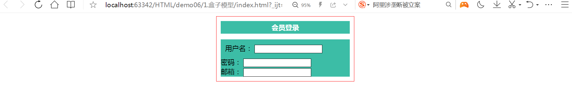
#box{
width: 300px;
border: 1px solid red;/*粗细 样式 颜色*/
}
h2{
font-size:16px;
background-color:#3cbda6;
line-height: 30px;
color: white;
text-align: center;
}
form{
background: #3cbda6;
}
div:nth-of-type(2) input{
border: 3px solid black; /*实线*/
}
div:nth-of-type(3) input{
border: 3px dashed yellow; /*虚线*/
}
</style>
</head>
<body>
<div id="box">
<h2>会员登录</h2>
<form action="#">
<div>
<span>用户名:</span>
<input type="text">
</div>
<div>
<span>密码:</span>
<input type="text">
</div>
<div>
<span>邮箱:</span>
<input type="text">
</div>
</form>
</div>
</body>
</html>
4.3 外边距margin/ 内边距padding
- 外边的作用 居中元素
margin : 上 左 下 右
<!DOCTYPE html>
<html lang="en">
<head>
    <meta charset="UTF-8">
    <title>Title</title>

    <style>
    /*body 总有一个默认的外边距8  margin: 0*/
    /*  规范:
     h1,ul,li,a,body {
             padding: 0;
             margin: 0;
             text-decoration: none;
         }
    */

        #box{
            width: 300px;
            border: 1px solid red;/*粗细 样式 颜色*/
            margin: 0 auto;
        }
        /*
         margin-top: 0; 上下左右
         margin-top: 0 1px;  上下   左右
         margin-top: 0 1px 2px 3px;  上 左  下 右
        */
        h2{
            font-size:16px;
            background-color:#3cbda6;
            line-height: 30px;
            color: white;
            text-align: center;
            margin-top: 0;
        }

        form{
         background: #3cbda6;
        }
        input{
            border: 1px solid black;

        }
        div:nth-of-type(1){
        padding:10px;
        }
    </style>

</head>
<body>

<div id="box">
    <h2>会员登录</h2>

    <form action="#">
        <div>
            <span>用户名:</span>
            <input type="text">
        </div>
        <div>
            <span>密码:</span>
            <input type="text">
        </div>
        <div>
            <span>邮箱:</span>
            <input type="text">
        </div>
    </form>
</div>

</body>
</html>
- 盒子的计算方式:你这个元素多大??
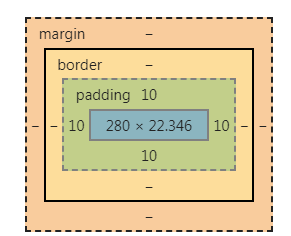
margin + border + padding +内容宽度
50*50 【所有的 自己规划】
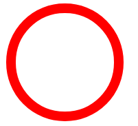
4.4 圆角边框
四个角
<!DOCTYPE html>
<html lang="en">
<head>
    <meta charset="UTF-8">
    <title>Title</title>
<!--   左上 右上 右下 左下 顺时针
        圆形:半径

 -->
    <style>
        div{
            width: 100px;
            height: 100px;
            border: 10px solid red;
            border-radius: 100px;/*左上 右上 右下 左下 顺时针*/
        }
    </style>
</head>
<body>
<div>
</div>
</body>
</html>
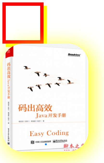
4.5 阴影
<!DOCTYPE html>
<html lang="en">
<head>
    <meta charset="UTF-8">
    <title>Title</title>

<!--    margin: 0 auto; 居中
        要求: 块元素 块元素有固定的宽度
-->
    <style>
        div{
        width: 100px;
        height: 100px;
        border: 10px solid red;
        box-shadow: 10px 10px 1px yellow;/*盒子阴影*/
        }
        img{
        border-radius: 60px;
        box-shadow: 10px 10px 100px yellow;
        }
    </style>
</head>
<body>
<div ></div>
<img src="images/a.png" alt="">

</body>
</html>
5 浮动
5.1 标准文档流
-
块级元素:独占一行
h1-h6 p div 列表... -
行内元素:不独占一行
span a img strong... -
行内元素可以被块块级元素中,反之 则不可以
5.2 display
<!DOCTYPE html>
<html lang="en">
<head>
    <meta charset="UTF-8">
    <title>Title</title>

<!--
        display:
      block  块元素
      inline 行内元素
      inline-block 是块元素 ,但是可以内联 在一行
      none  去掉
-->
    <style>
        div{
            width:100px;
            height: 100px;
            border: 1px solid red;
            display: inline-block;
        }
        span{
             width:100px;
            height: 100px;
            border: 1px solid red;
            display: none;
        }
    </style>
</head>
<body>
<div>div块元素</div>
<span>span行内元素</span>
</body>
</html>
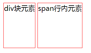
这个也是一种实现行内元素排列的方式,但是我们很多情况都是用float
5.3 float
左右浮动 float
css:
div{
    margin: 10px;
    padding: 5px;
}
#father{
    border: 1px solid red;
}
.layer01{
    border: 1px blue dashed;
     display: inline-block;
     float: right;
}
.layer02{
    border: 1px yellow dashed;
     display: inline-block;
     float: right;/*浮动是飘起来的!!*/
}
.layer03{
    border: 1px red dashed;
     display: inline-block;
     float: right;
      clear: both;
}
.layer04{
    border: 1px black dashed;
    font-weight: bold;
    font-size: 25px;
    line-height: 23px;
     display: inline-block;
     float: right;
     clear: both;/*清楚浮动*/
}
html
<!DOCTYPE html>
<html lang="en">
<head>
<meta charset="UTF-8">
<title>Title</title>
<link rel="stylesheet" href="css/style.css">
</head>
<body>
<div id="father">
<div class="layer01"><img src="images/1.png" alt=""></div>
<div class="layer02"><img src="images/2.png" alt=""></div>
<div class="layer03"><img src="images/3.png" alt=""></div>
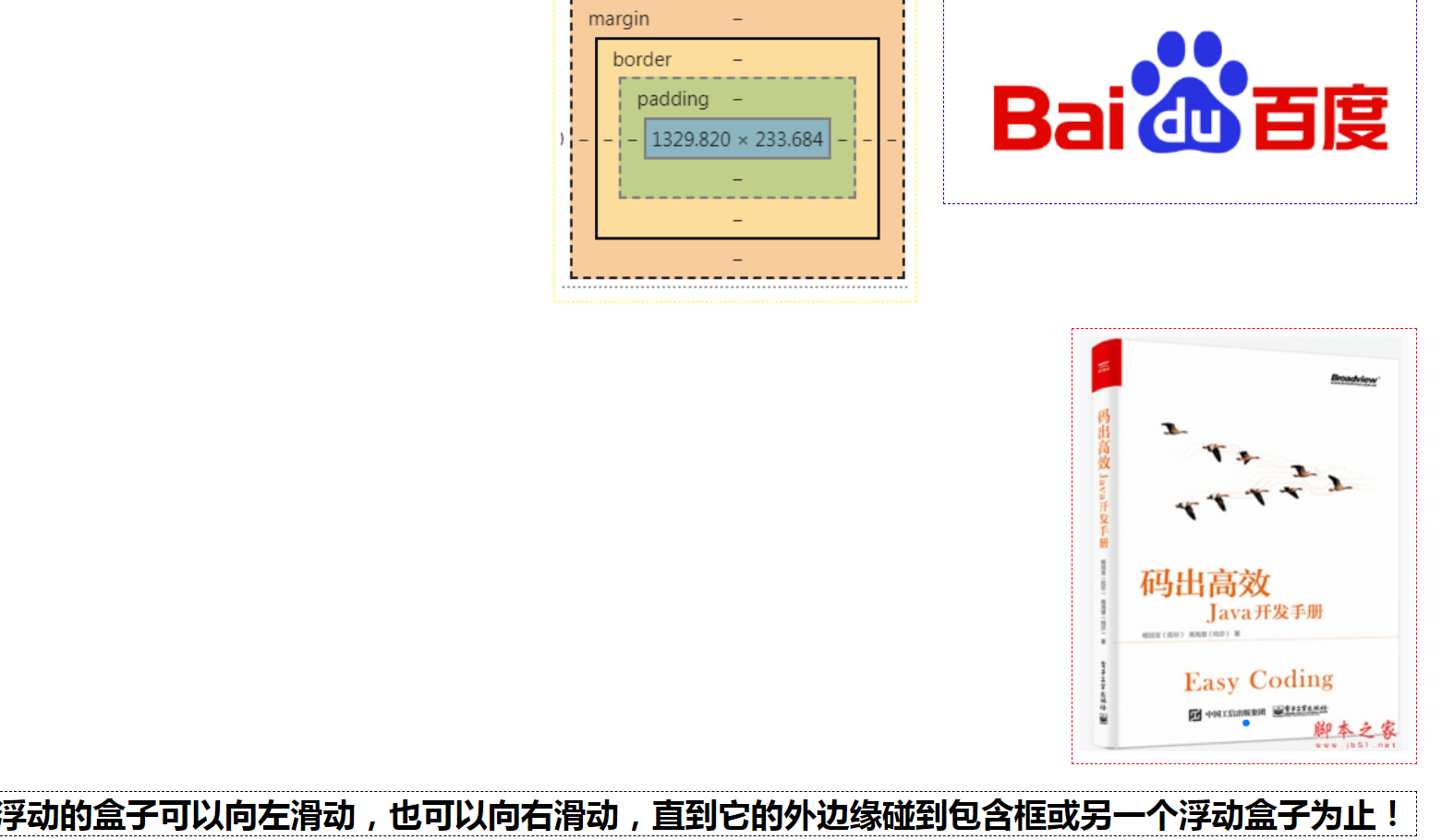
<div class="layer04">
浮动的盒子可以向左滑动,也可以向右滑动,直到它的外边缘碰到包含框或另一个浮动盒子为止!
</div>
</div>
</body>
</html>
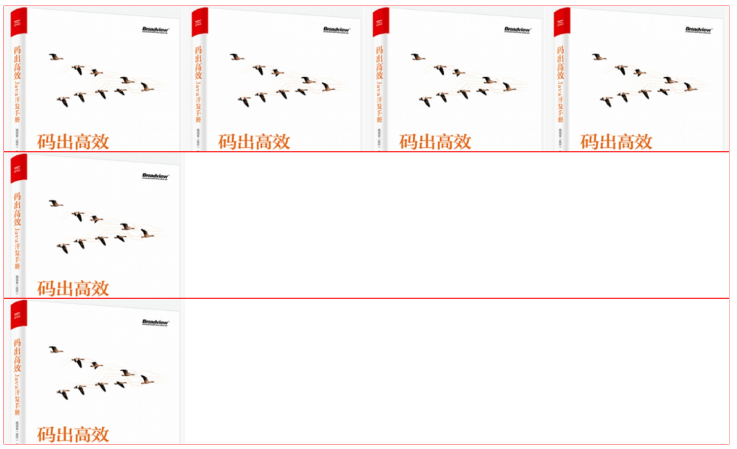
5.4 父级边框塌陷的问题
/*  clear: right; 右侧不允许有浮动元素
    clear: left; 右侧不允许有浮动元素
    clear: both; 两侧不允许有浮动元素
    clear: both;
*/
解决方案:
1、增加父级元素的高度~
.layer01{
    border: 1px blue dashed;
     display: inline-block;
     float: right;
}
2、增加一个空的div标签 清除浮动
<!DOCTYPE html>
<html lang="en">
<head>
    <meta charset="UTF-8">
    <title>Title</title>

    <link rel="stylesheet" href="css/style.css">
</head>
<body>
<div id="father">
    <div class="layer01"><img src="images/1.png" alt=""></div>
    <div class="layer02"><img src="images/2.png" alt=""></div>
    <div class="layer03"><img src="images/3.png" alt=""></div>
    <div class="layer04">
        浮动的盒子可以向左滑动,也可以向右滑动,直到它的外边缘碰到包含框或另一个浮动盒子为止!
    </div>
    <div class="clear"></div>

</div>
</body>
</html>
div{
    margin: 10px;
    padding: 5px;
}
#father{
    border: 1px solid red;
}
.layer01{
    border: 1px blue dashed;
     display: inline-block;
     float: right;
}
.layer02{
    border: 1px yellow dashed;
     display: inline-block;
     float: right;/*浮动是飘起来的!!*/
}
.layer03{
    border: 1px red dashed;
     display: inline-block;
     float: right;
      clear: both;
}
/*  clear: right; 右侧不允许有浮动元素
    clear: left; 右侧不允许有浮动元素
    clear: both; 两侧不允许有浮动元素
    clear: both;
*/

.layer04{
    border: 1px black dashed;
    font-weight: bold;
    font-size: 25px;
    line-height: 23px;
     display: inline-block;
     float: right;
     clear: both;/*清楚浮动*/
}
.clear{
    margin: 0;
    padding: 0;
    clear:both;
}
塌陷的图
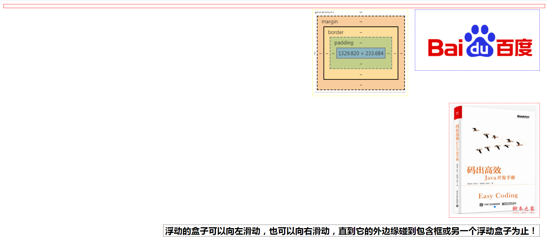
3、overflow
在父级元素中增加一个overflow: hidden;
4、父类添加一个伪类:after
#father:after{
   content: '';
   display: block;
   clear: both;
}
小结:
1、浮动元素后面增加空div 然后 clear: both;
简单、代码中尽量避免空div
2、设置父元素的高度
简单、元素假设有了固定的高度就会被限制
3、overflow
简单、下拉的一些场景避免使用
4、在父类添加一个伪类: after(推荐)
写法有一点复杂,但是没有副作用,推荐使用!!
5.5 对比
-
display
方向不可控制
-
float
浮动起来的话会脱离标准文档流,所有要解决父级边框塌陷的问题~
6 定位
6.1 相对定位
<!DOCTYPE html>
<html lang="en">
<head>
    <meta charset="UTF-8">
    <title>Title</title>

<!--    相对定位:
    相对于自己原来的位置进行偏移
-->
    <style>
        body{
        padding: 20px;
        }
        div{
            margin: 10px;
            padding: 5px;
            font-size; 12px;
            line-height: 25px;
        }
        #father{
            border: 1px solid orange;
            padding: 0;

        }
        #first{
            background-color: rgba(123,221,10,0.5);
            border: 1px dashed yellow;
            position: relative;  /*相对定位:上 下 左 右*/
            top: -20px;
            left: 20px;
        }
        #second{
            background-color: rgba(24,12,210,0.5);
            border: 1px dashed red;
             position: relative;  /*相对定位:上 下 左 右*/
             bottom: 20px;
        }
        #third{
            background-color: rgba(224,12,234,0.5);
            border: 1px dashed blue;
        }
    </style>

</head>
<body>
<div id="father">
    <div id="first">第一个盒子</div>
    <div id="second">第二个盒子</div>
    <div id="third">第三个盒子</div>
</div>
</body>
</html>
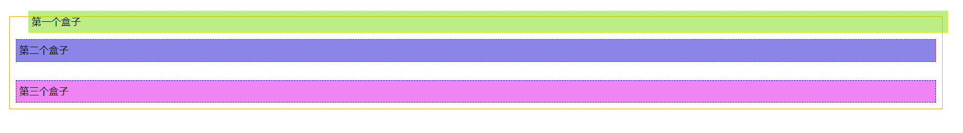
相对定位: position: relative;
相对于原来的位置进行偏移 。相对定位的话,它仍然在标准文档流中,原来的位置会被保留~~
top  -20px  基于上框 往上移20px     20px     基于上框 往下移20px
left
bottom
right
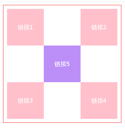
练习
- 使用div和超链接a布局页面
- 每个超链接宽度和高度100px,背景色都是粉色,鼠标移动上去变蓝色
- 使用相对定位改变每个超链接的位置
<!DOCTYPE html>
<html lang="en">
<head>
    <meta charset="UTF-8">
    <title>方块定位</title>
    <style>
        #box{
            width: 300px;
            height: 300px;
            border: 1px solid red;
            padding: 10px;
        }
        a{
            width: 100px;
            height: 100px;
            text-decoration: none;
            background: pink;
            display: block;/*必须变成块元素!!*/
            line-height: 100px;
            text-align: center;
            color: white;
        }
        a:hover{
            background: rgba(123,32,242,0.5);
        }
        .a2,.a4{
            position:relative;
            left:200px;
            top:-100px;
        }
        .a5{
            position:relative;
            left:100px;
            top:-300px;
        }
    </style>
</head>
<body>
<div id="box">
    <a class="a1" href="#">链接1</a>
    <a class="a2" href="#">链接2</a>
    <a class="a3" href="#">链接3</a>
    <a class="a4" href="#">链接4</a>
    <a class="a5" href="#">链接5</a>
</div>
</body>
</html>
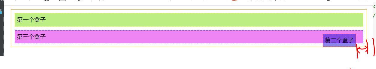
6.2 绝对定位
定位:基于xxx定位,上下左右~
1、没有父级元素定位的前提下,相对于浏览器定位
2、假设父级元素存在定位,我们通常会相对父级元素进行偏移(推荐!)
3、在父级元素范围内移动
相对于父级或浏览器的位置,进行指定的偏移,绝对定位的话,它不在标准文档流中,原来位置不会被保留!
示例:
<!DOCTYPE html>
<html lang="en">
<head>
    <meta charset="UTF-8">
    <title>Title</title>

    <style>
        div{
            margin: 10px;
            padding: 5px;
            font-size; 12px;
            line-height: 25px;
        }
        #father{
            border: 1px solid orange;
            padding: 0;
            position: relative;/*父级位置被保留*/
        }
        #first{
            background-color: rgba(123,221,10,0.5);
            border: 1px dashed yellow;
        }
        #second{
            background-color: rgba(24,12,210,0.5);
            border: 1px dashed red;
            position: absolute;
            right: 20px;
        }
        #third{
            background-color: rgba(224,12,234,0.5);
            border: 1px dashed blue;
        }
    </style>

</head>
<body>
<div id="father">
    <div id="first">第一个盒子</div>
    <div id="second">第二个盒子</div>
    <div id="third">第三个盒子</div>
</div>
</body>
</html>
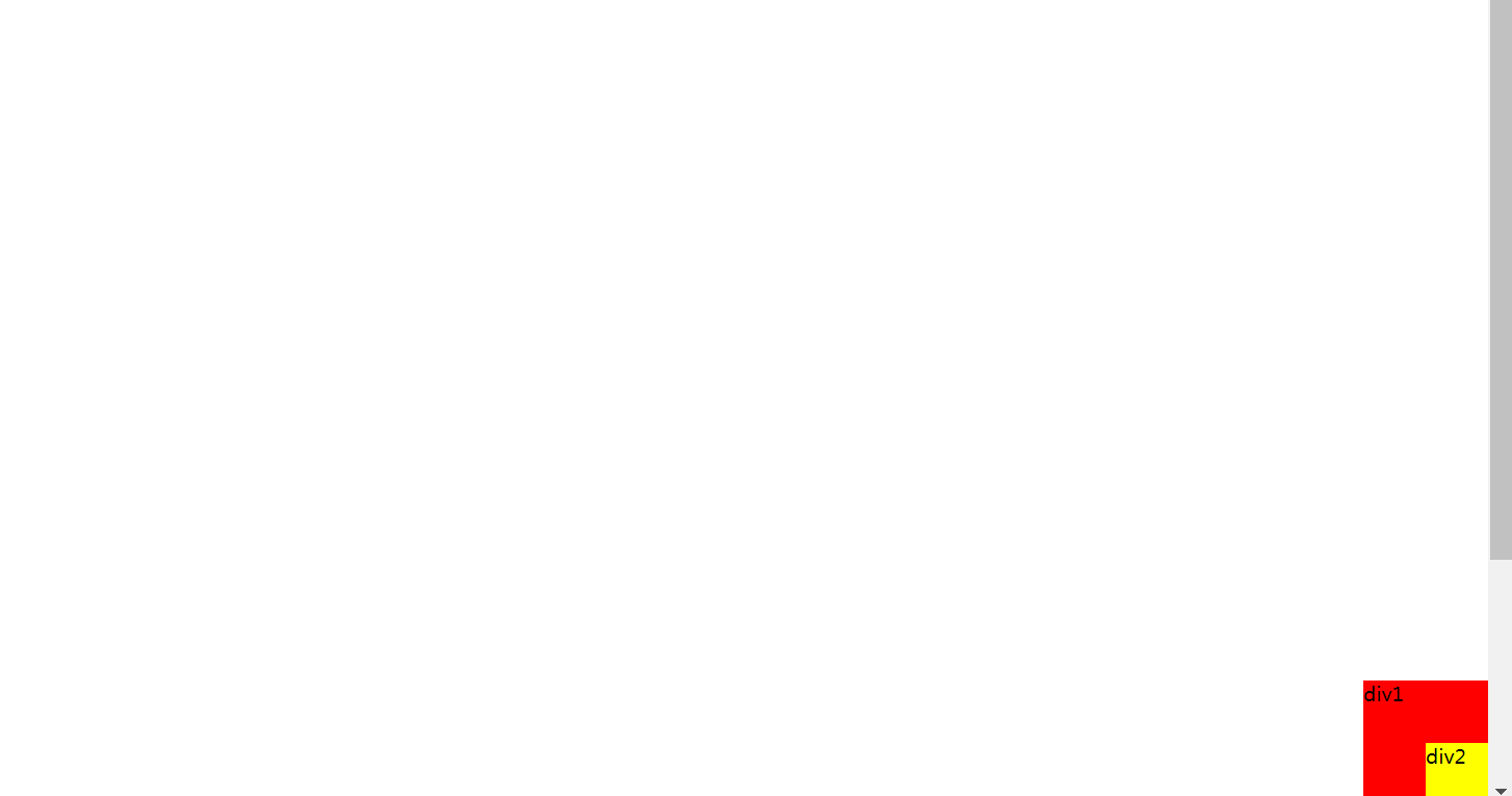
6.3 固定定位 fixed
示例: absolute & fixed
<!DOCTYPE html>
<html lang="en">
<head>
    <meta charset="UTF-8">
    <title>Title</title>

    <style>
        body{
           height: 1000px;
        }
        div:nth-of-type(1){/*绝对定位 相对于浏览器*/
            width: 100px;
            height: 100px;
            background: red;
            position: absolute;
            right: 0;
            bottom: 0;
        }
        div:nth-of-type(2){/*固定定位 定死的 */
            width:50px;
            height:50px;
            background: yellow;
            position: fixed;
            right: 0;
            bottom: 0;
        }
    </style>

</head>
<body>
<div>div1</div>
<div>div2</div>
</body>
</html>
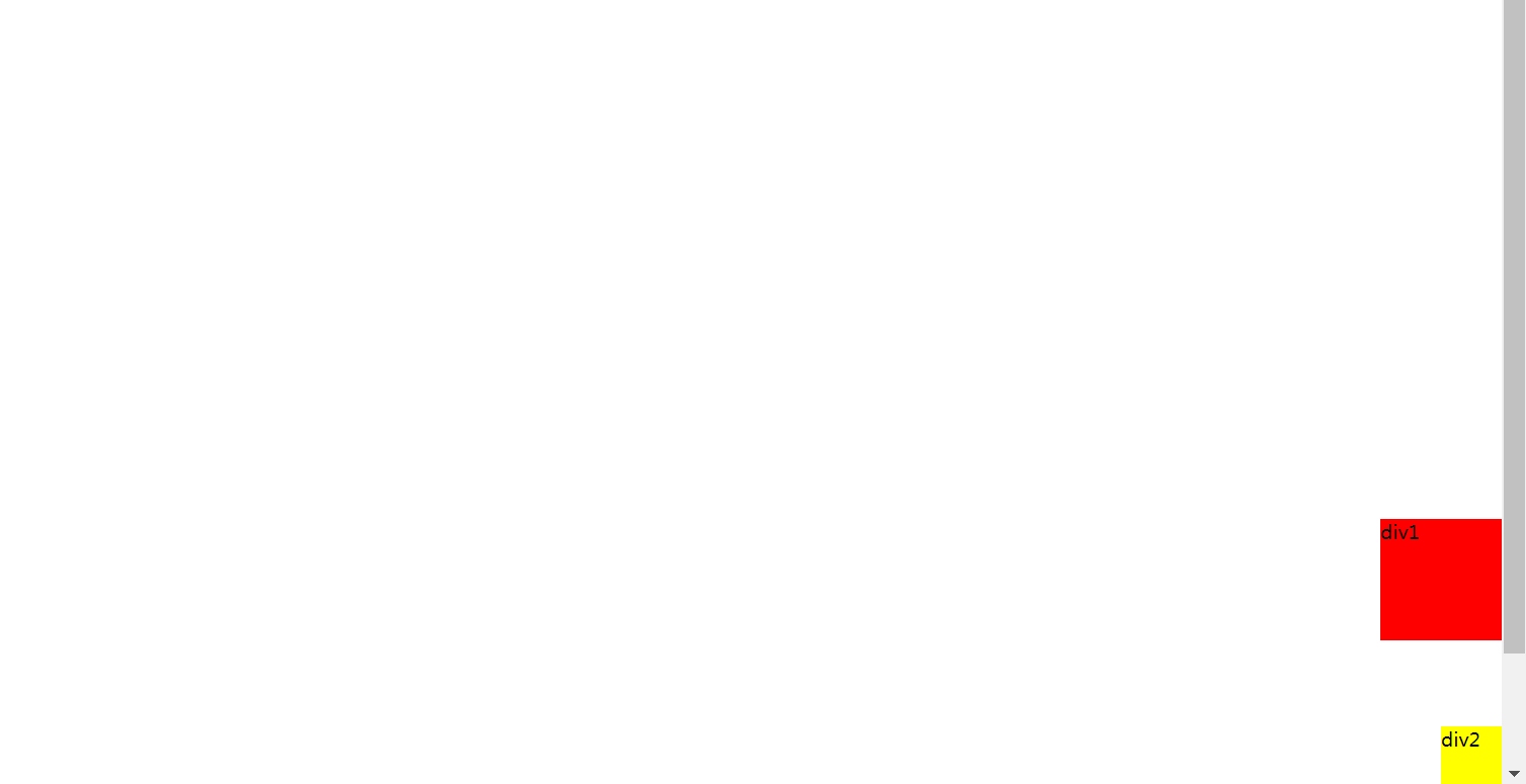
6.4 z-index
图层的概念: z-index 最低是0 最高不限制 置顶等~
css
#content{
    width:380px;
    padding:0;
    margin:0;
    overflow;hidden;
    font-size:12px;
    line-height:25px;
    border: 1px solid black;
}
ul,li{
    padding:0;
    margin:0;
    list-style: none;/*去○点*/
}
/*父级元素~*/
#content ul{
    position:relative;
}
.tipText,.tipBg{
    position: absolute;
    color: red;
    width: 300px;
    height: 25px;
    top: 200px;
}
.tipText{
    z-index:1;/*层级从0开始*/
}
.tipBg{
  background: black;
  opacity: 0.5;/*背透明度*/
}
html
<!DOCTYPE html>
<html lang="en">
<head>
    <meta charset="UTF-8">
    <title>Title</title>
    <link rel="stylesheet" href="css/style.css">
</head>
<body>
<div id="content">
    <ul>
        <li><img src="images/1.png" alt=""></li>
        <li class="tipText">学习前端知识</li>
        <li class="tipBg"></li>
        <li>时间: 2099-01-01</li>
        <li>地点: 金星上哇</li>
    </ul>
</div>
</body>
</html>
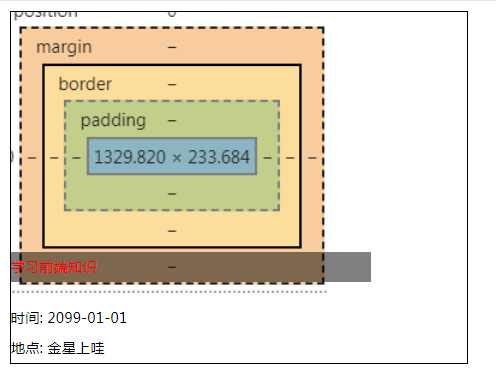
CSS总结图:
推荐网站
- https://www.grabient.com/ 背景颜色
- https://element.eleme.cn/ element
- https://ice.work 飞冰
- https://www.layui.com
- 菜鸟教程网站
- https://cybermap.kaspersky.com/cn 卡巴斯基实验室看地球~hhh
