图片一道亮光划过特效前言
前言
就是在图片上或者div上,一道亮光划过。话不多说,直接看效果:
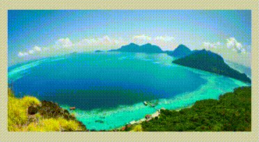
效果图
思路
1.用图片的外层div 的after,画一条半透明的线,
2.如:background: linear-gradient(to right, rgba(255, 255, 255, 0) 0, rgba(255, 255, 255, .3) 50%, rgba(255, 255, 255, 0) 100%);
3.然后在用transform: skewX(-45deg);把after画成的线倾斜45度,
4.最后在加一个动画animation: shine 2s linear -2s infinite;动态修改left的位置,实现一道亮光划过。
代码
<div class="box">
    <img src="http://img.daimg.com/uploads/allimg/140627/3-14062H30208.jpg" alt="">
</div>
.box {
    position: relative;
    margin: 0.5rem auto;
    width: 7rem;
    height: 3.5rem;
    /*background-color: red;*/
    overflow: hidden;
    cursor: pointer;
}

img {
    width: 100%;
}

.box:after {
    position: absolute;
    left: -100%;
    /*改变left的值,让其相对box影藏*/
    top: 0;
    width: 20%;
    height: 100%;
    content: "";
    /* Safari 5.1 - 6.0 */
    background: -webkit-linear-gradient(left, rgba(255, 255, 255, 0) 0, rgba(255, 255, 255, .3) 50%, rgba(255, 255, 255, 0) 100%);
    /* Opera 11.1 - 12.0 */
    background: -o-linear-gradient(left, rgba(255, 255, 255, 0) 0, rgba(255, 255, 255, .3) 50%, rgba(255, 255, 255, 0) 100%);
    /* Firefox 3.6 - 15 */
    background: -moz-linear-gradient(left, rgba(255, 255, 255, 0) 0, rgba(255, 255, 255, .3) 50%, rgba(255, 255, 255, 0) 100%);
    /* 标准的语法 */
    background: linear-gradient(to right, rgba(255, 255, 255, 0) 0, rgba(255, 255, 255, .3) 50%, rgba(255, 255, 255, 0) 100%);
    transform: skewX(-45deg);
    animation: shine 2s linear -2s infinite;
}
@keyframes shine {
      0% {
        left:-100%
      }
      100% {
        left: 150%;
      }
}
animation-name 规定需要绑定到选择器的 keyframe 名称。。
animation-duration 规定完成动画所花费的时间,以秒或毫秒计。
animation-timing-function 规定动画的速度曲线。
animation-delay 规定在动画开始之前的延迟。
animation-iteration-count 规定动画应该播放的次数。
animation-direction 规定是否应该轮流反向播放动画。

 浙公网安备 33010602011771号