异形轮播
前言
移动端越来越多的轮播,是异形轮播了,这里介绍两种异形轮播。
效果图
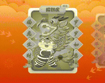
H5
思路
说到轮播,就不得不提一下swiper
此次就是在Swiper的基础上,通过css来达到异形轮播的效果。
代码
布局就按照官网,正常布局即可,这里就不多说了,如果正常布局完,没有反应,看下是不是忘记给每个轮播增加“swiper-slide”类名了。
swiper = new Swiper('.mySwiper', {
  slidesPerView: 2,//设置slider容器能够同时显示的slides数量
  spaceBetween: 80,//slide之间的距离(单位px)
  centeredSlides: true,//设定为true时,active slide会居中,而不是默认状态下的居左。
  observer:true,//修改swiper自己或子元素时,自动初始化swiper
  observeParents:true, //修改swiper的父元素时,自动初始化swiper
  on: {
    //回调函数,swiper从一个slide过渡到另一个slide结束时执行。
    slideChangeTransitionEnd: function(){

    },
  },
});
js部分,也是按照官网文档,配置即可。 我这里的轮播是中展示一个完整项(1),两边各展示一小部分(0.5+0.5),因此slidesPerView 设置为2。centeredSlides必须设置为true,不然首项轮播会居左,而不是居中。spaceBetween,距离按照实际情况,微调即可。
.mySwiper .swiper-slide {
    display: -webkit-box;
    display: -ms-flexbox;
    display: -webkit-flex;
    display: flex;
    -webkit-box-pack: center;
    -ms-flex-pack: center;
    -webkit-justify-content: center;
    justify-content: center;
    -webkit-box-align: center;
    -ms-flex-align: center;
    -webkit-align-items: center;
    align-items: center;
    transition: 300ms;
    transform: scale(0.8);
    opacity: 0.5;
    margin-top: 0.1rem;
}

/* 当前显示 */
.mySwiper .swiper-slide-active,
.mySwiper .swiper-slide-duplicate-active {
    opacity: 1;
    transform: scale(1);
    margin-top: 0;
}
/* 当前显示前后 */
.mySwiper .swiper-slide-prev,
.mySwiper .swiper-slide-next{
    transform: scale(0.8)!important;
    opacity: 0.5;
    margin-top: 0.1rem;
}
css部分,设置swiper-slide默认为缩放0.8,透明度0.5;当前显示为scale(1),透明度1;
前一项和后一项为缩放0.8,透明度0.5;这样效果就是,当前显示项完整,两边比当前显示项小且半透明。
小程序
小程序实现轮播都是使用自带的swiper,这里也是通过swiper实现异形轮播。
主要是这三个参数:
previous-margin:前边距,可用于露出前一项的一小部分,接受 px 和 rpx 值;
next-margin:后边距,可用于露出后一项的一小部分,接受 px 和 rpx 值;
current:当前所在滑块的 index;
思路
设置previous-margin和next-margin,先实现异形轮播布局(中间显示完整的,两边各显示3/1)。设置样式时,默认transform: scale(0.8);opacity: 0.5;缩小到0.8,透明度0.5;然后根据current判断哪个是当前显示项,添加类名rotationliscale,使之transform: scale(1);opacity: 1;正常显示。
以上就是实现了小程序异形轮播,关于previous-margin和next-margin设置多少像素合适,可根据实际情况微调;
代码如下
swiper的各类参数使用可参照官网文档
<view class="rotation">
                <view class="mySwiper">
                    <view class="rotationlist">
                        <swiper
                            class="rotationswiper"
                            autoplay="{{ViewModel.cardSwiper.autoplay}}"
                            circular="{{ViewModel.cardSwiper.circular}}"
                            duration="{{ViewModel.cardSwiper.duration}}"
                            snap-to-edge="{{ViewModel.cardSwiper.edge}}"
                            previous-margin="{{ViewModel.cardSwiper.previous}}"
                            next-margin="{{ViewModel.cardSwiper.next}}"
                            current="{{ViewModel.current}}"
                            bindchange="bindchange"
                        >
                        <block wx:for="{{ViewModel.cardList}}" wx:key="index">
                          <swiper-item>
                              <view class="rotationli {{ViewModel.current==index?'rotationliscale':''}}">
                                <image class="rotationimg" src="{{host}}rotation{{item.type}}.png"/>
                            </view>
                          </swiper-item>
                        </block>
                      </swiper>
                    </view>
                </view>
            </view>
.rotation {
    box-sizing: border-box;
    width: 750rpx;
    height: 570rpx;
    position: absolute;
    top: 401rpx;
    left: 0;
    overflow: hidden
}

.mySwiper {
    box-sizing: border-box;
    width: 750rpx
}

.rotationlist {
    box-sizing: border-box;
    width: 100%;
    height: 575rpx
}
.rotationswiper{
    width: 100%;
    height: 100%;
    line-height: 0;
}

.rotationli {
    box-sizing: border-box;
    display: flex;
    align-items: center;
    justify-content: center;
    transform: scale(0.8);
    opacity: 0.5;
}
.rotationliscale{
    transform: scale(1);
    opacity: 1;
}
  cardSwiper: {
    autoplay: false, //是否自动切换
    circular: false, //是否采用衔接滑动
    duration: 200, //滑动动画时长
    edge: false,
    previous: "140rpx",
    next: "140rpx",
  },

 浙公网安备 33010602011771号