CSS3 Flex布局
Flex 用于使页面上的内容自适应屏幕
首先,在网页代码的头部,加入一行viewport元标签。
<meta name=”viewport” content=”width=device-width, initial-scale=1″ />
viewport是网页默认的宽度和高度,上面这行代码的意思是,网页宽度默认等于屏幕宽度(width=device-width),原始缩放比例(initial-scale=1)为1.0,即网页初始大小占屏幕面积的100%。
HTML 代码
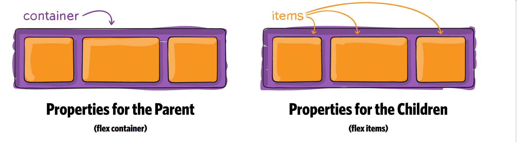
<div class="container">
    <div class="item"></div>
    <div class="item"></div>
    <div class="item order"></div>
    <div class="item"></div>
    <div class="item"></div>
</div>
Container CSS 代码
1. flex
要使用flex必须在container上加上display:flex 和 display: -webkit-flex; /_ Safari _/
.container {
  display: flex; /* or inline-flex */
  display: -webkit-flex; /_ Safari _/
}
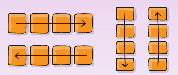
2. flex-direction
.container {
  -webkit-flex-direction: row | row-reverse | column | column-reverse;
  flex-direction: row | row-reverse | column | column-reverse;
}
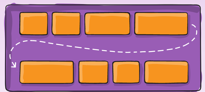
3. flex-wrap
.container{
  -webkit-flex-wrap: nowrap | wrap | wrap-reverse;
  flex-wrap: nowrap | wrap | wrap-reverse;
}
4. flex-flow
This property is a shorthand for setting the flex-direction and flex-wrap properties.
flex-flow: <‘flex-direction’> || <‘flex-wrap’>
.container {
  -webkit-flex-flow:  row nowrap;
  flex-flow:  row nowrap ;
}
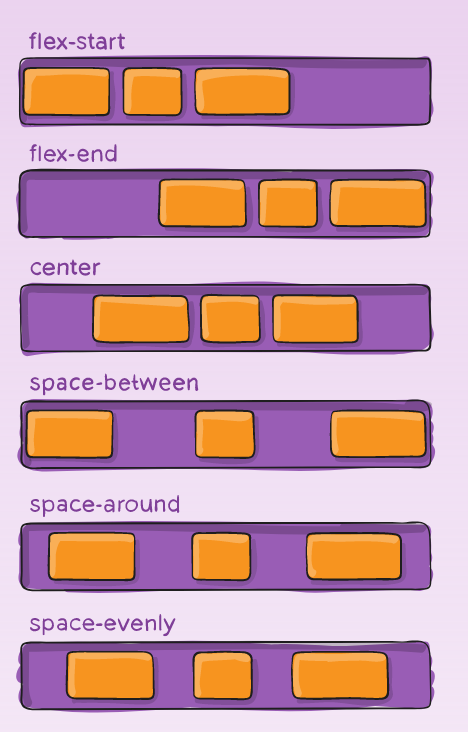
5. justify-content
Value : flex-start | flex-end | center | space-between | space-around | space-evenly;
.container {
  -webkit-justify-content: flex-start; /_ Safari _/
  justify-content:         flex-start;
}
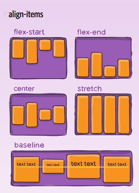
6. align-items
Value : flex-start | flex-end | center | baseline | stretch;
.container {
  -webkit-align-items: stretch; /_ Safari _/
  align-items:         stretch;
}
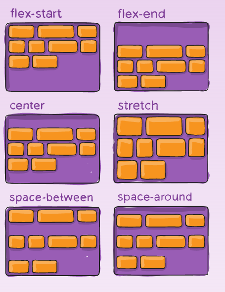
7. align-content
Value : flex-start | flex-end | center | space-between | space-around | stretch;
.container {
  -webkit-align-content: stretch; /_ Safari _/
  align-content:         stretch;
}
Item CSS 代码
1. Order
默认值为0,数值越小,排列越靠前.
.item.order {
  -webkit-order: 1; /_ Safari _/
  order:         1;
}
2. flex-grow
属性定义项目的放大比例,默认为0,即如果存在剩余空间,也不放大。
.item {
  -webkit-flex-grow: 0; /_ Safari _/
  flex-grow:         0;
}
3. flex-shrink
属性定义了项目的缩小比例,默认为1,即如果空间不足,该项目将缩小。
.item {
  flex-shrink: 1;
}
4. flex-basis
This property takes the same values as the width and height properties, and specifies the initial main size of the flex item, before free space is distributed according to the flex factors.
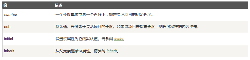
.item {
  -webkit-flex-basis: auto; /_ Safari _/
  flex-basis:         auto;
}
5. flex
This property is the shorthand for the flex-grow, flex-shrink and flex-basis properties. Among other values it also can be set to auto (1 1 auto) and none (0 0 auto).
Default value: 0 1 auto
.item {
  -webkit-flex: 0 1 auto; /_ Safari _/
  flex: 0 1 auto;
}
6. align-self
align-self属性允许单个项目有与其他项目不一样的对齐方式,可覆盖align-items属性。默认值为auto,表示继承父元素的align-items属性,如果没有父元素,则等同于stretch。
Value : auto | flex-start | flex-end | center | baseline | stretch;
.item {
  -webkit-align-self: auto; /_ Safari _/
  align-self:         auto;
}
https://developer.mozilla.org/en-US/docs/Web/CSS/CSS_Flexible_Box_Layout
https://css-tricks.com/snippets/css/a-guide-to-flexbox/
https://scotch.io/tutorials/a-visual-guide-to-css3-flexbox-properties
http://www.ruanyifeng.com/blog/2015/07/flex-grammar.html?utm_source=tuicool)

 浙公网安备 33010602011771号