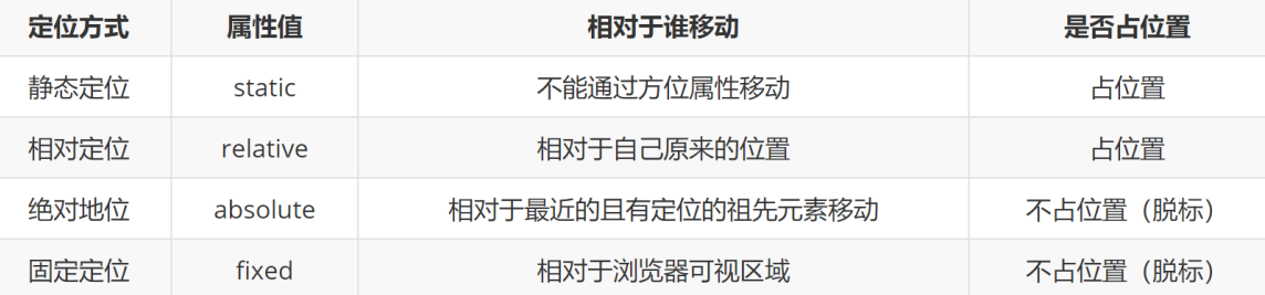
网页布局三种方式: 标准流 浮动 定位
定位
➢ 针对于盒子与盒子之间的层叠问题,推荐使用定位完成!
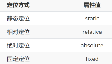
1. 设置定位的方式:position
![]()
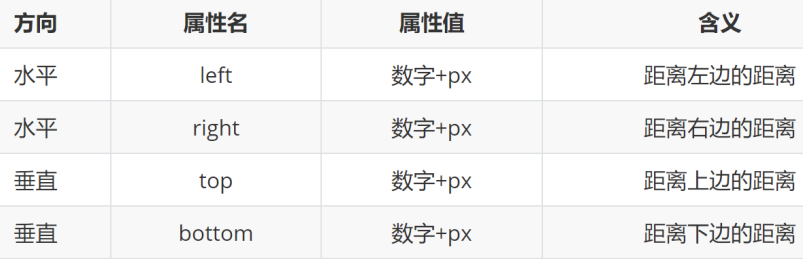
2. 设置偏移值:水平+垂直就近各取一个
![]()
➢ 相对定位position的属性值是什么?
• relative
➢ 相对定位是否需要配合方位属性实现移动?
• 需要配合方位属性实现移动
➢ 相对定位的元素相对于谁进行移动?
• 相对于自己原来位置进行移动
➢ 相对定位的元素在网页中是否占位置?
• 在页面中占位置 → 没有脱标
/* 如果left和right都有, 以left为准; top和bottom都有以top 为准 */
/* css书写: 1. 定位 / 浮动 / display ; 2. 盒子模型; 3. 文字属性 */
.box {
position: relative;
right: 200px;
bottom: 400px;
left: 100px;
top: 200px;
/*
1. 占有原来的位置
2. 仍然具体标签原有的显示模式特点
3. 改变位置参照自己原来的位置
*/
width: 200px;
height: 200px;
}
➢ 绝对定位position的属性值是什么?
• absolute
➢ 绝对定位是否需要配合方位属性实现移动?
• 需要配合方位属性实现移动
➢ 绝对定位的元素相对于谁进行移动?
1. 祖先元素中没有定位 → 默认相对于浏览器进行移动
2. 祖先元素中有定位 → 相对于 最近的 有定位 的祖先元素进行移动
➢ 绝对定位的元素在网页中是否占位置?
• 在页面中不占位置 → 已经脱标
.box {
/* 绝对定位:
先找已经定位的父级, 如果有这样的父级就以这个父级为参照物进行定位;
有父级, 但父级没有定位, 以浏览器窗口为参照为进行定位
*/
position: absolute;
/* left: 50px; */
left: 0;
top: 0;
/*
1. 脱标, 不占位
2. 改变标签的显示模式特点: 具体行内块特点(在一行共存, 宽高生效)
*/
width: 200px;
height: 200px;
}
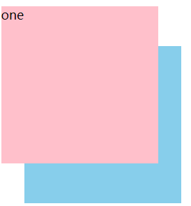
➢ 子绝父相的含义是什么?
• 子元素:绝对定位
• 父元素:相对定位
➢ 子绝父相的应用场景是什么?
• 让子元素相对于父元素进行自由移动
➢ 子绝父相的好处是什么?
• 父元素是相对定位,则对网页布局影响最小
<style>
.father {
position: relative;
width: 400px;
height: 400px;
background-color: pink;
}
.son {
/* 相对, 绝对 */
/* 父级相对定位; 子级绝对定位 -- 子绝父相 */
/* position: relative; */
/* position: absolute; */
/* right: 100px; */
width: 300px;
height: 300px;
background-color: skyblue;
}
.sun {
position: absolute;
/* left: 20px;
top: 30px; */
right: 20px;
bottom: 50px;
width: 200px;
height: 200px;
background-color: green;
}
/* 绝对定位查找父级的方式: 就近找定位的父级, 如果逐层查找不到这样的父级, 就以浏览器窗口为参照进行定位 */
</style>
</head>
<body>
<div class="father">
<div class="son">
<div class="sun"></div>
</div>
</div>
</body>
➢ 使用子绝父相水平垂直居中的操作是什么?
1. 子绝父相
2. left:50%;
3. top:50%;
4. transform:translate(-50%,-50%);
.box {
/* 1. 绝对定位的盒子不能使用左右margin auto居中 */
position: absolute;
/* margin: 0 auto; */
/* left: 50%, 整个盒子移动到浏览器中间偏右的位置 */
left: 50%;
/* 把盒子向左侧移动: 自己宽度的一半 */
/* margin-left: -150px; */
top: 50%;
/* margin-top: -150px; */
/* 位移: 自己宽度高度的一半 */
transform: translate(-50%, -50%);
width: 400px;
height: 300px;
}
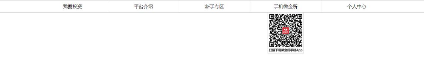
(案例)导航二维码居中定位案例
➢ 需求:根据设计图,定位二维码图片完成一致的效果
![]()
<!DOCTYPE html>
<html lang="en">
<head>
<meta charset="UTF-8">
<meta http-equiv="X-UA-Compatible" content="IE=edge">
<meta name="viewport" content="width=device-width, initial-scale=1.0">
<title>Document</title>
<style>
* {
margin: 0;
padding: 0;
}
/* 因为有通栏:占满一行的边框,所以需要有一个通栏:占满一行的盒子 */
.nav {
height: 40px;
border-bottom: 1px solid #ccc;
}
/* 因为ul中所有的内容都是在网页的宽度固定并且水平居中的盒子内部,所以设置ul为宽度固定并且水平居中的效果(后面项目中所用到的版心) */
ul {
list-style: none;
width: 1200px;
margin: 0 auto;
}
ul li {
float: left;
width: 20%;
height: 40px;
border-right: 1px solid #ccc;
/* 自动内减 */
box-sizing: border-box;
text-align: center;
line-height: 40px;
}
ul .last {
border-right: none;
}
ul li a {
/* a标签默认是行内元素,宽高由内容撑开,并且无法设置宽高,此时默认情况用户只能点击文字区域才能调整 */
/* 如果把a标签转换成块级元素,此时可以设置宽高,会让a标签范围更大,用户可以点击调整的区域也越大 */
display: block;
/* 宽度不设置块元素会默认占满一行 */
height: 40px;
text-decoration: none;
color: #000;
}
ul li .app {
position: relative;
}
.code {
position: absolute;
left: 50%;
top: 41px;
transform: translate(-50%);
}
</style>
</head>
<body>
<!-- 导航 -->
<div class="nav">
<ul>
<li><a href="#">我要投资</a></li>
<li><a href="#">平台介绍</a></li>
<li><a href="#">新手专区</a></li>
<!-- 因为用户鼠标放在二维码图片上也能跳转,所以证明img也是在a的范围内,因此把img写在a标签的内部 -->
<li><a href="#" class="app">手机微金所 <img src="./images/code.jpg" alt="" class="code"> </a></li>
<li class="last"><a href="#">个人中心</a></li>
</ul>
</div>
</body>
</html>
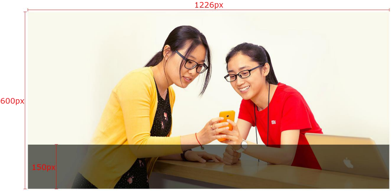
(案例)底部半透明遮罩效果
➢ 需求:根据设计图,通过代码在网页中完成一致的效果
➢ 注意点:定位的元素会脱标(如:绝对定位),脱标后的元素宽高默认由内容撑开
![]()
<!DOCTYPE html>
<html lang="en">
<head>
<meta charset="UTF-8">
<meta http-equiv="X-UA-Compatible" content="IE=edge">
<meta name="viewport" content="width=device-width, initial-scale=1.0">
<title>Document</title>
<style>
.banner {
position: relative;
margin: 0 auto;
width: 1226px;
height: 600px;
}
.mask {
position: absolute;
left: 0;
bottom: 0;
/* 绝对定位的盒子显示模式具备行内块特点: 加宽度高度生效, 如果没有宽度也没有内容, 盒子的宽度尺寸就是0 */
/* width: 1226px; */
/* 如果子级和父级的宽度相同 */
width: 100%;
height: 150px;
background-color: rgba(0,0,0, .5);
}
</style>
</head>
<body>
<div class="banner">
<img src="./images/bg.jpg" alt="">
<!-- 遮罩 -->
<div class="mask">111</div>
</div>
</body>
</html>
固定定位
相对于浏览器进行定位移动
➢ 代码:
![]()
➢ 特点: 1. 需要配合方位属性实现移动
2. 相对于浏览器可视区域进行移动
3. 在页面中不占位置 → 已经脱标
➢ 应用场景: 1. 让盒子固定在屏幕中的某个位置
.box {
position: fixed;
left: 0;
top: 0;
/*
1. 脱标-不占位置
2. 改变位置参考浏览器窗口
3. 具备行内块特点 给宽和高
*/
width: 200px;
height: 200px;
}
![]()
更改定位元素的层级(应用:后写的在上面 要让前面写的在上面)
➢ 标准流、浮动、定位元素之间的层级关系是什么样?
• 标准流 < 浮动 < 定位
➢ 不同定位元素之间的层级关系是什么样?
• 相对、绝对、固定默认层级相同
• 此时HTML中写在下面的元素层级更高,会覆盖上面的元素
➢ 通过什么属性可以修改定位元素的层级?
• z-index:数字;
![]()
<!DOCTYPE html>
<html lang="en">
<head>
<meta charset="UTF-8">
<meta http-equiv="X-UA-Compatible" content="IE=edge">
<meta name="viewport" content="width=device-width, initial-scale=1.0">
<title>Document</title>
<style>
div {
width: 200px;
height: 200px;
}
.one {
position: absolute;
left: 20px;
top: 50px;
z-index: 1;
background-color: pink;
}
.two {
position: absolute;
left: 50px;
top: 100px;
background-color: skyblue;
}
/*
默认情况下, 定位的盒子 后来者居上 ,
z-index:整数; 取值越大, 显示顺序越靠上, z-index的默认值是0
注意: z-index必须配合定位才生效
*/
</style>
</head>
<body>
<div class="one">one</div>
<div class="two">two</div>
</body>
</html>
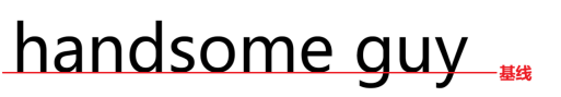
➢ 基线:浏览器文字类型元素排版中存在用于对齐的基线
![]()
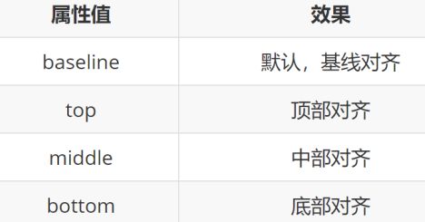
➢ 设置行内/行内块元素垂直对齐方式的属性是什么?
• vertical-align
➢ 垂直对齐方式的常见取值有哪些?
![]()
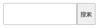
项目中 vertical-align 可以解决的问题
1. 文本框和表单按钮无法对齐问题
2. input和img无法对齐问题
3. div中的文本框,文本框无法贴顶问题
4. div不设高度由img标签撑开,此时img标签下面会存在额外间隙问题
5. 使用line-height让img标签垂直居中问题
➢ 注意点: • 学习浮动之后,不推荐使用行内块元素让div一行中显示,因为可能会出现垂直对齐问题
• 推荐优先使用浮动完成效果
![]()
<!DOCTYPE html>
<html lang="en">
<head>
<meta charset="UTF-8">
<meta name="viewport" content="width=device-width, initial-scale=1.0">
<title>Document</title>
<style>
/* 浏览器遇到行内和行内块标签当做文字处理, 默认文字是按基线对象 */
input {
height: 50px;
box-sizing: border-box;
vertical-align: middle;
}
</style>
</head>
<body>
<input type="text"><input type="button" value="搜索">
</body>
</html>
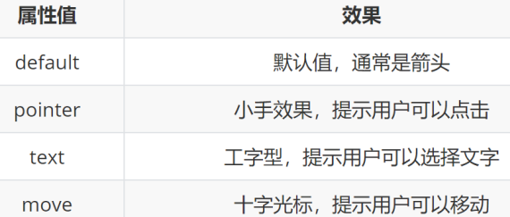
➢ 光标类型属性的属性名是什么?
• 属性名:cursor
➢ 光标类型属性的常见属性值有哪些?
![]()
<!DOCTYPE html>
<html lang="en">
<head>
<meta charset="UTF-8">
<meta http-equiv="X-UA-Compatible" content="IE=edge">
<meta name="viewport" content="width=device-width, initial-scale=1.0">
<title>Document</title>
<style>
div {
width: 200px;
height: 200px;
background-color: pink;
/* 手型 */
/* cursor: pointer; */
/* 工字型, 表示可以复制 */
/* cursor: text; */
/* 十字型, 表示可以移动 */
cursor: move;
}
</style>
</head>
<body>
<div>div</div>
</body>
</html>
边框圆角
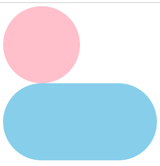
➢ 如果需要在网页中用盒子展示出一个正圆,应该如何完成?
1. 盒子必须是正方形
2. 设置 → border-radius:50%
➢ 如果需要在网页中用盒子展示出一个胶囊按钮,应该如何完成?
1. 盒子要求是长方形
2. 设置 → border-radius:盒子高度的一半
.box {
margin: 50px auto;
width: 200px;
height: 200px;
/* 一个值: 表示4个角是相同的 */
border-radius: 10px;
/* 4值: 左上 右上 右下 左下 -- 从左上顺时针转一圈 */
/* border-radius: 10px 20px 40px 80px; */
/* border-radius: 10px 40px 80px; */
/* border-radius: 10px 80px; */
}
!DOCTYPE html>
<html lang="en">
<head>
<meta charset="UTF-8">
<meta http-equiv="X-UA-Compatible" content="IE=edge">
<meta name="viewport" content="width=device-width, initial-scale=1.0">
<title>Document</title>
<style>
.one {
width: 200px;
height: 200px;
background-color: pink;
/* border-radius: 100px; */
/* 50% : 取盒子尺寸的一半 */
border-radius: 50%;
}
/* 胶囊状: 长方形, border-radius取值是高度的一半 */
.two {
width: 400px;
height: 200px;
background-color: skyblue;
border-radius: 100px;
}
</style>
</head>
<body>
<div class="one"></div>
<div class="two"></div>
</body>
</html>
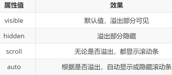
➢ 设置溢出部分显示效果的属性名是什么?
• 属性名:overflow
➢ 设置溢出部分显示效果的常见属性值有哪些?
![]()
.box {
width: 300px;
height: 300px;
/* 溢出隐藏 */
overflow: hidden;
/* 滚动: 无论内容是否超出都显示滚动条的位置 */
/* overflow: scroll; */
/* auto: 根据内容是否超出, 判断是否显示滚动条 */
/* overflow: auto; */
}
元素本身隐藏
• 元素隐藏 → display:none
• 元素显示 → display:block
div {
width: 200px;
height: 200px;
}
.one {
/* 占位隐藏 */
/* visibility: hidden; */
/* **** 不占位隐藏 */
display: none;
}
.two {
}
元素整体透明度
➢ 属性名:opacity
➢ 属性值:0~1之间的数字
• 1:表示完全不透明
• 0:表示完全透明
div {
width: 400px;
height: 400px;
opacity: 0.5;
}


 浙公网安备 33010602011771号