
CSS04上-浮动
使用 结构伪类选择器 在HTML中定位元素
<style>
/* 选中第一个 */
/* li:first-child {
} */
/* 最后一个 */
/* li:last-child {
} */
/* 任意一个 */
/* li:nth-child(5) {
} */
/* 倒数第xx个 */
li:nth-last-child(1) {
background-color: blue;
}
</style>
</head>
<body>
<!-- ul>li{这是第$个li}*8 -->
<ul>
<li>这是第1个li</li>
<li>这是第2个li</li>
<li>这是第3个li</li>
<li>这是第4个li</li>
<li>这是第5个li</li>
<li>这是第6个li</li>
<li>这是第7个li</li>
<li>这是第8个li</li>
</ul>
</body>
结构伪类公式
<style>
/* ** 偶数 */
/* li:nth-child(2n) { */
/* *** 奇数 */
/* li:nth-child(2n+1) { */
/* 找到前3个 */
/* li:nth-child(-n+3) { */
/* *** 4的倍数 */
li:nth-child(4n) {
background-color: green;
}
</style>
</head>
<body>
<ul>
<li>这是第1个li</li>
<li>这是第2个li</li>
<li>这是第3个li</li>
<li>这是第4个li</li>
<li>这是第5个li</li>
<li>这是第6个li</li>
<li>这是第7个li</li>
<li>这是第8个li</li>
</ul>
</body>
伪元素
1. 元素:HTML 设置的标签
2. 伪元素:由 CSS 模拟出的标签效果
<style>
.father {
width: 300px;
height: 300px;
background-color: pink;
}
.father::before {
/* 内容 */
/* content属性必须添加, 否则伪元素不生效 */
content: '';
color: green;
width: 100px;
height: 100px;
background-color: blue;
/* 默认是行内元素, 宽高不生效 */
display: block;
}
.father::after {
content: '大米';
}
</style>
</head>
<body>
<!-- 伪元素 通过css创建标签, 装饰性的不重要的小图 -->
<!-- 找父级, 在这个父级里面创建子级标签 -->
<div class="father">爱</div>
<!-- 老鼠爱大米 -->
</body>
1. 早期作用:图文环绕
2. 现在作用:用于布局,让垂直布局的盒子变成水平布局,如:一个在左,一个在右
1. 左浮动:float : left
2. 右浮动:float : right
浮动的特点
1. 浮动元素会脱离标准流(简称:脱标),在标准流中不占位置 • 相当于从地面飘到了空中
2. 浮动元素比标准流高半个级别,可以覆盖标准流中的元素
3. 浮动找浮动,下一个浮动元素会在上一个浮动元素后面左右浮动
4. 浮动元素有特殊的显示效果 • 一行可以显示多个 • 可以设置宽高
➢ 注意点: • 浮动的元素不能通过text-align:center或者margin:0 auto
CSS书写顺序: 浏览器执行效率更高
1. 浮动 / display
2. 盒子模型: margin border padding 宽度高度背景色
3. 文字样式
.left+.right+回车得到
<div class="left"></div>
<div class="right"></div>
margin:0 auto:
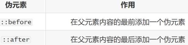
1、使用浮动,完成设计图中布局效果
<style>
* {
margin: 0;
padding: 0;
}
.top {
height: 40px;
background-color: #333;
}
.header {
width: 1226px;
height: 100px;
background-color: #ffc0cb;
/* 上下边界为0,左右则根据宽度自适应相同值(即居中) */
margin:0 auto;
}
.content {
width: 1226px;
height: 460px;
background-color: green;
margin: 0 auto;
}
.left {
float: left;
width: 234px;
height: 460px;
background-color: #ffa500;
}
.right {
float: left;
width: 992px;
height: 460px;
background-color: #87ceeb;
}
</style>
</head>
<body>
<div class="top"></div>
<div class="header">头部</div>
<div class="content">
<div class="left">left</div>
<div class="right">right</div>
</div>
</body>
2、使用浮动,完成设计图中布局效果
<title>小米产品</title>
<style>
* {
margin: 0;
padding: 0;
}
.box {
margin: 0 auto;
width: 1226px;
height: 615px;
/* */
}
.left {
float: left;
width: 234px;
height: 615px;
background-color: #800080;
}
.right {
float: right;
width: 978px;
height: 615px;
}
.right ul {
list-style: none;
}
.right li {
float: left;
/* .right和.left分别靠右和左浮动 刚好空隙是14px 就不用单独写 */
margin-right: 14px;
margin-bottom: 14px;
width: 234px;
height: 300px;
background-color: #87ceeb;
}
/* 如果父级的宽度不够, 子级会自动换行 */
/* 第四个li和第八个li右侧间距清除 */
.right li:nth-child(4n) {
margin-right: 0;
}
</style>
</head>
<body>
<div class="box">
<div class="left"></div>
<div class="right">
<!-- ul>li*8 -->
<ul>
<li></li>
<li></li>
<li></li>
<li></li>
<li></li>
<li></li>
<li></li>
<li></li>
</ul>
</div>
</div>
</body>
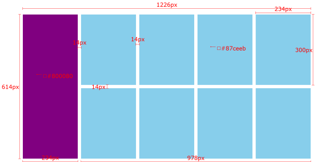
3、使用浮动,完成设计图中布局效果
<title>网页导航</title>
<style>
* {
/* m0+p0 */
margin: 0;
padding: 0;
}
.nav {
margin: 50px auto;
/* w640+h50+bc */
width: 640px;
height: 50px;
background-color: #ffc0cb;
}
.nav ul {
list-style: none;
}
.nav li {
float: left;
}
/* 每个新闻宽高设置 为了提高触发范围 设置在a里 */
.nav li a {
/* 1. 浮动 / display */
display: inline-block;
/* 2. 盒子模型 */
width: 80px;
height: 50px;
/* 3. 文字样式 */
text-align: center;
line-height: 50px;
font-size: 16px;
color: #fff;
text-decoration: none;
}
.nav li a:hover {
background-color: green;
}
</style>
</head>
<body>
<!-- 导航 -->
<div class="nav">
<!-- 网页主导航必须是 li>a 提高浏览器解析效率 -->
<!-- ul>li>a -->
<ul>
<li><a href="#">新闻</a></li>
<li><a href="#">新闻</a></li>
<li><a href="#">新闻</a></li>
<li><a href="#">新闻</a></li>
<li><a href="#">新闻</a></li>
<li><a href="#">新闻</a></li>
<li><a href="#">新闻</a></li>
<li><a href="#">新闻</a></li>
</ul>
</div>
</body>

 浙公网安备 33010602011771号