

Vue【原创】整合el-dialog,可拖动可全屏最大化弹出框
项目中很多时候需要弹出框可以拖动并且可最大化,el-dialog是不满足的,这边采用指令的方式进行拓展。
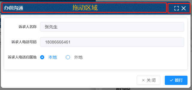
先来个效果图:
首先来个v-darg指令:
 1 import Vue from 'vue'
 2
 3 Vue.directive('alterELDialogMarginTop', {
 4     inserted(el, binding, vnode) {
 5         el.firstElementChild.style.marginTop = binding.value + 'px'
 6     }
 7 })
 8
 9 Vue.directive('alterELDialogMarginLeft', {
10     inserted(el, binding, vnode) {
11         el.firstElementChild.style.marginLeft = binding.value + 'px'
12     }
13 })
14
15 Vue.directive('drag', {
16     inserted(el, binding, vnode) {
17         let odiv = el.getElementsByTagName('div')[0];
18         let headerDiv = odiv.getElementsByTagName('div')[0];
19         const deepHeader = headerDiv.querySelector('header');
20         const flag = elementContains(headerDiv, deepHeader); //兼容dialog&&drawer
21         if(flag) {
22             headerDiv = deepHeader;
23         }
24         headerDiv.onmousedown = e => {
25             // document.body.style.userSelect = 'none';
26             // document.body.style.webkitUserSelect = 'none';
27             // document.body.style.msUserSelect = 'none';
28             // document.body.style.mozUserSelect = 'none';
29             // let odiv = el.getElementsByTagName('div')[0];
30             let disX = e.clientX - odiv.offsetLeft;
31             let disY = e.clientY - odiv.offsetTop;
32             document.onmousemove = e => {
33                 let left = e.clientX - disX;
34                 let top = e.clientY - disY;
35                 odiv.style.marginLeft = left + 'px';
36                 odiv.style.marginTop = top + 'px';
37             };
38             document.onmouseup = e => {
39                 document.onmousemove = null;
40                 document.onmouseup = null;
41                 // document.body.style.userSelect = 'auto';
42                 // document.body.style.webkitUserSelect = 'auto';
43                 // document.body.style.msUserSelect = 'auto';
44                 // document.body.style.mozUserSelect = 'auto';
45             };
46         };
47     }
48 })
49
50 const elementContains = (parent, child) => parent !== child && parent.contains(child);
再来个v-fullscreen指令:
 1 import Vue from 'vue'
 2
 3 function handleFullScreen(dialog, isFullScreen, marginTop, width) {
 4     if (!dialog) return false
 5     if (isFullScreen) {
 6         dialog.style.marginTop = '0'
 7         dialog.style.marginLeft = '0'
 8         dialog.style.position = 'absolute'
 9         dialog.style.top = '0px'
10         dialog.style.bottom = '0px'
11         dialog.style.left = '0px'
12         dialog.style.width = '100%'
13     } else {
14         // dialog.style.marginTop = marginTop
15         dialog.style.margin = '0 auto'
16         dialog.style.width = width
17         dialog.style.position = 'relative'
18     }
19 }
20
21 Vue.directive('fullScreen', {
22     bind(el, binding, vnode) {
23         let isFullScreen = false
24
25         const dialog = el.querySelector('.el-dialog')
26         const header = el.querySelector('.el-dialog__header')
27         if (!header || !dialog || !vnode) return
28         header.style.paddingRight = '43px'
29         header.style.boxShadow = '0 4px 6px -1px rgb(0 0 0 / 0.1), 0 2px 4px -2px rgb(0 0 0 / 0.1)'
30         const {
31             width,
32             top
33         } = vnode.componentInstance
34
35         const fullScreenBtn = document.createElement('button')
36         fullScreenBtn.type = 'button'
37         fullScreenBtn.style =
38             'padding:0;background: 0 0;border:0;outline:0;cursor:pointer;font-size:17px;top:14px;right:38px;position:absolute;color:white;'
39
40         const fullScreenIcon = document.createElement('i')
41         fullScreenIcon.className = 'el-icon el-icon-full-screen'
42         fullScreenBtn.append(fullScreenIcon)
43
44         fullScreenBtn.addEventListener('click', () => {
45             isFullScreen = !isFullScreen
46             handleFullScreen(dialog, isFullScreen, top, width)
47             return false
48         })
49
50         header.append(fullScreenBtn)
51
52         header.addEventListener('dblclick', () => {
53             isFullScreen = !isFullScreen
54             handleFullScreen(dialog, isFullScreen, top, width)
55             return false
56         })
57     }
58 })
集成el-dialog,(这个封装里面稍微做了一点对于移动端和pc端的尺寸响应,不需要可以去掉):
  1 <template>
  2     <el-dialog
  3         v-drag
  4         v-fullScreen
  5         :title="title"
  6         :visible="visible"
  7         :show-close="showClose"
  8         :close-on-click-modal="closeOnClickModal"
  9         :append-to-body="true"
 10         close-on-press-escape
 11         :modal="modal"
 12         :width="`${device === mobile ? 100 : width}%`"
 13         :top="`${device === mobile ? 0 : top}px`"
 14         v-if="visible"
 15         @close="closeDialog"
 16     >
 17         <div><slot name="title"></slot></div>
 18         <div><slot></slot></div>
 19         <div slot="footer"><slot name="footer"></slot></div>
 20     </el-dialog>
 21 </template>
 22
 23 <script>
 24 // :center="!!+(`${device === mobile ? false : true}`)"
 25
 26 const { body } = document;
 27 const WIDTH = 992; // refer to Bootstrap's responsive design
 28 const DESKTOP = 'desktop';
 29 const MOBILE = 'mobile';
 30
 31 export default {
 32     name: 'LiloResponsiveDialog',
 33     props: {
 34         title: {
 35             type: String,
 36             default: ''
 37         },
 38         width: {
 39             type: [Number, String],
 40             default: 50
 41         },
 42         top: {
 43             type: [Number, String],
 44             default: 54
 45         },
 46         visible: {
 47             type: Boolean,
 48             default: false
 49         },
 50         showClose: {
 51             type: Boolean,
 52             default: true
 53         },
 54         closeOnClickModal: {
 55             type: Boolean,
 56             default: false
 57         },
 58         modal: {
 59             type: Boolean,
 60             default: true
 61         }
 62     },
 63     data() {
 64         return {
 65             device: DESKTOP,
 66             mobile: MOBILE
 67         };
 68     },
 69     beforeMount() {
 70         window.addEventListener('resize', this.$_resizeHandler);
 71     },
 72     beforeDestroy() {
 73         window.removeEventListener('resize', this.$_resizeHandler);
 74     },
 75     mounted() {
 76         const isMobile = this.$_isMobile();
 77         if (isMobile) {
 78             this.device = 'mobile';
 79         }
 80     },
 81     methods: {
 82         $_isMobile() {
 83             const rect = body.getBoundingClientRect();
 84             return rect.width - 1 < WIDTH;
 85         },
 86         $_resizeHandler() {
 87             if (!document.hidden) {
 88                 const isMobile = this.$_isMobile();
 89                 this.device = isMobile ? MOBILE : DESKTOP;
 90             }
 91         },
 92         closeDialog() {
 93             this.$emit('update:visible', false);
 94             this.$emit('close');
 95         }
 96     }
 97 };
 98 </script>
 99
100 <style></style>
最后直接调用LiloResponsiveDialog组件即可,而我这里是做成了插件。
1 import ResponsiveDialog from './src/main';
2
3 /* istanbul ignore next */
4 ResponsiveDialog.install = function(Vue) {
5   Vue.component(ResponsiveDialog.name, ResponsiveDialog);
6 };
7
8 export default ResponsiveDialog;
作者: Binyy
出处: https://www.cnblogs.com/loveFlex
城市:wuhan
微信:momakeyy
详细源码请移步,记得点个星星噢~ https://gitee.com/binyylovesino/lilo-ui 欢迎各路大佬指导、提问~
本文版权归作者和博客园共有,欢迎转载,但未经作者同意必须保留此段声明,且在文章页面明显位置给出 原文链接 如有问题, 可邮件(408460486@qq.com)或者微信咨询.
posted on 2023-08-24 10:11 Binyy_Wuhan 阅读(1371) 评论(0) 编辑 收藏 举报
