flex 布局实例
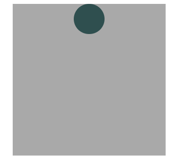
1.首先,只有左上角1个点的情况。Flex布局默认就是首行左对齐,所以一行代码就够了。
 1 <!DOCTYPE html>
 2 <html lang="zh">
 3 <head>
 4     <meta charset="UTF-8">
 5     <meta name="viewport" content="width=device-width, initial-scale=1.0">
 6     <meta http-equiv="X-UA-Compatible" content="ie=edge">
 7     <title></title>
 8     <style>
 9         body{
10             margin: 0;
11             padding: 0;
12         }
13         #box{
14             margin: 200px auto;
15             width: 200px;
16             height: 200px;
17             background-color: darkgray;
18             display: flex;
19         }
20         .item1 {
21             width: 40px;
22             height: 40px;
23             background-color: darkslategray;
24             border-radius: 50%;
25         }
26     </style>
27 </head>
28 <body>
29     <div id="box">
30         <div class="item1"></div>
31         <!-- <div class="item2"></div> -->
32     </div>
33 </body>
34 </html>

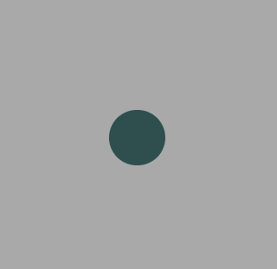
2.设置项目的对齐方式,就能实现居中对齐和右对齐。
1 #box{
2             margin: 200px auto;
3             width: 200px;
4             height: 200px;
5             background-color: darkgray;
6             display: flex;
         规定了项目在主轴上的对齐方式
7             justify-content: center;
8         }
1     #box{
2             margin: 200px auto;
3             width: 200px;
4             height: 200px;
5             background-color: darkgray;
6             display: flex;
7             justify-content: flex-end;
8         }

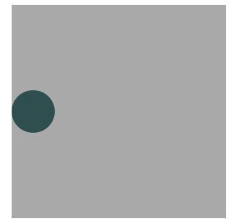
3.设置交叉轴对齐方式,可以垂直移动主轴。
1     #box{
2             margin: 200px auto;
3             width: 200px;
4             height: 200px;
5             background-color: darkgray;
6             display: flex;
7             align-items: center;
8         }
1     #box{
2             margin: 200px auto;
3             width: 200px;
4             height: 200px;
5             background-color: darkgray;
6             display: flex;
7             align-items: center;
8             justify-content: center;
9         }
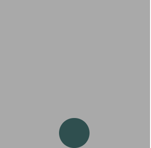
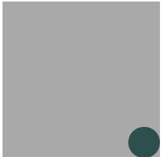
1 #box{
2             margin: 200px auto;
3             width: 200px;
4             height: 200px;
5             background-color: darkgray;
6             display: flex;
7             align-items: flex-end;
8             justify-content: center;
9         }
1 #box{
2             margin: 200px auto;
3             width: 200px;
4             height: 200px;
5             background-color: darkgray;
6             display: flex;
7             align-items: flex-end;
8             justify-content: flex-end;
9         }
以上是单项目实例 , 多项目实例下篇发
