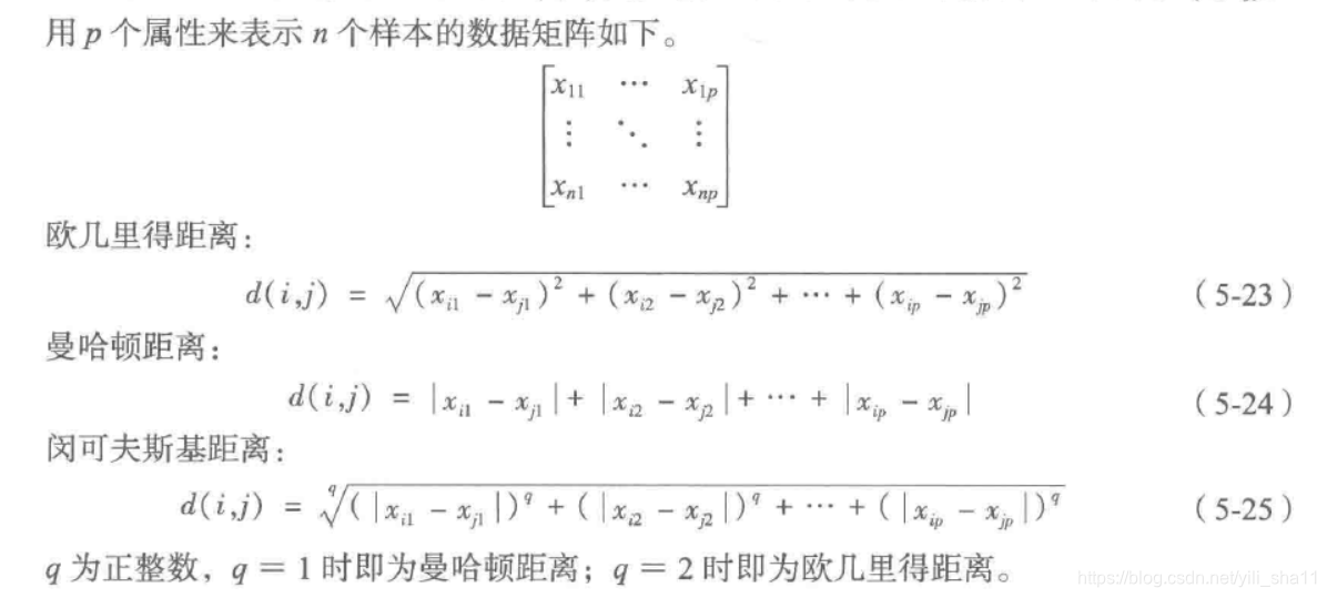
数据建模
第五章 数据建模
(一)聚类分析
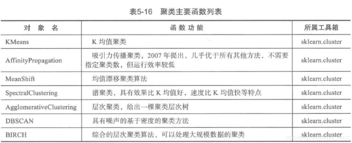
1、主要方法


2、距离分析
度量样本之间的相似性,采用距离算法:
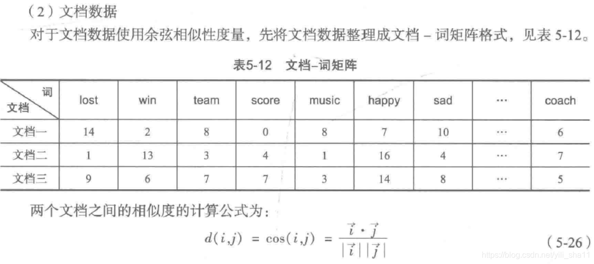
文档相似性度量
3、K-means分类
-- coding: utf-8 --
使用K-Means算法聚类消费行为特征数据
import pandas as pd
参数初始化
inputfile = '../data/consumption_data.xls' # 销量及其他属性数据
outputfile = '../tmp/data_type.xls' # 保存结果的文件名
k = 3 # 聚类的类别
iteration = 500 # 聚类最大循环次数
data = pd.read_excel(inputfile, index_col='Id') # 读取数据
data_zs = 1.0 * (data - data.mean()) / data.std() # 数据标准化from sklearn.cluster import KMeans
model = KMeans(n_clusters=k, n_jobs=1, max_iter=iteration) # 分为k类,并发数4
model.fit(data_zs) # 开始聚类简单打印结果
r1 = pd.Series(model.labels_).value_counts() # 统计各个类别的数目
r2 = pd.DataFrame(model.cluster_centers_) # 找出聚类中心
r = pd.concat([r2, r1], axis=1) # 横向连接(0是纵向),得到聚类中心对应的类别下的数目
r.columns = list(data.columns) + [u'类别数目'] # 重命名表头
print(r)详细输出原始数据及其类别
r = pd.concat([data, pd.Series(model.labels_, index=data.index)],
axis=1) # 详细输出每个样本对应的类别
r.columns = list(data.columns) + [u'聚类类别'] # 重命名表头
r.to_excel(outputfile) # 保存结果def density_plot(data): # 自定义作图函数
import matplotlib.pyplot as plt
plt.rcParams['font.sans-serif'] = ['SimHei'] # 用来正常显示中文标签
plt.rcParams['axes.unicode_minus'] = False # 用来正常显示负号
p = data.plot(kind='kde', linewidth=2, subplots=True, sharex=False)
[p[i].set_ylabel(u'密度') for i in range(k)]
plt.legend()
return pltpic_output = '../tmp/pd_' # 概率密度图文件名前缀
for i in range(k):
density_plot(data[r[u'聚类类别'] == i]).savefig(u'%s%s.png' % (pic_output, i))利用TSNE绘图
-- coding: utf-8 --
接k_means.py
from sklearn.manifold import TSNE
tsne = TSNE()
tsne.fit_transform(data_zs) # 进行数据降维
tsne = pd.DataFrame(tsne.embedding_, index=data_zs.index) # 转换数据格式import matplotlib.pyplot as plt
plt.rcParams['font.sans-serif'] = ['SimHei'] # 用来正常显示中文标签
plt.rcParams['axes.unicode_minus'] = False # 用来正常显示负号不同类别用不同颜色和样式绘图
d = tsne[r[u'聚类类别'] == 0]
plt.plot(d[0], d[1], 'r.')
d = tsne[r[u'聚类类别'] == 1]
plt.plot(d[0], d[1], 'go')
d = tsne[r[u'聚类类别'] == 2]
plt.plot(d[0], d[1], 'b*')
plt.show()
聚类分析算法评价 P111
(1)purity评价法
(2)RI评价法
(3)F值评价法
4、Meanshift
与kmeans算法不同,mean shift 算法可自动决定类别的数目。与kmeans算法一样的是,两者都是用集合内数据点的均值进行中心点的移动。
算法核心:算法的关键操作是通过感兴趣区域内的数据密度变化计算中心点的漂移向量,从而移动中心点进行下一次迭代,直到到达密度最大处(中心点不变)。从每个数据点出发都可以进行该操作,在这个过程,统计出现在感兴趣区域内的数据的次数。该参数将在最后作为分类的依据。
mean shift 算法中,bandwidth(带宽)是重要参数。
案例来源:AI with python(mean_shift.py)
import numpy as np
import matplotlib.pyplot as plt
from sklearn.cluster import MeanShift, estimate_bandwidth
from itertools import cycleLoad data from input file
X = np.loadtxt('../code/data_clustering.txt', delimiter=',')
Estimate the bandwidth of X
bandwidth_X = estimate_bandwidth(X, quantile=0.1, n_samples=len(X))
Cluster data with MeanShift
meanshift_model = MeanShift(bandwidth=bandwidth_X, bin_seeding=True)
meanshift_model.fit(X)Extract the centers of clusters
cluster_centers = meanshift_model.cluster_centers_
print('\nCenters of clusters:\n', cluster_centers)Estimate the number of clusters
labels = meanshift_model.labels_
num_clusters = len(np.unique(labels))
print("\nNumber of clusters in input data =", num_clusters)Plot the points and cluster centers
plt.figure()
markers = 'o*xvs'
for i, marker in zip(range(num_clusters), markers):Plot points that belong to the current cluster
plt.scatter(X[labelsi, 0], X[labelsi, 1], marker=marker, color='black')
Plot the cluster center
cluster_center = cluster_centers[i]
plt.plot(cluster_center[0], cluster_center[1], marker='o',
markerfacecolor='black', markeredgecolor='black',
markersize=15)plt.title('Clusters')
plt.show()
5、GMM算法
GMM算法主要利用EM算法来估计高斯混合模型中的参数,然后根据计算得到的 概率进行聚类。
GMM分布
高斯混合分布是假设总体的分布有多个不同的高斯分布混合而成,其中每一个高斯分布所占的权重不相同。

GMM和K-means直观对比
最后我们比较GMM和K-means两个算法的步骤。
GMM:
- 先计算所有数据对每个分模型的响应度
- 根据响应度计算每个分模型的参数
- 迭代
K-means:
- 先计算所有数据对于K个点的距离,取距离最近的点作为自己所属于的类
- 根据上一步的类别划分更新点的位置(点的位置就可以看做是模型参数)
- 迭代
可以看出GMM和K-means还是有很大的相同点的。GMM中数据对高斯分量的响应度就相当于K-
means中的距离计算,GMM中的根据响应度计算高斯分量参数就相当于K-
means中计算分类点的位置。然后它们都通过不断迭代达到最优。不同的是:GMM模型给出的是每一个观测点由哪个高斯分量生成的概率,而K-
means直接给出一个观测点属于哪一类。
案例来源AI with python (gmm_classifier.py)
import numpy as np
import pandas as pd
import matplotlib.pyplot as plt
from matplotlib import patches #from sklearn import datasets
from sklearn.mixture import GaussianMixture #GMM更换为GaussianMixture
from sklearn.model_selection import StratifiedKFoldLoad the iris dataset
iris = datasets.load_iris()
print(iris) #数据分为data和target两组
Split dataset into training and testing (80/20 split)
skf = StratifiedKFold(n_splits=5) #将数据分为5组。
indices=skf.split(iris.data,iris.target) #将数据分为4组train,1组testTake the first fold
train_index, test_index = next(iter(indices))
Extract training data and labels
X_train = iris.data[train_index]
y_train = iris.target[train_index]Extract testing data and labels
X_test = iris.data[test_index]
y_test = iris.target[test_index]Extract the number of classes
num_classes = len(np.unique(y_train))
Build GMM
classifier = GaussianMixture(n_components=num_classes,
covariance_type='full', #n_components指的是下层分布由几个构成,本项目中指的是num_classes.
covariance_type指一致性算法的类别
init_params='kmeans', max_iter=20)init_params中w代表weights,c代表covariance在迭代中进行更新;n_iter迭代次数
Initialize the GMM means
classifier.means_ = np.array([X_train[y_train == i].mean(axis=0)
for i in range(num_classes)])Train the GMM classifier
classifier.fit(X_train)
Draw boundaries
plt.figure()
colors = 'bgr'
for i, color in enumerate(colors):Extract eigenvalues and eigenvectors
eigenvalues, eigenvectors = np.linalg.eigh (classifier.covariances_[i][:2, :2])
参照GaussianMixture的属性修改为covariances_。在covariances_()时报错,希望通过dataframe的类对象的方法得到#numpy数组。不应带括号,他是属性,不是方法。
Normalize the first eigenvector
norm_vec = eigenvectors[0] / np.linalg.norm(eigenvectors[0])
Extract the angle of tilt
angle = np.arctan2(norm_vec[1], norm_vec[0])
angle = 180 * angle / np.piScaling factor to magnify the ellipses
(random value chosen to suit our needs)
scaling_factor = 8
eigenvalues *= scaling_factorDraw the ellipse
ellipse = patches.Ellipse(classifier.means_[i, :2],
eigenvalues[0], eigenvalues[1], 180 + angle,
color=color)
axis_handle = plt.subplot(1, 1, 1)
ellipse.set_clip_box(axis_handle.bbox)
ellipse.set_alpha(0.6)
axis_handle.add_artist(ellipse)Plot the data
colors = 'bgr'
for i, color in enumerate(colors):
cur_data = iris.data[iris.target == i]
plt.scatter(cur_data[:,0], cur_data[:,1], marker='o',
facecolors='none', edgecolors='black', s=40,
label=iris.target_names[i])test_data = X_test[y_test == i]
plt.scatter(test_data[:,0], test_data[:,1], marker='s',
facecolors='black', edgecolors='black', s=40,
label=iris.target_names[i])Compute predictions for training and testing data
y_train_pred = classifier.predict(X_train)
accuracy_training = np.mean(y_train_pred.ravel() == y_train.ravel()) * 100
print('Accuracy on training data =', accuracy_training)y_test_pred = classifier.predict(X_test)
accuracy_testing = np.mean(y_test_pred.ravel() == y_test.ravel()) * 100
print('Accuracy on testing data =', accuracy_testing)plt.title('GMM classifier')
plt.xticks(())
plt.yticks(())plt.show()
** 存在问题 :生成图形有差别,预测精度也有问题。特征值、特征向量的用法 **
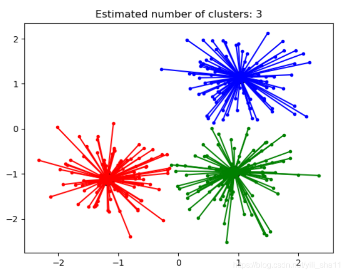
6、近邻传播算法
Affinity Propagation 聚类算法的通俗解释。下面案例是网上找的AP算法的一个案例。亲测可用。
[ https://blog.csdn.net/notHeadache/article/details/89003044
](https://blog.csdn.net/notHeadache/article/details/89003044)
print(doc)
**from sklearn.cluster import AffinityPropagation
from sklearn import metrics
from sklearn.datasets.samples_generator import make_blobs ****#
#############################################################################Generate sample data
centers = [[1, 1], [-1, -1], [1, -1]]
X, labels_true = make_blobs(n_samples=300, centers=centers,
cluster_std=0.5,
random_state=0) ****#
#############################################################################Compute Affinity Propagation
af = AffinityPropagation(preference=-50).fit(X)
cluster_centers_indices = af.cluster_centers_indices_
labels = af.labels_ **n_clusters_ = len(cluster_centers_indices) #
**print('Estimated number of clusters: %d' % n_clusters_)
print("Homogeneity: %0.3f" % metrics.homogeneity_score(labels_true,
labels))
print("Completeness: %0.3f" % metrics.completeness_score(labels_true,
labels))
print("V-measure: %0.3f" % metrics.v_measure_score(labels_true, labels))
print("Adjusted Rand Index: %0.3f"
% metrics.adjusted_rand_score(labels_true, labels))
print("Adjusted Mutual Information: %0.3f"
% metrics.adjusted_mutual_info_score(labels_true, labels))
print("Silhouette Coefficient: %0.3f"
% metrics.silhouette_score(X, labels, metric='sqeuclidean')) ****#
#############################################################################Plot result
import matplotlib.pyplot as plt
from itertools import cycle ****plt.close('all')
plt.figure(1)
plt.clf() ****colors = cycle('bgrcmykbgrcmykbgrcmykbgrcmyk')
for k, col in zip(range(n_clusters_), colors):
class_members = labels == k
cluster_center = X[cluster_centers_indices[k]]
plt.plot(X[class_members, 0], X[class_members, 1], col + '.')
plt.plot(cluster_center[0], cluster_center[1], 'o', markerfacecolor=col,
markeredgecolor='k', markersize=14)
for x in X[class_members]:
plt.plot([cluster_center[0], x[0]], [cluster_center[1], x[1]], col) ****plt.title('Estimated number of clusters: %d' % n_clusters_)
plt.show() **
(二)问题要点
1、数据连接
r = pd.concat([r2, r1], axis=1) # 横向连接(0是纵向),得到聚类中心对应的类别下的数目
r.columns = list(data.columns) + [u'类别数目'] # 重命名表头
2、分别绘图
pic_output = '../tmp/pd_' # 概率密度图文件名前缀
for i in range(k):
density_plot(data[r[u'聚类类别'] == i]).savefig(u'%s%s.png' % (pic_output, i))
3、数据标准化
data_zs = 1.0 * (data - data.mean()) / data.std() # 数据标准化
4、kmeans++算法
kmeans = KMeans(init='k-means++', n_clusters=num_clusters, n_init=10)
k-means++采用智能方法找出初始聚类中心,n_init为迭代次数
5、最优分类次数计算(采用轮廓系数判定)
import numpy as np
import matplotlib.pyplot as plt
from sklearn import metrics
from sklearn.cluster import KMeansLoad data from input file
X = np.loadtxt('../code/data_quality.txt', delimiter=',')
Plot input data
plt.figure()
plt.scatter(X[:,0], X[:,1], color='black', s=80, marker='o',
facecolors='none')
x_min, x_max = X[:, 0].min() - 1, X[:, 0].max() + 1
y_min, y_max = X[:, 1].min() - 1, X[:, 1].max() + 1
plt.title('Input data')
plt.xlim(x_min, x_max)
plt.ylim(y_min, y_max)
plt.xticks(())
plt.yticks(())Initialize variables
scores = []
values = np.arange(2, 10)Iterate through the defined range
for num_clusters in values: #从2到10里面选择
Train the KMeans clustering model
kmeans = KMeans(init='k-means++', n_clusters=num_clusters, n_init=10)
kmeans.fit(X)
score = metrics.silhouette_score(X, kmeans.labels_,metric='euclidean',
sample_size=len(X)) #轮廓系数
print("\nNumber of clusters =", num_clusters)
print("Silhouette score =", score)
scores.append(score)Plot silhouette scores
plt.figure()
plt.bar(values, scores, width=0.7, color='black', align='center')
plt.title('Silhouette score vs number of clusters')Extract best score and optimal number of clusters
num_clusters = np.argmax(scores) + values[0]
print('\nOptimal number of clusters =', num_clusters)plt.show()


 浙公网安备 33010602011771号