
matplotlib 偏差(Deviation)
在数据分析和可视化中最有用的 50 个 Matplotlib 图表。 这些图表列表允许使用 python 的 matplotlib 和 seaborn
库选择要显示的可视化对象。
这里开始第二部分内容:偏差(Deviation)
准备工作
在代码运行前先引入下面的设置内容。 当然,单独的图表,可以重新设置显示要素。
    # !pip install brewer2mpl
    import numpy as np
    import pandas as pd
    import matplotlib as mpl
    import matplotlib.pyplot as plt
    import seaborn as sns
    import warnings; warnings.filterwarnings(action='once')

    large = 22; med = 16; small = 12
    params = {'axes.titlesize': large,
              'legend.fontsize': med,
              'figure.figsize': (16, 10),
              'axes.labelsize': med,
              'axes.titlesize': med,
              'xtick.labelsize': med,
              'ytick.labelsize': med,
              'figure.titlesize': large}
    plt.rcParams.update(params)
    plt.style.use('seaborn-whitegrid')
    sns.set_style("white")
    # %matplotlib inline

    # Version
    print(mpl.__version__)  # >> 3.0.2
    print(sns.__version__)  # >> 0.9.0
本节内容
偏差(Deviation)
偏差又称为表观误差,是指个别测定值与测定的平均值之差,它可以用来衡量测定结果的精密度高低。在统计学中,偏差可以用于两个不同的概念,即有偏采样与有偏估计。一个有偏采样是对总样本集非平等采样,而一个有偏估计则是指高估或低估要估计的量
。——参考百度百科
- 10 发散型条形图 (Diverging Bars)
- 11 发散型文本 (Diverging Texts)
- 12 发散型包点图 (Diverging Dot Plot)
- 13 带标记的发散型棒棒糖图 (Diverging Lollipop Chart with Markers)
- 14 面积图 (Area Chart)
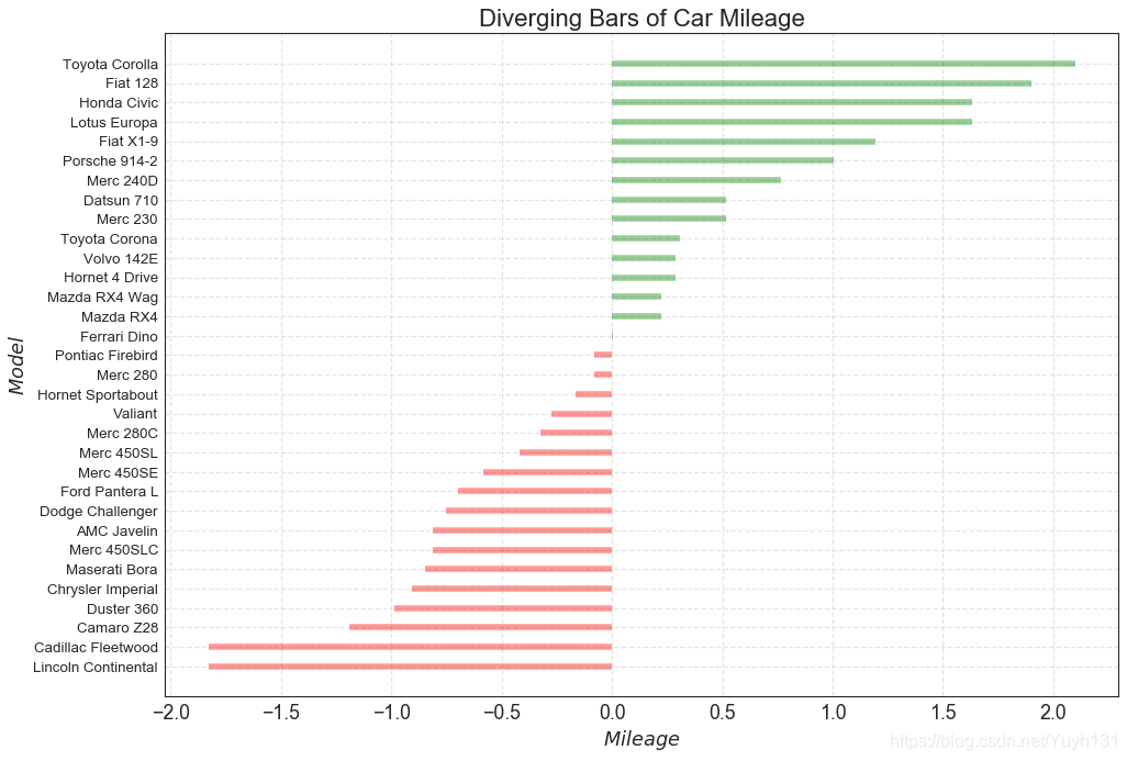
10 发散型条形图 (Diverging Bars)
如果你想根据单个指标查看项目的变化情况,并可视化此差异的顺序和数量,那么散型条形图 (Diverging Bars) 是一个很好的工具。
它有助于快速区分数据中组的性能,并且非常直观,并且可以立即传达这一点。
    # Prepare Data
    df = pd.read_csv("https://github.com/selva86/datasets/raw/master/mtcars.csv")
    x = df.loc[:, ['mpg']]
    df['mpg_z'] = (x - x.mean())/x.std()
    df['colors'] = ['red' if x < 0 else 'green' for x in df['mpg_z']]
    df.sort_values('mpg_z', inplace=True)
    df.reset_index(inplace=True)

    # Draw plot
    plt.figure(figsize=(14,10), dpi= 80)
    plt.hlines(y=df.index, xmin=0, xmax=df.mpg_z, color=df.colors, alpha=0.4, linewidth=5)

    # Decorations
    plt.gca().set(ylabel='$Model$', xlabel='$Mileage$')
    plt.yticks(df.index, df.cars, fontsize=12)
    plt.title('Diverging Bars of Car Mileage', fontdict={'size':20})
    plt.grid(linestyle='--', alpha=0.5)
    plt.show()
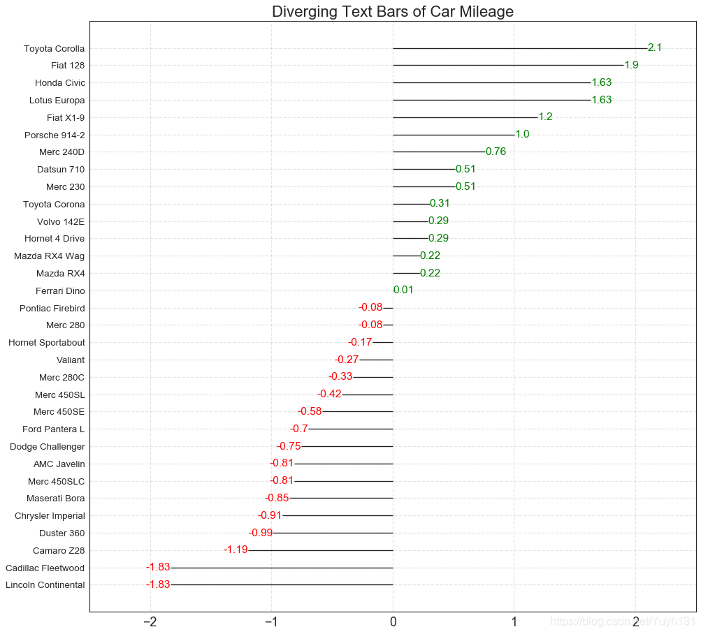
11 发散型文本 (Diverging Texts)
发散型文本 (Diverging Texts)与发散型条形图 (Diverging
Bars)相似,如果你想以一种漂亮和可呈现的方式显示图表中每个项目的价值,就可以使用这种方法。
    # Prepare Data
    df = pd.read_csv("https://github.com/selva86/datasets/raw/master/mtcars.csv")
    x = df.loc[:, ['mpg']]
    df['mpg_z'] = (x - x.mean())/x.std()
    df['colors'] = ['red' if x < 0 else 'green' for x in df['mpg_z']]
    df.sort_values('mpg_z', inplace=True)
    df.reset_index(inplace=True)

    # Draw plot
    plt.figure(figsize=(14,14), dpi= 80)
    plt.hlines(y=df.index, xmin=0, xmax=df.mpg_z)
    for x, y, tex in zip(df.mpg_z, df.index, df.mpg_z):
        t = plt.text(x, y, round(tex, 2), horizontalalignment='right' if x < 0 else 'left',
                     verticalalignment='center', fontdict={'color':'red' if x < 0 else 'green', 'size':14})

    # Decorations
    plt.yticks(df.index, df.cars, fontsize=12)
    plt.title('Diverging Text Bars of Car Mileage', fontdict={'size':20})
    plt.grid(linestyle='--', alpha=0.5)
    plt.xlim(-2.5, 2.5)
    plt.show()
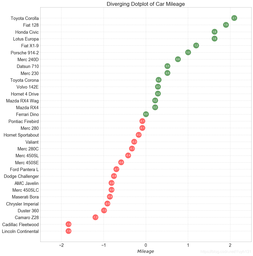
12 发散型包点图 (Diverging Dot Plot)
发散型包点图 (Diverging Dot Plot)也类似于发散型条形图 (Diverging Bars)。 然而,与发散型条形图 (Diverging
Bars)相比,条的缺失减少了组之间的对比度和差异。
    # Prepare Data
    df = pd.read_csv("https://github.com/selva86/datasets/raw/master/mtcars.csv")
    x = df.loc[:, ['mpg']]
    df['mpg_z'] = (x - x.mean())/x.std()
    df['colors'] = ['red' if x < 0 else 'darkgreen' for x in df['mpg_z']]
    df.sort_values('mpg_z', inplace=True)
    df.reset_index(inplace=True)

    # Draw plot
    plt.figure(figsize=(14,16), dpi= 80)
    plt.scatter(df.mpg_z, df.index, s=450, alpha=.6, color=df.colors)
    for x, y, tex in zip(df.mpg_z, df.index, df.mpg_z):
        t = plt.text(x, y, round(tex, 1), horizontalalignment='center',
                     verticalalignment='center', fontdict={'color':'white'})

    # Decorations
    # Lighten borders
    plt.gca().spines["top"].set_alpha(.3)
    plt.gca().spines["bottom"].set_alpha(.3)
    plt.gca().spines["right"].set_alpha(.3)
    plt.gca().spines["left"].set_alpha(.3)

    plt.yticks(df.index, df.cars)
    plt.title('Diverging Dotplot of Car Mileage', fontdict={'size':20})
    plt.xlabel('$Mileage$')
    plt.grid(linestyle='--', alpha=0.5)
    plt.xlim(-2.5, 2.5)
    plt.show()
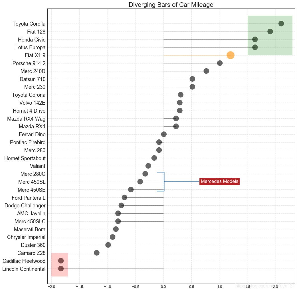
13 带标记的发散型棒棒糖图 (Diverging Lollipop Chart with Markers)
带标记的棒棒糖图通过强调您想要引起注意的任何重要数据点并在图表中适当地给出推理,提供了一种对差异进行可视化的灵活方式。
    # Prepare Data
    df = pd.read_csv("https://github.com/selva86/datasets/raw/master/mtcars.csv")
    x = df.loc[:, ['mpg']]
    df['mpg_z'] = (x - x.mean())/x.std()
    df['colors'] = 'black'

    # color fiat differently
    df.loc[df.cars == 'Fiat X1-9', 'colors'] = 'darkorange'
    df.sort_values('mpg_z', inplace=True)
    df.reset_index(inplace=True)


    # Draw plot
    import matplotlib.patches as patches

    plt.figure(figsize=(14,16), dpi= 80)
    plt.hlines(y=df.index, xmin=0, xmax=df.mpg_z, color=df.colors, alpha=0.4, linewidth=1)
    plt.scatter(df.mpg_z, df.index, color=df.colors, s=[600 if x == 'Fiat X1-9' else 300 for x in df.cars], alpha=0.6)
    plt.yticks(df.index, df.cars)
    plt.xticks(fontsize=12)

    # Annotate
    plt.annotate('Mercedes Models', xy=(0.0, 11.0), xytext=(1.0, 11), xycoords='data',
                fontsize=15, ha='center', va='center',
                bbox=dict(boxstyle='square', fc='firebrick'),
                arrowprops=dict(arrowstyle='-[, widthB=2.0, lengthB=1.5', lw=2.0, color='steelblue'), color='white')

    # Add Patches
    p1 = patches.Rectangle((-2.0, -1), width=.3, height=3, alpha=.2, facecolor='red')
    p2 = patches.Rectangle((1.5, 27), width=.8, height=5, alpha=.2, facecolor='green')
    plt.gca().add_patch(p1)
    plt.gca().add_patch(p2)

    # Decorate
    plt.title('Diverging Bars of Car Mileage', fontdict={'size':20})
    plt.grid(linestyle='--', alpha=0.5)
    plt.show()
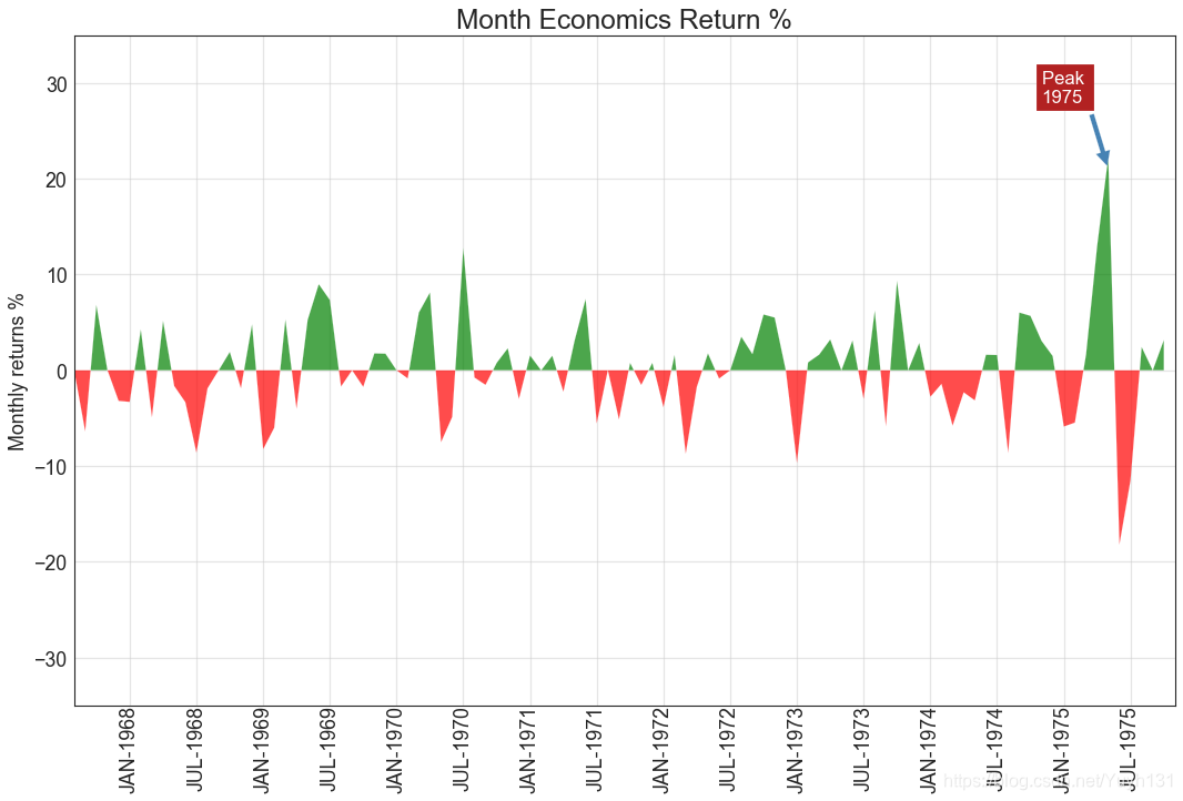
14 面积图 (Area Chart)
通过对轴和线之间的区域进行着色,面积图不仅强调峰和谷,而且还强调高点和低点的持续时间。 高点持续时间越长,线下面积越大。
    import numpy as np
    import pandas as pd

    # Prepare Data
    df = pd.read_csv("https://github.com/selva86/datasets/raw/master/economics.csv", parse_dates=['date']).head(100)
    x = np.arange(df.shape[0])
    y_returns = (df.psavert.diff().fillna(0)/df.psavert.shift(1)).fillna(0) * 100

    # Plot
    plt.figure(figsize=(16,10), dpi= 80)
    plt.fill_between(x[1:], y_returns[1:], 0, where=y_returns[1:] >= 0, facecolor='green', interpolate=True, alpha=0.7)
    plt.fill_between(x[1:], y_returns[1:], 0, where=y_returns[1:] <= 0, facecolor='red', interpolate=True, alpha=0.7)

    # Annotate
    plt.annotate('Peak \n1975', xy=(94.0, 21.0), xytext=(88.0, 28),
                 bbox=dict(boxstyle='square', fc='firebrick'),
                 arrowprops=dict(facecolor='steelblue', shrink=0.05), fontsize=15, color='white')


    # Decorations
    xtickvals = [str(m)[:3].upper()+"-"+str(y) for y,m in zip(df.date.dt.year, df.date.dt.month_name())]
    plt.gca().set_xticks(x[::6])
    plt.gca().set_xticklabels(xtickvals[::6], rotation=90, fontdict={'horizontalalignment': 'center', 'verticalalignment': 'center_baseline'})
    plt.ylim(-35,35)
    plt.xlim(1,100)
    plt.title("Month Economics Return %", fontsize=22)
    plt.ylabel('Monthly returns %')
    plt.grid(alpha=0.5)
    plt.show()
总结
第二部分【偏差】(Deviation) 就到这里结束啦~
传送门
[ Matplotlib可视化图表——第一部分【关联】(Correlation)
](https://blog.csdn.net/Yuyh131/article/details/102505734)
Matplotlib可视化图表——第二部分【偏差】(Deviation)
[ Matplotlib可视化图表——第三部分【排序】(Ranking)
](https://blog.csdn.net/Yuyh131/article/details/102519560)
[ Matplotlib可视化图表——第四部分【分布】(Distribution)
](https://blog.csdn.net/Yuyh131/article/details/102520819)
[ Matplotlib可视化图表——第五部分【组成】(Composition)
](https://blog.csdn.net/Yuyh131/article/details/102523068)
[ Matplotlib可视化图表——第六部分【变化】(Change)
](https://blog.csdn.net/Yuyh131/article/details/102523867)
[ Matplotlib可视化图表——第七部分【分组】(Groups)
](https://blog.csdn.net/Yuyh131/article/details/102523909)
完整版参考
[ 原文地址: Top 50 matplotlib Visualizations – The Master Plots (with full python
code) ](https://www.machinelearningplus.com/plots/top-50-matplotlib-
visualizations-the-master-plots-python/)
[ 中文转载:深度好文 | Matplotlib可视化最有价值的 50 个图表(附完整 Python 源代码)
](http://liyangbit.com/pythonvisualization/matplotlib-top-50-visualizations/)