

使用Design包实现QQ动画侧滑效果和滑动菜单导航
Google在2015的IO大会上,给我们带来了更加详细的Material Design设计规范,同时,也给我们带来了全新的Android Design Support Library,在这个support库里面,Google给我们提供了更加规范的MD设计风格的控件。最重要的是,Android Design Support Library的兼容性更广,直接可以向下兼容到Android 2.2。这不得不说是一个良心之作。
使用方法很简单,只需要添加一句依赖
compile 'com.android.support:design:24.0.0'
先用TabLayout和SnackBar以及Navigation实现QQ侧滑动画效果和滑动
项目已经同步至:https://github.com/nanchen2251/designNavigation-and-tabLayout
上个整体效果图
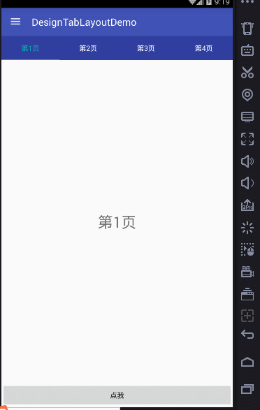
首先带来的是TabLayout
Tab滑动切换View并不是一个新的概念,但是Google却是第一次在support库中提供了完整的支持,
而且,Design library的TabLayout 既实现了固定的选项卡 - view的宽度平均分配,
也实现了可滚动的选项卡 - view宽度不固定同时可以横向滚动。选项卡可以在程序中动态添加,
但大部分时间我们都不会这样用,通常滑动布局都会和ViewPager配合起来使用,所以,我们需要ViewPager来帮忙:
通过一句话setupWithViewPager,我们就把ViewPager和TabLayout结合了起来。
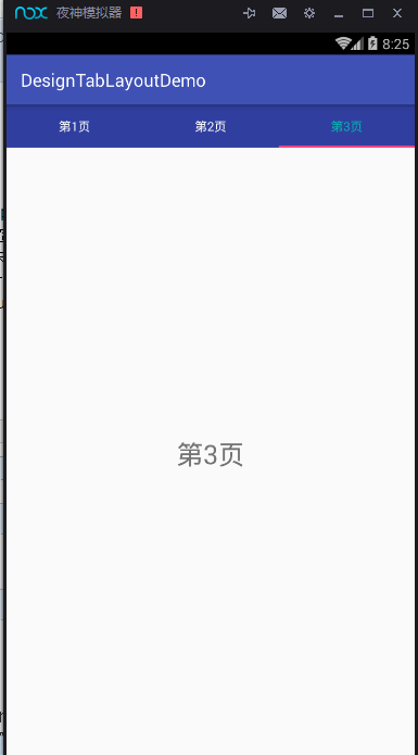
上个运行图:
看代码
首先是主页面的XML文件
1 2 3 4 5 6 7 8 9 10 11 12 13 14 15 16 17 18 19 20 21 22 23 24 | <?xml version="1.0" encoding="utf-8"?><LinearLayout xmlns:android="http://schemas.android.com/apk/res/android" xmlns:tools="http://schemas.android.com/tools" xmlns:app="http://schemas.android.com/apk/res-auto" android:layout_width="match_parent" android:layout_height="match_parent" android:orientation="vertical" tools:context="com.example.nanchen.designtablayoutdemo.MainActivity"> <android.support.design.widget.TabLayout android:layout_width="match_parent" app:tabBackground="@color/colorPrimaryDark" app:tabTextColor="@android:color/white" app:tabSelectedTextColor="#04b4ae" android:layout_height="wrap_content" android:id="@+id/main_tab_layout"/> <android.support.v4.view.ViewPager android:layout_width="match_parent" android:layout_height="0dp" android:layout_weight="1" android:id="@+id/main_vp"/></LinearLayout> |
其中由于必须TabLayout控件是Design包下的,所以必须加上
1 | xmlns:app="http://schemas.android.com/apk/res-auto"<br><br>这样才可以使用自定义它的属性。它的属性有很多,这样简单使用几个,更多的大家可以去尝试。<br>这里,我只滚动了三个,若是你的APP tab标签多的话, |
app:tabMode="scrollable"
必须指定这个属性,不然你会发现看不到,如果标签数少,还是建议设置为固定的,那样才会等分。
1 | <br><br>其次是Fragment的XML文件<br><br> |
1 2 3 4 5 6 7 8 9 10 11 12 13 14 15 16 | <FrameLayout xmlns:android="http://schemas.android.com/apk/res/android" xmlns:tools="http://schemas.android.com/tools" android:layout_width="match_parent" android:layout_height="match_parent" tools:context="com.example.nanchen.designtablayoutdemo.BlankFragment"> <!-- TODO: Update blank fragment layout --> <TextView android:layout_width="match_parent" android:layout_height="match_parent" android:textSize="30sp" android:gravity="center" android:id="@+id/fg_text" android:text="@string/hello_blank_fragment"/></FrameLayout> |
MainActivity.java
1 2 3 4 5 6 7 8 9 10 11 12 13 14 15 16 17 18 19 20 21 22 23 24 25 26 27 28 29 30 31 | package com.example.nanchen.designtablayoutdemo;import android.os.Bundle;import android.support.design.widget.TabLayout;import android.support.v4.view.ViewPager;import android.support.v7.app.AppCompatActivity;import java.util.ArrayList;import java.util.List;public class MainActivity extends AppCompatActivity { @Override protected void onCreate(Bundle savedInstanceState) { super.onCreate(savedInstanceState); setContentView(R.layout.activity_main); ViewPager vp = (ViewPager) findViewById(R.id.main_vp); TabLayout tabLayout = (TabLayout) findViewById(R.id.main_tab_layout); List<String> list = new ArrayList<>(); for (int i = 1; i < 4; i++) {// list.add(String.format(Locale.CHINA,"第02d%页",i)); list.add("第"+i+"页"); } vp.setAdapter(new MyAdapter(getSupportFragmentManager(),list)); tabLayout.setupWithViewPager(vp); }} |
FragmenT用于存放下面的数据
1 2 3 4 5 6 7 8 9 10 11 12 13 14 15 16 17 18 19 20 21 22 23 24 25 26 27 28 29 30 31 32 33 34 35 36 37 38 39 40 41 42 43 44 45 46 47 | package com.example.nanchen.designtablayoutdemo;import android.os.Bundle;import android.support.annotation.Nullable;import android.support.v4.app.Fragment;import android.view.LayoutInflater;import android.view.View;import android.view.ViewGroup;import android.widget.TextView;/** * A simple {@link Fragment} subclass. */public class BlankFragment extends Fragment { public BlankFragment() { // Required empty public constructor } public static BlankFragment newInstance(String text) { Bundle args = new Bundle(); args.putString("text",text); BlankFragment fragment = new BlankFragment(); fragment.setArguments(args); return fragment; } @Override public View onCreateView(LayoutInflater inflater, ViewGroup container, Bundle savedInstanceState) { // Inflate the layout for this fragment return inflater.inflate(R.layout.fragment_blank, container, false); } @Override public void onViewCreated(View view, @Nullable Bundle savedInstanceState) { super.onViewCreated(view, savedInstanceState); TextView text = (TextView) view.findViewById(R.id.fg_text); String str = getArguments().getString("text"); text.setText(str); }} |
需要一个PagerAdapter
自定义一个。
1 2 3 4 5 6 7 8 9 10 11 12 13 14 15 16 17 18 19 20 21 22 23 24 25 26 27 28 29 30 31 32 33 34 | package com.example.nanchen.designtablayoutdemo;import android.support.v4.app.Fragment;import android.support.v4.app.FragmentManager;import android.support.v4.app.FragmentPagerAdapter;import java.util.List;/** * Created by 南尘 on 2016/7/12. */public class MyAdapter extends FragmentPagerAdapter { private List<String> list; public MyAdapter(FragmentManager fm, List<String> list) { super(fm); this.list = list; } @Override public Fragment getItem(int position) { return BlankFragment.newInstance(list.get(position)); } @Override public int getCount() { return list.size(); } @Override public CharSequence getPageTitle(int position) { return list.get(position); }} |
2)再来看看如何使用Navigation和DrawerLayout实现侧滑功能的动画演示
前面讲解了Design包下的TabLayout的使用,下面将带来NavagationView和DrawLayout以及toolbar的联动。
NavigationView 通过提供抽屉导航所需的框架让实现更简单,同时它还能够直接通过菜单资源文件直接生成导航元素。把NavigationView作为DrawerLayout的内容视图来使用。NavigationView处理好了和状态栏的关系,可以确保NavigationView在API21+设备上正确的和状态栏交互。
以下代码在前面代码的基础上修改。
MainActivity.java
1 2 3 4 5 6 7 8 9 10 11 12 13 14 15 16 17 18 19 20 21 22 23 24 25 26 27 28 29 30 31 32 33 34 35 36 37 38 39 40 41 42 43 44 45 46 47 48 49 50 51 52 53 54 55 56 57 58 59 60 61 62 63 64 65 66 67 68 69 70 71 72 | package com.example.nanchen.designtablayoutdemo;import android.os.Bundle;import android.support.design.widget.NavigationView;import android.support.design.widget.TabLayout;import android.support.v4.view.GravityCompat;import android.support.v4.view.ViewPager;import android.support.v4.widget.DrawerLayout;import android.support.v7.app.ActionBarDrawerToggle;import android.support.v7.app.AppCompatActivity;import android.support.v7.widget.Toolbar;import android.view.MenuItem;import android.widget.Toast;import java.util.ArrayList;import java.util.List;public class MainActivity extends AppCompatActivity implements NavigationView.OnNavigationItemSelectedListener { private DrawerLayout drawerLayout; @Override protected void onCreate(Bundle savedInstanceState) { super.onCreate(savedInstanceState); setContentView(R.layout.activity_main); ViewPager vp = (ViewPager) findViewById(R.id.main_vp); TabLayout tabLayout = (TabLayout) findViewById(R.id.main_tab_layout); Toolbar toolbar = (Toolbar) findViewById(R.id.main_toolbar); drawerLayout = (DrawerLayout) findViewById(R.id.main_drawerlayout); //设置Toolbar和DrawerLayout实现动画和联动 this.setSupportActionBar(toolbar); ActionBarDrawerToggle toggle = new ActionBarDrawerToggle(this,drawerLayout,toolbar,0,0); drawerLayout.addDrawerListener(toggle);//设置监听 toggle.syncState();//加上同步 getSupportActionBar().setDefaultDisplayHomeAsUpEnabled(true); List<String> list = new ArrayList<>(); for (int i = 1; i < 5; i++) {// list.add(String.format(Locale.CHINA,"第02d%页",i)); list.add("第"+i+"页"); } vp.setAdapter(new MyAdapter(getSupportFragmentManager(),list)); tabLayout.setupWithViewPager(vp); NavigationView navigationView = (NavigationView) findViewById(R.id.main_navigation); navigationView.setNavigationItemSelectedListener(this); } @Override public boolean onNavigationItemSelected(MenuItem item) { switch (item.getItemId()) { case R.id.menu_item1: Toast.makeText(this,"你点击了菜单1",Toast.LENGTH_SHORT).show(); break; case R.id.menu_item2: Toast.makeText(this,"你点击了菜单2",Toast.LENGTH_SHORT).show(); break; case R.id.menu_item3: Toast.makeText(this,"你点击了菜单3",Toast.LENGTH_SHORT).show(); break; case R.id.menu_item4: Toast.makeText(this,"你点击了菜单4",Toast.LENGTH_SHORT).show(); break; } drawerLayout.closeDrawer(GravityCompat.START); return true; }} |
主布局
1 2 3 4 5 6 7 8 9 10 11 12 13 14 15 16 17 18 19 20 21 22 23 24 25 26 27 28 29 30 31 32 33 34 35 36 37 38 39 40 41 42 43 44 45 46 47 48 49 50 51 52 53 54 55 56 57 58 59 | <?xml version="1.0" encoding="utf-8"?><LinearLayout xmlns:android="http://schemas.android.com/apk/res/android" xmlns:tools="http://schemas.android.com/tools" xmlns:app="http://schemas.android.com/apk/res-auto" android:layout_width="match_parent" android:layout_height="match_parent" android:orientation="vertical" tools:context="com.example.nanchen.designtablayoutdemo.MainActivity"> <!--Toolbar,ActionBar的替代品--> <android.support.v7.widget.Toolbar android:id="@+id/main_toolbar" app:theme="@style/ThemeOverlay.AppCompat.Dark.ActionBar" android:background="@color/colorPrimary" android:layout_width="match_parent" android:layout_height="?actionBarSize"/> <android.support.v4.widget.DrawerLayout android:layout_width="match_parent" android:layout_height="0dp" android:id="@+id/main_drawerlayout" android:layout_weight="1"> <LinearLayout android:orientation="vertical" android:layout_width="match_parent" android:layout_height="match_parent"> <android.support.design.widget.TabLayout android:layout_width="match_parent" app:tabBackground="@color/colorPrimaryDark" app:tabTextColor="@android:color/white" app:tabSelectedTextColor="#04b4ae" android:layout_height="wrap_content" android:id="@+id/main_tab_layout"/> <android.support.v4.view.ViewPager android:layout_width="match_parent" android:layout_height="0dp" android:layout_weight="1" android:id="@+id/main_vp"/> </LinearLayout> <android.support.design.widget.NavigationView app:menu="@menu/navigation" android:id="@+id/main_navigation" android:layout_gravity="start" app:headerLayout="@layout/header" app:itemIconTint="@color/navigation_selector" app:itemTextColor="@color/navigation_selector" android:layout_width="match_parent" android:layout_height="match_parent"> </android.support.design.widget.NavigationView> </android.support.v4.widget.DrawerLayout></LinearLayout> |
navigation.xml
1 2 3 4 5 6 7 8 9 10 11 12 13 14 15 16 | <?xml version="1.0" encoding="utf-8"?><menu xmlns:android="http://schemas.android.com/apk/res/android"> <group android:checkableBehavior="single"> <item android:id="@+id/single_1" android:title="单选1" android:icon="@mipmap/ic_launcher"/> <item android:id="@+id/single_2" android:title="单选2" android:icon="@mipmap/ic_launcher"/> <item android:id="@+id/single_3" android:title="单选3" android:icon="@mipmap/ic_launcher"/> </group> <item android:id="@+id/menu_item1" android:title="菜单1" android:icon="@mipmap/ic_launcher"/> <item android:id="@+id/menu_item2" android:title="菜单2" android:icon="@mipmap/ic_launcher"/> <item android:id="@+id/menu_item3" android:title="菜单3" android:icon="@mipmap/ic_launcher"/> <item android:id="@+id/menu_item4" android:title="菜单4" android:icon="@mipmap/ic_launcher"/></menu> |
header.xml
1 2 3 4 5 6 7 8 9 10 11 12 13 14 15 16 17 18 | <?xml version="1.0" encoding="utf-8"?><LinearLayout xmlns:android="http://schemas.android.com/apk/res/android" android:layout_width="match_parent" android:orientation="vertical" android:gravity="center" android:background="@drawable/header_bg" android:layout_height="200dp"> <ImageView android:layout_width="wrap_content" android:layout_height="wrap_content" android:src="@mipmap/ic_launcher"/> <TextView android:layout_width="wrap_content" android:layout_height="wrap_content" android:text="文本"/></LinearLayout> |
header.bg.xml
1 2 3 4 5 6 | <?xml version="1.0" encoding="utf-8"?><shape xmlns:android="http://schemas.android.com/apk/res/android"> <gradient android:type="linear" android:angle="45" android:startColor="#143e52" android:endColor="#06a0ff"/></shape> |
navigation_selector.xml
1 2 3 4 5 | <?xml version="1.0" encoding="utf-8"?><selector xmlns:android="http://schemas.android.com/apk/res/android"> <item android:color="#fa08ca" android:state_checked="true"/> <item android:color="#6b6a6a" android:state_checked="false"/></selector> |
作 者:
南 尘
出 处: http://www.cnblogs.com/liushilin/
关于作者:专注于移动前端的项目开发。如有问题或建议,请多多赐教!欢迎加入Android交流群:118116509
版权声明:本文版权归作者和博客园共有,欢迎转载,但未经作者同意必须保留此段声明,且在文章页面明显位置给出原文链接。
特此声明:所有评论和私信都会在第一时间回复。也欢迎园子的大大们指正错误,共同进步。或者直接私信我
声援博主:如果您觉得文章对您有帮助,可以点击文章下部【推荐】或侧边【关注】。您的鼓励是作者坚持原创和持续写作的最大动力!
欢迎关注我的公众号,精讲面试、算法、Andrid、Java、Python,旨在打造全网最比心的公众号。


【推荐】国内首个AI IDE,深度理解中文开发场景,立即下载体验Trae
【推荐】编程新体验,更懂你的AI,立即体验豆包MarsCode编程助手
【推荐】抖音旗下AI助手豆包,你的智能百科全书,全免费不限次数
【推荐】轻量又高性能的 SSH 工具 IShell:AI 加持,快人一步
· 如何编写易于单元测试的代码
· 10年+ .NET Coder 心语,封装的思维:从隐藏、稳定开始理解其本质意义
· .NET Core 中如何实现缓存的预热?
· 从 HTTP 原因短语缺失研究 HTTP/2 和 HTTP/3 的设计差异
· AI与.NET技术实操系列:向量存储与相似性搜索在 .NET 中的实现
· 周边上新:园子的第一款马克杯温暖上架
· Open-Sora 2.0 重磅开源!
· 分享 3 个 .NET 开源的文件压缩处理库,助力快速实现文件压缩解压功能!
· Ollama——大语言模型本地部署的极速利器
· [AI/GPT/综述] AI Agent的设计模式综述