CSS绘制三角形
绘制三角形关键在于控制盒子模型的border属性。
<!DOCTYPE html>
<html>
<style>
#triangle-origin{
width:0;
height:0;
margin:10px auto;
border:50px solid transparent;
border-color:black blue red wheat;
}
</style>
<body>
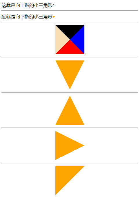
<div class="site-up">这就是向上指的小三角形 <b> </b> </div>
<hr>
<div class="site-down">这就是向下指的小三角形 <b> </b> </div>
<hr>
<div id="triangle-origin"></div>
<hr>
<div id="triangle-down"></div>
<hr>
<div id="triangle-up"></div>
<hr>
<div id="triangle-right"></div>
<hr>
<div id="triangle-left-top"></div>
</body>
</html>
盒子模型,给四个border染色
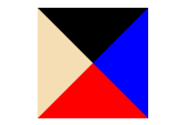
某一个方向的border宽度为0
向下的三角形:
#triangle-down{
	width:0;
	height:0;
	margin:10px auto;
	border-bottom: 0;
	border-right: 50px solid white;
	border-left: 50px solid white;
	border-top:100px solid orange;
}
向上的三角形:
#triangle-up{
	width:0;
	height:0;
	border-top: 0;
	border-right: 50px solid white;
	border-left: 50px solid white;
	border-bottom:100px solid orange;

	margin:10px auto;
}
向右的三角形:
#triangle-right{
	width:0;
	height:0;
	border-right: 0;
	border-top: 50px solid white;
	border-left: 100px solid orange;
	border-bottom:50px solid white;

	margin:10px auto;
}
向左上的三角形:
#triangle-left-top{
	width:0;
	height:0;
	border-right: 50px solid white;;
	border-top: 50px solid orange;
	border-left: 50px solid orange;
	border-bottom:50px solid white;

	margin:10px auto;
}
小结:
- 设置conten区宽高为0
- 上下左右,顶角在哪个方向,哪个方向的border宽度就设为0
- 左上、左下、右上、右下,其实就是两个三角形的组合
放在一段文字之后:
.site-down {
	width:auto;
	height:auto;
	background-color:#fff;
	position:relative;
}
.site-down b {
	width:0;
	height:0;
	margin:10px auto;
	border-bottom: 0;
	border-right: 4px solid white;
	border-left: 4px solid white;
	border-top:6px solid orange;
	position:absolute;
}
取盒子模型中四个三角形的一个
向上的三角形
.site-up {
	width:auto;
	height:auto;
	background-color:#fff;
	position:relative;
}
.site-up b {
	border-color: #fff #fff #666;;
	border-style: solid;
	border-width: 4px;

	position:absolute;
	top:3px;
}
小结:
由四个等腰三角形组成矩形盒子,把不需要的三角形设为和背景一样的颜色即可。因为所需要的向上三角形是很小的,所以实际的染黑部分未必是三角形,即使梯形,缩小后也会呈现三角形的样子。(可以通过增大border-width的值看到)
谢谢阅读!
