R语言 ggplot绘图中添加直线、箭头、注释、矩形等
001、基础绘图
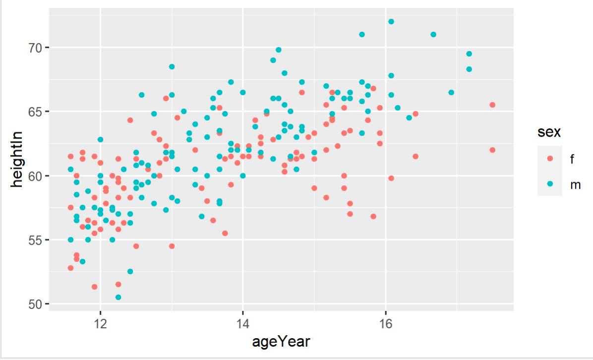
library(gcookbook)  # For the data set
p <- ggplot(heightweight, aes(x = ageYear, y = heightIn, colour = sex)) + geom_point()
p                              ## 基础绘图
002、添加直线
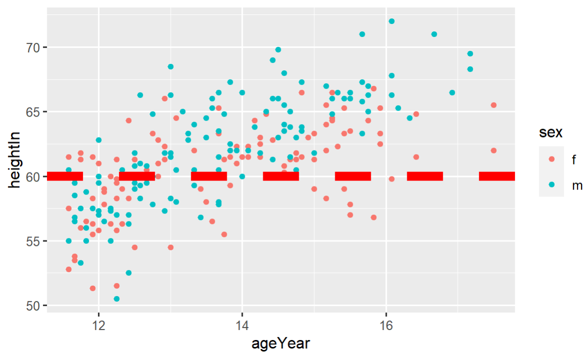
p + geom_hline(yintercept = 60) + geom_vline(xintercept = 14) ## 添加直线

003、调整颜色及粗细
p + geom_hline(yintercept = 60, colour = "red", lwd = 3) ## 调整颜色、粗细

003_02、
p + geom_hline(yintercept = 60, colour = "red", lwd = 3,
               linetype = "dashed")                ## 调整线条类型
004、增加斜线,控制截距和斜率
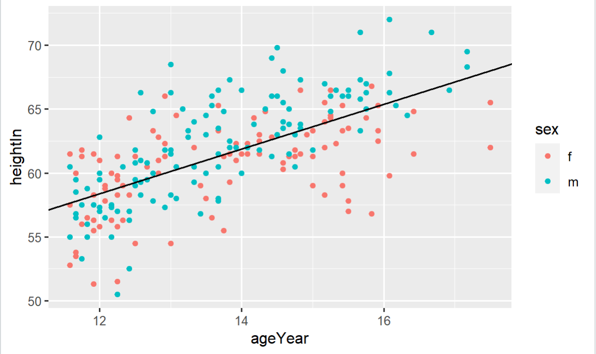
p + geom_abline(intercept = 37.4, slope = 1.75) ## 增加斜线,控制截距和斜率
005、 增加箭头
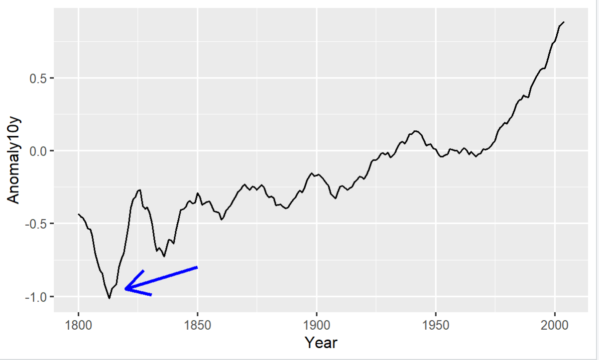
p <- ggplot(subset(climate, Source == "Berkeley"),
            aes(x = Year, y = Anomaly10y)) +
  geom_line()
p + annotate("segment", x = 1850, xend = 1820, y = -0.8,
yend = -0.95, colour = "blue", size = 1, arrow = arrow())   ## 增加箭头
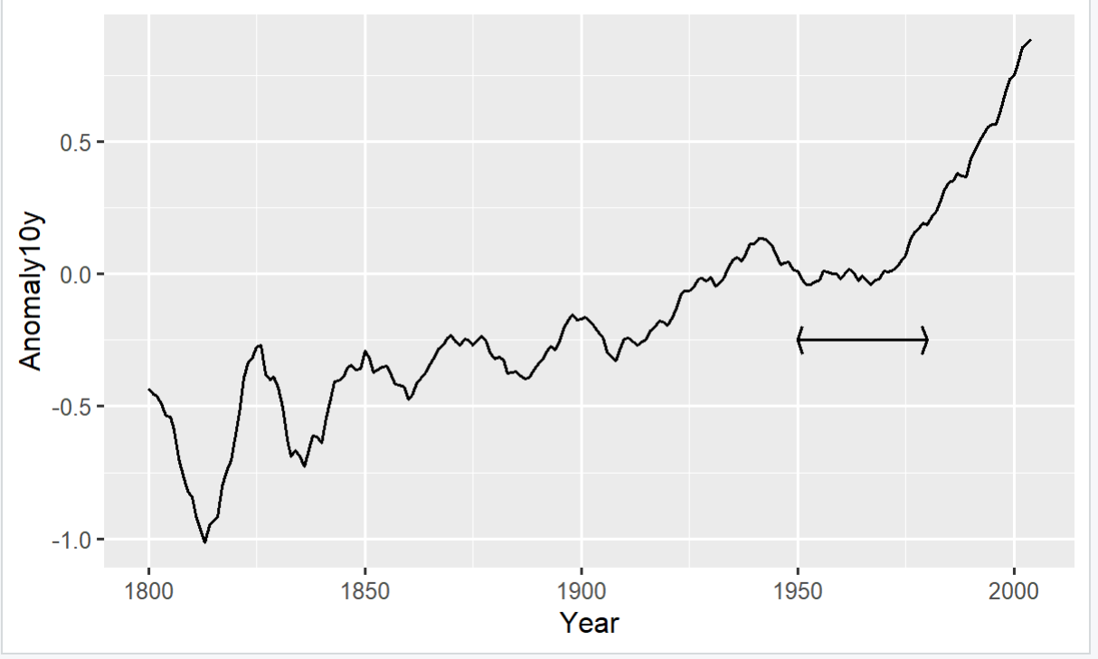
006、 增加箭头
p + annotate("segment", x = 1950, xend = 1980, y = -0.25,
yend = -0.25, arrow = arrow(ends = "both", angle = 70,
length = unit(0.2,  "cm")))         ## 增加箭头
007、 添加矩形
library(gcookbook)

p <- ggplot(subset(climate, Source == "Berkeley"), aes(x = Year, y = Anomaly10y)) +
  geom_line()                      ## 基础绘图
p
p + annotate("rect", xmin = 1950, xmax = 1980, ymin = -1, ymax = 1, alpha = 0.1,
             fill = "blue")        ## 添加矩形, 设置透明度,填充色
 。
。

 浙公网安备 33010602011771号