
8.渐变
渐变是可以在两个或多个指定的颜色之间显示平稳的渡过。
CSS3定义了两种类型的渐变:线性渐变和径向渐变。
一、线性渐变
语法:
background: linear-gradient(direction, color1, color2 top, ...);
参数介绍:
参数1.direction:渐变的方向
1)渐变方向
- 从上到下:to bottom(默认)
- 从下到上:to top
- 从左到右: to right
- 从右到左: to left
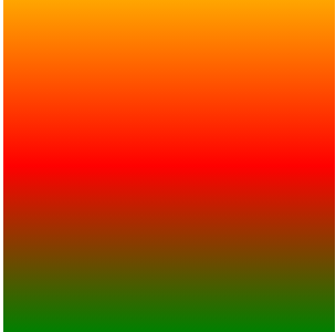
<!DOCTYPE html>
<html lang="en">
<head>
    <meta charset="UTF-8">
    <title>渐变属性</title>
    <style>
        div{
            width: 200px;
            height: 200px;
            background:linear-gradient(to top,green,red,orange);
        }
    </style>
</head>
<body>
<div></div>
</body>
</html>
2)对角渐变
- 从左上角到右下角:to left top
- 从左下角到右上角:to left bottom
- 从右上角到左下角:to right top
- 从右下角到左上角:to right bottom
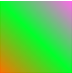
<!DOCTYPE html>
<html lang="en">
<head>
    <meta charset="UTF-8">
    <title>渐变属性</title>
    <style>
        div{
            width: 200px;
            height: 200px;
            background:linear-gradient(to left bottom, #ff69eb, #00ff2a, #fd7201); }
    </style>
 </head>
<body>
   <div></div>
</body>
</html>
3)角度渐变:角度+单位(deg)
语法:
background: linear-gradient(angle, color1, color2, ...);
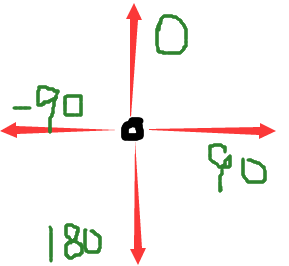
0deg代表top
90deg代表right
180deg代表bottom(默认)
-90deg代表left
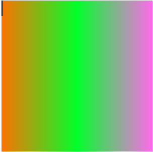
<!DOCTYPE html>
<html lang="en">
<head>
    <meta charset="UTF-8">
    <title>渐变属性</title>
    <style>
        div{
            width: 200px;
            height: 200px;
            background:linear-gradient(-90deg, #ff69eb, #00ff2a, #fd7201);
        }
    </style>
</head>
<body>
<div></div>
</body>
</html>
参数2.color:表示渐变的颜色
参数3:stop:stop的值可以是百分值也可以是像素值,表示某个颜色在stop值处停止。
background:linear-gradient(to right, green, blue 30px, pink  60px, yellow 80px,red);

background:linear-gradient(to right, green, blue 30%, pink  60%, yellow 80%,red);
 以绿色为起始颜色,渐变到30时为蓝色,渐变到60时是粉红色,到80时是黄色,到结束为红色
二、重复线性渐变
语法:
background: repeating-linear-gradient(to left bottom,pink 0, pink 10%, red 10%,red 20%);
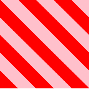 以粉色为起始颜色,到达10%仍然为粉色,在10%后变为红色直到20%仍为红色,然后粉色与红色循环
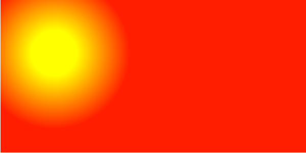
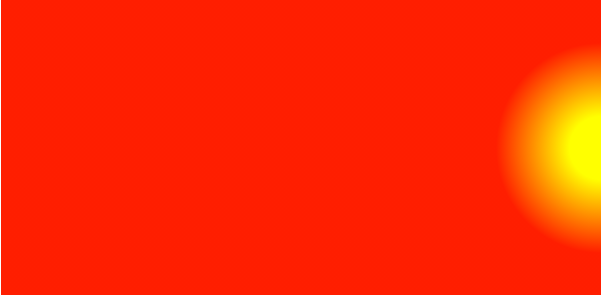
三、径向渐变
径向渐变由它的中心定义,至少定义两种颜色,可以指定渐变中心、形状和大小。
语法:
background: radial-gradient(shape size at position, start-color, ..., last-color);
中心:top / center / bottom 默认为center中心点
形状:circle / ellipse 默认为ellipse椭圆
大小:像素或百分比,指渐变圆心向外延伸的距离
注意:定义渐变形状可以通过传入具体值进行确定,如渐变形状为圆形,则不能用百分数,椭圆百分数像素均可。
1.当传入的参数值为一个或者两个相同的值,则渐变的形状为原形
background: radial-gradient(70px 70px,yellow 30% , #ff1e00 100%);
或直接声明形状同时加上渐变大小
background: radial-gradient(circle 70px,yellow 30% , #ff1e00 100%);

2.当传入的参数值为两个不同的值,则渐变形状为椭圆形
background: radial-gradient(80px 30px,yellow 30% , #ff1e00 100%);
或直接声明形状同时加上渐变大小,中间用空格隔开
background: radial-gradient(ellipse 80px 60px,yellow 30% , #ff1e00 100%);

定义大小除了给定具体值或使用百分比之外,还可以用以下四个值:
- closest-side:指定径向渐变的半径长度为从圆心到离圆心最近的边
- closest-corner:指定径向渐变的半径长度为从圆心到离圆心最近的角
- farthest-side:指定径向渐变的半径长度为从圆心到离圆心最远的边
- farthest-corner:指定径向渐变的半径长度为从圆心到离圆心最远的角
以closet-corner为例:position值不能为方位值
background: radial-gradient(circle closest-corner at 70px 70px,yellow 30% , #ff1e00 100%);
定义径向位置可以用具体值、百分值或方位值,默认是渐变形状处于容器中心点
1.当position只给定一个具体值或者百分比时,则表示在水平方向上所处的位置,垂直方向默认为50%
background: radial-gradient(circle 70px at 70px,yellow 30% , #ff1e00 100%);

2.当为position只给定一个方位时,表示该圆心在该方位上的值为0,而与垂直的方向上默认为50%
background: radial-gradient(circle 70px at right,yellow 30% , #ff1e00 100%);
四、重复径向渐变
background: repeating-radial-gradient(circle 70px ,white 0 ,white 20px, black 20px, black 40px);
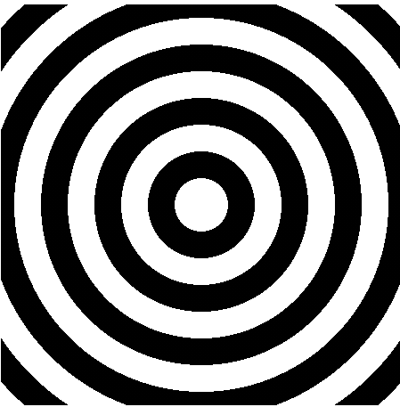
重重复线性渐变是沿着一个方向上的渐变,而重复径向渐变是以圆点为中心,以放射性的方式渐变。
此博客参考了https://blog.csdn.net/HU_YEWEN/article/details/90604792这位兄台的!谢谢,多向优秀的同学学习。

 浙公网安备 33010602011771号