

CSS垂直居中方法
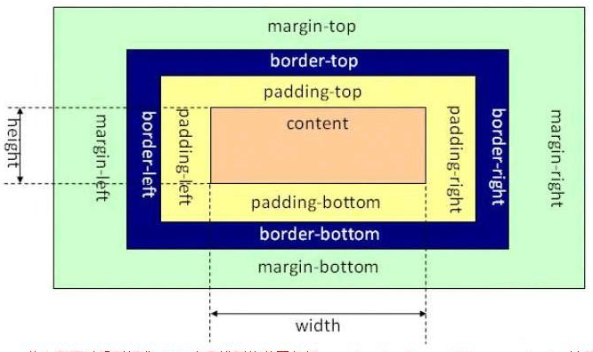
w3c指定盒子模型(标准模型)
首先,水平居中很简单:margin: 0 auto
垂直居中:
方法一:使用相对定位和 margin-top 属性对元素进行垂直居中
由于div元素的祖先元素html和body的高度默认是为0的,所以需要设置为100%,并且清除默认样式,即把margin和padding设置为0,如果不清除默认样式的话,浏览器就会出现滚动条。
top属性可以使元素向下偏移。但默认情况下,由于position的值为static(静止的、不可以移动的),元素在文档流里是从上往下、从左到右紧密的布局的,我们不可以直接通过top、left等属性改变它的偏移。所以,想要移动元素的位置,就要把position设置为不是static的其他值,如relative,absolute,fixed等。(注意,relative是不会使元素脱离文档流的,absolute和fixed则会!也就是说,relative会占据着移动之前的位置,但是absolute和fixed就不会)。
    <style>
        html,body{
            width: 100%;
            height: 100%;
            margin: 0;
            padding: 0;
        }
        .test{
            width: 200px;
            height: 200px;
            background-color: aquamarine;
            /* 水平居中 */
            margin: 0 auto;
            position: relative;
            top: 50%;
            margin-top: -100px;
        }
    </style>
注:这个方法兼容性不错,但是有一个小缺点:必须提前知道被居中块级元素的尺寸,否则无法准确实现垂直居中。
方法二:使用 transform 属性
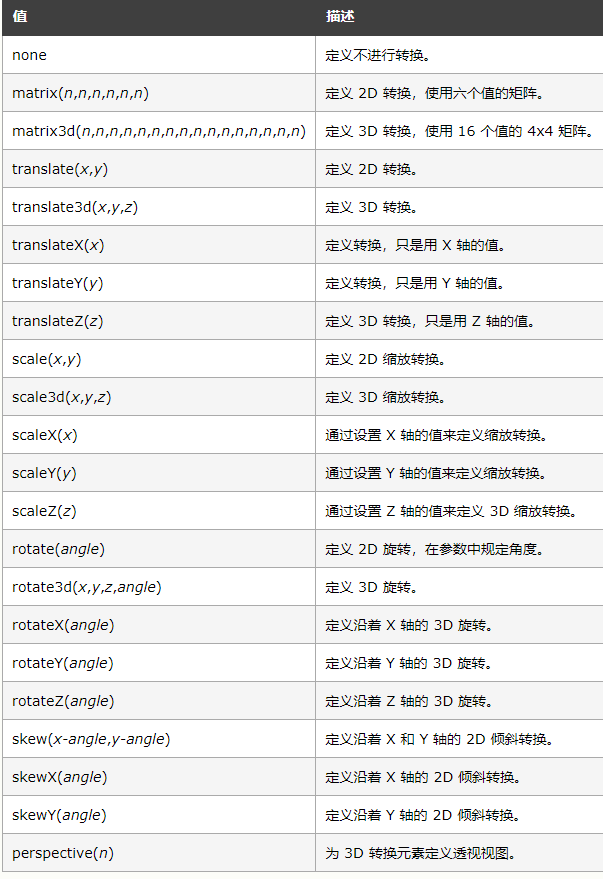
transform 属性向元素应用 2D 或 3D 转换。该属性允许我们对元素进行旋转、缩放、移动或倾斜。
    <style>
        html,body{
            width: 100%;
            height: 100%;
            margin: 0;
            padding: 0;
        }
        .test{
            width: 200px;
            height: 200px;
            background-color: aquamarine;
            /* 水平居中 */
            margin: 0 auto;
            position: relative;
            top: 50%;
            transform: translateY(-50%);
        }
    </style>
注:这种方法非常明显的好处就是不必提前知道被居中的元素的尺寸,因为transform中偏移的百分比就是相对于元素自身的尺寸而言,当被居中的元素是被自己内部元素撑开宽或者高的时候可适用此方法。
方法三:绝对定位结合 margin:auto
<style>
        html,body{
            width: 100%;
            height: 100%;
            margin: 0;
            padding: 0;
        }
        body{
            position: relative;
        }
        .test{
            width: 200px;
            height: 200px;
            background-color: aquamarine;
            top: 0;
            bottom: 0;
            left: 0;
            right: 0;
            margin: auto;
            position: absolute;

        }
    </style>
方法四:使用 CSS3 的弹性布局(flex)
使用CSS3的弹性布局很简单,只要设置父元素(这里是指body)的display的值为flex即可。
    <style>
        html,body{
            width: 100%;
            height: 100%;
            margin: 0;
            padding: 0;
        }
        body{
            display: flex;
            align-items: center;
            justify-content: center;
        }
        .test{
            width: 200px;
            height: 200px;
            background-color: aquamarine;
        }
    </style>
Flex是Flexible Box的缩写,意为”弹性布局”,用来为盒状模型提供最大的灵活性。具体可以看另一条笔记:


【推荐】国内首个AI IDE,深度理解中文开发场景,立即下载体验Trae
【推荐】编程新体验,更懂你的AI,立即体验豆包MarsCode编程助手
【推荐】抖音旗下AI助手豆包,你的智能百科全书,全免费不限次数
【推荐】轻量又高性能的 SSH 工具 IShell:AI 加持,快人一步
· TypeScript + Deepseek 打造卜卦网站:技术与玄学的结合
· 阿里巴巴 QwQ-32B真的超越了 DeepSeek R-1吗?
· 如何调用 DeepSeek 的自然语言处理 API 接口并集成到在线客服系统
· 【译】Visual Studio 中新的强大生产力特性
· 2025年我用 Compose 写了一个 Todo App