【Echarts】
下载官网的GitHub,解压至D盘

常用参数

一、柱状图
参照 https://www.echartsjs.com/tutorial.html#%E8%87%AA%E5%AE%9A%E4%B9%89%E6%9E%84%E5%BB%BA%20ECharts 的自定义构建 ECharts
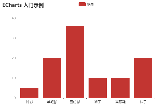
<html>
<head>
    <meta charset="utf-8">
    <!-- step1:引入echarts文件 -->
    <script src="D:\Echarts\incubator-echarts-4.2.1\dist\echarts.js"></script>
</head>
<body>
    <!-- step2:为 ECharts 准备一个具备大小(宽高)的 DOM -->
    <div id="main" style="width: 600px;height:400px;"></div>
    <script type="text/javascript">
        // step3:初始化Echarts图表
        var myChart = echarts.init(document.getElementById('main'));

        // step4:指定图表的配置项和数据
        var option = {
            title: {
                text: 'ECharts 入门示例'
            },
            tooltip: {},
            legend: {
                data:['销量']
            },
            xAxis: {
                data: ["衬衫","羊毛衫","雪纺衫","裤子","高跟鞋","袜子"]
            },
            yAxis: {},
            series: [{
                name: '销量',
                type: 'bar',
                data: [5, 20, 36, 10, 10, 20]
            }]
        };

        // step5:使用刚指定的配置项和数据显示图表
        myChart.setOption(option);
    </script>
</body>

</html>
选择 https://www.echartsjs.com/examples/editor.html?c=bar1 实例参考
<html>
<head>
    <meta charset="utf-8">
    <!-- step1:引入echarts文件 -->
    <script src="D:\Echarts\incubator-echarts-4.2.1\dist\echarts.js"></script>
</head>
<body>
    <!-- step2:为 ECharts 准备一个具备大小(宽高)的 DOM -->
    <div id="main" style="width: 900px;height:600px;"></div>
    <script type="text/javascript">
        // step3:初始化Echarts图表
        var myChart = echarts.init(document.getElementById('main'));

        // step4:指定图表的配置项和数据
        var option = {
            title : {
                text: '某地区蒸发量和降水量',
                subtext: '纯属虚构'
            },
            tooltip : {
                trigger: 'axis'
            },
            legend: {
                <!-- x:"center", -->
                <!-- y:"center", -->
                data:['蒸发量','降水量']
            },
            toolbox: {
                show : true,
                feature : {
                    dataView : {show: true, readOnly: false},
                    magicType : {show: true, type: ['line', 'bar']},
                    restore : {show: true},
                    saveAsImage : {show: true}
                }
            },
            calculable : true,
            xAxis : [
                {
                    type : 'category',
                    data : ['1月','2月','3月','4月','5月','6月','7月','8月','9月','10月','11月','12月']
                }
            ],
            yAxis : [
                {
                    type : 'value'
                }
            ],
            series : [
                {
                    name:'蒸发量',
                    type:'bar',
                    data:[2.0, 4.9, 7.0, 23.2, 25.6, 76.7, 135.6, 162.2, 32.6, 20.0, 6.4, 3.3],
                    markPoint : {
                        data : [
                            {type : 'max', name: '最大值'},
                            {type : 'min', name: '最小值'}
                        ]
                    },
                    <!-- markLine : { -->
                        <!-- data : [ -->
                            <!-- {type : 'average', name: '平均值'} -->
                        <!-- ] -->
                    <!-- } -->
                },
                {
                    name:'降水量',
                    type:'bar',
                    data:[2.6, 5.9, 9.0, 26.4, 28.7, 70.7, 175.6, 182.2, 48.7, 18.8, 6.0, 2.3],
                    markPoint : {
                        data : [
                            {name : '年最高', value : 182.2, xAxis: 7, yAxis: 183},
                            {name : '年最低', value : 2.3, xAxis: 11, yAxis: 3}
                        ]
                    },
                    <!-- markLine : { -->
                        <!-- data : [ -->
                            <!-- {type : 'average', name : '平均值'} -->
                        <!-- ] -->
                    <!-- } -->
                }
            ]
        };


        // step5:使用刚指定的配置项和数据显示图表。
        myChart.setOption(option);
    </script>
</body>

</html>

二、折线图
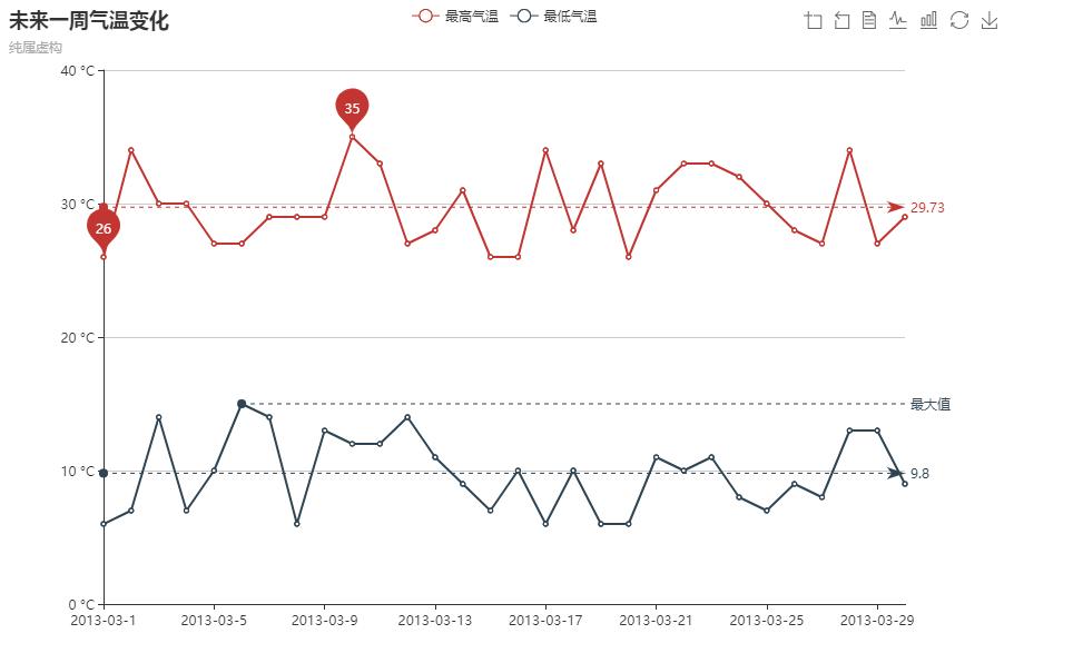
<html>
<head>
    <meta charset="utf-8">
    <!-- step1:引入echarts文件 -->
    <script src="D:\Echarts\incubator-echarts-4.2.1\dist\echarts.js"></script>
</head>
<body>
    <!-- step2:为 ECharts 准备一个具备大小(宽高)的 DOM -->
    <div id="main" style="width: 900px;height:600px;"></div>
    <script type="text/javascript">
        // step3:初始化Echarts图表
        var myChart = echarts.init(document.getElementById('main'));

        // step4:指定图表的配置项和数据
        var option = {
            title: {
                text: '未来一周气温变化',
                subtext: '纯属虚构'
            },
            tooltip: {
                trigger: 'axis'
            },
            legend: {
                data:['最高气温','最低气温']
            },
            toolbox: {
                show: true,
                feature: {
                    dataZoom: {
                        yAxisIndex: 'none'
                    },
                    dataView: {readOnly: false},
                    magicType: {type: ['line', 'bar']},
                    restore: {},
                    saveAsImage: {}
                }
            },
            xAxis:  {
                type: 'category',
                boundaryGap: false,
                data:function(){
                    var list=[];
                    for (var i=1;i<=30;i++){
                        list.push('2013-03-'+i);
                    }
                    return list;
                }()
            },
            yAxis: {
                type: 'value',
                axisLabel: {
                    formatter: '{value} °C'
                }
            },
            series: [
                {
                    name:'最高气温',
                    type:'line',
                    data:function(){
                        var list=[];
                        for (var i=1;i<=30;i++){
                            list.push(Math.round(Math.random()*10+25));
                        }
                        return list;
                    }(),
                    markPoint: {
                        data: [
                            {type: 'max', name: '最大值'},
                            {type: 'min', name: '最小值'}
                        ]
                    },
                    markLine: {
                        data: [
                            {type: 'average', name: '平均值'}
                        ]
                    }
                },
                {
                    name:'最低气温',
                    type:'line',
                    data:function(){
                        var list=[];
                        for (var i=1;i<=30;i++){
                            list.push(Math.round(Math.random()*10+5));
                        }
                        return list;
                    }(),
                    markPoint: {
                        data: [
                            {name: '周最低', value: -2, xAxis: 1, yAxis: -1.5}
                        ]
                    },
                    markLine: {
                        data: [
                            {type: 'average', name: '平均值'},
                            [{
                                symbol: 'none',
                                x: '90%',
                                yAxis: 'max'
                            }, {
                                symbol: 'circle',
                                label: {
                                    normal: {
                                        position: 'start',
                                        formatter: '最大值'
                                    }
                                },
                                type: 'max',
                                name: '最高点'
                            }]
                        ]
                    }
                }
            ]
        };


        // step5:使用刚指定的配置项和数据显示图表
        myChart.setOption(option);
    </script>
</body>

</html>
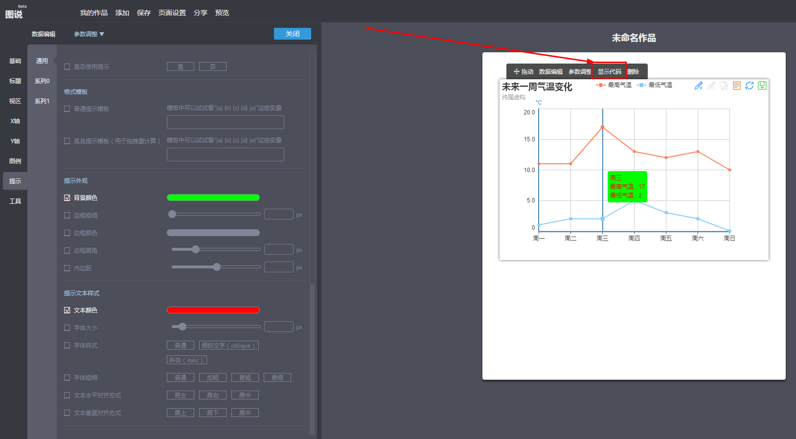
技巧:利用百度图说可以调节相关参数,然后复制代码到html文件即可(https://tushuo.baidu.com/)
三、饼图
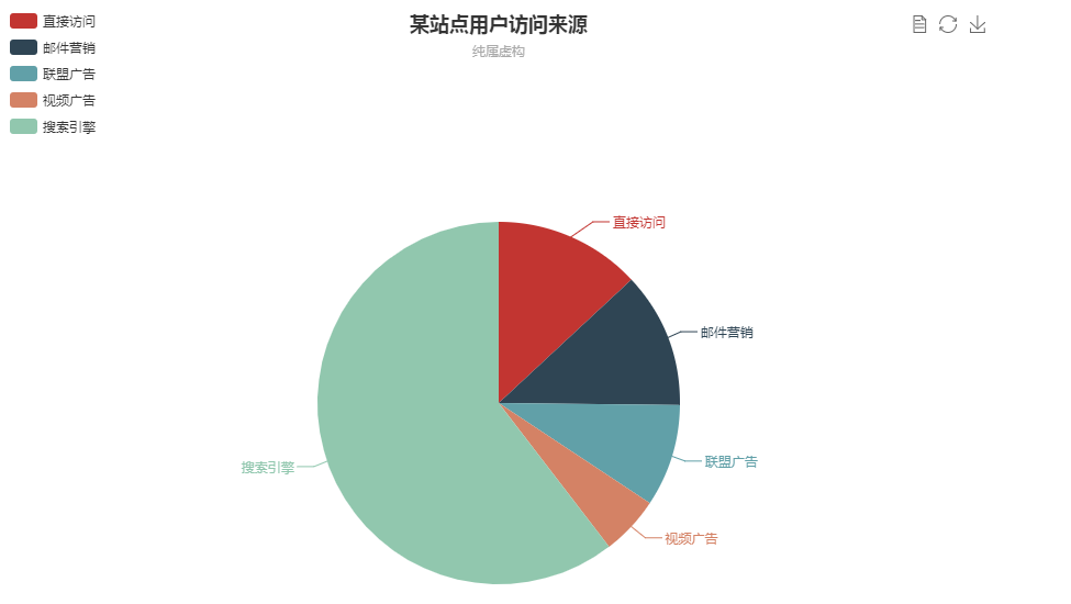
<html>
<head>
    <meta charset="utf-8">
    <!-- step1:引入echarts文件 -->
    <script src="D:\Echarts\incubator-echarts-4.2.1\dist\echarts.js"></script>
</head>
<body>
    <!-- step2:为 ECharts 准备一个具备大小(宽高)的 DOM -->
    <div id="main" style="width: 900px;height:600px;"></div>
    <script type="text/javascript">
        // step3:初始化Echarts图表
        var myChart = echarts.init(document.getElementById('main'));

        // step4:指定图表的配置项和数据
        var option = {
            title: {
                text: "某站点用户访问来源",
                subtext: "纯属虚构",
                x: "center"
            },
            tooltip: {
                trigger: "item",
                formatter: "{a} <br/>{b} : {c} ({d}%)"    //a系列名称,b数据项名称,c数值,d(饼图是百分比,雷达图是指标名称)
            },
            legend: {
                orient: "vertical",
                x: "left",
                data: ["直接访问", "邮件营销", "联盟广告", "视频广告", "搜索引擎"]
            },
            toolbox: {
                show: true,
                feature: {
                    mark: {
                        show: true
                    },
                    dataView: {
                        show: true,
                        readOnly: true
                    },
                    restore: {
                        show: true
                    },
                    saveAsImage: {
                        show: true
                    }
                }
            },
            calculable: true,
            series: [
                {
                    name: "访问来源",
                    type: "pie",
                    radius: "55%",
                    center: ["50%", "60%"],
                    data: [
                        {
                            value: 335,
                            name: "直接访问"
                        },
                        {
                            value: 310,
                            name: "邮件营销"
                        },
                        {
                            value: 234,
                            name: "联盟广告"
                        },
                        {
                            value: 135,
                            name: "视频广告"
                        },
                        {
                            value: 1548,
                            name: "搜索引擎"
                        }
                    ]
                }
            ]
        };


        // step5:使用刚指定的配置项和数据显示图表
        myChart.setOption(option);
    </script>
</body>

</html>
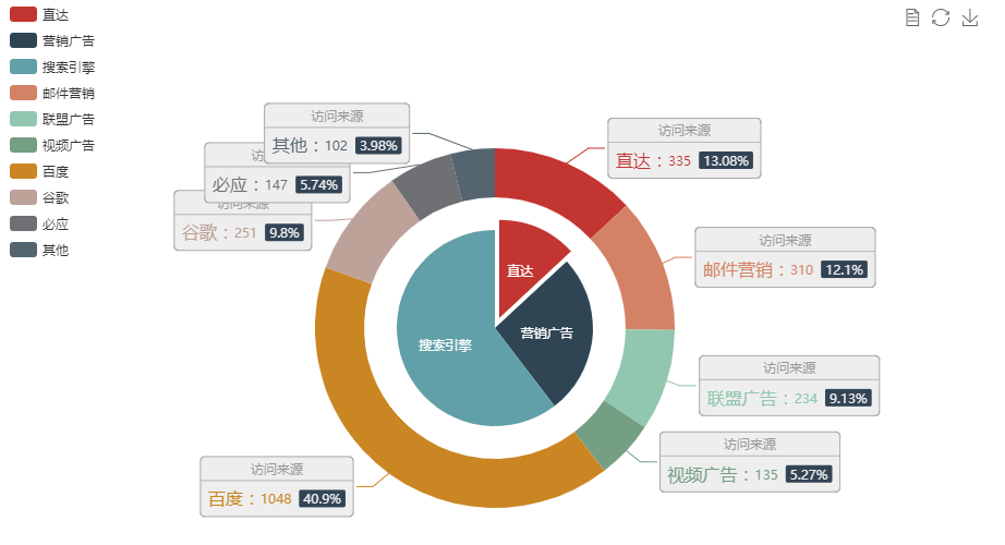
<html>
<head>
    <meta charset="utf-8">
    <!-- step1:引入echarts文件 -->
    <script src="D:\Echarts\incubator-echarts-4.2.1\dist\echarts.js"></script>
</head>
<body>
    <!-- step2:为 ECharts 准备一个具备大小(宽高)的 DOM -->
    <div id="main" style="width: 900px;height:600px;"></div>
    <script type="text/javascript">
        // step3:初始化Echarts图表
        var myChart = echarts.init(document.getElementById('main'));

        // step4:指定图表的配置项和数据
        var option = {
            tooltip: {
                trigger: 'item',
                formatter: "{a} <br/>{b}: {c} ({d}%)"
            },
            legend: {
                orient: 'vertical',
                x: 'left',
                data:['直达','营销广告','搜索引擎','邮件营销','联盟广告','视频广告','百度','谷歌','必应','其他']
            },
            toolbox: {
                show: true,
                feature: {
                    mark: {
                        show: true
                    },
                    dataView: {
                        show: true,
                        readOnly: true
                    },
                    restore: {
                        show: true
                    },
                    saveAsImage: {
                        show: true
                    }
                }
            },
            series: [
                {
                    name:'访问来源',
                    type:'pie',
                    selectedMode: 'single',
                    radius: [0, '30%'],

                    label: {
                        normal: {
                            position: 'inner'
                        }
                    },
                    labelLine: {
                        normal: {
                            show: false
                        }
                    },
                    data:[
                        {value:335, name:'直达', selected:true},
                        {value:679, name:'营销广告'},
                        {value:1548, name:'搜索引擎'}
                    ]
                },
                {
                    name:'访问来源',
                    type:'pie',
                    radius: ['40%', '55%'],
                    label: {
                        normal: {
                            formatter: '{a|{a}}{abg|}\n{hr|}\n  {b|{b}:}{c}  {per|{d}%}  ',
                            backgroundColor: '#eee',
                            borderColor: '#aaa',
                            borderWidth: 1,
                            borderRadius: 4,
                            // shadowBlur:3,
                            // shadowOffsetX: 2,
                            // shadowOffsetY: 2,
                            // shadowColor: '#999',
                            // padding: [0, 7],
                            rich: {
                                a: {
                                    color: '#999',
                                    lineHeight: 22,
                                    align: 'center'
                                },
                                // abg: {
                                //     backgroundColor: '#333',
                                //     width: '100%',
                                //     align: 'right',
                                //     height: 22,
                                //     borderRadius: [4, 4, 0, 0]
                                // },
                                hr: {
                                    borderColor: '#aaa',
                                    width: '100%',
                                    borderWidth: 0.5,
                                    height: 0
                                },
                                b: {
                                    fontSize: 16,
                                    lineHeight: 33
                                },
                                per: {
                                    color: '#eee',
                                    backgroundColor: '#334455',
                                    padding: [2, 4],
                                    borderRadius: 2
                                }
                            }
                        }
                    },
                    data:[
                        {value:335, name:'直达'},
                        {value:310, name:'邮件营销'},
                        {value:234, name:'联盟广告'},
                        {value:135, name:'视频广告'},
                        {value:1048, name:'百度'},
                        {value:251, name:'谷歌'},
                        {value:147, name:'必应'},
                        {value:102, name:'其他'}
                    ]
                }
            ]
        };


        // step5:使用刚指定的配置项和数据显示图表
        myChart.setOption(option);
    </script>
</body>

</html>
四、散点图
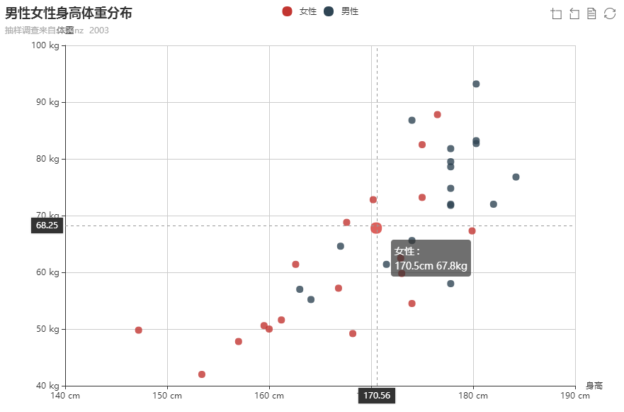
title: {
                text: "男性女性身高体重分布",
                subtext: "抽样调查来自: Heinz  2003"
            },
            tooltip: {
                showDelay: 0,
                formatter:function(params){
                    if (params.value.length>1) {
                        return params.seriesName+' :<br/>'        +params.value[0]+'cm    '        +params.value[1]+'kg';
                    }else{
                        return params.seriesName+' :<br/>'        +params.name+' : '        +params.value+'kg';
                    }
                },
                axisPointer: {
                    show:true,
                    type: "cross",
                    lineStyle: {
                        type: "dashed",
                        width: 1
                    }
                }
            },
            legend: {
                data: ["女性", "男性"]
            },
            toolbox: {
                show: true,
                feature: {
                    mark: {
                        show: true
                    },
                    dataZoom: {
                        show: true
                    },
                    dataView: {
                        show: true,
                        readOnly: true
                    },
                    restore: {
                        show: true
                    },
                    saveAsImage: {
                        show: true
                    }
                }
            },
            xAxis: [
                {
                    type: "value",
                    power: 1,
                    precision: 2,
                    scale: true,
                    name:'身高',
                    axisLabel:{
                        formatter:'{value} cm'
                    }
                }
            ],
            yAxis: [
                {
                    type: "value",
                    power: 1,
                    precision: 2,
                    scale: true,
                    name:'体重',
                    axisLabel:{
                        formatter:'{value} kg'
                    }
                }
            ],
            series: [
                {
                    name: "女性",
                    type: "scatter",
                    data: [[161.2, 51.6], [172.9, 62.5], [153.4, 42], [160, 50], [147.2, 49.8], [168.2, 49.2], [175, 73.2], [157, 47.8], [167.6, 68.8], [159.5, 50.6], [175, 82.5], [166.8, 57.2], [176.5, 87.8], [170.2, 72.8], [174, 54.5], [173, 59.8], [179.9, 67.3], [170.5, 67.8], [162.6, 61.4]]
                },
                {
                    name: "男性",
                    type: "scatter",
                    data: [[174, 65.6], [164.1, 55.2], [163, 57], [171.5, 61.4], [184.2, 76.8], [174, 86.8], [182, 72], [167, 64.6], [177.8, 74.8], [180.3, 93.2], [180.3, 82.7], [177.8, 58], [177.8, 79.5], [177.8, 78.6], [177.8, 71.8], [177.8, 72], [177.8, 81.8], [180.3, 83.2]]
                }
            ]
        };
五、气泡图
<html>
<head>
    <meta charset="utf-8">
    <!-- step1:引入echarts文件 -->
    <script src="D:\Echarts\incubator-echarts-4.2.1\dist\echarts.js"></script>
</head>
<body>
    <!-- step2:为 ECharts 准备一个具备大小(宽高)的 DOM -->
    <div id="main" style="width: 900px;height:600px;"></div>
    <script type="text/javascript">
        // step3:初始化Echarts图表
        var myChart = echarts.init(document.getElementById('main'));

        // step4:指定图表的配置项和数据
        var option = {
            tooltip: {
                trigger: "axis",
                showDelay: 0,
                axisPointer: {
                    type: "cross",
                    lineStyle: {
                        type: "dashed",
                        width: 1
                    }
                }
            },
            legend: {
                data: ["scatter1", "scatter2"]
            },
            toolbox: {
                show: true,
                feature: {
                    mark: {
                        show: true
                    },
                    dataZoom: {
                        show: true
                    },
                    dataView: {
                        show: true,
                        readOnly: true
                    },
                    restore: {
                        show: true
                    },
                    saveAsImage: {
                        show: true
                    }
                }
            },
            xAxis: [
                {
                    type: "value",
                    power: 1,
                    splitNumber: 4,
                    scale: true
                }
            ],
            yAxis: [
                {
                    type: "value",
                    power: 1,
                    splitNumber: 4,
                    scale: true
                }
            ],
            series: [
                {
                    name: "scatter1",
                    type: "scatter",
                    symbol: "circle",
                    data: [[-69, 58, 70], [10, 74, 29], [-11, 68, 99], [10, 76, 53], [-79, -9, 93], [-81, -67, 56], [-95, -71, 50], [-7, 22, 5], [-57, -67, 73], [16, 58, 73], [-65, 30, 56], [4, -75, 3], [-65, 92, 98], [30, -65, 29], [-11, -37, 59], [48, -31, 89], [-39, -51, 23], [-21, -37, 23], [24, -11, 38], [90, -19, 79], [-61, -11, 98], [-23, -83, 75], [-39, 58, 25], [-93, -65, 24], [60, -17, 22], [54, 88, 27], [-29, 76, 76], [-45, 32, 89], [-69, 58, 63], [90, 34, 33], [-41, -5, 91], [58, -33, 77], [-79, -83, 69], [-99, -43, 80], [44, 8, 0], [-81, -19, 74], [-13, 40, 84], [60, -67, 82], [16, 14, 59], [-37, 36, 93], [0, 54, 23], [-61, 44, 26], [32, 60, 10], [90, 20, 21], [20, -91, 53], [32, -87, 73], [-85, 90, 74], [72, -1, 95], [-67, -59, 87], [-21, -29, 60]],
                    symbolSize: function anonymous(value
                       /*``*/) {
                       var radius = (value[2] - 0) * 16 / 100 + 4;
                       return Math.max(Math.round(radius), 1) || 1;
                   }
                },
                {
                    name: "scatter2",
                    type: "scatter",
                    symbol: "circle",
                    data: [[76, 72, 50], [-67, 70, 52], [26, 20, 71], [-57, -63, 93], [-19, -49, 78], [46, 28, 71], [-87, -97, 7], [-81, -59, 71], [32, 28, 49], [68, 88, 73], [20, -47, 46], [-61, 18, 89], [-89, -3, 92], [-19, -27, 43], [-55, -67, 18], [-79, 52, 92], [14, 16, 61], [-19, -1, 97], [-93, -67, 81], [-63, 14, 4], [-87, -37, 92], [24, 96, 82]],
                    symbolSize: function anonymous(value
                       /*``*/) {
                       var radius = (value[2] - 0) * 16/ 100 + 4;
                       return Math.max(Math.round(radius), 1) || 1;
                   }
                }
            ]
        };

        // step5:使用刚指定的配置项和数据显示图表
        myChart.setOption(option);
    </script>
</body>
</html>

六、雷达图


<html>
<head>
    <meta charset="utf-8">
    <!-- step1:引入echarts文件 -->
    <script src="D:\Echarts\incubator-echarts-4.2.1\dist\echarts.js"></script>
</head>
<body>
    <!-- step2:为 ECharts 准备一个具备大小(宽高)的 DOM -->
    <div id="main" style="width: 900px;height:600px;"></div>
    <script type="text/javascript">
        // step3:初始化Echarts图表
        var myChart = echarts.init(document.getElementById('main'));

        // step4:指定图表的配置项和数据
        var option = {
            title: {
                text: "预算 vs 开销",
                subtext: "纯属虚构"
            },
            tooltip: {
                trigger: "item"
            },
            legend: {
                orient: "vertical",
                x: "right",
                y: "bottom",
                data: ["预算分配", "实际开销"]
            },
            toolbox: {
                show: true,
                feature: {
                    mark: {
                        show: true
                    },
                    dataView: {
                        show: true,
                        readOnly: false
                    },
                    restore: {
                        show: true
                    },
                    saveAsImage: {
                        show: true
                    }
                }
            },
            polar: [
                {
                    indicator: [
                        {
                            text: "销售",
                            max: 6000,
                            min: 0
                        },
                        {
                            text: "管理",
                            max: 16000,
                            min: 0
                        },
                        {
                            text: "信息技术",
                            max: 30000,
                            min: 0
                        },
                        {
                            text: "客服",
                            max: 38000,
                            min: 0
                        },
                        {
                            text: "研发",
                            max: 52000,
                            min: 0
                        },
                        {
                            text: "市场",
                            max: 25000,
                            min: 0
                        }
                    ]
                }
            ],
            calculable: true,
            series: [
                {
                    name: "",
                    type: "radar",
                    data: [
                        {
                            value: [4300, 10000, 28000, 35000, 50000, 19000],
                            name: "预算分配"
                        }
                    ]
                },
                {
                    name: "",
                    type: "radar",
                    data: [
                        {
                            value: [5000, 14000, 28000, 31000, 42000, 21000],
                            name: "实际开销"
                        }
                    ]
                }
            ]
        };

        // step5:使用刚指定的配置项和数据显示图表
        myChart.setOption(option);
    </script>
</body>
</html>

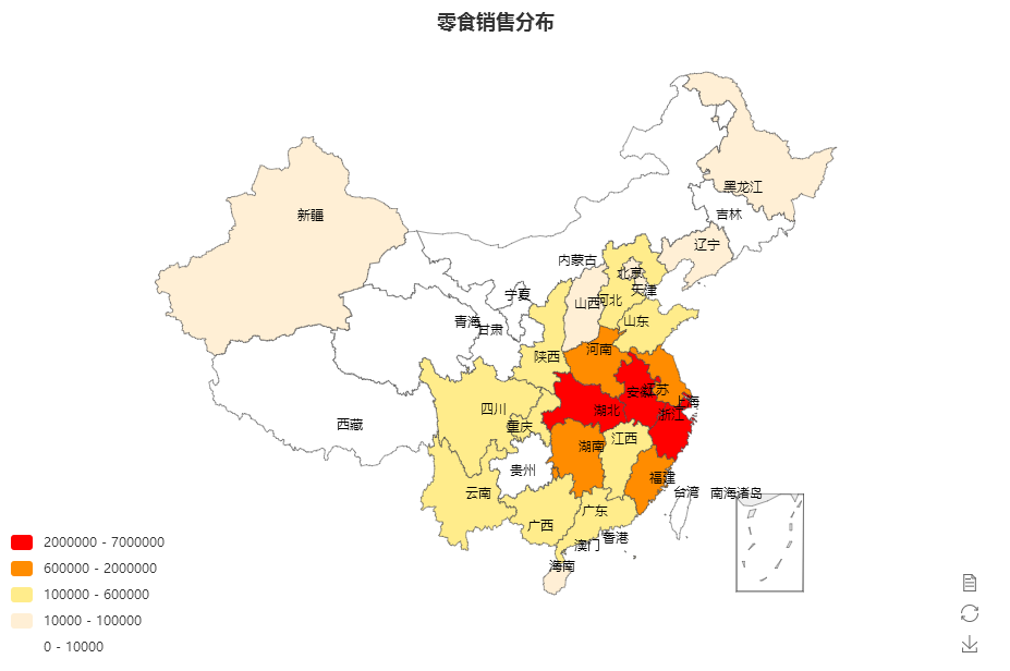
七、地图(Map)
首先需要加载相关的js文件,比如本案例使用中国地图,则需要加载china.js文件
<html>
<head>
    <meta charset="utf-8">
    <!-- step1:引入echarts文件 -->
    <script src="D:\Echarts\incubator-echarts-4.2.1\dist\echarts.js"></script>
    <script src="D:\Echarts\china.js"></script>
</head>
<body>
    <!-- step2:为 ECharts 准备一个具备大小(宽高)的 DOM -->
    <div id="main" style="width: 900px;height:600px;"></div>
    <script type="text/javascript">
        // step3:初始化Echarts图表
        var myChart = echarts.init(document.getElementById('main'));

        // step4:指定图表的配置项和数据
        var option = {
            title: {
                text: "零食销售分布",
                x: "center"
            },
            tooltip: {
                trigger: "item"
            },

            //左侧小导航图标
            visualMap: {
                show : true,
                x: 'left',
                y: 'bottom',
                splitList: [
                    {start: 0, end:10000},
                    {start: 10000, end: 100000},
                    {start: 100000, end: 600000},
                    {start: 600000, end: 2000000},
                    {start: 2000000, end: 7000000},
                ],
                color: [  '#FF0000','#FF8C00','#FFEC8B','#FFEFD5', '#FFFFFF']
            },

            toolbox: {
                show: true,
                orient: "vertical",
                x: "right",
                y: "bottom",
                feature: {
                    mark: {
                        show: true
                    },
                    dataView: {
                        show: true,
                        readOnly: false
                    },
                    restore: {
                        show: true
                    },
                    saveAsImage: {
                        show: true
                    }
                }
            },
            roamController: {
                show: true,
                x: "right",
                mapTypeControl: {
                    china: true
                }
            },
            series: [
                {
                    name: "零食销售",
                    type: "map",
                    mapType: "china",
                    roam: false,
                    mapValueCalculation: "sum",
                    itemStyle: {
                        normal: {
                            label: {
                                show: true
                            }
                        },
                        emphasis: {
                            label: {
                                show: true
                            }
                        }
                    },
                    data: [
                           {
                            name: "安徽",
                            value: 2809744
                        },
                        {
                            name: "北京",
                            value: 74861
                        },
                        {
                            name: "天津",
                            value: 20158
                        },
                        {
                            name: "上海",
                            value: 6201149
                        },
                        {
                            name: "重庆",
                            value: 201728
                        },
                        {
                            name: "河北",
                            value: 137862
                        },
                        {
                            name: "河南",
                            value: 1053178
                        },
                        {
                            name: "云南",
                            value: 154137
                        },
                        {
                            name: "辽宁",
                            value: 55507
                        },
                        {
                            name: "黑龙江",
                            value: 19895
                        },
                        {
                            name: "湖南",
                            value: 1319330
                        },

                        {
                            name: "山东",
                            value: 386914
                        },
                        {
                            name: "新疆",
                            value: 28373
                        },
                        {
                            name: "江苏",
                            value: 956038
                        },
                        {
                            name: "浙江",
                            value: 3038199
                        },
                        {
                            name: "江西",
                            value: 164753
                        },
                        {
                            name: "湖北",
                            value: 2498581
                        },
                        {
                            name: "广西",
                            value: 296415
                        },
                        {
                            name: "甘肃",
                            value: 0
                        },
                        {
                            name: "山西",
                            value: 88890
                        },
                        {
                            name: "内蒙古",
                            value: 3131
                        },
                        {
                            name: "陕西",
                            value: 131262
                        },
                        {
                            name: "吉林",
                            value: 2326
                        },
                        {
                            name: "福建",
                            value: 1686892
                        },
                        {
                            name: "贵州",
                            value: 4079
                        },
                        {
                            name: "广东",
                            value: 573615
                        },
                        {
                            name: "青海",
                            value: 0
                        },
                        {
                            name: "西藏",
                            value: 0
                        },
                        {
                            name: "四川",
                            value: 175550
                        },
                        {
                            name: "宁夏",
                            value: 0
                        },
                        {
                            name: "海南",
                            value: 25938
                        },
                        {
                            name: "台湾",
                            value: 0
                        },
                        {
                            name: "香港",
                            value: 0
                        },
                        {
                            name: "澳门",
                            value: 0
                        }
                    ]
                }
            ]
        };

        // step5:使用刚指定的配置项和数据显示图表
        myChart.setOption(option);
    </script>
</body>
</html>
八、漏斗图

 浙公网安备 33010602011771号