CSS三栏布局
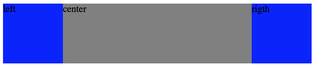
一、绝对定位
<!DOCTYPE html>
<html>
    <head>
        <meta charset="utf-8" />
        <style type="text/css">
            .container{
                position: relative;
            }
            .left{
                position: absolute;
                top: 0;
                right: 0;
                width: 100px;
                height: 100px;
                background: blue;
            }
            .right{
                position: absolute;
                top: 0;
                right: 0;
                width: 100px;
                height: 100px;
                background: green;
            }
            .center{
                margin: 0px 100px;
                height: 100px;
                background: gray;
            }
        </style>
    </head>

    <body>
        <div class="container">
            <div class="left">left</div>
            <div class="center">center</div>
            <div class="right">rigth</div>
        </div>
    </body>
</html>
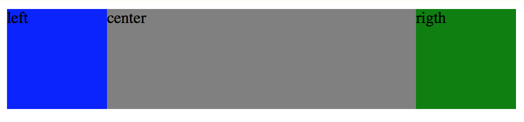
二、浮动
<!DOCTYPE html>
<html>
    <head>
        <meta charset="utf-8" />
        <style type="text/css">
            .left{
                float: left;
                width: 100px;
                height: 100px;
                background-color: blue;
            }
            .right{
                float: right;
                width: 100px;
                height: 100px;
                background-color: red;
            }
            .center{
                height: 100px;
                margin: 0 100px;
                background-color: green;
            }
        </style>
    </head>

    <body>
        <div>
            <div class="left">left</div>
            <div class="right">right</div>
            <div class="center">center</div>
        </div>
    </body>
</html>
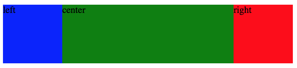
三、圣杯
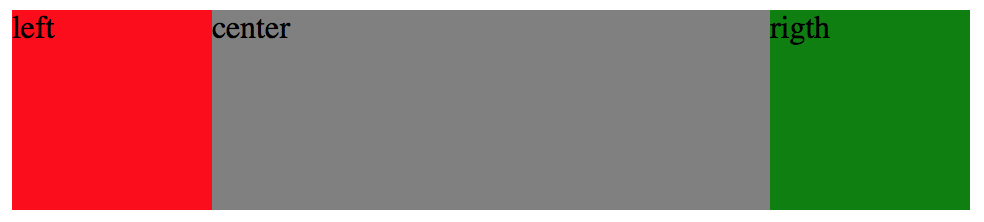
<!DOCTYPE html>
<html>
    <head>
        <meta charset="utf-8" />
        <style type="text/css">
            .container{
                height: 100px;
                padding: 0 100px 0 100px;
            }
            .center{
                float: left;
                width: 100%;
                height: 100%;
                background: #808080;
            }
            .left{
                position: relative;
                left: -100px;
                float: left;
                width: 100px;
                height: 100%;
                background: red;
                margin-left: -100%;
            }
            .right{
                position: relative;
                right: -100px;
                float: left;
                width: 100px;
                height: 100%;
                background: green;
                margin-left: -100px;
            }
        </style>
    </head>

    <body>
        <div class="container">
            <!-- 中间的 div 必须写在最前面 -->
            <div class="center">center</div>
            <div class="left">left</div>
            <div class="right">rigth</div>
        </div>
    </body>
</html>
1.中间盒子的宽度设置为 width: 100%; 独占一行;
2.使用负边距(均是 margin-left)把左右两边的盒子都拉上去和中间盒子同一行;
.left {margin-left:-100%;} 把左边的盒子拉上去
.right {margin-left:-右边盒子宽度px;} 把右边的盒子拉上去
3.父盒子设置左右的 padding 来为左右盒子留位置;
4.对左右盒子使用相对布局来占据 padding 的空白,避免中间盒子的内容被左右盒子覆盖;
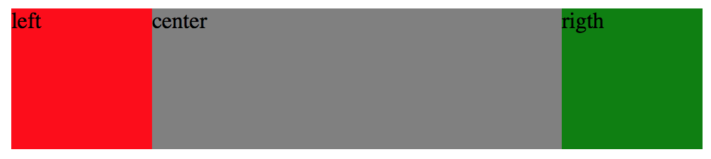
四、双飞翼
<!DOCTYPE html>
<html>
    <head>
        <meta charset="utf-8" />
        <style type="text/css">
            .container{
                height: 100px;
            }
            .center{
                float: left;
                width: 100%;
                height: 100%;
                background: #808080;
            }
            .center-inner{
                margin: 0 100px;
            }
            .left{
                float: left;
                width: 100px;
                height: 100%;
                background: red;
                margin-left: -100%;
            }
            .right{
                float: left;
                width: 100px;
                height: 100%;
                background: green;
                margin-left: -100px;
            }
        </style>
    </head>

    <body>
        <div class="container">
            <!-- 中间的 div 必须写在最前面,并且中间的盒子再套一个div -->
            <div class="center">
                <div class="center-inner">center</div>
            </div>
            <div class="left">left</div>
            <div class="right">rigth</div>
        </div>
    </body>
</html>
1.中间盒子的宽度设置为 width: 100%; 独占一行;
2.使用负边距(均是 margin-left)把左右两边的盒子都拉上去和中间盒子同一行;
3.在中间盒子里面再添加一个 div,然后对这个 div 设置 margin-left 和 margin-right来为左右盒子留位置;
五、圣杯和双飞翼异同
圣杯布局和双飞翼布局解决的问题是一样的,都是两边定宽,中间自适应的三栏布局,中间栏要在放在文档流前面以优先渲染。
两种方法基本思路都相同:首先让中间盒子 100% 宽度占满同一高度的空间,在左右两个盒子被挤出中间盒子所在区域时,使用 margin-left 的负值将左右两个盒子拉回与中间盒子同一高度的空间。接下来进行一些调整避免中间盒子的内容被左右盒子遮挡。
主要区别在于 如何使中间盒子的内容不被左右盒子遮挡:
圣杯布局的方法:设置父盒子的 padding 值为左右盒子留出空位,再利用相对布局对左右盒子调整位置占据 padding 出来的空位;
双飞翼布局的方法:在中间盒子里再增加一个子盒子,直接设置这个子盒子的 margin 值来让出空位,而不用再调整左右盒子。
简单说起来就是双飞翼布局比圣杯布局多创建了一个 div,但不用相对布局了,少设置几个属性。
六、Flexbox
<!DOCTYPE html>
<html>
    <head>
        <meta charset="utf-8" />
        <style type="text/css">
            .container{
                display: flex;
                flex-direction: row;
                height: 100px;
            }
            .left{
                flex-basis: 100px;
                height: 100%;
                background: #0000FF;
            }
            .center{
                flex-grow: 1;
                height: 100%;
                background: gray;

            }
            .right{
                flex-basis: 100px;
                height: 100%;
                background: #0000FF;
            }
        </style>
    </head>

    <body>
        <div class="container">
            <div class="left">left</div>
            <div class="center">center</div>
            <div class="right">rigth</div>
        </div>
    </body>
</html>