
2018前端难点整理
一、弹性盒子
1.基本概念
flex布局的元素称为“flex容器”,里面额子元素成员叫做“flex项目”。

- 容器默认存在两根轴:水平的主轴(main axis)和垂直的交叉轴(cross axis)。主轴的开始位置(与边框的交叉点)叫做main start,结束位置叫做main end;交叉轴的开始位置叫做cross start,结束位置叫做cross end。
- 项目默认沿主轴排列。单个项目占据的主轴空间叫做main size,占据的交叉轴空间叫做cross size。
二、容器的属性
- flex-direction 主轴的方向(即项目的排列方向)
- flex-wrap 换行方式
- flex-flow flex-direction属性和flex-wrap属性的简写形式
- justify-content 项目在主轴上的对齐方式
- align-items 项目在交叉轴上如何对齐
- align-content text文本轴线的对齐方式
flex-direction
.box { flex-direction: row | row-reverse | column | column-reverse; }

flex-wrap
.box{ flex-wrap: nowrap | wrap | wrap-reverse; }

flex-flow
// flex-flow 是flex-direction属性和flex-wrap属性的简写形式,默认值为row nowrap。 flex-flow:row-reverse wrap;
justify-content
// justify-content属性定义了项目在主轴上的对齐方式。 .box { justify-content: flex-start | flex-end | center | space-between | space-around; }

align-items
align-items属性定义项目在交叉轴上如何对齐。 .box { align-items: flex-start | flex-end | center | stretch | baseline ; }

align-content
align-content属性定义了多根轴线的对齐方式。如果项目只有一根轴线,该属性不起作用。 .box { align-content: flex-start | flex-end | center | space-between | space-around | stretch; }

三、项目属性
(1) order (2) flex-grow (3)flex-shrink (4)flex-basis (5)flex (6)align-self
(1)

(2)


(3)


(4)

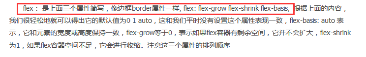
(5)
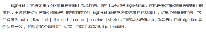
(6)


本文作者:轻风细雨_林木木
本文链接:https://www.cnblogs.com/linzhifen5/p/16961383.html
版权声明:本作品采用知识共享署名-非商业性使用-禁止演绎 2.5 中国大陆许可协议进行许可。


【推荐】国内首个AI IDE,深度理解中文开发场景,立即下载体验Trae
【推荐】编程新体验,更懂你的AI,立即体验豆包MarsCode编程助手
【推荐】抖音旗下AI助手豆包,你的智能百科全书,全免费不限次数
【推荐】轻量又高性能的 SSH 工具 IShell:AI 加持,快人一步