
Flutter进阶组件(5):ExpansionTile(折叠列表项)
ExpansionTile是一个常用的折叠列表项,它允许用户点击标题来展开或折叠更多的内容。这个组件在实现可折叠列表、FAQ 部分或显示详情信息时非常有用。
一、基本使用
使用ExpansionTile的基本方式如下:
import 'package:flutter/material.dart';

void main() {
  runApp(const MaterialApp(
    debugShowCheckedModeBanner: false,
    home: Scaffold(
      body: ExpansionTileExample(),
    )
  ));
}

class ExpansionTileExample extends StatelessWidget {
 const ExpansionTileExample({super.key});
  @override
  Widget build(BuildContext context) {
    return ListView(
      children: const <Widget>[
        ExpansionTile(
          title: Text('Expansion Tile 1'),
          children: <Widget>[
            Text('Content for tile 1'),
            // 可以添加更多内容
          ],
        ),
        ExpansionTile(
          title: Text('Expansion Tile 2'),
          children: <Widget>[
            Text('Content for tile 2'),
            // 可以添加更多内容
          ],
        ),
      ],
    );
  }
}
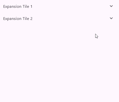
在这个例子中,我们创建了一个ListView,其中包含了两个ExpansionTile,每个ExpansionTile都有一个标题和一个内容列表。效果图如下所示:
二、属性
ExpansionTile小部件的主要属性包括:
title: 展开/折叠按钮的标题。children: 展开时显示的内容列表。initiallyExpanded: 是否在初始状态下展开。onExpansionChanged: 展开/折叠状态改变时调用的回调函数。
三、自定义 ExpansionTile
ExpansionTile可以用于各种自定义场景,例如:
ExpansionTile(
  title: Text('Custom ExpansionTile'),
  children: <Widget>[
    Container(
      color: Colors.amber,
      child: Padding(
        padding: EdgeInsets.all(16.0),
        child: Text('Custom content'),
      ),
    ),
  ],
  initiallyExpanded: true, // 默认展开
  onExpansionChanged: (bool expanded) {
    // 处理展开/折叠状态改变的逻辑
  },
)
3.1 将折叠图标移动到左侧
在 Flutter 中ExpansionTile的默认布局是将折叠图标(通常是箭头)放置在右侧。如果你想将折叠图标移动到左侧,可以通过自定义leading和trailing属性来实现。
以下是一个示例代码,展示如何将折叠图标设置在最左边:
import 'package:flutter/material.dart';

void main() {
  runApp(MyApp());
}

class MyApp extends StatelessWidget {
  @override
  Widget build(BuildContext context) {
    return MaterialApp(
      home: Scaffold(
        appBar: AppBar(title: Text('ExpansionTile Example')),
        body: ExpansionTile(
          leading: Icon(Icons.arrow_drop_down), // 将图标放在左侧
          title: Text('Title'),
          children: <Widget>[
            ListTile(title: Text('Item 1')),
            ListTile(title: Text('Item 2')),
          ],
          trailing: SizedBox.shrink(), // 隐藏右侧的默认图标
        ),
      ),
    );
  }
}
关键点:
-
leading属性:用于设置左侧的图标。我们将折叠图标(Icons.arrow_drop_down)放在这里。 -
trailing属性:默认情况下ExpansionTile会在右侧显示折叠图标。通过将其设置为SizedBox.shrink(),可以隐藏右侧的默认图标。
3.2 动态图标(展开/折叠状态)
如果你希望图标能够根据展开/折叠状态动态变化,可以使用ExpansionTile的onExpansionChanged回调和一个状态变量来实现:
import 'package:flutter/material.dart';

void main() {
  runApp(MyApp());
}

class MyApp extends StatelessWidget {
  @override
  Widget build(BuildContext context) {
    return MaterialApp(
      home: Scaffold(
        appBar: AppBar(title: Text('ExpansionTile Example')),
        body: ExpansionTileExample(),
      ),
    );
  }
}

class ExpansionTileExample extends StatefulWidget {
  @override
  _ExpansionTileExampleState createState() => _ExpansionTileExampleState();
}

class _ExpansionTileExampleState extends State<ExpansionTileExample> {
  bool _isExpanded = false;

  @override
  Widget build(BuildContext context) {
    return ExpansionTile(
      leading: Icon(
        _isExpanded ? Icons.arrow_drop_up : Icons.arrow_drop_down, // 动态图标
      ),
      title: Text('Title'),
      children: <Widget>[
        ListTile(title: Text('Item 1')),
        ListTile(title: Text('Item 2')),
      ],
      trailing: SizedBox.shrink(), // 隐藏右侧的默认图标
      onExpansionChanged: (bool expanded) {
        setState(() {
          _isExpanded = expanded;
        });
      },
    );
  }
}
四、高级用法
- 动态内容:
children可以是动态生成的内容,如根据数据库或其他数据源生成的列表项。 - 自定义折叠图标:通过自定义
title属性中的leading或trailingwidget,可以改变默认的折叠图标。 - 条件渲染:根据应用的状态或用户交互动态决定是否渲染
ExpansionTile。
五、示例
// ignore_for_file: prefer_const_constructors
import 'package:flutter/material.dart';
import 'package:flutter/cupertino.dart';

void main() {
  runApp(const MaterialApp(
      debugShowCheckedModeBanner: false,
      home: Scaffold(
        body: ExpansionTilePage(),
      )));
}

class ExpansionTilePage extends StatefulWidget {
  const ExpansionTilePage({super.key});
  @override
  State<ExpansionTilePage> createState() => _ExpansionTileState();
}

class _ExpansionTileState extends State<ExpansionTilePage> {
  bool isSwitched1 = false;
  bool isSwitched2 = false;

  @override
  Widget build(BuildContext context) {
    return Container(
        clipBehavior: Clip.antiAlias,
        decoration: BoxDecoration(
          color: Color.fromRGBO(20, 45, 86, (1.0)),
          borderRadius: BorderRadius.circular(4),
        ),
        child: ListView(
          children: <Widget>[
            ExpansionTile(
              maintainState: true,
              backgroundColor: Color.fromARGB(48, 33, 149, 243),
              tilePadding: EdgeInsets.only(left: 10, right: 20),
              minTileHeight: 40,
              shape: Border(
                  top: BorderSide(color: Colors.transparent),
                  bottom: BorderSide(color: Colors.transparent)),
              dense: true,
              title: Text(
                "语言",
                style: TextStyle(
                  color: Colors.white,
                  fontSize: 14,
                ),
              ),
              leading: Image(
                image: AssetImage("assets/images/icon_language.png"),
                width: 14,
                height: 14,
                fit: BoxFit.fill,
              ),
              // 下面添加折叠或展开的语言选项
              children: <Widget>[
                ListTile(
                  hoverColor: Color.fromARGB(128, 5, 70, 108),
                  dense: true,
                  contentPadding: EdgeInsets.only(left: 46, right: 20),
                  minTileHeight: 40,
                  title: Text(
                    "简体中文",
                    style: TextStyle(
                      color: Colors.white,
                      fontSize: 14,
                    ),
                  ),
                  trailing: Visibility(
                      visible: true,
                      child: Icon(
                        Icons.check,
                        color: Colors.lightBlue,
                        size: 20,
                      )),
                  onTap: () {
                    debugPrint('简体中文');
                  },
                ),
                ListTile(
                  hoverColor: Color.fromARGB(128, 5, 70, 108),
                  dense: true,
                  contentPadding: EdgeInsets.only(left: 46, right: 20),
                  minTileHeight: 40,
                  title: Text(
                    "繁体中文",
                    style: TextStyle(
                      color: Colors.white,
                      fontSize: 14,
                    ),
                  ),
                  trailing: Visibility(
                      visible: false,
                      child: Icon(
                        Icons.check,
                        color: Colors.lightBlue,
                        size: 20,
                      )),
                  onTap: () {
                    debugPrint('繁体中文');
                  },
                ),
                ListTile(
                  hoverColor: Color.fromARGB(128, 5, 70, 108),
                  dense: true,
                  contentPadding: EdgeInsets.only(left: 46, right: 20),
                  minTileHeight: 40,
                  title: Text(
                    "English",
                    style: TextStyle(
                      color: Colors.white,
                      fontSize: 14,
                    ),
                  ),
                  trailing: Visibility(
                      visible: false,
                      child: Icon(
                        Icons.check,
                        color: Colors.lightBlue,
                        size: 20,
                      )),
                  onTap: () {
                    debugPrint('English');
                  },
                ),
              ],
            ),
            ListTile(
              contentPadding: EdgeInsets.only(left: 10),
              dense: true,
              minTileHeight: 40,
              title: Text(
                "快捷键",
                style: TextStyle(
                  color: Colors.white,
                  fontSize: 14,
                ),
              ),
              leading: Image(
                image: AssetImage("assets/images/icon_shortCut.png"),
                width: 14,
                height: 14,
                fit: BoxFit.fill,
              ),
              onTap: () {
                debugPrint('快捷键');
              },
            ),
            ListTile(
              contentPadding: EdgeInsets.only(left: 10, right: 5),
              dense: true,
              minTileHeight: 40,
              title: Text(
                "键盘显示",
                style: TextStyle(
                  color: Colors.white,
                  fontSize: 14,
                ),
              ),
              leading: Image(
                image: AssetImage("assets/images/icon_keyboard.png"),
                width: 14,
                height: 14,
                fit: BoxFit.fill,
              ),
              trailing: Transform.scale(
                  scale: 0.6,
                  child: CupertinoSwitch(
                    value: isSwitched2,
                    onChanged: (value) {
                      setState(() {
                        isSwitched2 = value;
                      });
                    },
                    thumbColor: Color.fromARGB(255, 1, 29, 53),
                    activeColor: Colors.blue,
                    trackColor: Colors.grey,
                  )),
              onTap: () {
                debugPrint('键盘显示');
              },
            ),
            ListTile(
              contentPadding: EdgeInsets.only(left: 10),
              dense: true,
              minTileHeight: 40,
              title: Text(
                "锁屏设置",
                style: TextStyle(
                  color: Colors.white,
                  fontSize: 14,
                ),
              ),
              leading: Image(
                image: AssetImage("assets/images/icon_userRight.png"),
                width: 14,
                height: 14,
                fit: BoxFit.fill,
              ),
              onTap: () {
                debugPrint('锁屏设置');
              },
            ),
            ExpansionTile(
              backgroundColor: Color.fromARGB(48, 33, 149, 243),
              tilePadding: EdgeInsets.only(left: 10, right: 20),
              shape: Border(
                  top: BorderSide(color: Colors.transparent),
                  bottom: BorderSide(color: Colors.transparent)),
              dense: true,
              minTileHeight: 40,
              title: Text(
                "管理员",
                style: TextStyle(
                  color: Colors.white,
                  fontSize: 14,
                ),
              ),
              leading: Image(
                image: AssetImage("assets/images/icon_managerSet.png"),
                width: 14,
                height: 14,
                fit: BoxFit.fill,
              ),
              children: <Widget>[
                ListTile(
                  contentPadding: EdgeInsets.only(left: 10),
                  dense: true,
                  minTileHeight: 40,
                  title: Text(
                    "用户",
                    style: TextStyle(
                      color: Colors.white,
                      fontSize: 14,
                    ),
                  ),
                  leading: Image(
                    image: AssetImage("assets/images/icon_install.png"),
                    width: 14,
                    height: 14,
                    fit: BoxFit.fill,
                  ),
                  onTap: () {
                    debugPrint('用户');
                  },
                ),
                ListTile(
                  contentPadding: EdgeInsets.only(left: 10),
                  dense: true,
                  minTileHeight: 40,
                  title: Text(
                    "布局",
                    style: TextStyle(
                      color: Colors.white,
                      fontSize: 14,
                    ),
                  ),
                  leading: Image(
                    image: AssetImage("assets/images/icon_layout.png"),
                    width: 14,
                    height: 14,
                    fit: BoxFit.fill,
                  ),
                  onTap: () {
                    debugPrint('布局');
                  },
                ),
              ],
            ),
          ],
        ));
  }
}
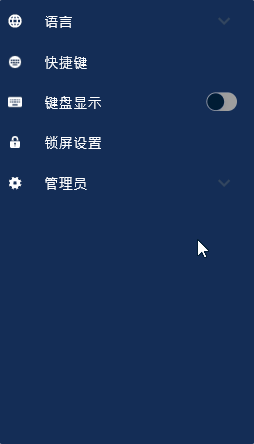
效果图如下图所示:

 浙公网安备 33010602011771号