

Flutter进阶组件(1):RadioListTiles(单选列表项)
RadioListTile是一个特殊的ListTile,它内嵌了一个单选按钮(Radio),包含更多信息的单选项,提供多种配置信息的属性,可以表现更丰富的信息。这使得它非常适合用来创建单选列表项,常用于让用户在多个选项中选择一个的场景。
一、属性
RadioListTile组件提供了以下属性,以支持各种自定义需求:
title: 显示的标题,通常是一个TextWidget。subtitle: 显示的副标题,也可以是一个TextWidget。value: 表示这个RadioListTile的值。groupValue: 表示整个单选组选中的值。onChanged: 当单选按钮的值改变时调用的回调函数。secondary: 显示在标题旁边的Widget,如图标或图片。isThreeLine: 决定是否显示三行文本,如设置为true,则副标题会换行显示。dense: 是否减少列表项的高度,使文字更紧凑。contentPadding: 控制内边距。
二、示例
以下是一个使用RadioListTile的示例:
import 'package:flutter/material.dart';

void main() {
  runApp(const MaterialApp(
    home: RadioPage(),
    debugShowCheckedModeBanner: false,
  ));
}

class RadioPage extends StatelessWidget {
  const RadioPage({super.key});
  @override
  Widget build(BuildContext context) {
    return Scaffold(
      appBar: AppBar(
        title: const Text('Radio Page'),
      ),
      body: const Center(
        child: MyRadioGroup(),
      ),
    );
  }
}

class MyRadioGroup extends StatefulWidget {
  const MyRadioGroup({super.key});
  @override
  State<MyRadioGroup> createState() => _MyRadioGroupState();
}

class _MyRadioGroupState extends State<MyRadioGroup> {
  int _selectedValue = 0;

  @override
  Widget build(BuildContext context) {
    return Column(
      children: [
        RadioListTile(
          title: const Text('Option 1'),
          value: 1,
          groupValue: _selectedValue,
          onChanged: (value) {
            setState(() {
              _selectedValue = value as int;
            });
          },
        ),
        RadioListTile(
          title: const Text('Option 2'),
          value: 2,
          groupValue: _selectedValue,
          onChanged: (value) {
            setState(() {
              _selectedValue = value as int;
            });
          },
        ),
      ],
    );
  }
}
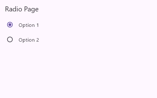
在上面的示例中,我们创建了一个名为MyRadioGroup的有状态(stateful)小部件。通过使用RadioListTile,我们为每个选项创建了一个单选按钮,并使用groupValue属性指定当前选中的值。onChanged回调函数在选择改变时被调用,通过调用setState来更新选择的值。效果图如下所示:
三、高级用法
RadioListTile可以与图标、副标题等结合使用,创建复杂的列表项:
class _MyRadioGroupState extends State<MyRadioGroup> {
  int _selectedValue = 0;

  @override
  Widget build(BuildContext context) {
    return Column(
      children: [
        RadioListTile(
          title: const Text('First Option with icon and subtitle'),
          subtitle: const Text('This is a subtitle for the option'),
          secondary: const Icon(Icons.ac_unit), // 显示在标题旁边的图标
          value: 1,
          groupValue: _selectedValue,
          onChanged: (int? value) {
            setState(() {
              _selectedValue = value!;
            });
          },
          isThreeLine: true, // 显示三行文本
        ),
        RadioListTile(
          title: const Text('Second Option with icon and subtitle'),
          subtitle: const Text('This is a subtitle for the option'),
          secondary: const Icon(Icons.access_alarm), // 显示在标题旁边的图标
          value: 2,
          groupValue: _selectedValue,
          onChanged: (int? value) {
            setState(() {
              _selectedValue = value!;
            });
          },
          isThreeLine: true, // 显示三行文本
        ),
      ],
    );
  }
}
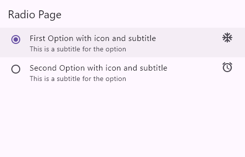
效果图如下所示:
四、自定义RadioListTile
你可以通过设置不同的属性来定制RadioListTile的外观:
class _MyRadioGroupState extends State<MyRadioGroup> {
  int _selectedValue = 0;

  @override
  Widget build(BuildContext context) {
    return Column(
      children: [
        RadioListTile(
          title: const Text('First Custom RadioListTile'),
          subtitle: const Text('This is a custom subtitle'),
          value: 1,
          groupValue: _selectedValue,
          onChanged: (int? value) {
            setState(() {
              _selectedValue = value!;
            });
          },
          activeColor: Colors.green, // 单选按钮激活时的颜色
          contentPadding: const EdgeInsets.all(12.0), // 自定义内边距
        ),

        RadioListTile(
          title: const Text('Second Custom RadioListTile'),
          subtitle: const Text('This is a custom subtitle'),
          value: 2,
          groupValue: _selectedValue,
          onChanged: (int? value) {
            setState(() {
              _selectedValue = value!;
            });
          },
          activeColor: Colors.green, // 单选按钮激活时的颜色
          contentPadding: const EdgeInsets.all(12.0), // 自定义内边距
        ),
      ],
    );
  }
}
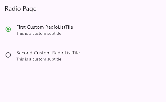
效果图如下所示:
五、扩展:同时使用Radio和RadioListTile的示例
// ignore_for_file: prefer_const_constructors
import 'package:flutter/material.dart';

void main() => runApp(const MyApp());

class MyApp extends StatelessWidget {
  const MyApp({super.key});
  @override
  Widget build(BuildContext context) {
    return const MaterialApp(
      debugShowCheckedModeBanner: false,
      home: Scaffold(
        body: RadioPage(),
      )
    );
  }
}

class RadioPage extends StatefulWidget {
  const RadioPage({super.key});
  @override
  State<RadioPage> createState() => _RadioPageState();
}

class _RadioPageState extends State<RadioPage> {
  int ?sex = 1;
  int ?status = 1;
  bool ?flag = true;

  @override
  Widget build(BuildContext context) {
    return Scaffold(
      appBar: AppBar(
          title: Text("Radio"),
      ),
      body:Padding(
          padding: EdgeInsets.all(20),
          child:Column(
            children: <Widget>[
              // 简易选择项
              Row(
                children: <Widget>[
                    Text("男"),
                    Radio(
                        // 按钮的值
                        value: 1,
                        // 改变事件
                        onChanged: (value){
                            setState(() {
                              sex = value;
                            });
                        },
                        // 按钮组的值
                        groupValue:this.sex ,
                    ),

                    SizedBox(width: 20,),
                    Text("女"),
                    Radio(
                        value:2,
                        onChanged: (value){
                            setState(() {
                              sex = value;
                            });
                        },
                        groupValue: sex,
                    ),
                ],
              ),

              // 组合选择项1
              RadioListTile(
                value:1,
                groupValue:status,
                onChanged:(value){
                    setState(() {
                        status = value;
                    });
                },
                title:Text("标题"),
                subtitle:Text("这是二级标题"),
                secondary:Icon(Icons.help),
                selected:status == 1,
              ),

              // 组合选择项2
              RadioListTile(
                value:2,
                groupValue:status,
                onChanged:(value){
                    setState(() {
                        status = value;
                    });
                },
                title:Text("标题"),
                subtitle:Text("这是二级标题"),
                secondary:Image.network('https://www.itying.com/images/flutter/1.png'),
                selected:status == 2,
              ),
            ],
          )
        )
    );
  }
}
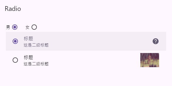
效果图如下所示:

 浙公网安备 33010602011771号