

Flutter基础组件(9):Progress(进度条)
在 Flutter 应用开发中,无论是处理网络请求,执行耗时任务,或是等待用户响应,我们总是需要在界面上显示进度条或者等待指示器。在这篇博客中,我们将介绍 Flutter 中两种常用的进度指示器:LinearProgressIndicator 和 CircularProgressIndicator。我们将比较它们的异同点,以及如何使用和自定义它们。
一、LinearProgressIndicator和CircularProgressIndicator的异同点
相同点:
- 都是进度指示器,用于在应用执行某项任务时提供视觉反馈。
- 都可以设置为确定的进度模式(显示当前进度)和不确定的进度模式(表示任务正在进行,但具体进度未知)。
不同点:
- 形状不同:
LinearProgressIndicator是线性的,水平显示,而CircularProgressIndicator是圆形的,类似于加载旋转轮。 - 由于形状的差异,两者在空间使用上有所不同,
LinearProgressIndicator通常用于宽度更大的空间,而CircularProgressIndicator则适用于任何方向的空间。
两者的使用和效果对比
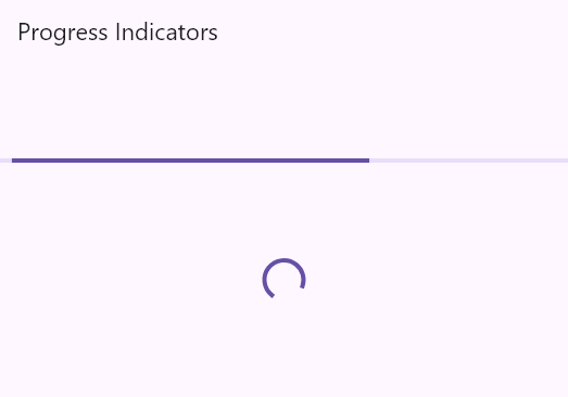
在开始介绍如何使用这两个组件之前,我们先看一下他们的效果。以下是一个简单的 Flutter 应用,其中包含一个LinearProgressIndicator和一个CircularProgressIndicator。
import 'package:flutter/material.dart';

void main() {
  runApp(
    MaterialApp(
      debugShowCheckedModeBanner: false,
      home: Scaffold(
        appBar: AppBar(title: const Text('Progress Indicators')),
        body: const Center(
          child: Column(
            mainAxisAlignment: MainAxisAlignment.spaceEvenly,
            children: <Widget>[
              LinearProgressIndicator(),
              CircularProgressIndicator(),
            ],
          ),
        ),
      ),
    ),
  );
}
在这个例子中,我们将两个进度指示器放置在屏幕的中央。当你运行这个程序时,你会看到一个水平的进度条和一个旋转的圆形进度指示器。效果图如下所示:
二、LinearProgressIndicator
LinearProgressIndicator的主要参数有:
value:一个介于 0.0 和 1.0 之间的数字,表示进度。当值为null时,进度指示器将进入不确定的模式,显示一个循环动画。backgroundColor:进度条的背景颜色。valueColor:进度条的颜色。通常与AlwaysStoppedAnimation<Color>一起使用。
示例:
// 模糊进度条(会执行一个动画)
LinearProgressIndicator(
backgroundColor: Colors.grey[200],
valueColor: AlwaysStoppedAnimation(Colors.blue),
),
// 进度条显示50%
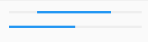
LinearProgressIndicator(
value: 0.5, // 进度值,0.5表示50%
backgroundColor: Colors.grey[200], // 进度条的背景颜色
valueColor: AlwaysStoppedAnimation(Colors.blue), // 进度条的颜色
)
第一个进度条在执行循环动画:蓝色条一直在移动,而第二个进度条是静止的,停在50%的位置。效果图如下所示:
三、CircularProgressIndicator
CircularProgressIndicator是一个圆形进度条,定义如下:
 CircularProgressIndicator({
  double value,
  Color backgroundColor,
  Animation<Color> valueColor,
  this.strokeWidth = 4.0,
  ...
})
CircularProgressIndicator的主要参数和LinearProgressIndicator相似,它也有value、backgroundColor 和 valueColor,不再赘述。strokeWidth表示圆形进度条的粗细。示例如下:
// 模糊进度条(会执行一个旋转动画)
CircularProgressIndicator(
  backgroundColor: Colors.grey[200],
  valueColor: AlwaysStoppedAnimation(Colors.blue),
),
// 进度条显示50%,会显示一个半圆
CircularProgressIndicator(
  backgroundColor: Colors.grey[200],
  valueColor: AlwaysStoppedAnimation(Colors.blue),
  value: .5,
),
运行效果如下图所示:
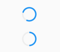
第一个进度条会执行旋转动画,而第二个进度条是静止的,它停在 50% 的位置。
四、自定义进度指示器样式
LinearProgressIndicator(
  value: _progressValue, // 当前进度值
  backgroundColor: Colors.grey[300], // 背景颜色
  color: Theme.of(context).primaryColor, // 前景色
)

CircularProgressIndicator(
  value: _progressValue, // 当前进度值
  backgroundColor: Colors.grey[200], // 背景颜色
  valueColor: AlwaysStoppedAnimation<Color>(Colors.blue), // 前景色
  strokeWidth: 4.0, // 线宽
)
五、自定义尺寸
我们可以发现LinearProgressIndicator和CircularProgressIndicator,并没有提供设置圆形进度条尺寸的参数;如果我们希望LinearProgressIndicator的线细一些,或者希望CircularProgressIndicator的圆大一些该怎么做?
其实LinearProgressIndicator和CircularProgressIndicator都是取父容器的尺寸作为绘制的边界的。知道了这点,我们便可以通过尺寸限制类Widget,如ConstrainedBox、SizedBox (我们将在后面容器类组件一章中介绍)来指定尺寸,如:
// 线性进度条高度指定为3
SizedBox(
  height: 3,
  child: LinearProgressIndicator(
    backgroundColor: Colors.grey[200],
    valueColor: AlwaysStoppedAnimation(Colors.blue),
    value: .5,
  ),
),
// 圆形进度条直径指定为100
SizedBox(
  height: 100,
  width: 100,
  child: CircularProgressIndicator(
    backgroundColor: Colors.grey[200],
    valueColor: AlwaysStoppedAnimation(Colors.blue),
    value: .7,
  ),
),
运行效果如下图所示:

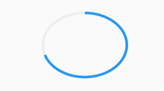
注意,如果CircularProgressIndicator显示空间的宽高不同,则会显示为椭圆。如:
// 宽高不等
SizedBox(
  height: 100,
  width: 130,
  child: CircularProgressIndicator(
    backgroundColor: Colors.grey[200],
    valueColor: AlwaysStoppedAnimation(Colors.blue),
    value: .7,
  ),
),
运行效果如下图所示:
六、进度色动画
前面说过可以通过valueColor对进度条颜色做动画,关于动画我们将在后面专门的章节详细介绍,这里先给出一个例子,读者在了解了Flutter动画一章后再回过头来看。
我们实现一个进度条在3秒内从灰色变成蓝色的动画:
import 'package:flutter/material.dart';

void main() {
  runApp(const MaterialApp(
    debugShowCheckedModeBanner: false,
    home: Scaffold(
      body: ProgressRoute(),
    )
  ));
}

class ProgressRoute extends StatefulWidget {
  const ProgressRoute({super.key});
  @override
  State<ProgressRoute> createState() => _ProgressRouteState();
}

class _ProgressRouteState extends State<ProgressRoute>
  with SingleTickerProviderStateMixin {
  late AnimationController _animationController;

  @override
  void initState() {
    //动画执行时间3秒
    _animationController = AnimationController(
        vsync: this, //注意State类需要混入SingleTickerProviderStateMixin(提供动画帧计时/触发器)
        duration: const Duration(seconds: 3),
      );
    _animationController.forward();
    _animationController.addListener(() => setState(() => {}));
    super.initState();
  }

  @override
  void dispose() {
    _animationController.dispose();
    super.dispose();
  }

  @override
  Widget build(BuildContext context) {
    return SingleChildScrollView(
      child: Column(
        children: <Widget>[
            Padding(
            padding: const EdgeInsets.all(16),
            child: LinearProgressIndicator(
              backgroundColor: Colors.grey[200],
              valueColor: ColorTween(begin: Colors.grey, end: Colors.blue)
                .animate(_animationController), // 从灰色变成蓝色
              value: _animationController.value,
            ),
          )
        ],
      ),
    );
  }
}

 浙公网安备 33010602011771号