Flutter功能性组件(1):对话框
Material 库提供了三种基本对话框组件
- AlertDialog 通常用于提示型对话框
- SimpleDialog 通常用于列表型对话框
- Dialog 通常用于自定义布局元素的对话框
弹出对话框时,调用 showDialog 函数,将对话框控件传入,由于对话框本身是路由,所以关闭对话框时,需使用 Navigator.of(context).pop()
一、AlertDialog(提示对话框)
AlertDialog 是一个 Flutter widget,用于显示弹出式对话框,通常用于向用户显示重要信息或要求他们进行一些确认操作。
属性解析:
const AlertDialog({
  super.key, // 控件的键值,用于标识控件。
  this.icon, // 对话框顶部的图标。
  this.iconPadding, // 图标的内边距。
  this.iconColor, // 图标的颜色。
  this.title, // 对话框的标题。
  this.titlePadding, // 标题的内边距。
  this.titleTextStyle, // 标题的文本样式。
  this.content, // 对话框的内容。
  this.contentPadding, // 内容的内边距。
  this.contentTextStyle, 内容的文本样式。
    this.actions, // 对话框底部的动作按钮列表。
  this.actionsPadding, // 动作按钮的内边距。
  this.actionsAlignment, // 动作按钮在溢出时的对齐方式。
  this.actionsOverflowAlignment, // 动作按钮溢出时的排列方向。
  this.actionsOverflowDirection, // 动作按钮在溢出时的间隔。
  this.actionsOverflowButtonSpacing, // 动作按钮在溢出时的间隔。
  this.buttonPadding, // 按钮的内边距。
  this.backgroundColor, // 对话框的背景颜色。
  this.elevation, // 对话框的阴影高度。
  this.shadowColor, // 对话框阴影的颜色。
  this.surfaceTintColor, // 表面色调的颜色。
  this.semanticLabel, // 屏幕阅读器使用的语义标签。
  this.insetPadding = _defaultInsetPadding, // 对话框与屏幕边缘的间距。
  this.clipBehavior = Clip.none, // 对话框的剪裁行为。
  this.shape, // 对话框的外形。
  this.alignment, // :对话框相对于其父控件的对齐方式。
  this.scrollable = false, // 如果内容超出可视区域,是否应该滚动。默认为 false。
})
二、使用showDialog显示对话框
在介绍其他两种基本对话框之前,先介绍一下 showDialog,方便下面贴出显示对话框的示例。
showDialog<T?>是一个 Flutter 方法,用于显示模态对话框。
属性解析
Future<T?> showDialog<T>({
  required BuildContext context, // 表示对话框所处的上下文,通常来自当前 widget。
  required WidgetBuilder builder, // 用于构建对话框内容的函数。它传递一个 BuildContext 并返回一个 Widget,这通常是对话框的主体。
  bool barrierDismissible = true, // 指示用户点击屏幕背景(对话框外部)时是否关闭对话框。默认为 true。
  Color? barrierColor, // 对话框背景障碍物(屏幕其余部分)的颜色。
  String? barrierLabel, // 屏障的语义标签,用于无障碍功能。
  bool useSafeArea = true, // 是否考虑安全区域(如异形屏幕的凹槽、状态栏等)。默认为 true。
  bool useRootNavigator = true, // 是否使用根导航器来推送对话框。默认为 true。
  RouteSettings? routeSettings, // 传递给对话框路由的配置信息,如名称和参数。
  Offset? anchorPoint, // 指定对话框弹出的锚点位置。
  TraversalEdgeBehavior? traversalEdgeBehavior, // 定义对话框边缘遍历行为。
})
(1)直接显示对话框
class MyHomeBody extends StatelessWidget {
  const MyHomeBody({Key? key}) : super(key: key);
  @override
  Widget build(BuildContext context) {
    return Center(
      child: ElevatedButton(
        onPressed: () {
          showDialog(
              context: context,
              builder: (BuildContext context) => AlertDialog(
                    title: const Text('标题'),
                    content: const Text('我是对话框'),
                    actions: [
                      OutlinedButton(
                          onPressed: () {
                            print('取消');
                            Navigator.of(context).pop();
                          },
                          child: Text('取消')),
                      OutlinedButton(
                          onPressed: () {
                            print('确定');
                            Navigator.of(context).pop();
                          },
                          child: Text('确定')),
                    ],
                  ));
        },
        child: Text("弹出对话框"),
      ), // 使用你的组件
    );
  }
}
(2)使用函数显示对话框
class MyHomeBody extends StatelessWidget {
  const MyHomeBody({Key? key}) : super(key: key);
  @override
  Widget build(BuildContext context) {
    return Center(
      child: ElevatedButton(
        onPressed: () {
          _showAlertDialog(context);
        },
        child: Text("弹出对话框"),
      ), // 使用你的组件
    );
  }
}

Future<void> _showAlertDialog(BuildContext context) async {
  return showDialog<void>(
    context: context,
    barrierDismissible: false, // 设置为false,点击背景不会关闭
    builder: (BuildContext context) {
      return AlertDialog(
        title: const Text('标题'),
        content: const Text('我是对话框'),
        actions: [
          OutlinedButton(
              onPressed: () {
                print('取消');
                Navigator.of(context).pop();
              },
              child: Text('取消')),
          OutlinedButton(
              onPressed: () {
                print('确定');
                Navigator.of(context).pop();
              },
              child: Text('确定')),
        ],
      );
    },
  );
}
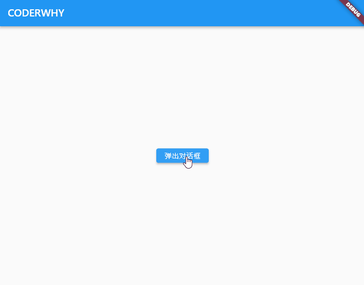
点击按钮后调用 _showMyDialog 函数来显示对话框。效果图如下所示:
三、返回值的处理
用户在点击退出登录时,通常的做法就是弹框用来确认是否退出登录,返回值是 bool 类型,为 true 表示退出登录,反之不需要退出,这个时候应该怎处理这个 bool 类型的返回值呢?
我们知道 showDialog 本身返回的就是 Future 对象,如果需要在 Dialog 关闭后继续执行一些其它逻辑,我们可以使用 await 和 async 关键字来接收返回数据处理异步操作,下面来看看该怎么实现。
Future<bool?> _showAlertDialog(BuildContext context) {
  return showDialog<bool>(
    context: context,
    builder: (context) {
      return AlertDialog(
        title: const Text("Logout"),
        content: const Text("Are you sure you want to logout?"),
        actions: [
          TextButton(
            onPressed: () {
              Navigator.of(context).pop(false);
            },
            child: const Text("Cancel"),
          ),
          TextButton(
            onPressed: () {
              Navigator.of(context).pop(true);
            },
            child: const Text("Sure"),
          )
        ],
      );
    },
  );
}
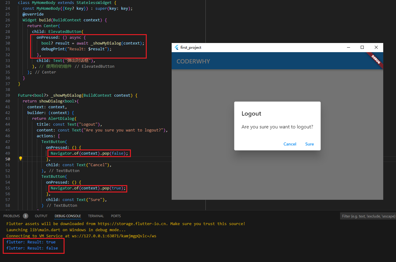
利用 Navigator.of(context).pop(true) 方法来关闭对话框,并传递 true 或者 false 值作为对话框的返回结果,当点击按钮调用 _showMyDialog 弹出 Dialog。
class MyHomeBody extends StatelessWidget {
  const MyHomeBody({Key? key}) : super(key: key);
  @override
  Widget build(BuildContext context) {
    return Center(
      child: ElevatedButton(
        onPressed: () async {
          bool? result = await _showAlertDialog(context);
          debugPrint("Result: $result");
        },
        child: Text("弹出对话框"),
      ), // 使用你的组件
    );
  }
}
效果图如下所示:
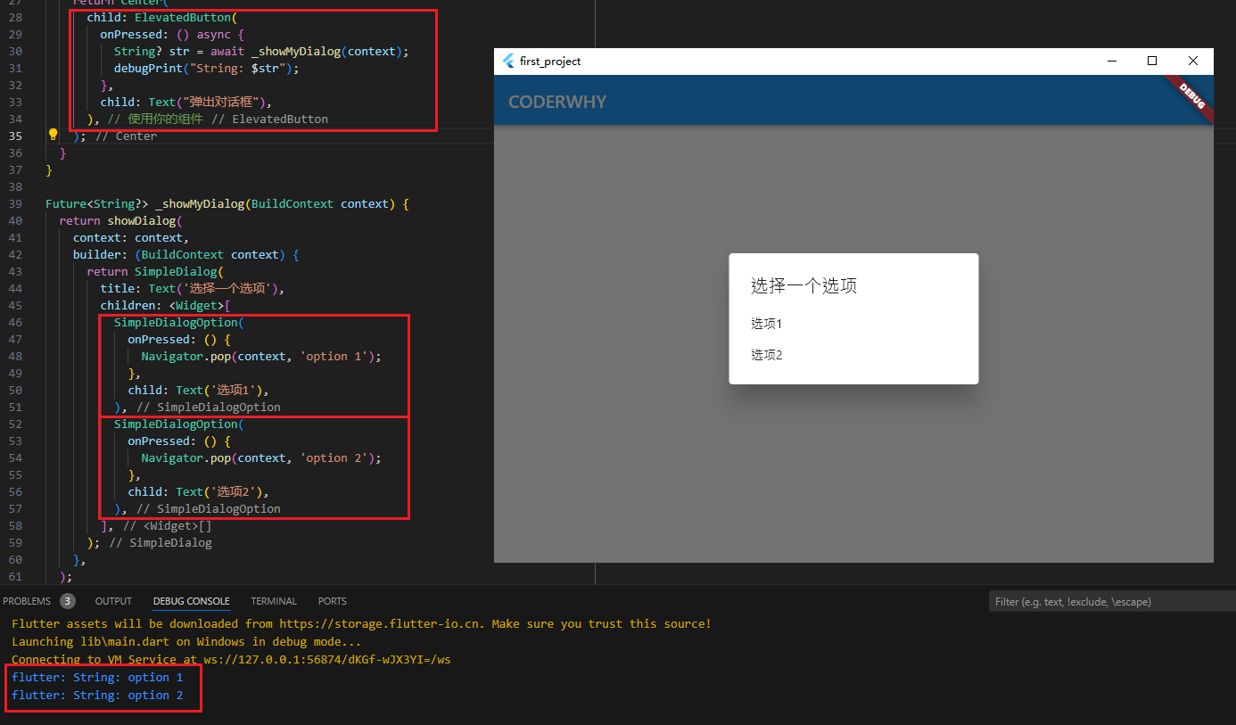
四、SimpleDialog(模态对话框)
SimpleDialog:用于显示一个简单的对话框,通常包含一个标题和多个选项。
class MyHomeBody extends StatelessWidget {
  const MyHomeBody({Key? key}) : super(key: key);
  @override
  Widget build(BuildContext context) {
    return Center(
      child: ElevatedButton(
        onPressed: () {
          _showSimpleDialog(context);
        },
        child: Text("弹出对话框"),
      ),
    );
  }
}

Future<bool?> _showSimpleDialog(BuildContext context) {
  return showDialog(
    context: context,
    builder: (BuildContext context) {
      return SimpleDialog(
        title: Text('选择一个选项'),
        children: <Widget>[
          SimpleDialogOption(
            onPressed: () {
              Navigator.pop(context, '选项1');
            },
            child: Text('选项1'),
          ),
          SimpleDialogOption(
            onPressed: () {
              Navigator.pop(context, '选项2');
            },
            child: Text('选项2'),
          ),
        ],
      );
    },
  );
}
效果图如下所示:
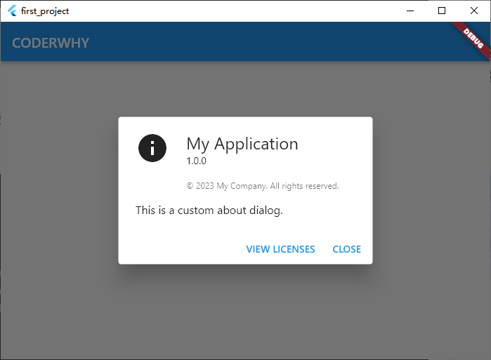
五、AboutDialog(关于对话框)
AboutDialog 用于显示应用程序的相关信息,例如版本号、作者等。
void showAboutDialog({
  required BuildContext context, // 表示对话框所处的上下文,通常来自当前 widget。
  String? applicationName, // 应用程序的名称。如果未提供,将使用 DefaultWidgetsLocalizations.of(context).appName。
  String? applicationVersion, // 应用程序的版本。
  Widget? applicationIcon, // 应用程序的图标。
  String? applicationLegalese, // 应用程序的法律声明。
  List<Widget>? children, // 在对话框中显示的额外小部件。
  bool barrierDismissible = true, // 指示用户点击屏幕背景(对话框外部)时是否关闭对话框。默认为 true。
  Color? barrierColor, // 弹出框背景障碍物(屏幕其余部分)的颜色。
  String? barrierLabel, // 屏障的语义标签,用于无障碍功能。
  bool useRootNavigator = true, // 是否使用根导航器来推送对话框。默认为 true。
  RouteSettings? routeSettings, // 传递给对话框路由的配置信息,如名称和参数。
  Offset? anchorPoint, // 指定对话框弹出的锚点位置。
})
代码如下:
class MyHomeBody extends StatelessWidget {
  const MyHomeBody({Key? key}) : super(key: key);
  @override
  Widget build(BuildContext context) {
    return Center(
      child: ElevatedButton(
        onPressed: () {
          _showAboutDialog(context);
        },
        child: Text("弹出对话框"),
      ), // 使用你的组件
    );
  }
}

_showAboutDialog(BuildContext context) {
  showAboutDialog(
    context: context,
    applicationName: 'My Application',
    applicationVersion: '1.0.0',
    applicationIcon: Icon(Icons.info, size: 48.0),
    applicationLegalese: '© 2023 My Company. All rights reserved.',
    children: <Widget>[
      Padding(
        padding: const EdgeInsets.only(top: 16.0),
        child: Text('This is a custom about dialog.'),
      ),
    ],
  );
}
效果图如下所示:
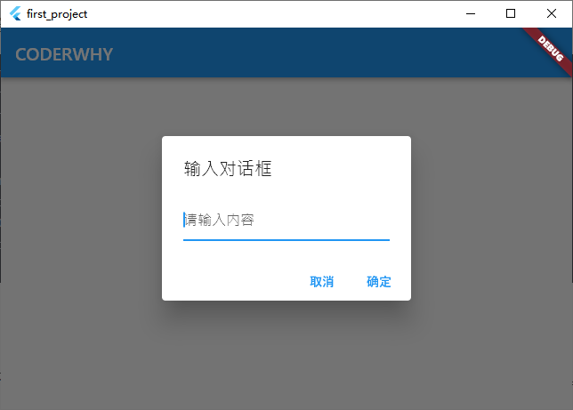
六、Input Dialog(输入对话框)
有时你可能需要一个简单的对话框来收集用户输入,如文本或数字。
示例:
class MyHomeBody extends StatelessWidget {
  const MyHomeBody({Key? key}) : super(key: key);
  @override
  Widget build(BuildContext context) {
    return Center(
      child: ElevatedButton(
        onPressed: () async {
          String? input = await showDialog<String>(
            context: context,
            builder: (BuildContext context) {
              return InputDialog();
            },
          );
          debugPrint('用户输入: $input');
        },
        child: Text('显示输入对话框'),
      ), // 使用你的组件
    );
  }
}

class InputDialog extends StatefulWidget {
  const InputDialog({Key? key}) : super(key: key);
  @override
  _InputDialogState createState() => _InputDialogState();
}

class _InputDialogState extends State<InputDialog> {
  final TextEditingController _controller = TextEditingController();

  @override
  Widget build(BuildContext context) {
    return AlertDialog(
      title: Text('输入对话框'),
      content: TextField(
        controller: _controller,
        decoration: InputDecoration(hintText: '请输入内容'),
      ),
      actions: <Widget>[
        TextButton(
          onPressed: () {
            Navigator.of(context).pop(null);
          },
          child: Text('取消'),
        ),
        TextButton(
          onPressed: () {
            Navigator.of(context).pop(_controller.text);
          },
          child: Text('确定'),
        ),
      ],
    );
  }
}
效果图如下所示:
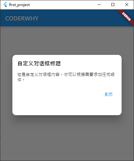
七、自定义Dialog
Dialog 是一个 Flutter 小部件,用于显示对话框
属性解析
const Dialog({
  super.key, // 用于标识小部件的唯一键。
  this.backgroundColor, //
  this.elevation, // 对话框的阴影高度。
  this.shadowColor, // 阴影颜色。
  this.surfaceTintColor, // 表面色调颜色。
  this.insetAnimationDuration = const Duration(milliseconds: 100), // 对话框插入动画的持续时间。默认为 Duration(milliseconds: 100)。
  this.insetAnimationCurve = Curves.decelerate, // 对话框插入动画的曲线。默认为 Curves.decelerate。
  this.insetPadding = _defaultInsetPadding, // 对话框相对于屏幕边缘的填充。默认值为 _defaultInsetPadding。
  this.clipBehavior = Clip.none, // 裁剪行为,默认值为 Clip.none。
  this.shape, // 对话框的形状,例如圆角矩形。
  this.alignment, // 对话框在屏幕上的对齐方式。
  this.child, // 对话框的子组件,通常是内容区域。
})
示例:
class MyHomeBody extends StatelessWidget {
  const MyHomeBody({Key? key}) : super(key: key);
  @override
  Widget build(BuildContext context) {
    return Center(
      child: ElevatedButton(
        onPressed: () {
          showDialog(
            context: context,
            builder: (BuildContext context) {
              return CustomDialog();
            },
          );
        },
        child: Text("弹出对话框"),
      ), // 使用你的组件
    );
  }
}

class CustomDialog extends StatelessWidget {
  const CustomDialog({Key? key}) : super(key: key);
  @override
  Widget build(BuildContext context) {
    return Dialog(
      shape: RoundedRectangleBorder(borderRadius: BorderRadius.circular(12)),
      child: Container(
        height: 200,
        padding: EdgeInsets.all(16),
        child: Column(
          crossAxisAlignment: CrossAxisAlignment.start,
          children: <Widget>[
            Text(
              '自定义对话框标题',
              style: TextStyle(fontSize: 18, fontWeight: FontWeight.bold),
            ),
            SizedBox(height: 16),
            Text('这是自定义对话框内容。你可以根据需要添加任何组件。'),
            SizedBox(height: 24),
            Align(
              alignment: Alignment.bottomRight,
              child: TextButton(
                onPressed: () {
                  Navigator.of(context).pop();
                },
                child: Text('关闭'),
              ),
            )
          ],
        ),
      ),
    );
  }
}
效果图如下所示:
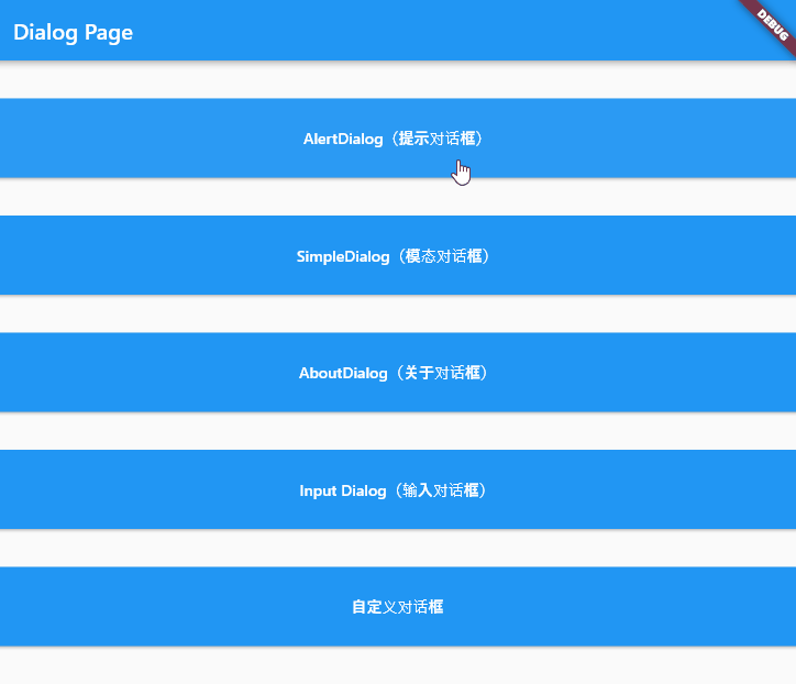
八、综合对话框示例
// ignore_for_file: prefer_const_constructors
import 'package:flutter/material.dart';

void main() {
  runApp(MyApp());
}

class MyApp extends StatelessWidget {
  const MyApp({Key? key}) : super(key: key);
  @override
  Widget build(BuildContext context) {
    return MaterialApp(
      home: Scaffold(
        appBar: AppBar(
          title: Text("Dialog Page"),
        ),
        body: MyHomeBody(),
      ),
    );
  }
}

// 主页面
class MyHomeBody extends StatelessWidget {
  const MyHomeBody({Key? key}) : super(key: key);

  @override
  Widget build(BuildContext context) {
    return Column(
      // 垂直布局
      mainAxisAlignment: MainAxisAlignment.spaceEvenly, // 平均分布各个 Widget
      crossAxisAlignment: CrossAxisAlignment.stretch, // 填充整个交叉轴
      mainAxisSize: MainAxisSize.max,
      children: <Widget>[
        ElevatedButton(
          onPressed: () async {
            bool? result = await _showAlertDialog(context);
            debugPrint("Result: $result");
          },
          style: ElevatedButton.styleFrom(
            minimumSize: const Size(160, 80),
          ),
          child: Text("AlertDialog(提示对话框)"),
        ),
        ElevatedButton(
          onPressed: () {
            _showSimpleDialog(context);
          },
          style: ElevatedButton.styleFrom(
            minimumSize: const Size(160, 80),
          ),
          child: Text("SimpleDialog(模态对话框)"),
        ),
        ElevatedButton(
          onPressed: () {
            _showAboutDialog(context);
          },
          style: ElevatedButton.styleFrom(
            minimumSize: const Size(160, 80),
          ),
          child: Text("AboutDialog(关于对话框)"),
        ),
        ElevatedButton(
          onPressed: () async {
            String? input = await showDialog<String>(
              context: context,
              builder: (BuildContext context) {
                return InputDialog();
              },
            );
            debugPrint("用户输入: $input");
          },
          style: ElevatedButton.styleFrom(
            minimumSize: const Size(160, 80),
          ),
          child: Text("Input Dialog(输入对话框)"),
        ),
        ElevatedButton(
          onPressed: () {
            showDialog(
              context: context,
              builder: (BuildContext context) {
                return CustomDialog();
              },
            );
          },
          style: ElevatedButton.styleFrom(
            minimumSize: const Size(160, 80),
          ),
          child: Text("自定义对话框"),
        ),
      ],
    );
  }
}

// AlertDialog(提示对话框)
Future<bool?> _showAlertDialog(BuildContext context) {
  return showDialog<bool>(
    context: context,
    builder: (context) {
      return AlertDialog(
        title: const Text("Logout"),
        content: const Text("Are you sure you want to logout?"),
        actions: [
          TextButton(
            onPressed: () {
              Navigator.of(context).pop(false);
            },
            child: const Text("Cancel"),
          ),
          TextButton(
            onPressed: () {
              Navigator.of(context).pop(true);
            },
            child: const Text("Sure"),
          )
        ],
      );
    },
  );
}

// SimpleDialog(模态对话框)
Future<String?> _showSimpleDialog(BuildContext context) {
  return showDialog(
    context: context,
    builder: (BuildContext context) {
      return SimpleDialog(
        title: Text('选择一个选项'),
        children: <Widget>[
          SimpleDialogOption(
            onPressed: () {
              Navigator.pop(context, '选项1');
            },
            child: Text('选项1'),
          ),
          SimpleDialogOption(
            onPressed: () {
              Navigator.pop(context, '选项2');
            },
            child: Text('选项2'),
          ),
        ],
      );
    },
  );
}

// AboutDialog(关于对话框)
_showAboutDialog(BuildContext context) {
  showAboutDialog(
    context: context,
    applicationName: 'My Application',
    applicationVersion: '1.0.0',
    applicationIcon: Icon(Icons.info, size: 48.0),
    applicationLegalese: '© 2023 My Company. All rights reserved.',
    children: <Widget>[
      Padding(
        padding: const EdgeInsets.only(top: 16.0),
        child: Text('This is a custom about dialog.'),
      ),
    ],
  );
}

// Input Dialog(输入对话框)
class InputDialog extends StatefulWidget {
  const InputDialog({Key? key}) : super(key: key);
  @override
  _InputDialogState createState() => _InputDialogState();
}

class _InputDialogState extends State<InputDialog> {
  final TextEditingController _controller = TextEditingController();

  @override
  Widget build(BuildContext context) {
    return AlertDialog(
      title: Text('输入对话框'),
      content: TextField(
        controller: _controller,
        decoration: InputDecoration(hintText: '请输入内容'),
      ),
      actions: <Widget>[
        TextButton(
          onPressed: () {
            Navigator.of(context).pop(null);
          },
          child: Text('取消'),
        ),
        TextButton(
          onPressed: () {
            Navigator.of(context).pop(_controller.text);
          },
          child: Text('确定'),
        ),
      ],
    );
  }
}

// 自定义对话框
class CustomDialog extends StatelessWidget {
  const CustomDialog({Key? key}) : super(key: key);
  @override
  Widget build(BuildContext context) {
    return Dialog(
      shape: RoundedRectangleBorder(borderRadius: BorderRadius.circular(12)),
      child: Container(
        height: 200,
        padding: EdgeInsets.all(16),
        child: Column(
          crossAxisAlignment: CrossAxisAlignment.start,
          children: <Widget>[
            Text(
              '自定义对话框标题',
              style: TextStyle(fontSize: 18, fontWeight: FontWeight.bold),
            ),
            SizedBox(height: 16),
            Text('这是自定义对话框内容。你可以根据需要添加任何组件。'),
            SizedBox(height: 24),
            Align(
              alignment: Alignment.bottomRight,
              child: TextButton(
                onPressed: () {
                  Navigator.of(context).pop();
                },
                child: Text('关闭'),
              ),
            )
          ],
        ),
      ),
    );
  }
}
效果图如下所示:
参考:
Flutter 初识:对话框和弹出层_flutter 正在发布 弹出层-CSDN博客
Flutter 中如何优雅地使用弹框 - 知乎 (zhihu.com)

 浙公网安备 33010602011771号