Flutter可滚动组件(7):TabBarView
TabBarView 是 Material 组件库中提供了 Tab 布局组件,通常和 TabBar 配合使用。
一、TabBarView
TabBarView 封装了 PageView,它的构造方法很简单
 TabBarView({
  Key? key,
  required this.children, // tab 页
  this.controller, // TabController
  this.physics,
  this.dragStartBehavior = DragStartBehavior.start,
})
TabController 用于监听和控制 TabBarView 的页面切换,通常和 TabBar 联动。如果没有指定,则会在组件树中向上查找并使用最近的一个 DefaultTabController 。
二、TabBar
TabBar 为 TabBarView 的导航标题,如下图所示:
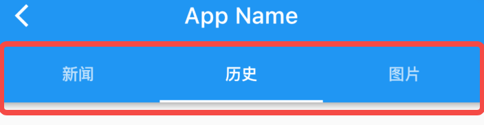
TabBar 有很多配置参数,通过这些参数我们可以定义 TabBar 的样式,很多属性都是在配置 indicator 和 label,拿上图来举例,Label 是每个Tab 的文本,indicator 指 “历史” 下面的白色下划线。
const TabBar({
  Key? key,
  required this.tabs, // 具体的 Tabs,需要我们创建
  this.controller,
  this.isScrollable = false, // 是否可以滑动
  this.padding,
  this.indicatorColor,// 指示器颜色,默认是高度为2的一条下划线
  this.automaticIndicatorColorAdjustment = true,
  this.indicatorWeight = 2.0,// 指示器高度
  this.indicatorPadding = EdgeInsets.zero, //指示器padding
  this.indicator, // 指示器
  this.indicatorSize, // 指示器长度,有两个可选值,一个tab的长度,一个是label长度
  this.labelColor,
  this.labelStyle,
  this.labelPadding,
  this.unselectedLabelColor,
  this.unselectedLabelStyle,
  this.mouseCursor,
  this.onTap,
  ...
})
TabBar 通常位于 AppBar 的底部,它也可以接收一个 TabController ,如果需要和 TabBarView 联动, TabBar 和 TabBarView 使用同一个 TabController 即可,注意,联动时 TabBar 和 TabBarView 的孩子数量需要一致。如果没有指定 controller,则会在组件树中向上查找并使用最近的一个 DefaultTabController 。另外我们需要创建需要的 tab 并通过 tabs 传给 TabBar, tab 可以是任何 Widget,不过Material 组件库中已经实现了一个 Tab 组件,我们一般都会直接使用它:
const Tab({
  Key? key,
  this.text, //文本
  this.icon, // 图标
  this.iconMargin = const EdgeInsets.only(bottom: 10.0),
  this.height,
  this.child, // 自定义 widget
})
注意,text 和 child 是互斥的,不能同时指定。
三、简单示例
下面我们看一个例子:
import 'package:flutter/material.dart';

void main() {
  runApp(const MyApp());
}

class MyApp extends StatelessWidget {
  const MyApp({super.key});
  @override
  Widget build(BuildContext context) {
    return MaterialApp(
      debugShowCheckedModeBanner: false,
      home: DefaultTabController(
        length: 3, // 选项卡的数量
        child: Scaffold(
          appBar: AppBar(
            title: const Text('TabBarView示例'),
            bottom: const TabBar(
              tabs: [
                Tab(text: '选项卡1'),
                Tab(text: '选项卡2'),
                Tab(text: '选项卡3'),
              ],
            ),
          ),
          body: const TabBarView(
            children: [
              // 每个选项卡的内容
              Center(child: Text('选项卡1内容')),
              Center(child: Text('选项卡2内容')),
              Center(child: Text('选项卡3内容')),
            ],
          ),
        ),
      ),
    );
  }
}
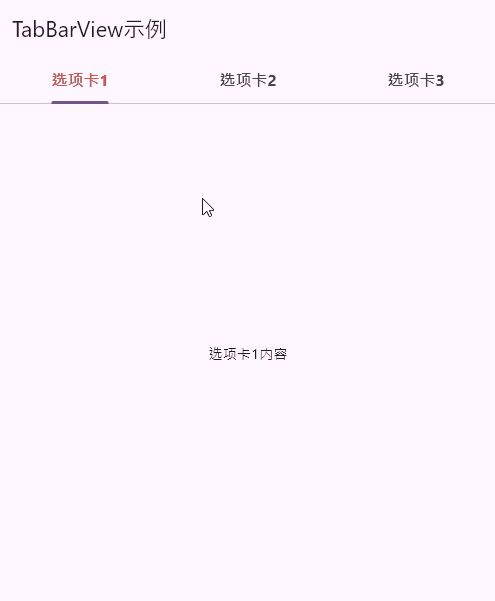
点一点,滑动滑动。常规得不能再常规。效果图如下所示:
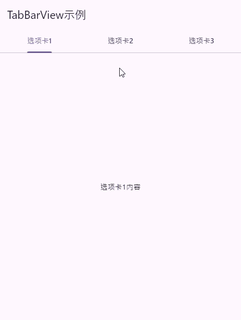
上面这几行代码,我们可以知道。
-
DefaultTabController的length属性设置为3,表示我们有三个选项卡。 -
在
DefaultTabController的child属性中,我们创建了一个Scaffold,这是一个包含应用程序基本布局的小部件。Scaffold包括一个AppBar和一个TabBarView。 -
AppBar是顶部的应用栏,它包含一个标题("TabBarView示例")和一个TabBar小部件。TabBar用于显示选项卡,它的tabs属性包含三个Tab小部件,分别命名为 "选项卡1","选项卡2" 和 "选项卡3"。 -
TabBarView是一个小部件,用于显示选项卡内容。它的children属性包含了三个子小部件,每个子小部件都代表一个选项卡的内容。在这个示例中,内容很简单,只是一个居中显示的文本,分别对应 "选项卡1内容","选项卡2内容" 和 "选项卡3内容"。
四、不结合Scaffold的示例
可以使用DefaultTabController、TabBar和TabBarView,并将它们包裹在您自己的自定义布局中。不结合Scaffold;
import 'package:flutter/material.dart';

void main() {
  runApp(const MyApp());
}

class MyApp extends StatelessWidget {
  const MyApp({super.key});
  @override
  Widget build(BuildContext context) {
    return const MaterialApp(
      debugShowCheckedModeBanner: false,
      home: DefaultTabController(
        length: 3, // 选项卡的数量
        child: MyTabBarView(),
      ),
    );
  }
}

class MyTabBarView extends StatefulWidget {
  const MyTabBarView({super.key});
  @override
  State<MyTabBarView> createState() => _MyTabBarViewState();
}

class _MyTabBarViewState extends State<MyTabBarView> {
  @override
  Widget build(BuildContext context) {
    return Scaffold(
      appBar: AppBar(
        title: const Text('TabBarView示例'),
        bottom: const TabBar(
          tabs: [
            Tab(
              text: '选项卡1',
            ),
            Tab(
              text: '选项卡2',
            ),
            Tab(
              text: '选项卡3',
            ),
          ],
          labelStyle: TextStyle(
            fontSize: 16,
            fontWeight: FontWeight.bold,
            color: Colors.red,
          ),
        ),
      ),
      body: const TabBarView(
        physics: BouncingScrollPhysics(), // 添加弹簧效果
        children: [
          // 每个选项卡的内容
          Center(child: Text('选项卡1内容')),
          Center(child: Text('选项卡2内容')),
          Center(child: Text('选项卡3内容')),
        ],
      ),
    );
  }
}
效果图如下所示:
五、来点自定义
5.1 自定义选项卡视图
import 'package:flutter/material.dart';
void main() {
runApp(const MyApp());
}
class MyApp extends StatelessWidget {
const MyApp({super.key});
@override
Widget build(BuildContext context) {
return MaterialApp(
debugShowCheckedModeBanner: false,
home: DefaultTabController(
length: 3, // 选项卡的数量
child: Scaffold(
appBar: AppBar(
title: const Text('TabBarView示例'),
bottom: const TabBar(
tabs: [
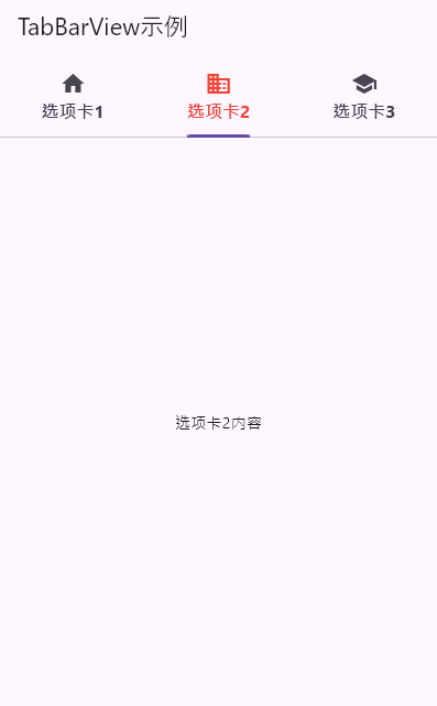
Tab(
text: '选项卡1',
icon: Icon(Icons.home), // 添加图标
),
Tab(
text: '选项卡2',
icon: Icon(Icons.business), // 添加不同图标
),
Tab(
text: '选项卡3',
icon: Icon(Icons.school), // 添加不同图标
),
],
labelStyle: TextStyle(
fontSize: 16,
fontWeight: FontWeight.bold,
color: Colors.red,
),
),
),
body: const TabBarView(
children: [
// 每个选项卡的内容
Center(child: Text('选项卡1内容')),
Center(child: Text('选项卡2内容')),
Center(child: Text('选项卡3内容')),
],
),
),
),
);
}
}
效果图如下所示:
5.2 tabBar在底部,tabBarView在上方
import 'package:flutter/material.dart';

void main() {
  runApp(const MyApp());
}

class MyApp extends StatelessWidget {
  const MyApp({super.key});
  @override
  Widget build(BuildContext context) {
    return MaterialApp(
      debugShowCheckedModeBanner: false,
      home: DefaultTabController(
        length: 3,
        child: Scaffold(
          body: Column(
            children: [
              const Expanded(
                child: TabBarView(
                  children: [
                    Center(child: Text('选项卡1内容')),
                    Center(child: Text('选项卡2内容')),
                    Center(child: Text('选项卡3内容')),
                  ],
                ),
              ),
              Container(
                color: Colors.blue, // 设置TabBar的背景颜色
                child: const TabBar(
                  tabs: [
                    Tab(
                      text: '选项卡1',
                      icon: Icon(Icons.home),
                    ),
                    Tab(
                      text: '选项卡2',
                      icon: Icon(Icons.business),
                    ),
                    Tab(
                      text: '选项卡3',
                      icon: Icon(Icons.school),
                    ),
                  ],
                ),
              ),
            ],
          ),
        ),
      ),
    );
  }
}
效果图如下所示:
5.3 自定义选项卡的背景颜色
- 字体大小、颜色、粗细等
- 自定义选项卡的颜色
- 自定义tab的图标和文本的距离
- 自定义选项卡指示器的背景颜色
- 自定义整个TabBar的颜色
import 'package:flutter/material.dart';
void main() {
runApp(const MyApp());
}
class MyApp extends StatelessWidget {
const MyApp({super.key});
@override
Widget build(BuildContext context) {
return MaterialApp(
debugShowCheckedModeBanner: false,
home: DefaultTabController(
length: 3, // 选项卡的数量
child: Scaffold(
appBar: AppBar(
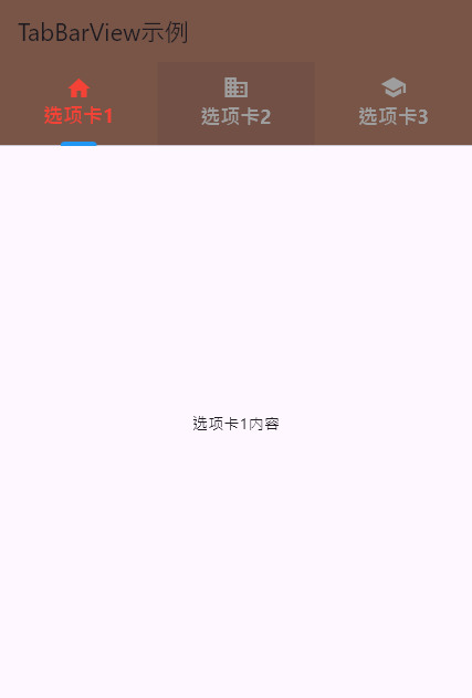
backgroundColor: Colors.brown, // 设置AppBar的背景颜色为棕色
title: const Text('TabBarView示例'),
bottom: const TabBar(
tabs: [
Tab(
text: '选项卡1',
icon: Icon(Icons.home), // 添加图标
// 特殊设置一下
iconMargin: EdgeInsets.only(bottom: 0.0), // 图标与文本之间的距离
),
Tab(
text: '选项卡2',
icon: Icon(Icons.business), // 添加不同图标
),
Tab(
text: '选项卡3',
icon: Icon(Icons.school), // 添加不同图标
),
],
// 字体大小、颜色、粗细等
labelStyle: TextStyle(
fontSize: 18, // 自定义字体大小
fontWeight: FontWeight.bold, // 字体粗细
color: Colors.blue, // 文本颜色
),
// 自定义选项卡的颜色
labelColor: Colors.red, // 选中状态下的文本颜色
unselectedLabelColor: Colors.grey, // 未选中状态下的文本颜色
// 自定义选项卡指示器的背景颜色
indicatorColor: Colors.blue, // 选中状态下的指示器颜色
indicatorWeight: 4.0, // 选中状态下的指示器厚度
indicatorSize:
TabBarIndicatorSize.label, // 指示器大小计算方式 tab、label两种方式
indicatorPadding:
EdgeInsets.symmetric(horizontal: 16.0), // 指示器内边距
),
),
body: const TabBarView(
children: [
// 每个选项卡的内容
Center(child: Text('选项卡1内容')),
Center(child: Text('选项卡2内容')),
Center(child: Text('选项卡3内容')),
],
),
),
),
);
}
}
效果图如下所示:
六、稍微高级一点的自定义
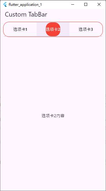
6.1 tabBar自定义。圆角啊,线包裹啊
PreferredSize 走一个
import 'package:flutter/material.dart';

void main() => runApp(const MyApp());

class MyApp extends StatelessWidget {
  const MyApp({super.key});
  @override
  Widget build(BuildContext context) {
    return MaterialApp(
      debugShowCheckedModeBanner: false,
      home: MyHomePage(),
    );
  }
}

class MyHomePage extends StatefulWidget {
  @override
  State<MyHomePage> createState() => _MyHomePageState();
}

class _MyHomePageState extends State<MyHomePage>
    with SingleTickerProviderStateMixin {
  TabController? _tabController;

  @override
  void initState() {
    super.initState();
    _tabController = TabController(length: 3, vsync: this);
  }

  @override
  void dispose() {
    _tabController?.dispose();
    super.dispose();
  }

  @override
  Widget build(BuildContext context) {
    return Scaffold(
      appBar: AppBar(
        title: const Text('Custom TabBar'),
        bottom: PreferredSize(
          preferredSize: const Size.fromHeight(50.0),
          child: Container(
            decoration: BoxDecoration(
              borderRadius: BorderRadius.circular(20),
              border: Border.all(color: Colors.red),
            ),
            margin: const EdgeInsets.all(10),
            padding: const EdgeInsets.all(1),
            child: TabBar(
              controller: _tabController,
              indicator: BoxDecoration(
                borderRadius: BorderRadius.circular(20),
                color: Colors.red,
              ),
              unselectedLabelColor: Colors.black,
              labelColor: Colors.white,
              tabs: const [
                Tab(text: '选项卡1'),
                Tab(text: '选项卡2'),
                Tab(text: '选项卡3'),
              ],
            ),
          ),
        ),
      ),
      body: TabBarView(
        controller: _tabController,
        children: const [
          Center(child: Text('选项卡1内容')),
          Center(child: Text('选项卡2内容')),
          Center(child: Text('选项卡3内容')),
        ],
      ),
    );
  }
}
效果图如下所示:
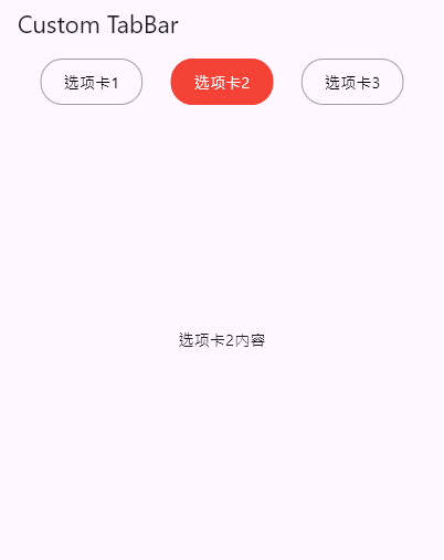
6.2 用Row代替Tabvar,TabController走一个
要使用Row来实现类似TabBar的效果,并且不使用PreferredSize。
可以自定义一个Row来放置的选项卡,并使用TabController来控制TabBarView。
import 'package:flutter/material.dart';

void main() => runApp(const MyApp());

class MyApp extends StatelessWidget {
  const MyApp({super.key});
  @override
  Widget build(BuildContext context) {
    return const MaterialApp(
      debugShowCheckedModeBanner: false,
      home: MyHomePage(),
    );
  }
}

class MyHomePage extends StatefulWidget {
  const MyHomePage({super.key});
  @override
  State<MyHomePage> createState() => _MyHomePageState();
}

class _MyHomePageState extends State<MyHomePage>
    with SingleTickerProviderStateMixin {
  late TabController _tabController;

  @override
  void initState() {
    super.initState();
    _tabController = TabController(length: 3, vsync: this);
  }

  @override
  void dispose() {
    _tabController.dispose();
    super.dispose();
  }

  @override
  Widget build(BuildContext context) {
    return Scaffold(
      appBar: AppBar(
        title: const Text('Custom TabBar'),
        bottom: AppBarBottom(tabController: _tabController),
      ),
      body: TabBarView(
        controller: _tabController,
        children: const [
          Center(child: Text('选项卡1内容')),
          Center(child: Text('选项卡2内容')),
          Center(child: Text('选项卡3内容')),
        ],
      ),
    );
  }
}

class AppBarBottom extends StatefulWidget implements PreferredSizeWidget {
  final TabController tabController;

  const AppBarBottom({required this.tabController});

  @override
  State<AppBarBottom> createState() => _AppBarBottomState();

  @override
  Size get preferredSize => Size.fromHeight(50.0);
}

class _AppBarBottomState extends State<AppBarBottom> {
  @override
  void initState() {
    super.initState();
    widget.tabController.addListener(_setActiveTab);
  }

  void _setActiveTab() {
    if (mounted) {
      setState(() {}); // 触发重建
    }
  }

  @override
  void dispose() {
    widget.tabController.removeListener(_setActiveTab);
    super.dispose();
  }

  @override
  Widget build(BuildContext context) {
    return Container(
      margin: const EdgeInsets.all(10),
      padding: const EdgeInsets.all(1),
      child: Row(
        mainAxisAlignment: MainAxisAlignment.spaceEvenly,
        children: List<Widget>.generate(3, (int index) {
          bool isSelected = widget.tabController.index == index;
          return GestureDetector(
            onTap: () => widget.tabController.animateTo(index),
            child: Container(
              padding: const EdgeInsets.symmetric(vertical: 10, horizontal: 20),
              decoration: BoxDecoration(
                color: isSelected ? Colors.red : Colors.transparent,
                borderRadius: BorderRadius.circular(20),
                border:
                    Border.all(color: isSelected ? Colors.red : Colors.grey),
              ),
              child: Text(
                '选项卡${index + 1}',
                style: TextStyle(
                  color: isSelected ? Colors.white : Colors.black,
                ),
              ),
            ),
          );
        }),
      ),
    );
  }
}
效果图如下所示:

 浙公网安备 33010602011771号