Flutter容器(4):裁剪(Clip)
一、Flutter 的 Clip 类:裁剪部件的使用
在 Flutter 中,Clip 类提供了一种方便的方式来裁剪部件,以实现各种独特的界面效果。Clip 类包含多个子类,如 ClipOval、ClipRect ClipRRect、和 ClipPath,每个子类都提供了不同的裁剪方式和参数。本篇博客将详细介绍 Clip 类的使用和自定义,帮助你掌握裁剪部件的强大功能。
注意:ClipRect ClipRRect 没写错,一个字母的差别,ClipRect 是矩形,ClipRRect 是圆角矩形。
下面是一个将 Clip 类的不同子类和作用总结成表格的示例:
| 子类 | 作用 |
|---|---|
ClipOval |
将部件裁剪为椭圆形 |
ClipRRect |
将部件裁剪为圆角矩形 |
ClipRect |
将部件裁剪为矩形 |
ClipPath |
自定义裁剪路径 |
ClipPolygon |
将部件裁剪为多边形 |
ClipShadow |
裁剪并添加阴影 |
这个表格总结了 Clip 类的几个常用子类以及它们的作用。通过选择合适的子类,我们可以实现不同的裁剪效果,从椭圆形到圆角矩形,甚至是自定义形状。
请注意,这只是一个简单的总结,实际上还有更多的裁剪子类和选项可以使用。你可以根据具体需求选择适合的子类来实现所需的裁剪效果。
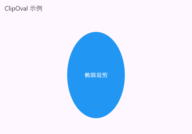
1.1 ClipOval:椭圆裁剪
ClipOval 类用于将部件裁剪为椭圆形。以下是一个示例代码,演示如何使用 ClipOval 实现椭圆形裁剪效果:
import 'package:flutter/material.dart';

void main() {
  runApp(const MyApp());
}

class MyApp extends StatelessWidget {
  const MyApp({super.key});
  @override
  Widget build(BuildContext context) {
    return MaterialApp(
      debugShowCheckedModeBanner: false,
      home: Scaffold(
        appBar: AppBar(
          title: const Text('ClipOval 示例'),
        ),
        body: Center(
          child: ClipOval(
            child: Container(
              width: 200,
              height: 300,
              color: Colors.blue,
              child: const Center(
                child: Text(
                  '椭圆裁剪',
                  style: TextStyle(
                    fontSize: 20,
                    color: Colors.white,
                  ),
                ),
              ),
            ),
          ),
        ),
      ),
    );
  }
}
在上述代码中,我们创建了一个 Container 部件,并将其包裹在 ClipOval 中。Container 的宽度和高度分别为 200和300,背景颜色为蓝色。在 Container 中心位置添加了一个文本部件,显示了"椭圆裁剪"的文本内容。(如果宽高都为200,这里裁剪出来的是个圆)效果图如下所示:
ClipOval 能否裁剪出常见的一个圆角按钮呢?
ClipOvalEmm,不行,ClipRRect可以
1.2 ClipRect:矩形裁剪
ClipRect 类用于将部件裁剪为矩形。以下是一个示例代码,演示如何使用 ClipRect 实现矩形裁剪效果:
import 'package:flutter/material.dart';

void main() {
  runApp(const MyApp());
}

class MyApp extends StatelessWidget {
  const MyApp({super.key});
  @override
  Widget build(BuildContext context) {
    return MaterialApp(
      home: Scaffold(
        appBar: AppBar(
          title: const Text('ClipRect 示例'),
        ),
        body: Center(
          child: Column(
            mainAxisAlignment: MainAxisAlignment.center,
            children: [
              Container(
                width: 200,
                height: 200,
                color: Colors.green,
                child: const Center(
                  child: Text(
                    '未裁剪矩形',
                    style: TextStyle(
                      fontSize: 20,
                      color: Colors.white,
                    ),
                  ),
                ),
              ),
              const SizedBox(height: 20),
              ClipRect(
                child: Container(
                  width: 100,
                  height: 100,
                  color: Colors.red,
                  child: const Center(
                    child: Text(
                      '裁剪后的矩形',
                      style: TextStyle(
                        fontSize: 20,
                        color: Colors.white,
                      ),
                    ),
                  ),
                ),
              ),
            ],
          ),
        ),
      ),
    );
  }
}
效果图如下所示:
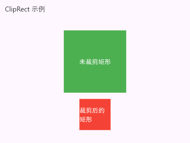
在上述代码中,我们创建了一个 Container 部件,并将其包裹在 ClipRect 中。Container 的宽度和高度分别为 200,背景颜色为绿色。在 Container 中心位置添加了一个文本部件,显示了"矩形裁剪"的文本内容。
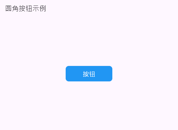
1.3 ClipRRect 圆角裁剪
圆角圆角
import 'package:flutter/material.dart';

void main() {
  runApp(const MyApp());
}

class MyApp extends StatelessWidget {
  const MyApp({super.key});
  @override
  Widget build(BuildContext context) {
    return MaterialApp(
      debugShowCheckedModeBanner: false,
      home: Scaffold(
        appBar: AppBar(
          title: const Text('圆角按钮示例'),
        ),
        body: Center(
          child: ClipRRect(
            borderRadius: BorderRadius.circular(10),
            child: Container(
              width: 150,
              height: 50,
              color: Colors.blue,
              child: const Center(
                child: Text(
                  '按钮',
                  style: TextStyle(
                    fontSize: 20,
                    color: Colors.white,
                  ),
                ),
              ),
            ),
          ),
        ),
      ),
    );
  }
}
效果图如下所示:
二、CustomClipper,ClipPath:自定义裁剪
自定义裁剪需要用到,CustomClipper
ClipPath 类允许我们自定义裁剪路径,从而实现各种创意和艺术裁剪效果。
CustomClipper和ClipPath的关系
CustomClipper和ClipPath是Flutter中用于自定义裁剪区域的两个关键类。它们之间存在一种紧密的关系,用于实现自定义形状的裁剪效果。CustomClipper是一个抽象类,用于定义裁剪路径的形状。你可以通过继承CustomClipper类并实现其中的getClip()方法来创建自己的裁剪路径。getClip()方法返回一个Path对象,描述了你想要裁剪的形状。ClipPath是一个小部件,用于将裁剪路径应用于其子小部件。它接收一个CustomClipper对象作为clipper参数,并使用getClip()方法返回的路径来裁剪其子小部件。只有位于裁剪路径内部的部分才会被显示,而位于路径外部的部分将被裁剪掉。
比如:ClipOval 无法直接实现带有自定义圆角的按钮效果。为了实现带有自定义圆角的按钮,我们后面会自定义一下。
2.1 示例1
以下是一个示例代码,演示如何使用 ClipPath 实现自定义裁剪路径的效果:
import 'package:flutter/material.dart';

void main() {
  runApp(const MyApp());
}

class MyApp extends StatelessWidget {
  const MyApp({super.key});
  @override
  Widget build(BuildContext context) {
    return MaterialApp(
      debugShowCheckedModeBanner: false,
      home: Scaffold(
        appBar: AppBar(
          title: const Text('ClipPath 示例'),
        ),
        body: Center(
          child: ClipPath(
            clipper: MyCustomClipper(),
            child: Container(
              width: 200,
              height: 200,
              color: Colors.orange,
              child: const Center(
                child: Text(
                  '自定义裁剪路径',
                  style: TextStyle(
                    fontSize: 20,
                    color: Colors.white,
                  ),
                ),
              ),
            ),
          ),
        ),
      ),
    );
  }
}

class MyCustomClipper extends CustomClipper<Path> {
  @override
  Path getClip(Size size) {
    var path = Path();
    path.moveTo(size.width * 0.5, 0);
    path.lineTo(size.width, size.height * 0.5);
    path.lineTo(size.width * 0.5, size.height);
    path.lineTo(0, size.height * 0.5);
    path.close();
    return path;
  }

  @override
  bool shouldReclip(covariant CustomClipper<Path> oldClipper) {
    return false;
  }
}
效果图如下所示:
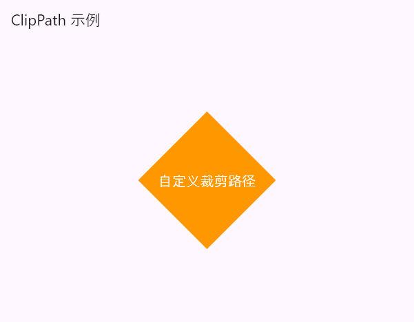
在上述代码中,我们创建了一个自定义的裁剪路径 MyCustomClipper,继承自 CustomClipper<Path>。在 getClip 方法中,我们使用 Path 类来描述一个自定义的裁剪路径,从而实现了一个四边形的裁剪效果。然后,我们将这个自定义裁剪路径应用到 ClipPath 部件中,并将 ClipPath 包裹在一个 Container 部件中。Container 的宽度和高度分别为 200,背景颜色为橙色。在 Container 中心位置添加了一个文本部件,显示了"自定义裁剪路径"的文本内容。
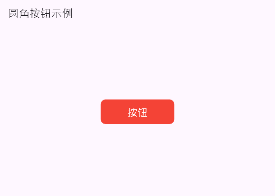
2.2 示例2
利用ClipPath实现圆角
import 'package:flutter/material.dart';

void main() {
  runApp(const MyApp());
}

class MyApp extends StatelessWidget {
  const MyApp({super.key});
  @override
  Widget build(BuildContext context) {
    return MaterialApp(
      debugShowCheckedModeBanner: false,
      home: Scaffold(
        appBar: AppBar(
          title: const Text('圆角按钮示例'),
        ),
        body: Center(
          child: ClipPath(
            clipper: ButtonClipper(),
            child: Container(
              width: 150,
              height: 50,
              color: Colors.red,
              child: const Center(
                child: Text(
                  '按钮',
                  style: TextStyle(
                    fontSize: 20,
                    color: Colors.white,
                  ),
                ),
              ),
            ),
          ),
        ),
      ),
    );
  }
}

class ButtonClipper extends CustomClipper<Path> {
  @override
  Path getClip(Size size) {
    var path = Path();
    var radius = 10.0;
    path.moveTo(radius, 0);
    path.lineTo(size.width - radius, 0);
    path.arcToPoint(
      Offset(size.width, radius),
      radius: Radius.circular(radius),
    );
    path.lineTo(size.width, size.height - radius);
    path.arcToPoint(
      Offset(size.width - radius, size.height),
      radius: Radius.circular(radius),
    );
    path.lineTo(radius, size.height);
    path.arcToPoint(
      Offset(0, size.height - radius),
      radius: Radius.circular(radius),
    );
    path.lineTo(0, radius);
    path.arcToPoint(
      Offset(radius, 0),
      radius: Radius.circular(radius),
    );
    path.close();
    return path;
  }

  @override
  bool shouldReclip(covariant CustomClipper<Path> oldClipper) {
    return false;
  }
}
效果图如下所示:
通过这些示例代码,我们可以看到 Clip 类的强大功能和灵活性。你可以根据实际需求使用 Clip 类的不同子类,或者通过自定义裁剪路径来实现各种独特的裁剪效果。
三、 全部子类汇个总
下面是一个将 Clip 类的不同子类和作用总结成表格的示例:
| 子类 | 作用 |
|---|---|
ClipOval |
将部件裁剪为椭圆形 |
ClipRRect |
将部件裁剪为圆角矩形 |
ClipRect |
将部件裁剪为矩形 |
ClipPath |
自定义裁剪路径 |
ClipPolygon |
将部件裁剪为多边形 |
ClipShadow |
裁剪并添加阴影 |
这个表格总结了 Clip 类的几个常用子类以及它们的作用。通过选择合适的子类,我们可以实现不同的裁剪效果,从椭圆形到圆角矩形,甚至是自定义形状。
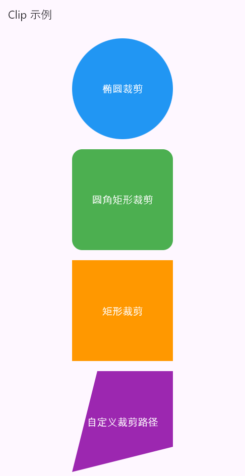
import 'package:flutter/material.dart';
import 'dart:math' as math;

void main() {
  runApp(const MyApp());
}

class MyApp extends StatelessWidget {
  const MyApp({super.key});
  @override
  Widget build(BuildContext context) {
    return MaterialApp(
      debugShowCheckedModeBanner: false,
      home: Scaffold(
        appBar: AppBar(
          title: const Text('Clip 示例'),
        ),
        body: Center(
          child: SingleChildScrollView(
            child: Column(
              mainAxisAlignment: MainAxisAlignment.center,
              children: [
                const SizedBox(
                  height: 20,
                ),
                ClipOval(
                  child: Container(
                    width: 200,
                    height: 200,
                    color: Colors.blue,
                    child: const Center(
                      child: Text(
                        '椭圆裁剪',
                        style: TextStyle(
                          fontSize: 20,
                          color: Colors.white,
                        ),
                      ),
                    ),
                  ),
                ),
                const SizedBox(
                  height: 20,
                ),
                ClipRRect(
                  borderRadius: BorderRadius.circular(20),
                  child: Container(
                    width: 200,
                    height: 200,
                    color: Colors.green,
                    child: const Center(
                      child: Text(
                        '圆角矩形裁剪',
                        style: TextStyle(
                          fontSize: 20,
                          color: Colors.white,
                        ),
                      ),
                    ),
                  ),
                ),
                const SizedBox(
                  height: 20,
                ),
                ClipRect(
                  child: Container(
                    width: 200,
                    height: 200,
                    color: Colors.orange,
                    child: const Center(
                      child: Text(
                        '矩形裁剪',
                        style: TextStyle(
                          fontSize: 20,
                          color: Colors.white,
                        ),
                      ),
                    ),
                  ),
                ),
                const SizedBox(
                  height: 20,
                ),
                ClipPath(
                  clipper: MyCustomClipper(),
                  child: Container(
                    width: 200,
                    height: 200,
                    color: Colors.purple,
                    child: const Center(
                      child: Text(
                        '自定义裁剪路径',
                        style: TextStyle(
                          fontSize: 20,
                          color: Colors.white,
                        ),
                      ),
                    ),
                  ),
                ),
                const SizedBox(
                  height: 20,
                ),
                ClipPath(
                  clipper: MyPolygonClipper(),
                  child: Container(
                    width: 200,
                    height: 200,
                    color: Colors.pink,
                    child: const Center(
                      child: Text(
                        '多边形裁剪',
                        style: TextStyle(
                          fontSize: 20,
                          color: Colors.white,
                        ),
                      ),
                    ),
                  ),
                ),
                const SizedBox(
                  height: 20,
                ),
                ClipPath(
                  clipper: MyShadowClipper(),
                  child: Container(
                    width: 200,
                    height: 200,
                    color: Colors.red,
                    child: const Center(
                      child: Text(
                        '裁剪并添加阴影',
                        style: TextStyle(
                          fontSize: 20,
                          color: Colors.white,
                        ),
                      ),
                    ),
                  ),
                ),
                const SizedBox(
                  height: 20,
                ),
              ],
            ),
          ),
        ),
      ),
    );
  }
}

class MyCustomClipper extends CustomClipper<Path> {
  @override
  Path getClip(Size size) {
    var path = Path();
    path.moveTo(size.width * 0.25, 0);
    path.lineTo(size.width, 0);
    path.lineTo(size.width, size.height * 0.75);
    path.lineTo(0, size.height);
    path.close();
    return path;
  }

  @override
  bool shouldReclip(covariant CustomClipper<Path> oldClipper) {
    return false;
  }
}

class MyPolygonClipper extends CustomClipper<Path> {
  @override
  Path getClip(Size size) {
    var path = Path();
    var radius = size.width * 0.5;
    var centerX = size.width * 0.5;
    var centerY = size.height * 0.5;
    var sides = 6; // 六边形
    var angle = (2 * 3.1415926) / sides;

    path.moveTo(centerX + radius * math.cos(0), centerY + radius * math.sin(0));

    for (var i = 1; i <= sides; i++) {
      var x = centerX + radius * math.cos(angle * i);
      var y = centerY + radius * math.sin(angle * i);
      path.lineTo(x, y);
    }

    path.close();
    return path;
  }

  @override
  bool shouldReclip(covariant CustomClipper<Path> oldClipper) {
    return false;
  }
}

class MyShadowClipper extends CustomClipper<Path> {
  @override
  Path getClip(Size size) {
    var path = Path();
    path.moveTo(0, 0);
    path.lineTo(size.width, 0);
    path.lineTo(size.width, size.height);
    path.lineTo(0, size.height * 0.5);
    path.close();
    return path;
  }

  @override
  bool shouldReclip(covariant CustomClipper<Path> oldClipper) {
    return false;
  }
}
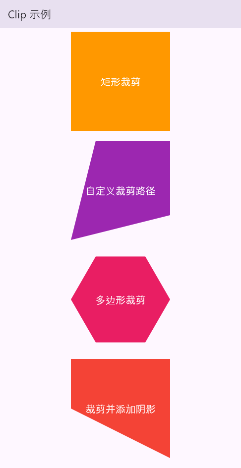
效果图如下所示:
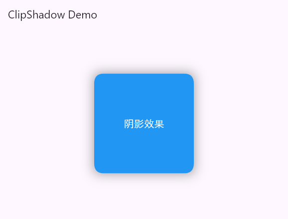
看起来,裁剪并添加阴影,效果不是很明显,重新来一个吧
裁剪和阴影
import 'package:flutter/material.dart';

void main() {
  runApp(const MyApp());
}

class MyApp extends StatelessWidget {
  const MyApp({super.key});
  @override
  Widget build(BuildContext context) {
    return MaterialApp(
      debugShowCheckedModeBanner: false,
      title: 'ClipShadow Demo',
      theme: ThemeData(
        primarySwatch: Colors.blue,
      ),
      home: const MyHomePage(),
    );
  }
}

class MyHomePage extends StatelessWidget {
  const MyHomePage({super.key});
  @override
  Widget build(BuildContext context) {
    return Scaffold(
      appBar: AppBar(
        title: const Text('ClipShadow Demo'),
      ),
      body: Center(
        child: Container(
          width: 200,
          height: 200,
          child: ClipShadow(
            clipper: MyClipper(),
            boxShadow: [
              BoxShadow(
                color: Colors.black.withOpacity(0.4),
                blurRadius: 20.0,
                spreadRadius: 10.0,
                offset: const Offset(0, 5),
              ),
            ],
            child: Container(
              color: Colors.blue,
              child: const Center(
                child: Text(
                  '阴影效果',
                  style: TextStyle(
                    fontSize: 20,
                    color: Colors.white,
                  ),
                ),
              ),
            ),
          ),
        ),
      ),
    );
  }
}

class MyClipper extends CustomClipper<Path> {
  @override
  Path getClip(Size size) {
    final path = Path();
    path.moveTo(20, 0);
    path.lineTo(size.width - 20, 0);
    path.quadraticBezierTo(size.width, 0, size.width, 20); // 右上角的曲线
    path.lineTo(size.width, size.height - 20);
    path.quadraticBezierTo(
        size.width, size.height, size.width - 20, size.height); // 右下角的曲线
    path.lineTo(20, size.height);
    path.quadraticBezierTo(0, size.height, 0, size.height - 20); // 左下角的曲线
    path.lineTo(0, 20);
    path.quadraticBezierTo(0, 0, 20, 0); // 左上角的曲线
    return path;
  }

  @override
  bool shouldReclip(covariant CustomClipper<Path> oldClipper) {
    return true;
  }
}

class ClipShadow extends StatelessWidget {
  final List<BoxShadow> boxShadow;
  final CustomClipper<Path> clipper;
  final Widget child;

  @override
  const ClipShadow({
    required this.boxShadow,
    required this.clipper,
    required this.child,
  });

  @override
  Widget build(BuildContext context) {
    return CustomPaint(
      painter: _ClipShadowPainter(boxShadow),
      child: ClipPath(
        clipper: clipper,
        child: child,
      ),
    );
  }
}

class _ClipShadowPainter extends CustomPainter {
  final List<BoxShadow> boxShadow;

  _ClipShadowPainter(this.boxShadow);

  @override
  void paint(Canvas canvas, Size size) {
    for (var shadow in boxShadow) {
      final paint = shadow.toPaint();
      final clipPath = Path()
        ..addRect(Rect.fromLTWH(0, 0, size.width, size.height));
      canvas.drawPath(clipPath, paint);
    }
  }

  @override
  bool shouldRepaint(covariant CustomPainter oldDelegate) {
    return true;
  }
}
效果图如下所示:

 浙公网安备 33010602011771号