Flutter容器(2):容器组件(Container)
在 Flutter 中,Container(容器)是一个非常基础且功能丰富的小部件,用于定义一个矩形区域,它可以包含其他小部件。Container 提供了多种定制化选项,如颜色、边距、边框、尺寸等,同时还可以对子部件进行对齐、填充和变换等操作。
如果你需要一个视图,有一个背景颜色、图像、有固定的尺寸、需要一个边框、圆角等效果,那么就可以使用 Container 组件。
一、基础用法
Container小部件最基本的用法是作为一个盒子,包裹并容纳其他小部件:
Container(
  child: Text('Hello, World!'),
)
这将创建一个Container,其中包含一个简单的文本。
二、定制化属性
Container提供了多种属性来定制其外观和行为:
Container({
  this.alignment, // 对齐方式
  this.padding, // 内边距
  Color color, // 背景颜色
  Decoration decoration, // 背景装饰,如边框、圆角、阴影等
  Decoration foregroundDecoration, // 前景装饰
  double width,// 容器的宽度
  double height, // 容器的高度
  BoxConstraints constraints, // 容器大小的限制条件
  this.margin,// 外边距
  this.transform, // 变换
  this.child,
})
有两点需要说明:
- 容器的大小可以通过
width、height属性来指定,也可以通过constraints来指定,如果同时存在时,width、height优先。实际上Container内部会根据width、height来生成一个constraints; color和decoration是互斥的,实际上,当指定color时,Container内会自动创建一个decoration;
2.1 对齐方式
alignment:指定 Container 内部子部件的对齐方式。以下是一些常见的对齐方式:
Alignment.topLeft // 将子部件对齐到 Container 的左上角
Alignment.center // 将子部件居中对齐到 Container
Alignment.bottomRight // 将子部件对齐到 Container 的右下角
你还可以通过 Alignment 类的其他静态属性来实现更多的对齐方式。
2.2 颜色和背景
color: 设置容器的背景颜色。foregroundColor: 设置容器前景色,如在背景上有覆盖的图标或文字时使用。
Container(
  color: Colors.red,
  child: Text('Red Background', style: TextStyle(color: Colors.white)),
)
2.3 边距和填充
margin: 容器外围的空白区域。padding: 容器内侧的空白区域。
Container(
  margin: EdgeInsets.all(20.0),
  padding: EdgeInsets.symmetric(vertical: 10.0, horizontal: 20.0),
  child: Text('Padded and Margined'),
)
2.4 边框
border: 容器的边框。
Container(
  border: Border.all(width: 1.0, color: Colors.black),
  child: Text('Outlined Container'),
)
2.5 尺寸
width和height: 可以设置容器的确切尺寸。
Container(
  width: 100.0,
  height: 100.0,
  color: Colors.blue,
)
2.6 形状和裁剪
shape: 定义容器的形状,如矩形或圆形。clipBehavior: 控制裁剪行为。
Container(
  shape: RoundedRectangleBorder(borderRadius: BorderRadius.circular(10.0)),
  clipBehavior: Clip.antiAlias,
  color: Colors.green,
)
2.7 装饰
Container 的装饰可以通过 decoration 属性统一设置,它是一个 BoxDecoration 对象,包含了颜色、边框、背景图片等。
Container(
  decoration: BoxDecoration(
    color: Colors.purple,
    border: Border.all(color: Colors.white),
    borderRadius: BorderRadius.circular(10.0),
  ),
  child: Text('Decorated Container'),
)
2.8 变换和阴影
transform: 应用变换,如旋转、缩放。elevation: 用于设置阴影,表示容器的海拔,即其在空间中的层叠高度。
Container(
  transform: Matrix4.rotationZ(0.3),
  elevation: 5.0,
  child: Text('Rotated and Elevated'),
)
三、Container 的代码示例
让我们通过多个代码示例来了解如何使用 Container:
3.1 示例 1:基本用法
import 'package:flutter/material.dart';

void main() {
  runApp(const MyApp());
}

class MyApp extends StatelessWidget {
  const MyApp({super.key});
  @override
  Widget build(BuildContext context) {
    return MaterialApp(
      debugShowCheckedModeBanner: false,
      home: Scaffold(
        appBar: AppBar(
          title: const Text('Container Demo'),
        ),
        body: Center(
          child: Container(
            width: 200,
            height: 200,
            margin: const EdgeInsets.all(20),
            padding: const EdgeInsets.all(10),
            alignment: Alignment.center,
            decoration: BoxDecoration(
              color: Colors.blue,
              borderRadius: BorderRadius.circular(10),
              boxShadow: [
                BoxShadow(
                  color: Colors.black.withOpacity(0.3),
                  spreadRadius: 2,
                  blurRadius: 5,
                ),
              ],
            ),
            child: const Text(
              'Hello, Flutter!',
              style: TextStyle(
                color: Colors.white,
                fontSize: 20,
              ),
            ),
          ),
        ),
      ),
    );
  }
}
效果图如下所示:
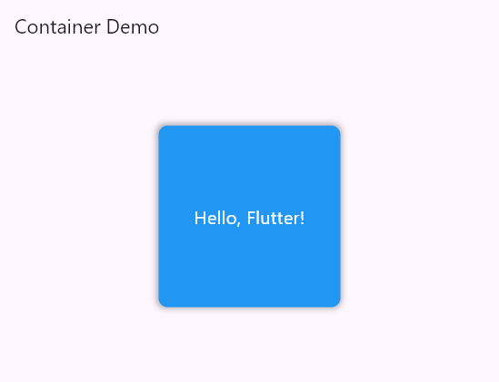
在上述代码示例中,我们创建了一个具有自定义样式和布局的 Container 部件。Container 的宽度和高度分别为 200,外边距和内边距都设置为 20 和 10,子部件居中对齐。Container 的背景颜色为蓝色,设置了圆角和阴影效果。最后,Container 中包含了一个文本部件,显示了"Hello, Flutter!"的文本内容。
3.2 示例 2:动态宽度和高度
import 'package:flutter/material.dart';

void main() {
  runApp(const MyApp());
}

class MyApp extends StatelessWidget {
  const MyApp({super.key});
  @override
  Widget build(BuildContext context) {
    return MaterialApp(
      home: Scaffold(
        appBar: AppBar(
          title: const Text('Container 示例'),
        ),
        body: Builder(
          builder: (context) {
            return Center(
              child: Container(
                width: MediaQuery.of(context).size.width * 0.8,
                height: 100,
                color: Colors.yellow,
                child: const Text(
                  '动态大小的容器',
                  style: TextStyle(fontSize: 20, color: Colors.black),
                ),
              ),
            );
          },
        ),
      ),
    );
  }
}
效果图如下所示:
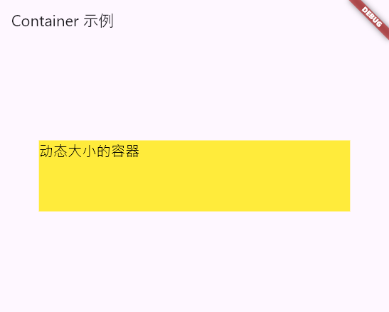
在上述代码示例中,我们使用 MediaQuery 来获取屏幕的宽度,并将 Container 的宽度设置为屏幕宽度的 80%。高度为 100,背景颜色为黄色。在 Container 中包含了一个文本部件,显示了"Dynamic Size Container"的文本内容。
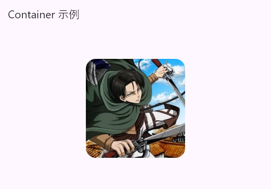
3.3 示例 3:实现圆角图像
可以通过 Container+BoxDecoration来实现圆角图像。
实现代码如下:
import 'package:flutter/material.dart';

void main() {
  runApp(const MyApp());
}

class MyApp extends StatelessWidget {
  const MyApp({super.key});
  @override
  Widget build(BuildContext context) {
    return MaterialApp(
      debugShowCheckedModeBanner: false,
      home: Scaffold(
        appBar: AppBar(
          title: const Text('Container 示例'),
        ),
        body: Builder(
          builder: (context) {
            return Center(
              child: Container(
                width: 200,
                height: 200,
                decoration: BoxDecoration(
                    borderRadius: BorderRadius.circular(20),
                    image: const DecorationImage(
                      image: NetworkImage(
                          "https://tva1.sinaimg.cn/large/006y8mN6gy1g7aa03bmfpj3069069mx8.jpg"),
                    )),
              ),
            );
          },
        ),
      ),
    );
  }
}
效果图如下所示:
四、注意事项
在使用 Container 部件时,有一些注意事项需要考虑:
- Container 的大小和位置是由其父部件和布局约束决定的。因此,在使用 Container 时,需要确保它能够适应父部件的大小和布局要求。
- 当 Container 的大小属性与装饰属性冲突时,装饰属性会优先生效。例如,如果设置了装饰的边框宽度为 5 像素,同时指定了 Container 的宽度为 100 像素,那么边框的宽度仍然会是 5 像素,而不是 100 像素。

 浙公网安备 33010602011771号