CSS之2D转换模块
_____egon新书来袭请看:https://egonlin.com/book.html
一 2D转换模块之transform
| 取值 | 描述 |
|---|---|
transform: rotate(35deg); |
以中心为准进行旋转 |
transform: translate(100px,50px); |
以中心为准进行平移 |
transform: scale(1.5,1); |
以中心为准进行缩放 |
transform: rotate(35deg) translate(100px,20px) scale(2,2); |
注意: |


<!DOCTYPE html>
<html lang="en">
<head>
    <meta charset="UTF-8">
    <title>Title</title>

    <style>
        * {
            margin: 0;
            padding: 0;
        }

        div {
            width: 150px;
            height: 150px;
            background: #cccccc;
            margin: 0 auto;

        }
        span {
            display: block;
            width: 50px;
            height: 50px;
        }

        .box1 span {
            background: #003399;
        }

        .box2 span {
            background: green;

            /*
            以中心为准进行旋转
            deg旋转多少度
            */
            transform: rotate(35deg);
        }

        .box3 span  {
            background: red;

            /*
            以中心为准进行平移
            第一个参数是:水平方向,即x轴
            第二个方向:垂直方向,即y轴
            */
            transform: translate(100px,50px);
        }

        .box4 span  {
            background: blue;

            /*
            以中心为准进行缩放
            第一个参数是:水平方向,即x轴
            第二个方向:垂直方向,即y轴

            注意:
                如果取值是1,代表不变
                如果取值大于1,代表需要放大,反之代表缩小

                如果水平和垂直缩放都一样,那么可以简写为一个参数
            */
            transform: scale(1.5,1);
        }

        .box5 span  {
            background-color: #55BBBB;

            /*
            注意:
                1、如果需要进行多个转换,那么用空格隔开
                2、2D的转换会修改元素的坐标系,所以旋转之后再平移不是水平,(旋转之后的坐标系就变了)

            */
            transform: rotate(35deg) translate(100px,20px) scale(2,2);
        }


    </style>
</head>
<body>
    <div class="box1">
        <span>正常</span>
    </div>
    <hr>
    <div class="box2">
        <span>旋转</span>
    </div>
    <hr>
    <div class="box3">
        <span>平移</span>
    </div>
    <hr>
    <div class="box4">
        <span>缩放</span>
    </div>
    <hr>
    <div class="box5">
        <span>综合</span>
    </div>

</body>
</html>
二 2D转换模块之形变中心点
#1、默认情况下所有元素都是以自己的中心点作为参考来旋转的
形变中心点指的是修改元素改变形状的参考点

#2、格式:
transform-origin: 水平方向的值 垂直方向的值;

水平方向与垂直方向的值都是以自己原来的宽高为参考


#3、注意点:
取值有三种形式
    具体像素
    百分比
    特殊的关键字
| 取值 | 描述 |
|---|---|
具体像素 |
transform-origin: 0px 0px; 左上角 transform-origin: 200px 0px; 右上角 |
百分比 |
transform-origin: 0% 0%; 左上角 transform-origin: 50% 50%; 中心点 |
关键字 |
transform-origin: left center; 左中 |
<!DOCTYPE html>
<html lang="en">
<head>
    <meta charset="UTF-8">
    <title>Title</title>

    <style>
        * {
            margin: 0;
            padding: 0;
        }

        ul {
            width: 200px;
            height: 200px;
            background: #cccccc;
            list-style: none;
            margin: 100px auto;
            position: relative;
            border: 1px solid #000;

        }

        ul li {
            width: 200px;
            height: 200px;
            position: absolute;

            left: 0;
            top: 0;

            /*transform-origin: center center;*/
            transform-origin: left center;
        }

        ul li:nth-of-type(1) {
            background: green;

            transform: rotate(35deg);
        }

        ul li:nth-of-type(2) {
            background: blue;

            transform: rotate(65deg);

        }

        ul li:nth-of-type(3) {
            background: yellow;

            transform: rotate(105deg);

        }


    </style>
</head>
<ul>
    <li></li>
    <li></li>
    <li></li>
</ul>
</html>
三 2D转换模块之旋转轴向
http://www.zhangxinxu.com/wordpress/2012/09/css3-3d-transform-perspective-animate-transition/
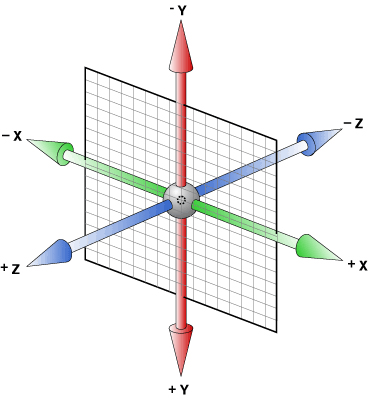
| 取值 | 描述 |
|---|---|
transform: rotateZ(60deg); |
默认情况下所有元素都是围绕Z轴进行旋转 |
transform: rotateX(60deg); |
围绕X轴进行旋转 |
transform: rotateY(60deg); |
围绕Y轴进行旋转 |
<!DOCTYPE html>
<html lang="en">
<head>
    <meta charset="UTF-8">
    <title>Title</title>
    <style>
        * {
            margin: 0;
            padding: 0;
        }
        ul {
            width: 800px;
            height: 500px;
            /*border: 1px solid #000;*/
            margin: 0 auto;

            /*下一小节将讲这个属性,加上他就可以看到X轴方向的旋转了*/
            perspective: 500px;
        }

        ul li{
            list-style: none;
            width: 200px;
            height: 200px;
            margin: 0 auto;
            margin-top: 50px;
            border: 1px solid #000;
        }

        ul li img {
            width: 200px;
            height: 200px;
        }

        ul li:nth-child(1) {
            /*默认情况下所有元素都是围绕Z轴进行旋转*/
            transform: rotateZ(60deg);
        }

        ul li:nth-child(2) img{
            transform: rotateX(60deg);
        }

        ul li:nth-child(3) img{


            transform: rotateY(60deg);
        }
        /*
        总结:
            想围绕哪个轴旋转,那么只需要在rotate后面加上哪个轴即可
        */

    </style>
</head>
<body>


<ul>
    <li><img src="https://images2018.cnblogs.com/blog/1036857/201805/1036857-20180517102336179-1496473693.jpg" alt=""></li>
    <li><img src="https://images2018.cnblogs.com/blog/1036857/201805/1036857-20180517102350242-559679027.jpg" alt=""></li>
    <li><img src="https://images2018.cnblogs.com/blog/1036857/201805/1036857-20180517102412261-843878417.jpg" alt=""></li>
</ul>
</body>
</html>

<!DOCTYPE html>
<html lang="en">
<head>
    <meta charset="UTF-8">
    <title>Title</title>
    <style>
        * {
            margin: 0;
            padding: 0;
        }
        div {
            /*display: inline-block;*/
            width: 500px;
            height: 700px;

            margin: 100px auto;

            border: 1px solid #f6c2d2;
            background-color: #cccccc;
            box-sizing: border-box;
            perspective: 500px;

            position: relative;

        }
        span {
            position: absolute;
            width: 300px;
            left: 50%;
            margin-left: -100px;
            font-size: 5px;
            color: #55BBBB;

            transition: all 5s;


        }

        div img {
            width: 100%;
            height: 100%;
            position: absolute;
            left: 0;
            top: 0;

            transform-origin: center bottom;
            transition: transform 5s;
        }

        div:hover img {
            transform: rotateX(45deg);
        }

        div:hover span {
            font-size: 30px;
            color: #e9289c;
        }


    </style>
</head>
<body>

<div class="box1">
    <span>开启一个神奇的世界</span>
    <img src="https://images2018.cnblogs.com/blog/1036857/201805/1036857-20180517103833496-68776850.png" alt="">
</div>

<div class="box2">
    <span>先生里边请</span>
    <img src="https://images2018.cnblogs.com/blog/1036857/201805/1036857-20180517104955799-454977663.png" alt="">
</div>

</body>
</html>
<!DOCTYPE html>
<html lang="en">
<head>
    <meta charset="UTF-8">
    <title>Title</title>
    <style>
        * {
            margin: 0;
            padding: 0;
        }
        div {
            /*display: inline-block;*/
            width: 500px;
            height: 700px;

            margin: 100px auto;

            border: 1px solid #f6c2d2;
            background-color: #cccccc;
            box-sizing: border-box;
            perspective: 500px;

            position: relative;

        }
        span {
            position: absolute;
            width: 300px;
            left: 50%;
            margin-left: -100px;
            font-size: 5px;
            color: #55BBBB;

            transition: all 5s;


        }

        div img {
            width: 100%;
            height: 100%;
            position: absolute;
            left: 0;
            top: 0;
        }

        .box1 img {
            width: 100%;
            height: 100%;
            position: absolute;
            left: 0;
            top: 0;

            transform-origin: left center;
            transition: transform 5s;
        }

        .box1:hover img {
            transform: rotateY(45deg);
        }

        .box1:hover span {
            font-size: 30px;
            color: #e9289c;
        }


        .box2 img {
            width: 100%;
            height: 100%;
            position: absolute;
            left: 0;
            top: 0;

            transform-origin: right center;
            transition: transform 5s;
        }

        .box2:hover img {
            transform: rotateY(-45deg);
        }

        .box2:hover span {
            font-size: 30px;
            color: #e9289c;
        }


        .box3 img {
            width: 100%;
            height: 100%;
            position: absolute;
            left: 0;
            top: 0;

            transform-origin: right center;
            transition: transform 5s;
        }

        .box3:hover img {
            transform: rotateY(45deg);
        }

        .box3:hover span {
            font-size: 30px;
            color: #e9289c;
        }


    </style>
</head>
<body>

<div class="box1">
    <span>开启一个神奇的世界</span>
    <img src="https://images2018.cnblogs.com/blog/1036857/201805/1036857-20180517103833496-68776850.png" alt="">
</div>

<div class="box2">
    <span>先生里边请</span>
    <img src="https://images2018.cnblogs.com/blog/1036857/201805/1036857-20180517104955799-454977663.png" alt="">
</div>

<div class="box3">
    <span>先生里边请</span>
    <img src="https://images2018.cnblogs.com/blog/1036857/201805/1036857-20180517104955799-454977663.png" alt="">
</div>

</body>
</html>
四 2D转换模块之透视属性
#1、什么是透视属性
视线延伸到屏幕后端,呈现近大远小的效果,perspective: 10px;,值越小
近大远小的效果越明显

#2、注意:
    透视属性必须添加到需要呈现近大远小的效果的元素的父元素上
<!DOCTYPE html>
<html lang="en">
<head>
    <meta charset="UTF-8">
    <title>Title</title>
    <style>
        * {
            margin: 0;
            padding: 0;
        }
        div {
            /*display: inline-block;*/
            width: 500px;
            height: 700px;

            margin: 100px auto;

            border: 1px solid #f6c2d2;
            background-color: #cccccc;
            box-sizing: border-box;
            position: relative;

            /*!!!推荐添加的直接的父元素上*/
            /*perspective: 100px;*/
            perspective: 500px;


        }

        div img {
            width: 100%;
            height: 100%;
            position: absolute;
            left: 0;
            top: 0;
        }

        .box1 img {
            width: 100%;
            height: 100%;
            position: absolute;
            left: 0;
            top: 0;

            transform-origin: center bottom;
            transition: transform 5s;
        }

        .box1:hover img {
            transform: rotateX(45deg);
       }


    </style>
</head>
<body>

<div class="box1">
    <img src="https://images2018.cnblogs.com/blog/1036857/201805/1036857-20180517102350242-559679027.jpg" alt="">
</div>

</body>
</html>
五 盒子阴影与文字阴影
#1、如何给盒子添加阴影
    box-shadow:水平阴影的位置(可为负值) 垂直阴影的位置(可为负值)模糊距离 阴影的尺寸 阴影颜色 内外阴影inset/outset;

注意点:
    1.1 水平偏移与垂直偏移为必须要有的,其余均为可选

    1.1盒子的阴影分为内外阴影,默认情况下就是外阴影outset,内阴影为inset

    1.3 快速添加阴影,只需要编写三个参数即可
    box-shadow:水平偏移 垂直偏移 模糊度;
    默认情况下阴影的颜色和盒子的颜色一致


#2、如何给文字添加阴影
    text-shadow:水平偏移 垂直偏移 模糊度 阴影颜色;

注意点:
    阴影颜色默认跟文字颜色一致
<!DOCTYPE html>
<html lang="en">
<head>
    <meta charset="UTF-8">
    <title>Title</title>
    <style>
        * {
            margin: 0;
            padding: 0;
        }

        .box1 {
            width: 200px;
            height: 200px;
            background-color: red;
            margin: 100px auto;

            text-align: center;
            line-height: 200px;

            /*box-shadow:水平阴影的位置(可为负值) 垂直阴影的位置(可为负值)模糊距离 阴影的尺寸 阴影颜色 内外阴影inset/outset;*/
            /*box-shadow: 0px 0px 0px 0px black;*/
            /*box-shadow: 10px 0px 0px 0px black;*/
            /*box-shadow: 0px 10px 0px 0px black;*/
            /*box-shadow: 10px 10px 0px 0px black;*/
            /*box-shadow: 10px 10px 10px 0px black;*/
            /*box-shadow: 10px 10px 10px 10px black;*/
            /*box-shadow: 10px 10px 10px 10px skyblue;*/
            /*box-shadow: 10px 10px 10px 10px skyblue ;*/

            /*快速添加阴影*/
            box-shadow: 10px 10px 10px blue;
            color: yellow;
        }

        .box2 {
            width: 200px;
            height: 200px;
            margin: 0 auto;
            background-color: pink;

            text-align: center;
            line-height: 200px;

            font-size: 40px;


            /*text-shadow: 10px 0px 0px black;*/
            /*text-shadow: 10px 10px 10px black;*/
            text-shadow: 10px 10px 10px purple;
            color: #666666;

        }
    </style>
</head>
<body>

<div class="box1">我是盒子1</div>

<div class="box2">我是盒子</div>
</body>
</html>

<!DOCTYPE html>
<html lang="en">
<head>
    <meta charset="UTF-8">
    <title>Title</title>
    <style>
        * {
            margin: 0;
            padding: 0;
        }
        ul {
            height: 400px;
            border: 1px solid #000;
            background-color: skyblue;
            margin-top: 100px;

            text-align: center;
        }

        ul li {
            list-style: none;
            width: 150px;
            height: 200px;
            background-color: red;

            display: inline-block;

            margin-top: 100px;

            transition: all 1s;

            position: relative;


            /*添加阴影*/
            box-shadow: 0 0 10px;

        }

        ul li img {
            width: 150px;
            height: 200px;
            border: 5px solid #fff;
            box-sizing: border-box;
        }

        ul li:nth-child(1) {
            transform: rotate(30deg);
        }
        ul li:nth-child(2) {
            transform: rotate(-40deg);
        }
        ul li:nth-child(3) {
            transform: rotate(10deg);
        }
        ul li:nth-child(4) {
            transform: rotate(45deg);
        }

        ul li:hover {
            /*transform: rotate(0deg);*/
            /*同上*/
            /*transform: none;*/
            /*放大*/
            transform: rotate(0deg) translate(0,0) scale(2);
            z-index: 998;

        }


    </style>
</head>
<body>


<ul>
    <li><img src="https://images2018.cnblogs.com/blog/1036857/201805/1036857-20180517102336179-1496473693.jpg" alt=""></li>
    <li><img src="https://images2018.cnblogs.com/blog/1036857/201805/1036857-20180517102350242-559679027.jpg" alt=""></li>
    <li><img src="https://images2018.cnblogs.com/blog/1036857/201805/1036857-20180517102412261-843878417.jpg" alt=""></li>
    <li><img src="https://images2018.cnblogs.com/blog/1036857/201805/1036857-20180517102428440-2124533640.jpg" alt=""></li></ul>
</body>
</html>

 浙公网安备 33010602011771号