HTML+CSS部分复习(蓝桥杯参考)
0. 考前准备
1. web标准
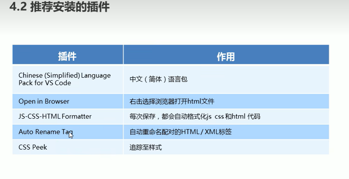
2. 前端插件安装
3. img的border属性
4. a标签target属性
- 链接打开方式
- 默认值_self当前窗口,
_blank新的窗口
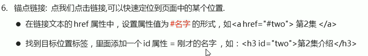
5. a标签实现锚点链接
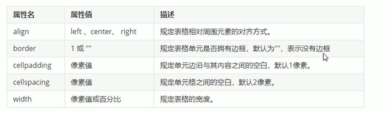
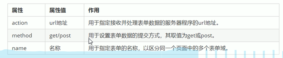
6. 表格属性
7.table单元格合并
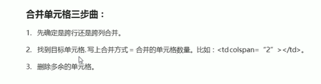
- colspan:跨列,水平方向
- rowspan:跨行,垂直方向

10.单选框分组
| |
| |
| |
| <p>性别: <input type="radio" name="性别" checked="">男 <input type="radio" name="性别">女</p> |
11.单选框和多选框选中

- 注意属性值为checked
- 属性名checked
- 也可以直接加上checked属性
| <p>爱好:<input type="checkbox" checked>敲代码 <input type="checkbox"> 睡觉</p> |
12. label标签
| |
| |
| |
| |
| <input type="radio" id="1" name="性别"><label for="1">男</label> |
| <input type="radio" id="2" name="性别"><label for="2">女</label> |
| |
| |
| |
| <label > <input type="radio" name="性别">男 </label> |
| <label > <input type="radio" name="性别">女 </label> |
13. select控件

14. textarea设置默认值
| <textarea>需要设置的默认值</textarea> |
| <textarea id="topic" rows="10" name="topic" ></textarea> |
| |
| <script> |
| document.getElementById("topic").value="helloword" |
| </script> |
| |
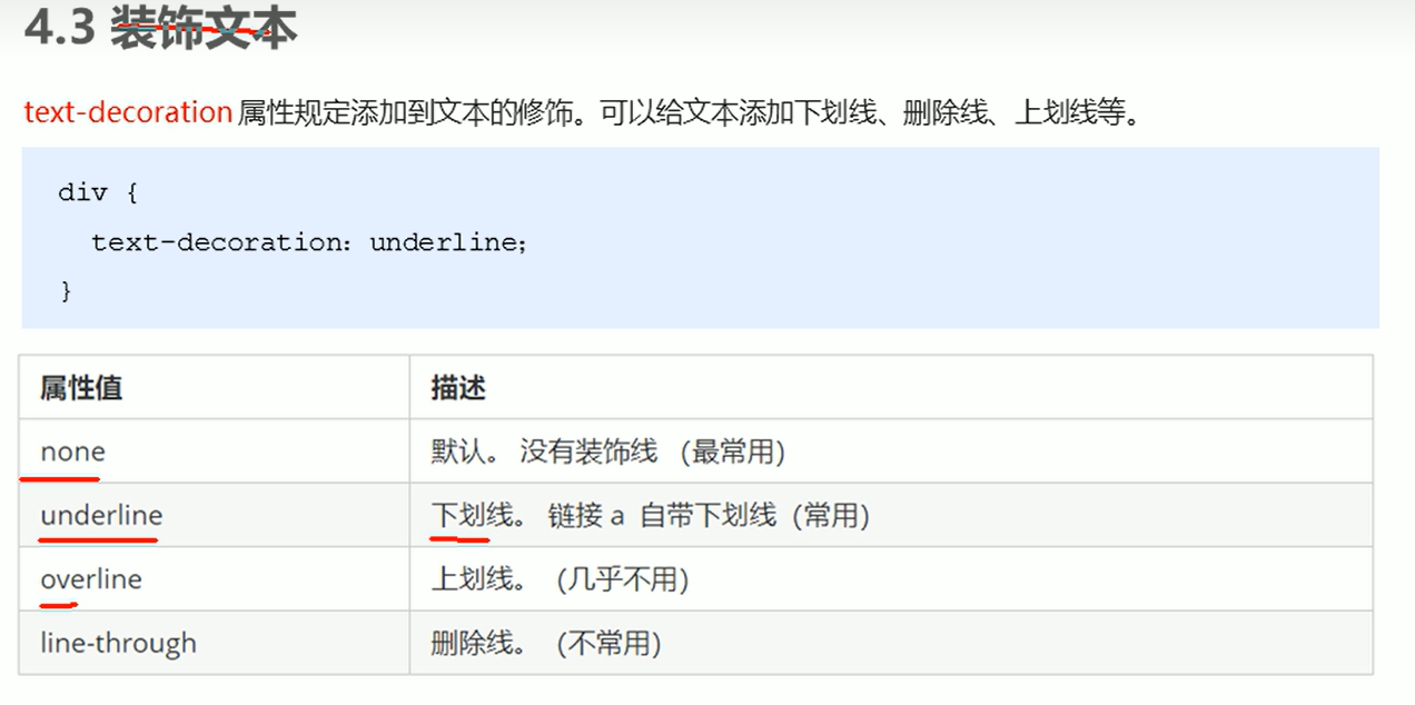
15.css text-decoration
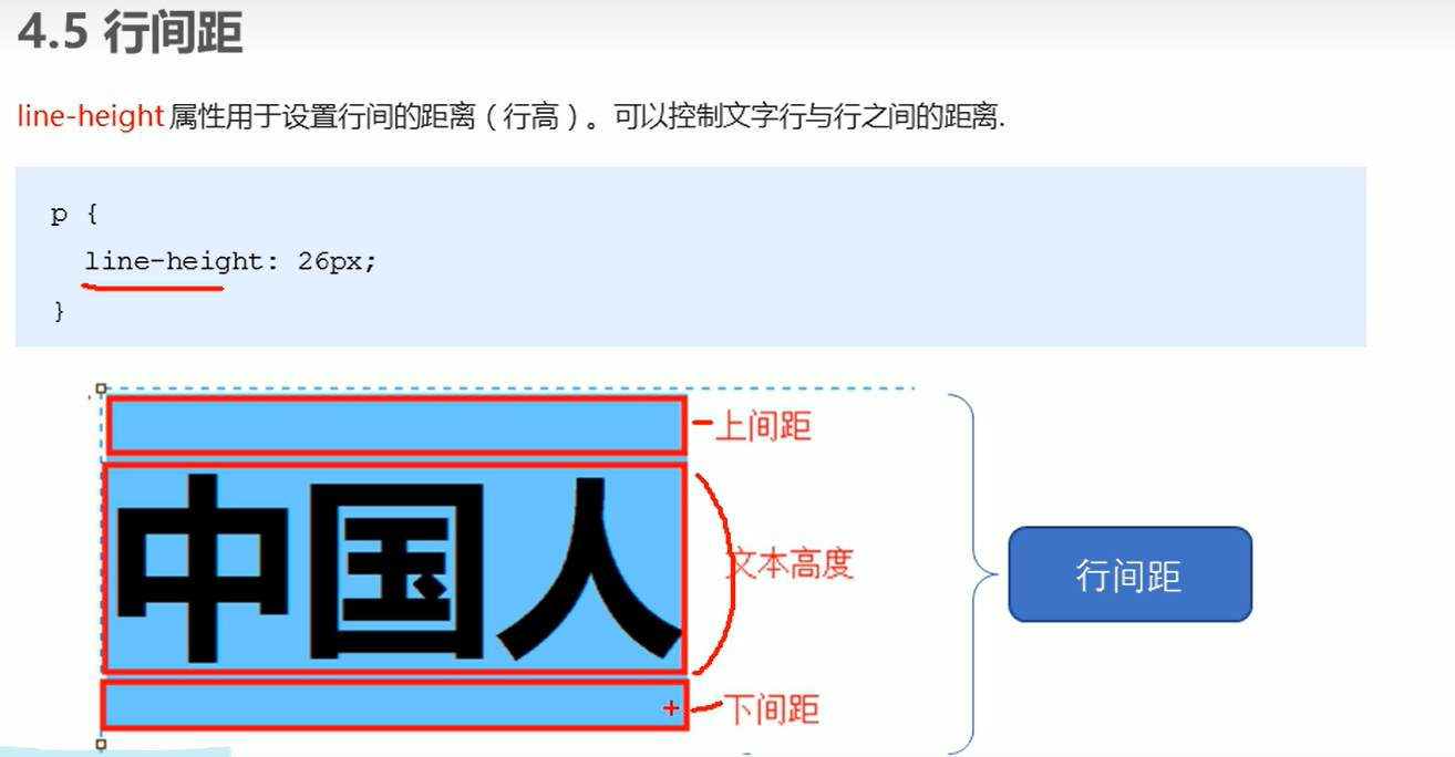
16 行间距
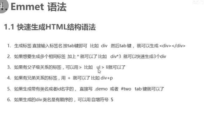
17. Emmet语法
| div{666} |
| |
| // 结果代码 |
| <div> |
| 666 |
| </div> |
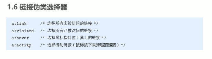
18.链接伪类选择器
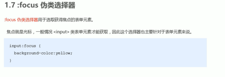
19 :focus伪类选择器
20 块级元素

| <p> |
| <div> |
| 666 |
| </div> |
| </p> |
| |
| // 相当于 |
| |
| <p> |
| |
| </p> |
| |
| <div> |
| 666 |
| </div> |
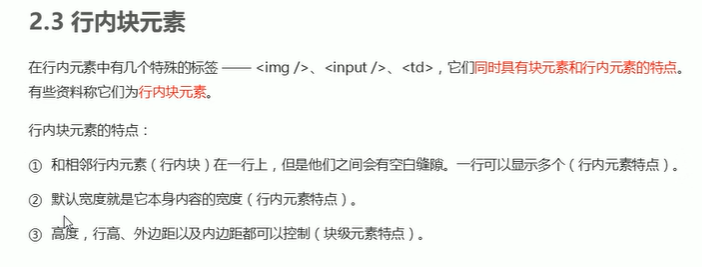
21. 行内块元素
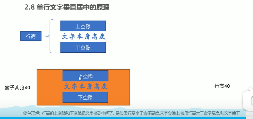
22.行高垂直居中
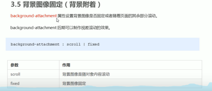
23. 背景图像固定
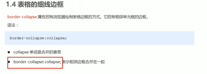
24. 边框合并css
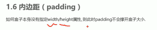
25.padding不会撑大盒子的情况
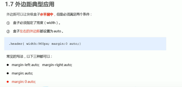
26.外边距实现水平居中
27.边框圆角实现原理
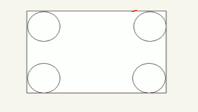
28.圆角边框特殊使用
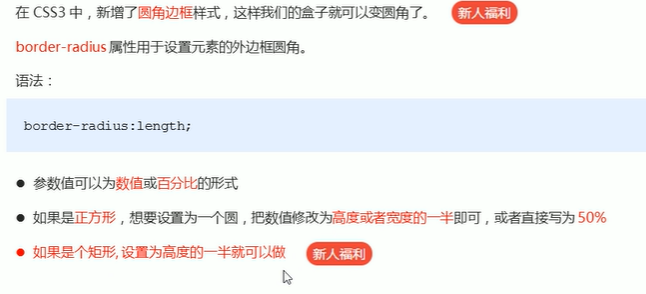
- 正方形可以写50%
- 圆角矩形必须写高度的一半,写50%会成椭圆
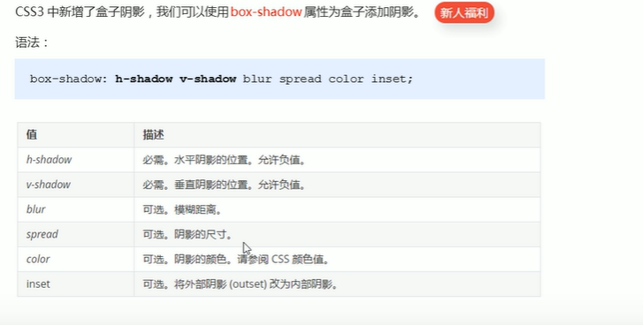
29.盒子阴影
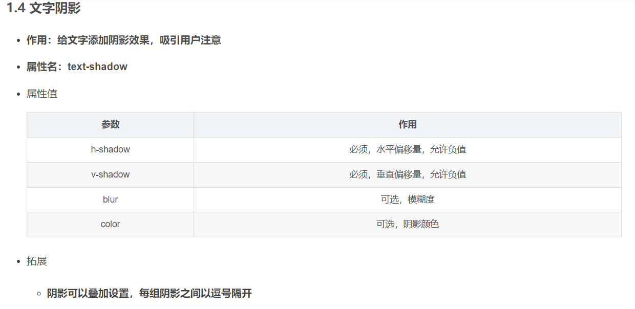
30 文字阴影
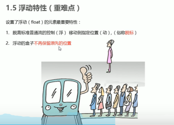
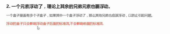
31. 浮动元素的特性
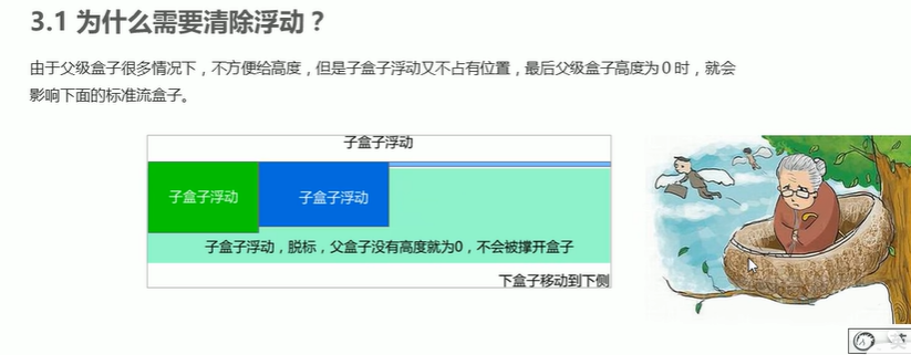
32. 清除浮动的原因
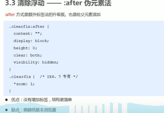
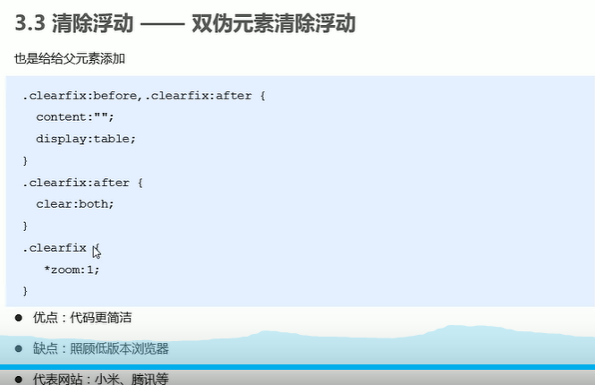
33. 清除浮动

34. 行内块元素
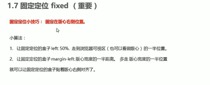
35.固定定位fixed固定在版心(其他盒子)右侧位置
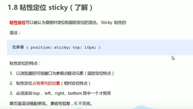
36 粘性定位
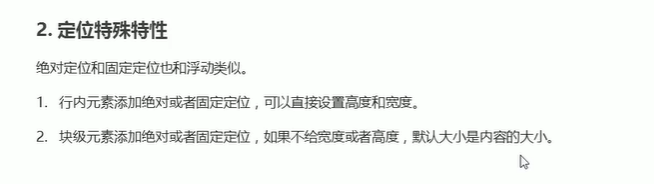
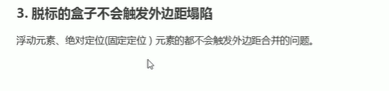
37 定位特性,脱标特性
38 浮动,定位的区别

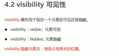
39.visibility
40 CSS三角形
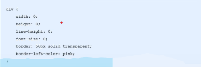
- font-size:0,line-height:0;照顾兼容性问题
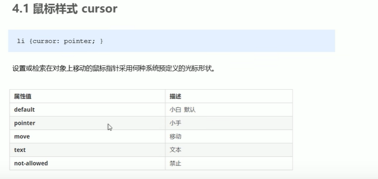
41.鼠标样式
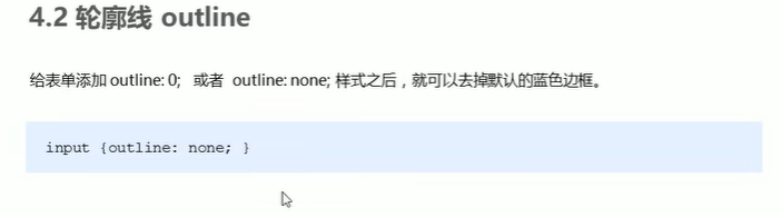
42. 轮廓线
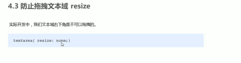
43. 防止拖拽文本域
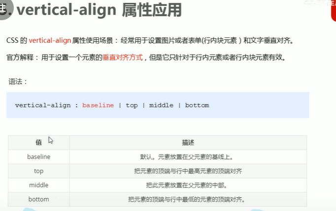
44.vertical-align属性
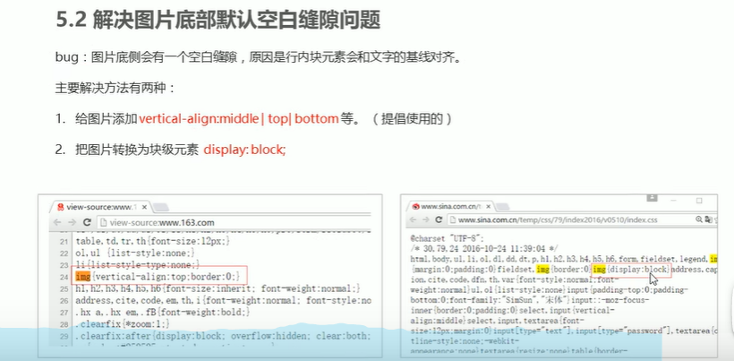
45. 解决图片底部默认空白缝隙问题
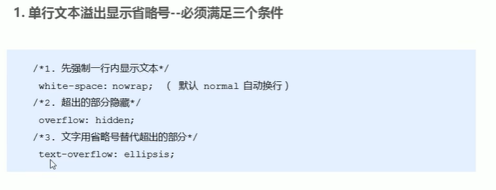
46 单行文本溢出显示省略号
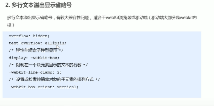
46 多行文本溢出显示省略号
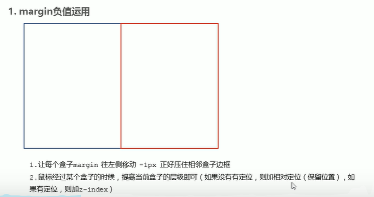
47 margin负值的使用
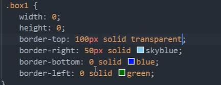
48.直角三角形
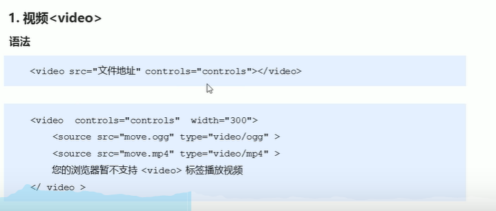
49 video标签兼容性
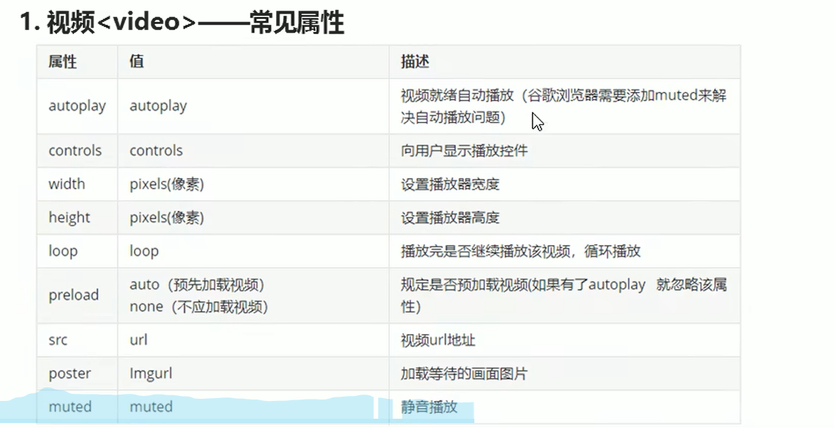
50 video标签属性
51. audio标签

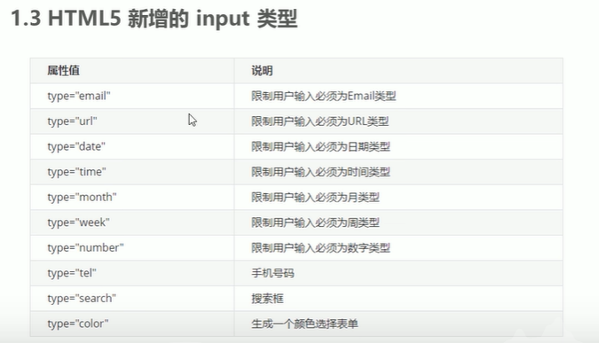
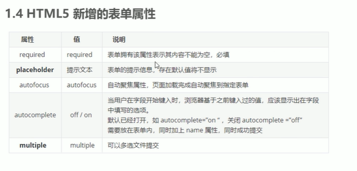
53. HTML5新增表单属性
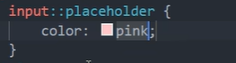
54. 修改placeholder颜色
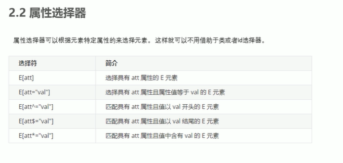
55 CSS3新增选择器
56 CSS3权重问题

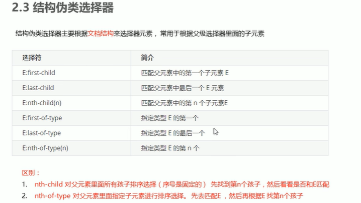
57.结构伪类选择器
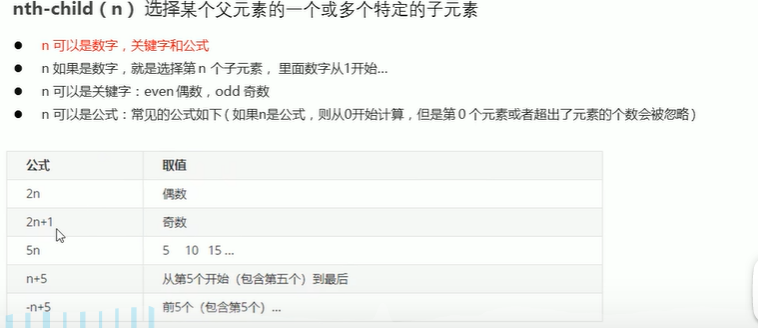
58 nth-child()与nth-of-type的区别
59 伪元素选择器

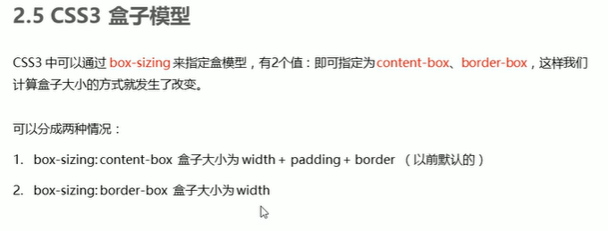
60 CSS3盒子模型
61. CSS3滤镜

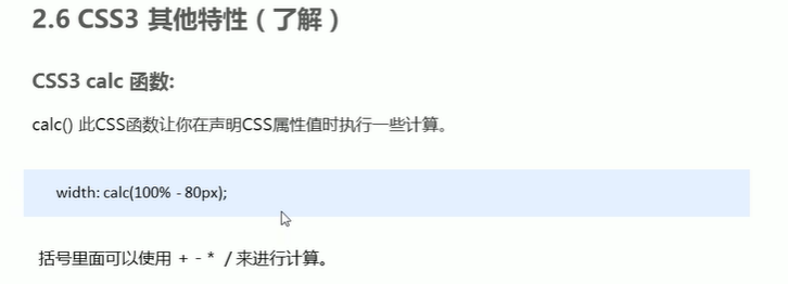
61. CSS3的Calc函数
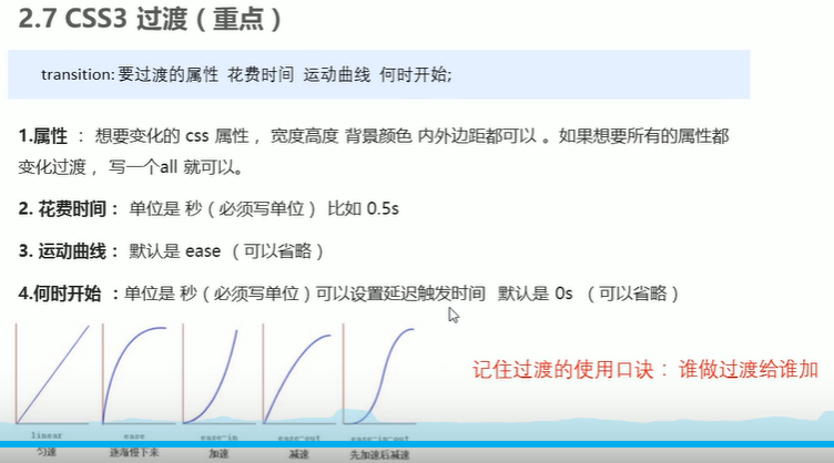
62. CSS的过渡
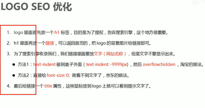
63 LOGO SEO优化
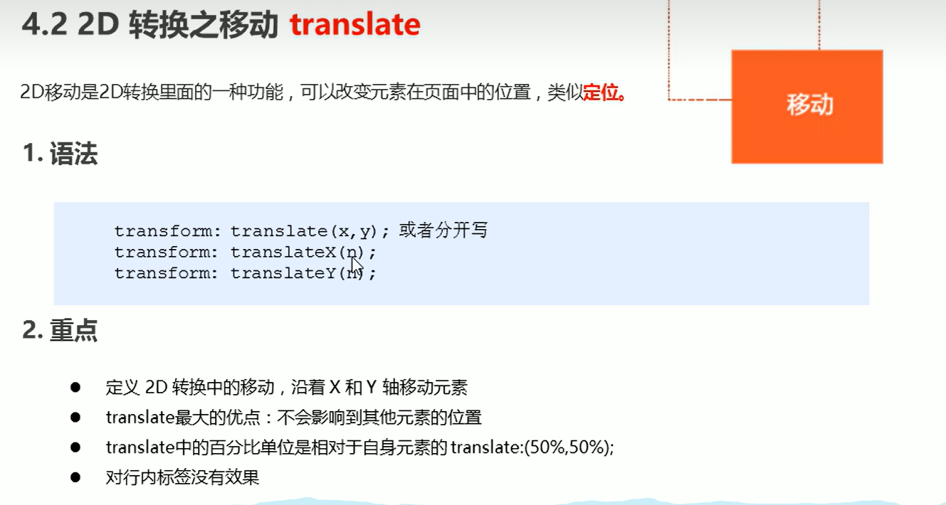
64 2D转换-translate
65 2D转换-rotate实现三角
| div{ |
| position:relative; |
| width:200px; |
| height:50px; |
| border:1px soild #ccc; |
| } |
| |
| |
| div::after{ |
| position:'absolute'; |
| content:''; |
| |
| width:10px; |
| height:10px; |
| |
| right:0; |
| top:0; |
| |
| |
| |
| |
| |
| border-right:1px soild #000; |
| border-bottom:1px soild #000; |
| |
| transform:rotate(45deg); |
| |
| } |
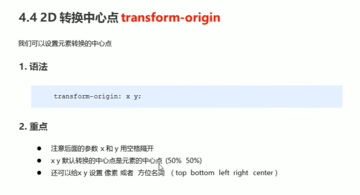
66 rotate的转换中心点
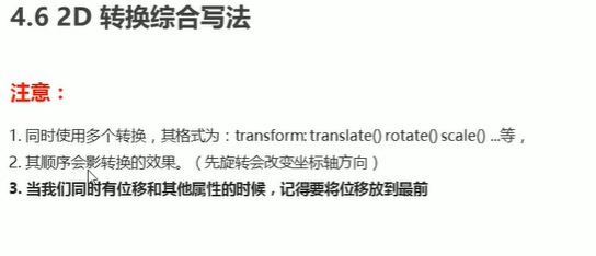
67.2D转换复合写法
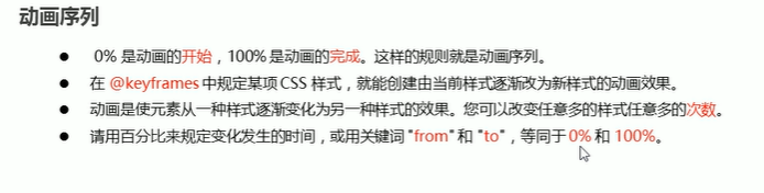
68 动画的基本使用
- 定义动画
| @keyframes move{ |
| |
| // 开始状态 |
| 0%{ |
| transform:translateX(0px); |
| } |
| |
| // 结束状态 |
| 100%{ |
| transform:translateX(100px); |
| } |
| } |
- 使用动画
| .box{ |
| animation-name:move; |
| animation-duration:3s; |
| |
| // 或者属性连写 |
| animation:move,3s; |
| } |
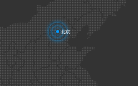
69.焦点图综合案例
| <!DOCTYPE html> |
| <html lang="en"> |
| |
| <head> |
| <meta charset="UTF-8"> |
| <meta name="viewport" content="width=device-width, initial-scale=1.0"> |
| <meta http-equiv="X-UA-Compatible" content="ie=edge"> |
| <title>Document</title> |
| <style> |
| body { |
| background-color: #333; |
| } |
| |
| .map { |
| position: relative; |
| width: 747px; |
| height: 616px; |
| background: url(media/map.png) no-repeat; |
| margin: 0 auto; |
| } |
| |
| .city { |
| position: absolute; |
| top: 227px; |
| right: 193px; |
| color: #fff; |
| } |
| |
| .tb { |
| top: 500px; |
| right: 80px; |
| } |
| |
| .dotted { |
| width: 8px; |
| height: 8px; |
| background-color: #09f; |
| border-radius: 50%; |
| } |
| |
| .city div[class^="pulse"] { |
| |
| position: absolute; |
| top: 50%; |
| left: 50%; |
| transform: translate(-50%, -50%); |
| width: 8px; |
| height: 8px; |
| box-shadow: 0 0 12px #009dfd; |
| border-radius: 50%; |
| animation: pulse 1.2s linear infinite; |
| } |
| |
| .city div.pulse2 { |
| animation-delay: 0.4s; |
| } |
| |
| .city div.pulse3 { |
| animation-delay: 0.8s; |
| } |
| |
| @keyframes pulse { |
| 0% {} |
| 70% { |
| |
| width: 40px; |
| height: 40px; |
| opacity: 1; |
| } |
| 100% { |
| width: 70px; |
| height: 70px; |
| opacity: 0; |
| } |
| } |
| </style> |
| </head> |
| |
| <body> |
| <div class="map"> |
| <div class="city"> |
| <div class="dotted"></div> |
| <div class="pulse1"></div> |
| <div class="pulse2"></div> |
| <div class="pulse3"></div> |
| </div> |
| <div class="city tb"> |
| <div class="dotted"></div> |
| <div class="pulse1"></div> |
| <div class="pulse2"></div> |
| <div class="pulse3"></div> |
| </div> |
| </div> |
| </body> |
| |
| </html> |
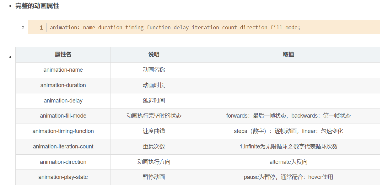
70 动画属性-animation-timing-function
- 不止可以设置linear,easy
- 设置布长steps
打字机效果
| |
| <!DOCTYPE html> |
| <html lang="en"> |
| |
| <head> |
| <meta charset="UTF-8"> |
| <meta name="viewport" content="width=device-width, initial-scale=1.0"> |
| <meta http-equiv="X-UA-Compatible" content="ie=edge"> |
| <title>Document</title> |
| <style> |
| div { |
| overflow: hidden; |
| font-size: 20px; |
| width: 0; |
| height: 30px; |
| background-color: pink; |
| |
| white-space: nowrap; |
| |
| animation: w 4s steps(10) forwards; |
| } |
| |
| @keyframes w { |
| 0% { |
| width: 0; |
| } |
| 100% { |
| width: 200px; |
| } |
| } |
| </style> |
| </head> |
| |
| <body> |
| <div>世纪佳缘我在这里等你</div> |
| </body> |
| |
| </html> |
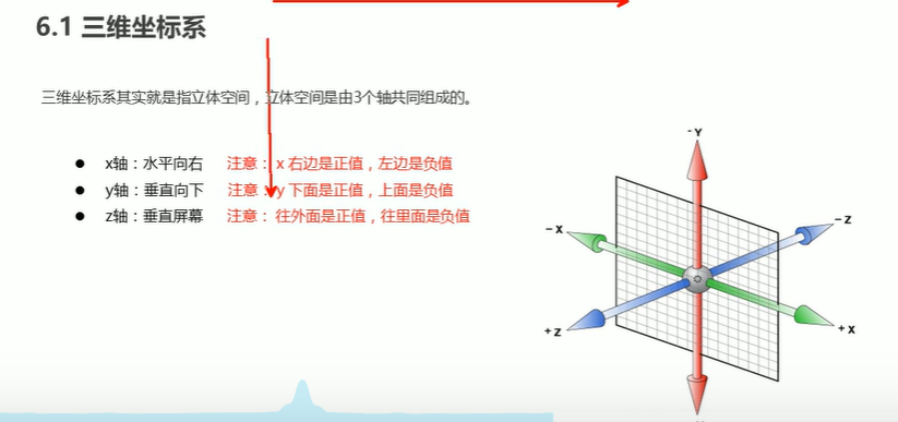
71 三维坐标系
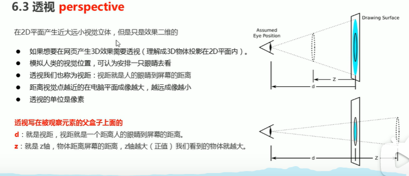
72. 透视
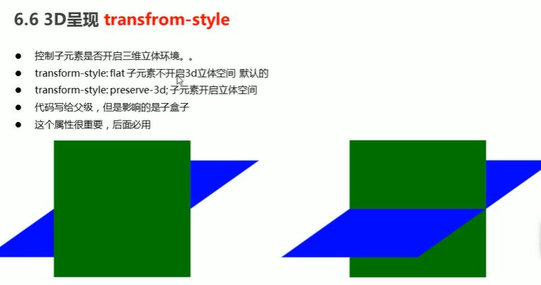
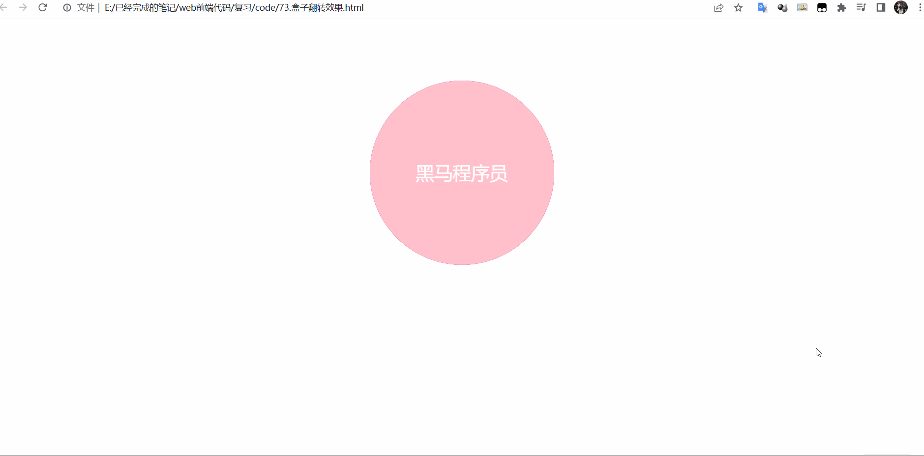
73. 3D呈现
| <!DOCTYPE html> |
| <html lang="en"> |
| |
| <head> |
| <meta charset="UTF-8"> |
| <meta name="viewport" content="width=device-width, initial-scale=1.0"> |
| <meta http-equiv="X-UA-Compatible" content="ie=edge"> |
| <title>Document</title> |
| <style> |
| body { |
| perspective: 400px; |
| } |
| |
| .box { |
| position: relative; |
| width: 300px; |
| height: 300px; |
| margin: 100px auto; |
| transition: all .4s; |
| |
| transform-style: preserve-3d; |
| } |
| |
| .box:hover { |
| transform: rotateY(180deg); |
| } |
| |
| .box:hover .back { |
| z-index: 2; |
| } |
| |
| .front, |
| .back { |
| position: absolute; |
| top: 0; |
| left: 0; |
| width: 100%; |
| height: 100%; |
| border-radius: 50%; |
| font-size: 30px; |
| color: #fff; |
| text-align: center; |
| line-height: 300px; |
| } |
| |
| .front { |
| background-color: pink; |
| z-index: 1; |
| } |
| |
| .back { |
| background-color: purple; |
| |
| transform: rotateY(180deg); |
| } |
| </style> |
| </head> |
| |
| <body> |
| <div class="box"> |
| <div class="front">黑马程序员</div> |
| <div class="back">pink老师这里等你</div> |
| </div> |
| </body> |
| |
| </html> |
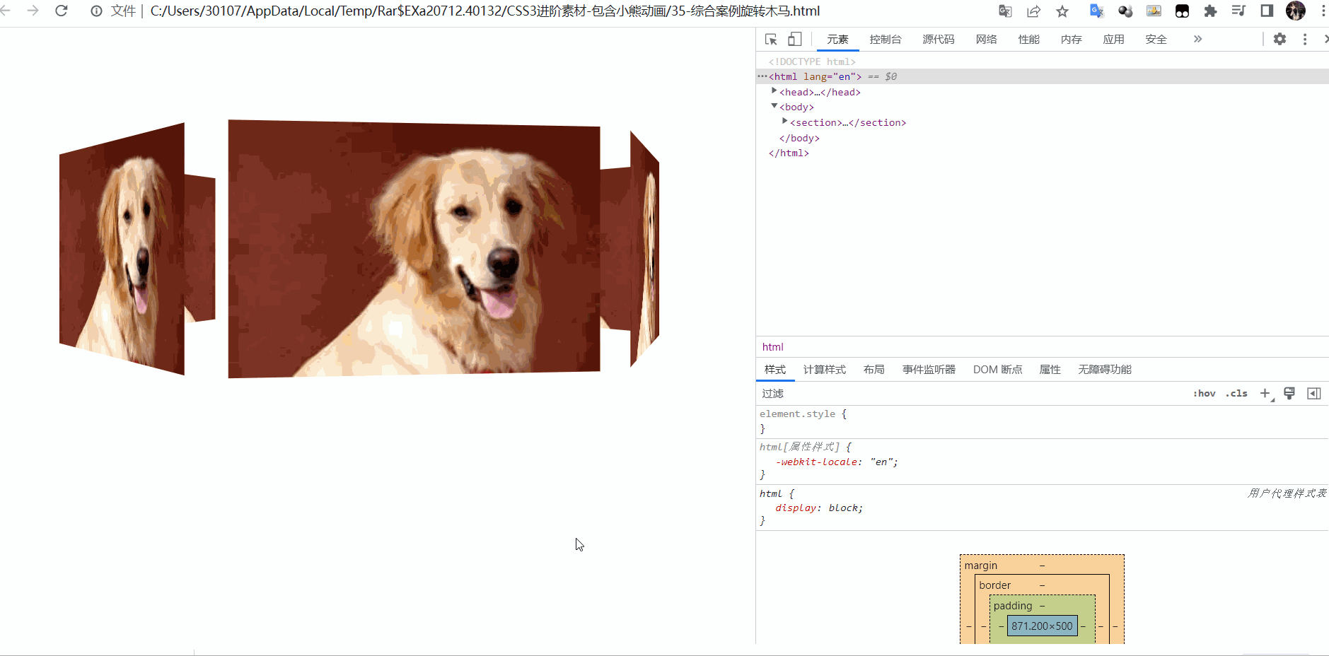
74 旋转木马的效果
| <!DOCTYPE html> |
| <html lang="en"> |
| |
| <head> |
| <meta charset="UTF-8"> |
| <meta name="viewport" content="width=device-width, initial-scale=1.0"> |
| <meta http-equiv="X-UA-Compatible" content="ie=edge"> |
| <title>Document</title> |
| <style> |
| body { |
| perspective: 1000px; |
| } |
| |
| section { |
| position: relative; |
| width: 300px; |
| height: 200px; |
| margin: 150px auto; |
| transform-style: preserve-3d; |
| |
| animation: rotate 10s linear infinite; |
| background: url(media/pig.jpg) no-repeat; |
| } |
| |
| section:hover { |
| |
| animation-play-state: paused; |
| } |
| |
| @keyframes rotate { |
| 0% { |
| transform: rotateY(0); |
| } |
| 100% { |
| transform: rotateY(360deg); |
| } |
| } |
| |
| section div { |
| position: absolute; |
| top: 0; |
| left: 0; |
| width: 100%; |
| height: 100%; |
| background: url(media/dog.jpg) no-repeat; |
| } |
| |
| section div:nth-child(1) { |
| transform: rotateY(0) translateZ(300px); |
| } |
| |
| section div:nth-child(2) { |
| |
| transform: rotateY(60deg) translateZ(300px); |
| } |
| |
| section div:nth-child(3) { |
| |
| transform: rotateY(120deg) translateZ(300px); |
| } |
| |
| section div:nth-child(4) { |
| |
| transform: rotateY(180deg) translateZ(300px); |
| } |
| |
| section div:nth-child(5) { |
| |
| transform: rotateY(240deg) translateZ(300px); |
| } |
| |
| section div:nth-child(6) { |
| |
| transform: rotateY(300deg) translateZ(300px); |
| } |
| </style> |
| </head> |
| |
| <body> |
| <section> |
| <div></div> |
| <div></div> |
| <div></div> |
| <div></div> |
| <div></div> |
| <div></div> |
| </section> |
| </body> |
| |
| </html> |
- 旋转好后--->坐标轴发生了改变,z轴方向为旋转后的面向外
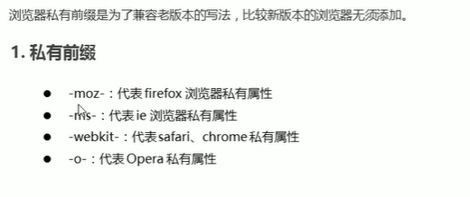
75.浏览器私有前缀
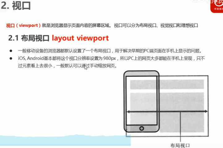
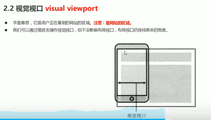
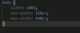
75.移动端视口
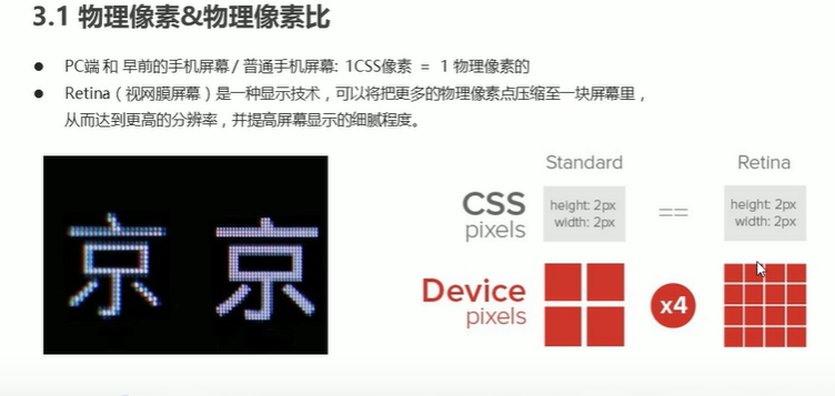
76 物理像素
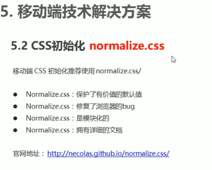
77 移动端CSS初始化
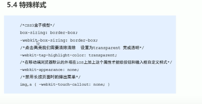
78 . 移动端特殊样式
79.移动端缩放限制
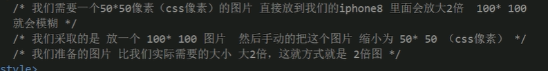
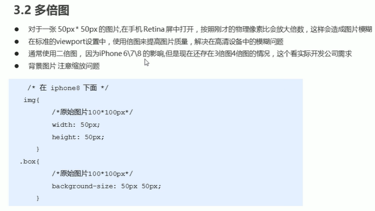
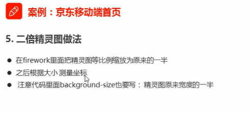
80 二倍精灵图
81. flex布局注意reverse
82 flex-侧轴上子元素对其方式(多行)
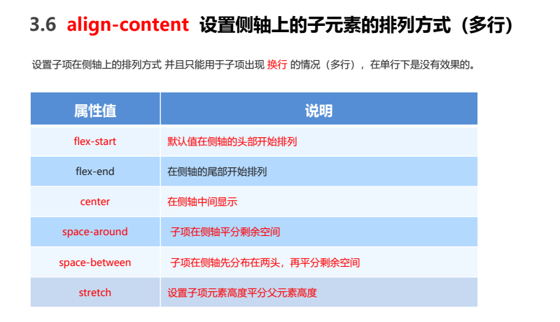
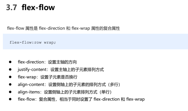
83. flex-属性连写
84. order布局子项常见属性

85 媒体查询
| <style> |
| |
| |
| |
| @media screen and (max-width: 539px) { |
| body { |
| background-color: blue; |
| } |
| } |
| |
| |
| |
| |
| |
| |
| |
| @media screen and (min-width: 540px) { |
| body { |
| background-color: green; |
| } |
| } |
| |
| |
| @media screen and (min-width: 970px) { |
| body { |
| background-color: red; |
| } |
| } |
| |
| |
| </style> |
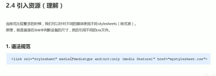
86.媒体查询引入资源
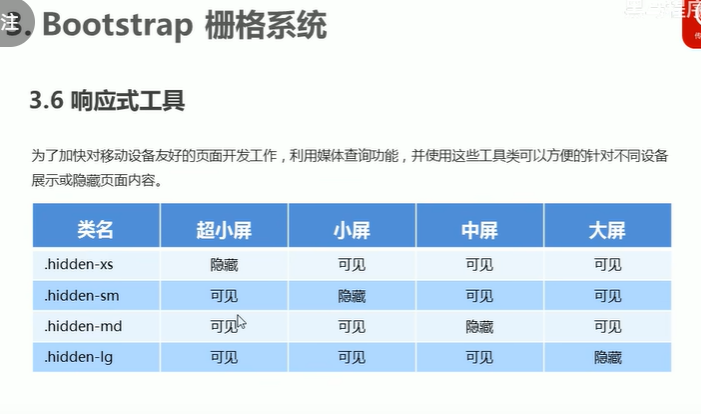
87. 响应式工具


【推荐】国内首个AI IDE,深度理解中文开发场景,立即下载体验Trae
【推荐】编程新体验,更懂你的AI,立即体验豆包MarsCode编程助手
【推荐】抖音旗下AI助手豆包,你的智能百科全书,全免费不限次数
【推荐】轻量又高性能的 SSH 工具 IShell:AI 加持,快人一步
· 被坑几百块钱后,我竟然真的恢复了删除的微信聊天记录!
· 没有Manus邀请码?试试免邀请码的MGX或者开源的OpenManus吧
· 【自荐】一款简洁、开源的在线白板工具 Drawnix
· 园子的第一款AI主题卫衣上架——"HELLO! HOW CAN I ASSIST YOU TODAY
· Docker 太简单,K8s 太复杂?w7panel 让容器管理更轻松!