

HTML与CSS学习第10天
HTML学习第10天

1. 字体图标
1.1 字体图标概述
- 定义:本质是字体,但展示的是图标
- 作用:处理简单的,颜色单一的图片
1.2 字体图标的优点
- 灵活性:灵活的修改样式,例如:尺寸,大小
- 轻量级:体积小,渲染快,降低服务器请求次数
- 兼容性:几乎兼容所有主流浏览器
1.3 字体图标的下载
-
图标库:<iconfont-阿里巴巴矢量图标库>
-
下载图标:
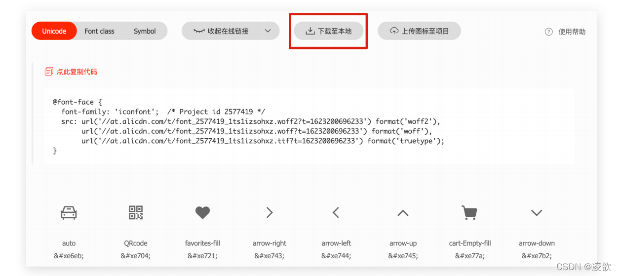
-
图标编码
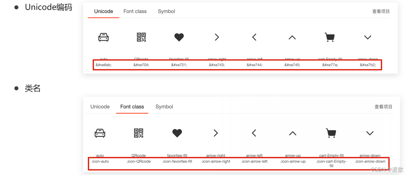
1.4 字体图标的使用(unicode编码使用)
-
引入样式表:
<link rel="stylesheet" href="../iconfont/iconfont.css"> -
使用unicode编码引用字体图标
<!-- 使用unicode编码引用字体图标 --> <span></span> -
设置span标签的字体为iconfont
<!-- 设置文字字体为字体图标 --> <style> span{ font-family: "iconfont"; } </style>
案例
<!DOCTYPE html> <html lang="en"> <head> <meta charset="UTF-8"> <meta http-equiv="X-UA-Compatible" content="IE=edge"> <meta name="viewport" content="width=device-width, initial-scale=1.0"> <title>Document</title> <!-- 引入字体图标样式表 --> <link rel="stylesheet" href="../iconfont/iconfont.css"> <!-- 设置文字字体为字体图标 --> <style> span{ font-family: "iconfont"; } </style> </head> <body> <!-- 使用unicode编码引用字体图标 --> <span></span> </body> </html>
- 效果图
1.5 字体图标的使用(调用类名实现(推荐))
-
引入样式表:
<!-- 引入字体图标样式表 --> <link rel="stylesheet" href="../iconfont/iconfont.css"> -
调用类名
<!-- 使用类名引用字体图标 --> <span class="iconfont icon-QRcode"></span>
注意点
- 使用类名是需要两个类名:iconfont 和 单个图标本身的类名
案例
<!DOCTYPE html> <html lang="en"> <head> <meta charset="UTF-8"> <meta http-equiv="X-UA-Compatible" content="IE=edge"> <meta name="viewport" content="width=device-width, initial-scale=1.0"> <title>Document</title> <!-- 引入字体图标样式表 --> <link rel="stylesheet" href="../iconfont/iconfont.css"> </head> <body> <!-- 使用类名引用字体图标 --> <span class="iconfont icon-QRcode"></span> </body> </html>
- 效果图

1.7 综合案例(购物车)
<!DOCTYPE html> <html lang="en"> <head> <meta charset="UTF-8"> <meta http-equiv="X-UA-Compatible" content="IE=edge"> <meta name="viewport" content="width=device-width, initial-scale=1.0"> <title>Document</title> <link rel="stylesheet" href="../iconfont/iconfont.css"> <style> li{ list-style: none; } li a{ text-decoration: none; color: #333; } li a.icon-cart-Empty-fill{ color: orange; } </style> </head> <body> <!-- 第一和第三个a使用字体图标 --> <li> <a href="#" class="iconfont icon-cart-Empty-fill"></a> <a href="#">购物车</a> <a href="#" class="iconfont icon-arrow-down"></a> </li> </body> </html>
- 效果图

1.8 矢量图片转换为图标
- 将svg格式的矢量图片上传到阿里巴巴图标库
- 去除本地svg图片的颜色再上传
- 加入购物车,下载
2. 平面转换
2.1 平面转换的定义
- 定义:改变盒子在平面内的形态(位移,旋转,缩放)
- 2D转换
2.2 平面转换属性1(位移)
- 属性名:transform:translate(水平移动距离,垂直移动距离)
- 取值(正负均可)
- 数字+px
- 百分比:盒子自身大小的百分比
注意点
-
translate()如果只给出一个值,表示x轴方向移动的距离
-
单方向取值:translateX(),translateY()
案例:实现盒子相对于父元素水平居中对齐(无论父子宽高如何变化)
<!DOCTYPE html> <html lang="en"> <head> <meta charset="UTF-8"> <meta http-equiv="X-UA-Compatible" content="IE=edge"> <meta name="viewport" content="width=device-width, initial-scale=1.0"> <title>Document</title> <style> /* 清除默认边距 */ *{ margin: 0; padding: 0; } .father{ position: relative; margin: 100px auto; width: 400px; height: 400px; background-color: pink; } .son{ position: absolute; left: 50%; top: 50%; /* 平面转换实现 */ transform: translate(-50%,-50%); width: 100px; height: 100px; background-color: blue; } </style> </head> <body> <div class="father"> <div class="son"> </div> </div> </body> </html>
- 效果图

案例:双开门
<!DOCTYPE html> <html lang="en"> <head> <meta charset="UTF-8"> <meta http-equiv="X-UA-Compatible" content="IE=edge"> <meta name="viewport" content="width=device-width, initial-scale=1.0"> <title>Document</title> <style> /* 清除默认边距 */ *{ margin: 0; padding: 0; } .father{ width: 1000px; height: 600px; background: url("./images/bg.jpg") -180px 0; margin: 100px auto; /* 移出时隐藏 */ overflow: hidden; } .son1{ float: left; width: 500px; height: 600px; background: url("./images/fm.jpg") -180px 0; transition: all 0.5s; } .son2{ float: left; width: 500px; height: 600px; background: url("./images/fm.jpg") -650px 0; transition: all 0.5s; } .father:hover .son1{ /* 左移出去 */ transform: translateX(-100%); } .father:hover .son2{ /* 右移出去 */ transform: translateX(100%); } </style> </head> <body> <div class="father"> <div class="son1"></div> <div class="son2"></div> </div> </body> </html>
- 效果图

注意点
- background:right 0 可以取图片右半部分
2.3 平面转换属性2(旋转)
- 属性名:transform:rotate(角度)
- 取值:数字+deg
- 取值为正,顺时针移动
- 取值为负,逆时针移动
注意点
- 角度的单位为deg
案例
<!DOCTYPE html> <html lang="en"> <head> <meta charset="UTF-8"> <meta http-equiv="X-UA-Compatible" content="IE=edge"> <meta name="viewport" content="width=device-width, initial-scale=1.0"> <title>Document</title> <style> /* 清除默认边距 */ *{ margin: 0; padding: 0; } .box{ width: 400px; height: 400px; background-image: url("./images/rotate.png"); background-size: 400px; transition: all .5s; } .box:hover{ transform: rotate(360deg); } </style> </head> <body> <div class="box"></div> </body> </html>
- 效果图

2.3.2 转换中心点(不止旋转,其他效果如位移,缩放的中心点也是这个)
-
属性:transform-origin:原点水平位置 原点垂直位置
-
取值:默认是盒子的中心点
- 方位名词(left,top,right,bottom,center)
- 数字+px
- 百分比:参照盒子自身大小
案例
<!DOCTYPE html> <html lang="en"> <head> <meta charset="UTF-8"> <meta http-equiv="X-UA-Compatible" content="IE=edge"> <meta name="viewport" content="width=device-width, initial-scale=1.0"> <title>Document</title> <style> /* 清除默认边距 */ *{ margin: 0; padding: 0; } .box{ width: 400px; height: 400px; background-image: url("./images/rotate.png"); background-size: 400px; transition: all 2s; /* 旋转的中心点改变:右下角 */ transform-origin: right bottom; } .box:hover{ /* 顺时针旋转360度 */ transform: rotate(360deg); } </style> </head> <body> <div class="box"></div> </body> </html>
- 效果图

案例:旋转加上位移
<!DOCTYPE html> <html lang="en"> <head> <meta charset="UTF-8"> <meta http-equiv="X-UA-Compatible" content="IE=edge"> <meta name="viewport" content="width=device-width, initial-scale=1.0"> <title>Document</title> <style> /* 清除默认间距 */ *{ margin: 0; padding: 0; } body{ line-height: 1; } .box{ width: 1336px; height: 400px; box-sizing: border-box; border: 1px solid #000; margin: 100px auto; } .img{ text-align: center; width: 400px; height: 400px; transition: all 2s; } .img img{ margin-top: 50px; } .box:hover .img{ transform: translateX(1000px) rotate(720deg); } </style> </head> <body> <div class="box"> <div class="img"><img src="./images/tyre.png" alt=""></div> </div> </body> </html>
- 效果图

注意点
- 旋转会改变坐标轴的方向
2.4 平面转换属性3(缩放)
-
缩放在之前可通过width和height的变化实现,但不是中心缩放,而这个属性为中心缩放
-
属性名:transform:scale(x轴缩放倍数,y轴缩放倍数)
-
属性值:纯数字
- 大于1放大
- 小于1缩小
-
一般情况下这样使用:
- transform:scale(缩放倍数)
案例
<!DOCTYPE html> <html lang="en"> <head> <meta charset="UTF-8"> <meta http-equiv="X-UA-Compatible" content="IE=edge"> <meta name="viewport" content="width=device-width, initial-scale=1.0"> <title>Document</title> <style> .box{ width: 400px; height: 200px; /* background-color: pink; */ margin:100px auto; } img{ width: 100%; transition: all 1s; } .box:hover img{ transform: scale(1.2); } </style> </head> <body> <div class="box"> <img src="./images/fm.jpg" alt=""> </div> </body> </html>
- 效果图

案例2:现实案例
<!DOCTYPE html> <html lang="en"> <head> <meta charset="UTF-8"> <meta http-equiv="X-UA-Compatible" content="IE=edge"> <meta name="viewport" content="width=device-width, initial-scale=1.0"> <title>Document</title> <style> /*清除默认边距 */ *{ padding: 0; margin: 0; } .box{ width: 300px; height: 300px; background-color: #fff; } .box .pic{ width: 100%; position: relative; } .box img{ /* overflow: hidden; */ width: 100%; } .box .pic::after{ position: absolute; content: ''; width: 58px; height: 58px; left: 50%; top: 50%; /* 层叠性原因,需要连写在一起 */ transform: translate(-50%,-50%) scale(5); /* background-color: blue; */ background-image: url("./images/play.png"); background-size: 100%; opacity: 0; transition: all 1s; } .box:hover .pic::after{ opacity: 1; /* 由于层叠性原因,需要加上translate(-50%,-50%) */ transform: translate(-50%,-50%) scale(1); } </style> </head> <body> <div class="box"> <div class="pic"> <img src="./images/party.jpeg" alt=""> </div> <p>【和平精英】”初火“ 音乐概念片:四圣觉醒......</p> </div> </body> </html>
- 效果图

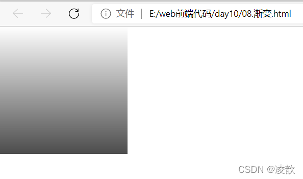
3. 渐变
-
定义:多个颜色逐渐变化的视觉效果
-
作用:设置盒子的背景
-
语法
-
background-image: linear-gradient( 颜色1, 颜色2, ...., 颜色n );
-
案例
<!DOCTYPE html> <html lang="en"> <head> <meta charset="UTF-8"> <meta http-equiv="X-UA-Compatible" content="IE=edge"> <meta name="viewport" content="width=device-width, initial-scale=1.0"> <title>Document</title> <style> /* 清除默认边距 */ *{ margin: 0; padding: 0; } .box{ width: 200px; height: 200px; background-image: linear-gradient( transparent, rgba(0,0,0,.7) ); } </style> </head> <body> <div class="box"></div> </body> </html>
- 效果图


【推荐】国内首个AI IDE,深度理解中文开发场景,立即下载体验Trae
【推荐】编程新体验,更懂你的AI,立即体验豆包MarsCode编程助手
【推荐】抖音旗下AI助手豆包,你的智能百科全书,全免费不限次数
【推荐】轻量又高性能的 SSH 工具 IShell:AI 加持,快人一步
· 被坑几百块钱后,我竟然真的恢复了删除的微信聊天记录!
· 没有Manus邀请码?试试免邀请码的MGX或者开源的OpenManus吧
· 【自荐】一款简洁、开源的在线白板工具 Drawnix
· 园子的第一款AI主题卫衣上架——"HELLO! HOW CAN I ASSIST YOU TODAY
· Docker 太简单,K8s 太复杂?w7panel 让容器管理更轻松!