前端布局flex从入门到入土
前端布局flex从入门到入土
作为一个后端,谈不上多会前端,但是一些常见的布局都可以做到,例如flex布局。推荐菜鸟教程的布局:https://www.runoob.com/w3cnote/flex-grammar.html
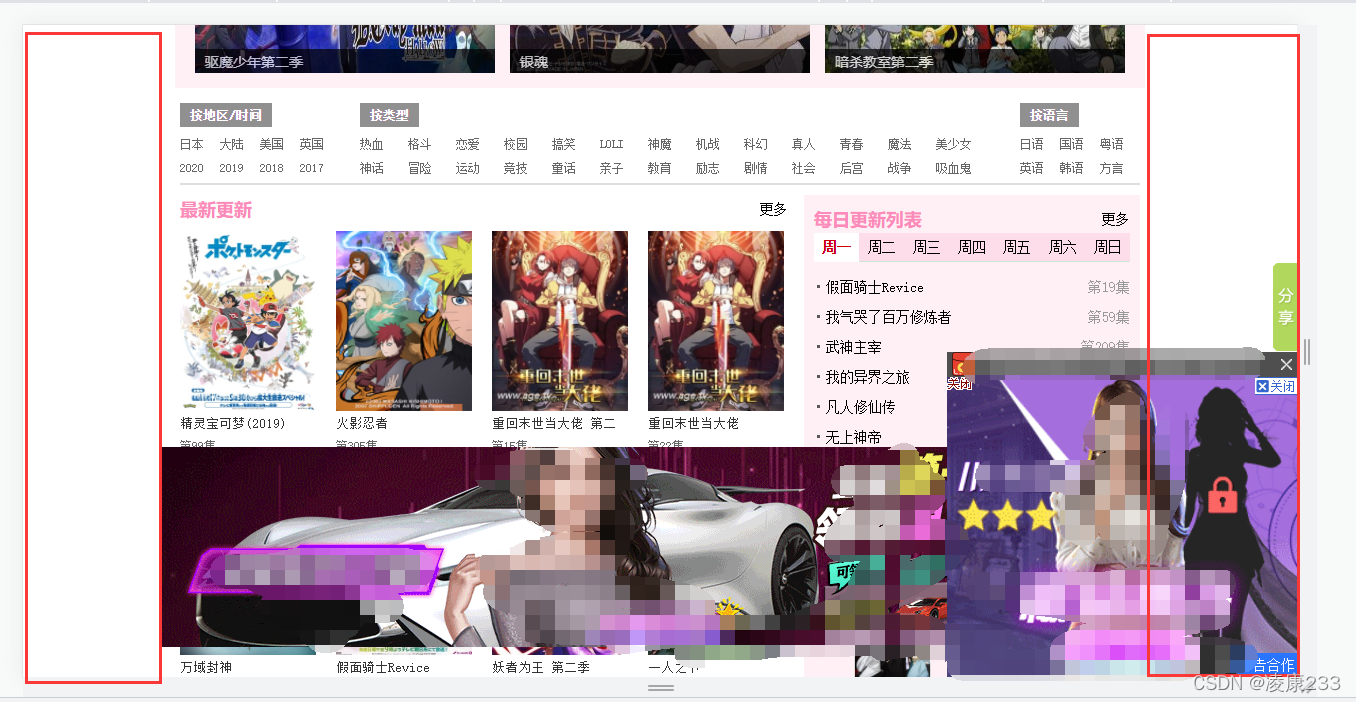
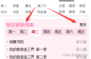
例如某网站布局:
场景一
左中右布局,并且要求上下页铺满
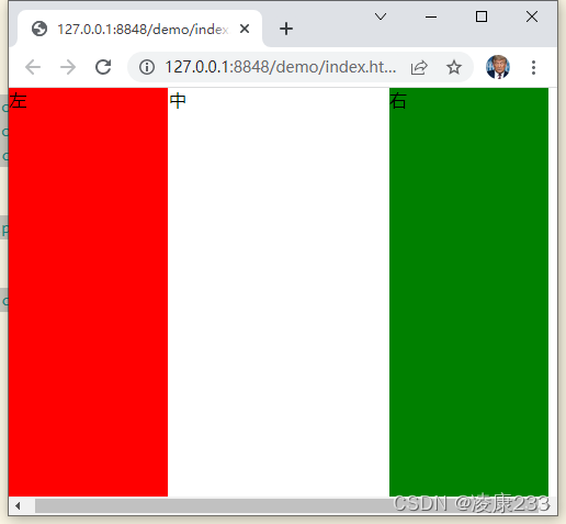
	<body>
		<div style="position: absolute;top: 0;bottom: 0;">
			<div style="display: flex;flex-direction: row;height: 100%;width: 100vw;">
				<div style="width: 29%;background-color: red;">
					左
				</div>
				<div style="width: 40%;margin: 0 1px;">
					中
				</div>
				<div style="width: 29%;background-color: green;">
					右
				</div>
			</div>
		</div>
	</body>
使用绝对定位让上下占满
看起来不错,但是当内容超出后就跟尴尬了:
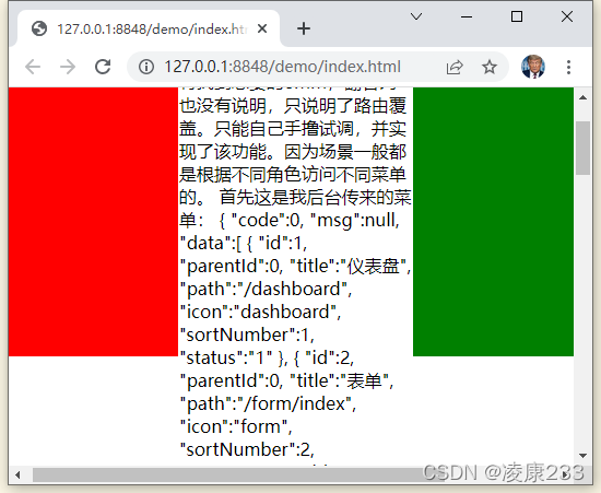
这时我们可以在中间的div设置overflow达到让内容不超出视图,并且能够用鼠标滚动
<div style="width: 40%;margin: 0 1px;overflow-y: auto;overflow-x: hidden;">
overflow-y: auto;overflow-x: hidden;
效果:
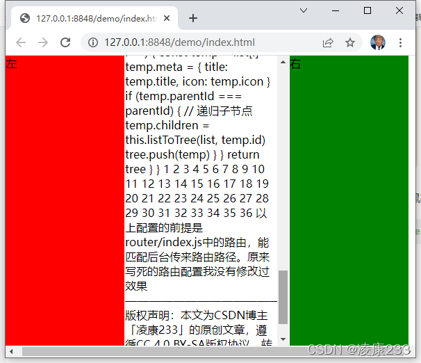
奈斯~
场景二
列布局要求,例如商品中要求展示上面图片下面价格名称描述,这时用列布局
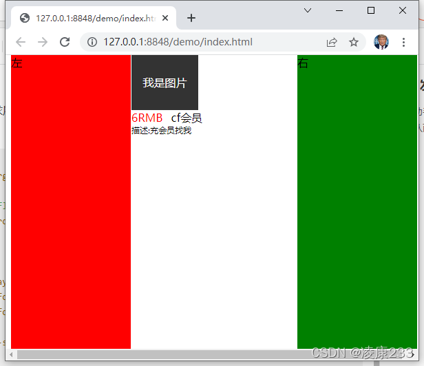
基于上面第一个布局的代码,使用行和列的布局组合实现
<!-- 中 -->
<div style="width: 40%;margin: 0 1px;">
	<!-- 列布局 -->
	<div style="display: flex;flex-direction: column;width: 45%;">
		<div style="background-color: #333;width: 90%;height: 80px;text-align: center;line-height: 80px;color: white;">
			我是图片
		</div>
		<!-- 行布局 -->
		<div style="display: flex;flex-direction: row;">
			<span style="font-size: 14;color: red;">6RMB</span>
			<span style="font-size: 14;margin-left: 12px;">cf会员</span>
		</div>
		<span style="font-size: 12px;">描述:充会员找我</span>
	</div>
</div>
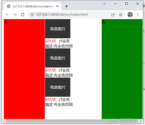
这时又有要求了,会有多个商品,我们直接copy就会变成这样:
这时你想使用场景一中的行布局,将中间的div改成这样:<div style="width: 40%;margin: 0 1px;display: flex;flex-direction: row;">,发现成了这样:
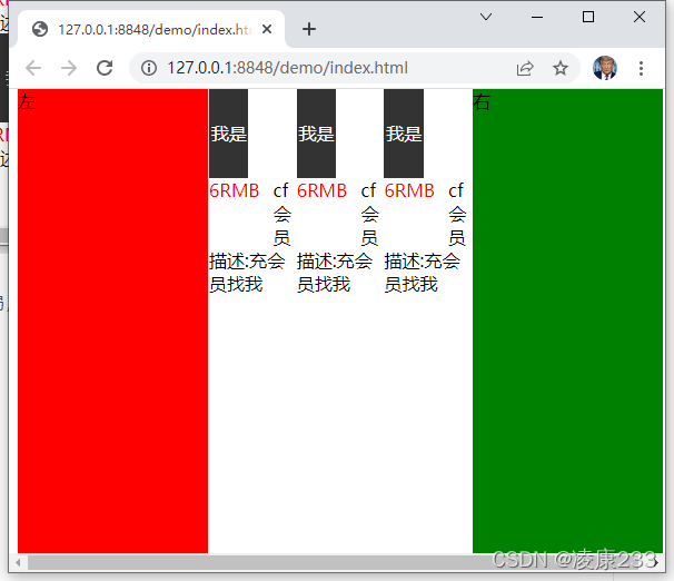
这显然不是我想要的,哪咋办啊?这时就用到了flex中的flex-wrap,他会自动换行
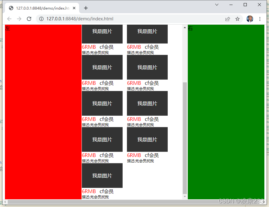
主要在中间的div添加了display: flex;flex-wrap: wrap;overflow-x: hidden;overflow-y: auto;
<!-- 中 -->
<div style="width: 40%;margin: 0 1px;display: flex;flex-wrap: wrap;overflow-x: hidden;overflow-y: auto;">
	<!-- 列布局 -->
	<div style="display: flex;flex-direction: column;width: 45%;height: 130px;">
		<div style="background-color: #333;width: 90%;height: 80px;text-align: center;line-height: 80px;color: white;">
			我是图片
		</div>
		<!-- 行布局 -->
		<div style="display: flex;flex-direction: row;">
			<span style="font-size: 14;color: red;">6RMB</span>
			<span style="font-size: 14;margin-left: 12px;">cf会员</span>
		</div>
		<span style="font-size: 12px;">描述:充会员找我</span>
	</div>
	// ...省略更多
</div>
实现了上面的场景是不是和某些免费网站一样呢?左边是渣渣辉砍一刀广告,右边是美女秘书养成游戏,中间就是无修xx。
依稀记得刚毕业在外包驻场工作,当时负责后端,经常加班,技术还可以,任务分分钟搞定下班。大家都在加班,就我跑下班。后来把老成员熬走我就成了主程。半年后,搞前后端分离,想去开发前端vue,上级不同意,挺遗憾的。
现在我还是觉的前端开发挺容易的,不像后端又是java又是服务器k8s容器普罗米修斯监控,一套下来人都傻了。面试还要JVM,源码,又不是看不懂源码。我为啥要记那么多呢?我还是比较喜欢啥都学一些,深入一下就行了,无法深耕某一领域了。
追加更新>>加快入土
追加更新与2022年3月2日
细节场景
这时又遇到经典的左右浮动环节,记得在大学上的第一课网络设计入门,老师叫高雪妮是一个主任,教html设计,当时用的最多的是float,啥也不会先学着吧。不过现在使用flex布局再混合float就很难调节div布局了,所以还是用flex实现类似浮动的效果。
新手这样写:
<!-- 中 -->
<div style="width: 40%;margin: 0 1px;">
	<div style="width: 100%;">
		<h style="float: left;">每日更新列表</h>
		<a style="float: right;">更多</a>
	</div>
</div>
虽然能达到效果,但不适合flex混合,例如uniapp等不推荐用浮动
老手会这样写:
<!-- 中 -->
<div style="width: 40%;margin: 0 1px;">
	<div style="width: 100%;display: flex;flex-direction: row;">
		<div style="flex: 1;background-color: aqua;">每日更新列表</div>
		<div>更多</div>
	</div>
</div>
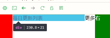
要学会用flex:1撑开div很有用,别忘了父标签的行布局:display: flex;flex-direction: row;
还能这样写
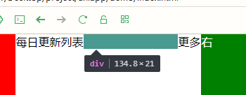
<!-- 中 -->
<div style="width: 40%;margin: 0 1px;">
		<div style="width: 100%;display: flex;flex-direction: row;">
			<div>每日更新列表</div>
			<!-- 中间用flex:1 撑开 -->
			<div style="flex: 1;background-color: green;"></div>
			<div>更多</div>
		</div>
	</div>
要学会用flex:1撑开div很有用,别忘了父标签的行布局:display: flex;flex-direction: row;
例如削微杂点的行列撑开效果:
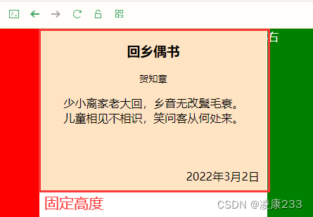
<!-- 中 -->
<div style="width: 40%;margin: 0 1px;">
<div
style="width: 100%;display: flex;flex-direction: column;height: 230px;background-color: bisque;">
<h3 style="text-align: center;">回乡偶书</h3>
<small style="text-align: center;">贺知章</small>
<p>
少小离家老大回,乡音无改鬓毛衰。
<br>
儿童相见不相识,笑问客从何处来。
</p>
<!-- 上下撑开 -->
<div style="flex: 1;"></div>
<div style="display: flex;flex-direction: row;padding: 10px 10px;">
<!-- 左右撑开 -->
<div style="flex: 1;"></div>
<span>2022年3月2日</span>
</div>
</div>
</div>

 浙公网安备 33010602011771号